
Need a font that’s both stylish and super readable? Muller Font is a modern sans-serif that blends geometric precision with friendly curves. It’s perfect for branding, web design, titles, and even body text. This guide will show you exactly how to use it to make your designs shine.
Choosing the right typeface can feel like a big decision, right? You want something that looks good but is also easy for everyone to read. Sometimes fonts look great on a screen but become a struggle when printed, or vice versa. It can be a bit overwhelming trying to figure out what works best for your project. But don’t worry! We’re here to break down one of today’s most popular and versatile fonts: Muller. You’ll soon see why so many designers love it and how it can elevate your own creative work. Let’s dive in!
What is Muller Font? A Design Overview
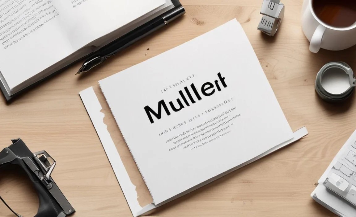
Muller Font is a contemporary geometric sans-serif typeface. Designed by the talented team at Positype, it was released with a clear vision: to create a font that is both highly functional and aesthetically pleasing. Its design draws inspiration from classic geometric forms, evident in its perfectly circular ‘o’s and consistent stroke widths. Yet, it avoids feeling rigid or overly mechanical. The subtle humanist touches, like slightly open apertures and a touch of softness in its curves, give Muller an approachable and friendly character.
This unique blend of geometric structure and humanist warmth makes Muller incredibly versatile. It’s not just another sans-serif; it’s a carefully crafted tool that strikes a beautiful balance. This balance is key to its widespread adoption across various design disciplines, ensuring legibility without sacrificing personality.
Key Characteristics of Muller Font

Let’s look at what makes Muller stand out. Understanding these characteristics will help you appreciate why it works so well in different contexts.
- Geometric Foundation: The core shapes in Muller are based on simple geometric elements like circles, squares, and triangles. This gives it a clean, modern, and organized feel.
- Humanist Touches: While geometric, Muller isn’t cold. It incorporates subtle humanist qualities, like slight variations in stroke contrast and open letterforms. This makes it feel more natural and easier to read than some purely geometric fonts.
- Excellent Readability: The generous x-height (the height of lowercase letters like ‘x’) and clear letterforms contribute to its superb legibility, even at small sizes or at a distance.
- Wide Range of Weights: Muller typically comes in a comprehensive family of weights, from Thin to Black. This allows for great flexibility in design, whether you need delicate headlines or impactful statements.
- Large Character Set: Most versions of Muller include a broad range of characters, punctuation, and symbols, supporting multiple languages and various design needs.
- Modern and Clean Aesthetic: Its overall look is sleek, contemporary, and uncluttered, making it a great choice for brands aiming for a modern image.
Why Choose Muller Font for Your Projects?

In the crowded world of typography, why does Muller consistently get picked? It boils down to its problem-solving capabilities and its sheer elegance. Here’s why it’s a favorite among designers:
- Versatility: One font that can do it all is a designer’s dream. Muller works beautifully for logos, headlines, body copy, user interfaces, print materials, and web content.
- Legibility on Screens: In our digital-first world, a font’s performance on various screens is crucial. Muller’s clear letterforms and generous spacing ensure it remains crisp and readable on websites, apps, and digital ads.
- Professional Appeal: Its balanced design projects an image of professionalism, sophistication, and clarity. This is invaluable for businesses and brands that want to make a strong, trustworthy impression.
- Design Harmony: Because Muller is so well-balanced, it often plays nicely with other fonts. This makes it an excellent candidate for use in font pairings, creating visually appealing and coherent design systems.
- Timelessness: While modern, its geometric roots give it a sense of timelessness that prevents it from feeling quickly dated.
Best Uses for Muller Font
Muller’s adaptability means it can be slotted into almost any visual project. But where does it truly excel? Let’s explore some of its prime applications:
1. Branding and Logo Design
Muller is a fantastic choice for creating memorable brand identities. Its clean lines and modern feel convey a sense of efficiency and trust. Whether used for a tech startup, a design agency, or a lifestyle brand, Muller can help establish a contemporary and professional image.
- Logotypes: The distinct yet simple letterforms of Muller make for clean and impactful wordmarks.
- Taglines and Slogans: Its readability ensures that your brand’s core message is always clear.
- Brand Guidelines: Using Muller across all brand collateral (from business cards to websites) creates a cohesive and recognizable identity.
2. Web Design and UI/UX
For websites and digital applications, readability is paramount. Muller excels here due to its clear structure and generous spacing, which prevent text from looking cramped or losing definition on different screen resolutions.
- Headings: Use bolder weights of Muller to create clear, attention-grabbing headlines that guide the user’s eye.
- Body Text: Lighter or regular weights are perfect for paragraphs, ensuring comfortable reading experiences for long articles or product descriptions.
- User Interface Elements: Buttons, navigation menus, and form labels in Muller are easy to read and interact with, enhancing the overall user experience.
3. Editorial Design and Print Materials
From magazines and books to brochures and reports, Muller brings a sophisticated and organized look to printed matter. Its clarity ensures that readers can easily consume information, while its stylish structure adds a modern flair.
- Magazine Layouts: Use different weights to distinguish between article titles, subheadings, and body copy, creating a dynamic yet readable layout.
- Book Covers: Muller can lend a strong, contemporary feel to book covers, especially for non-fiction or modern fiction genres.
- Reports and Presentations: Its professional appearance makes it ideal for corporate documents, annual reports, and slide decks where clarity and polish are essential.
4. Marketing and Advertising
In the fast-paced world of marketing, your message needs to be seen and understood quickly. Muller’s blend of style and clarity makes it a powerful tool for advertisements, social media graphics, and campaign materials.
- Advertisements: Bold weights grab attention for headlines, while regular weights keep ad copy legible.
- Social Media Graphics: Muller’s clean aesthetic translates well to visually driven platforms, ensuring text is readable even on small mobile screens.
- Infographics: Its structured nature makes it perfect for presenting data in a clear and organized way within infographics.
Muller Font Family: Exploring the Weights
A great feature of the Muller font family is its extensive range of weights. This allows for a huge amount of typographic flexibility within a single, cohesive style. Typically, you’ll find Muller available in weights like:
| Weight Name | Description |
|---|---|
| Thin | Extremely light, delicate for subtle emphasis or decorative use. |
| Extra Light | A very light weight, suitable for elegant headlines or secondary text. |
| Light | A softer, lighter option for extended reading with a touch of sophistication. |
| Regular | The go-to for body text, offering excellent balance between presence and readability. |
| Medium | Slightly more presence than Regular, good for subheadings or emphasized text. |
| Semi Bold | A robust weight for stronger headlines or call-to-actions. |
| Bold | Impactful and strong, perfect for main headlines and key statements. |
| Extra Bold / Heavy | Dominant and attention-grabbing, for headlines that demand to be seen. |
| Black | The heaviest weight, providing maximum visual weight and presence. |
Having this spectrum allows designers to create hierarchy and contrast within their designs using only one font family, ensuring visual consistency. For instance, you might use Muller Black for a main title, Muller Medium for a subheading, and Muller Regular for the main body of your text.
Pairing Muller Font: Creating Visual Harmony
While Muller is excellent on its own, pairing it with other typefaces can create even more dynamic and engaging designs. The key is to choose fonts that complement Muller without competing with it.
1. Pairing Muller with Serif Fonts
For a classic yet modern feel, pair Muller with a well-chosen serif font. The contrast between sans-serif and serif can create visual interest and help differentiate elements.
- For Headlines (Muller) and Body Text (Serif): This is a very common and effective pairing. Use a bold weight of Muller for attention-grabbing headlines, and then choose a readable serif for longer passages of text. Examples of serifs that work well include:
- Garamond
- Merriweather
- Playfair Display
- For Body Text (Muller) and Headlines (Serif): You can also reverse this, using a classic serif for headlines and a clean sans-serif like Muller for body text. This can lend a slightly more traditional or literary feel while keeping the main content highly legible.
2. Pairing Muller with Other Sans-Serif Fonts
If you’re sticking with sans-serifs, contrast is key. Look for fonts that have a different personality or structure than Muller.
- Geometric vs. Humanist Sans: Pair geometric Muller with a more humanist sans-serif (like Open Sans or Lato) for a subtle contrast in feel. This can add approachability to geometric rigor.
- Display vs. Text Sans: Use Muller for your more functional text elements and a more distinct, stylized sans-serif for larger display type or decorative headlines. This ensures readability while allowing for creative expression.
- Font with Different Proportions: Consider pairing Muller with a sans-serif that has a narrower or wider stance for a unique visual texture.
3. Pairing Muller with Script or Decorative Fonts
Use these pairings sparingly for maximum impact. Muller’s clean nature makes it an excellent neutral base for more expressive fonts.
- Accents: Let a beautiful script font handle a signature, a short emotive phrase, or a decorative element. Use Muller for all surrounding text to keep the design grounded and readable.
- Event Invitations: Muller can be great for the logistical details (date, time, location) while a flowing script graces the main invitation text.
When pairing, always consider the context of your project. The goal is to create harmony, not chaos. Test your pairings in actual design mockups to see how they feel and read. Resources like Google Fonts specimen pages or font pairing tools can offer inspiration and visual examples.
Where to Find and Use Muller Font
Muller Font is widely available and can be incorporated into your design workflow through several avenues:
- Font Marketplaces: The most comprehensive versions of Muller, often including all weights and styles, can be purchased from marketplaces like MyFonts. This is ideal for commercial projects where licensing is crucial.
- Adobe Fonts: If you’re an Adobe Creative Cloud subscriber, Muller is often available through Adobe Fonts. This allows you to activate and use the font across your Adobe applications seamlessly.
- Desktop Publishing Software: Once acquired, Muller can be installed on your computer like any other font and used in design software such as Adobe Photoshop, Illustrator, InDesign, Sketch, and Affinity Designer.
- Web Use: For websites, Muller can be implemented using CSS. Most font vendors, including those providing Adobe Fonts or custom licenses, will offer web-font kits. Ensure you have the appropriate license for web embedding.
Always check the licensing terms of the font version you’re using. This ensures you’re complying with usage rights for both personal and commercial projects. For instance, the U.S. Government Publishing Office (GPO) maintains standards for typography in federal documents, and while Muller might not be explicitly listed, adhering to high standards of readability and professional presentation is key for any official publication.
Tips for Maximizing Muller Font in Your Designs
To truly make Muller shine, consider these practical tips:
- Hierarchy is Key: Use the different weights of Muller to establish a clear visual hierarchy. Bold for headlines, regular for body text, and lighter weights for secondary information.
- Kerning and Spacing: While Muller is well-designed, pay attention to kerning (the space between specific letter pairs) for headlines and titles to ensure a polished look. Ensure adequate line spacing (leading) for body text to maintain readability.
- Context is King: Consider the overall tone and message of your project. Muller leans modern and clean, making it perfect for brands that want to convey efficiency, innovation, or sophistication.
- Don’t Overdo It: Even the best fonts can be overused. While Muller is versatile, consider where its specific aesthetic truly adds value to your design.
- Test Across Devices: Especially for web projects, always preview your designs with Muller on various screen sizes and resolutions to confirm consistent readability.
Frequently Asked Questions About Muller Font
Q1: Is Muller Font free to use?
Muller Font is typically a commercial font, meaning it requires purchase or a subscription to a service like Adobe Fonts for proper licensing. While some free fonts might share similar characteristics, the official Muller font family is not free for commercial use from its creators. Always check the licensing details where you obtain the font.
Q2: What makes Muller a sans-serif font?
A sans-serif font is one that does not have the small decorative strokes, or “serifs,” at the ends of the main strokes of letters. Muller’s clean, straight lines and lack of serifs classify it as a prominent example of a sans-serif typeface.
Q3: What kind of projects is Muller Font best suited for?
Muller is highly versatile. It excels in branding, logo design, web design, UI/UX interfaces, editorial layouts, print materials, and marketing campaigns due to its excellent readability and modern aesthetic.
Q4: Can I use different weights of Muller in the same design?
Absolutely! Using different weights from the Muller family (e.g., Bold for headlines, Regular for body text) is a great way to create visual hierarchy and add contrast, enhancing the overall design. This is a recommended practice for effective typography.
Q5: How does Muller compare to other popular geometric sans-serif fonts like Futura or Gotham?
While all are geometric sans-serifs, Muller often strikes a balance between the pure geometric rigidity of Futura and the more robust, humanist-influenced Gotham. Muller is known for its slightly softer curves and open apertures, often giving it a more friendly and approachable feel than Futura, while maintaining a strong sense of modern structure.
Q6: Is Muller Font good for body text?
Yes, Muller font is very good for body text, especially in its Regular or Light weights. Its generous x-height, clear letterforms, and balanced spacing contribute to excellent readability, even for extended blocks of copy. This makes it a solid choice for both print and digital publications.
Conclusion: Embrace the Clarity and Style of Muller Font
Muller Font offers a compelling combination of modern, geometric structure and a friendly, approachable character. Its exceptional readability, extensive range of weights, and inherent versatility make it an invaluable asset for any designer. Whether you’re building a brand identity from the ground up, designing a user-friendly website, or crafting an elegant print publication, Muller provides the clarity and style you need to succeed.
By understanding its characteristics and exploring its best uses, you can confidently integrate Muller into your next project. Don’t hesitate to experiment with its different weights and to pair it with complementary typefaces to create visually stunning and highly effective designs. Muller is more than just a font; it’s a design solution that promises clarity, professionalism, and enduring aesthetic appeal. Happy designing!


