
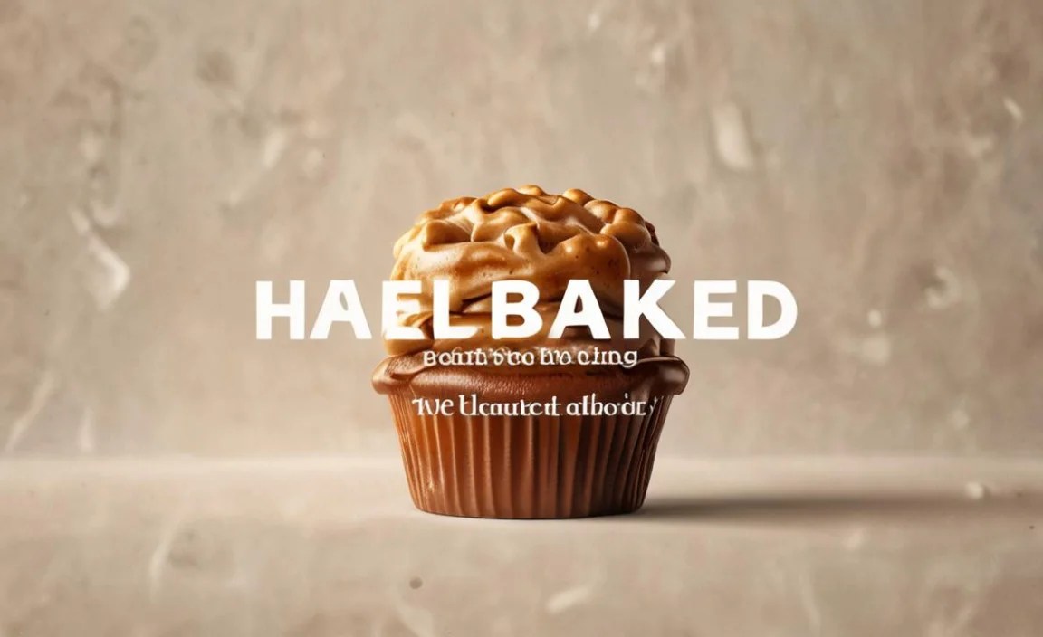
The “Half Baked Font” is a brilliant design concept where a font intentionally appears unfinished or unrefined to evoke a specific handmade, quirky, or raw aesthetic. It’s a deliberate choice to communicate authenticity, playfulness, or a work-in-progress vibe, making it stand out from polished, predictable typefaces.
Ever stumbled upon a font that looked like it was sketched out in a hurry, yet somehow… perfect? That’s the magic of what many in the design world playfully call the “Half Baked Font” effect. It’s not about a font being incomplete or poorly made, but rather a clever design choice that embraces a raw, unpolished feel. This approach can inject so much personality into your designs, moving them from ordinary to exceptionally memorable. If you’ve ever thought, “How do I achieve that cool, imperfect look?” you’re in the right place. Let’s explore why this design strategy works and how you can use it.
What is the “Half Baked Font” Vibe?

The term “Half Baked Font” isn’t an official typographic classification, but it perfectly captures a design trend where typefaces intentionally mimic processes like sketching, hand-lettering with slight hesitations, or even digital textures that suggest unfinished work. Think of fonts that have varying stroke widths that aren’t perfectly smooth, clean edges that appear slightly smudged, or letterforms that suggest a quick, spontaneous creation. This is different from a messy or poorly designed font; it’s a deliberate artistic choice.
These fonts often feel more approachable and human. They break away from the sterile perfection of many digital fonts, bringing a sense of authenticity and character. Imagine a baker’s handwritten sign for a rustic bakery, or a street artist’s tag – there’s an inherent story and personality in that imperfect charm. That narrative is what the “Half Baked Font” aims to capture in broader design applications.
Why This “Unfinished” Look Works Wonders

In a world saturated with sleek, predictable designs, imperfection can be a powerful differentiator. The “Half Baked Font” aesthetic taps into several psychological triggers that make it so effective:
- Authenticity and Trust: Designs that feel handmade or less processed can appear more honest and trustworthy. This is particularly crucial for small businesses, artisanal brands, or projects aiming for a personal touch.
- Creativity and Playfulness: This style inherently communicates a sense of creativity, spontaneity, and fun. It tells the viewer that you don’t take yourself too seriously, making your brand or message more engaging.
- Memorability: Unique and unconventional styles tend to stick in people’s minds. A “Half Baked Font” can make your logo, website, or marketing materials instantly recognizable.
- Human Connection: Imperfections often humanize a design. They can evoke emotions and make a brand feel more relatable.
- “Work in Progress” Narrative: Sometimes, you want to convey a sense of evolution, growth, or an ongoing journey. This aesthetic can subtly suggest that your brand or project is dynamic and developing.
Identifying the Characteristics of a “Half Baked Font”

While the term is informal, you can spot these fonts by looking for specific visual cues:
Key Visual Characteristics:
- Varied Stroke Weights: Lines might be thicker or thinner in unexpected places, as if drawn with a fluctuating pen.
- Slight Irregularities: Curves might not be perfectly smooth, and edges might not be razor-sharp.
- Sketchy or Hand-Drawn Feel: Letterforms can resemble quick sketches, complete with visible “construction lines” or a slightly rough outline.
- Inconsistent Baseline or Kerning: While often still readable, there might be subtle variations in how letters align or space, mimicking natural handwriting.
- Textured Undertones: Some fonts might incorporate a subtle texture, like paper grain or a faded ink effect, enhancing the “analog” feel.
- Unique Ligatures or Glyphs: Sometimes, the “imperfect” nature extends to unique character variations or connections between letters.
It’s important to distinguish this from actual legibility issues. A good “Half Baked Font” is still clear and readable, especially at its intended sizes. The “imperfection” is stylistic, not functional.
Where to Find and Use “Half Baked Fonts”

These distinctive typefaces can add a dynamic edge to a variety of projects. Here are some ideal scenarios:
Ideal Use Cases:
- Branding for Creative Businesses: Think artisanal food producers, craft breweries, independent boutiques, artists, and designers.
- Marketing Materials: Posters, flyers, social media graphics, and advertisements looking to grab attention.
- Website Design: For headings, call-to-action buttons, or specific sections that need a personality boost on blogs, portfolios, or e-commerce sites.
- Packaging Design: To give products a unique, handcrafted, or quirky appeal.
- Event Promotion: Especially for festivals, workshops, or community events that value a relaxed, engaging atmosphere.
- Logos and Identity: For brands wanting to convey approachability, originality, and a distinct character.
Finding Your “Half Baked” Gem: Tools and Resources
Discovering fonts that fit this unique aesthetic can be a fun treasure hunt. Here are some excellent places to start:
- Google Fonts: While known for its extensive library of clean, readable fonts, Google Fonts also offers some gems with hand-drawn or slightly imperfect qualities. Look for keywords like “handwritten,” “display,” or “organic.”
- Adobe Fonts (Typekit): For Adobe Creative Cloud subscribers, this is a vast resource. Explore their curated collections and search for terms that hint at handcrafted styles.
- Creative Market: This marketplace is a goldmine for unique, often hand-crafted fonts. Many designers specialize in creating typefaces with that signature “half-baked” charm.
- Fontspring & MyFonts: These are professional font retailers where you can find an enormous selection of styles, many with distinct, artistic qualities.
- Dafont & Font Squirrel: These sites offer a mix of free and premium fonts. Be sure to check the licensing for commercial use, but they can be great for exploring experimental styles.
When searching, use terms like “quirky,” “hand-drawn,” “sketch,” “rough,” “organic,” “imperfect,” “scribble,” or “artistic” to uncover fonts that fit the “half baked” vibe.
Crafting a “Half Baked” Design System: Pairing and Typography
A “Half Baked Font,” especially a display or bolder one, often pairs best with simpler, more structured fonts to ensure readability and balance. Here’s how to approach it:
Font Pairing Strategies:
- Pair with a Clean Sans-Serif: A highly legible, geometric, or humanist sans-serif font can act as a perfect counterpoint. Use the “Half Baked Font” for headlines or key design elements and the sans-serif for body text.
- Combine with a Classic Serif: For a more sophisticated yet still playful feel, pair a “Half Baked” display font with a timeless serif for longer passages of text.
- Use Sparingly: This style is often best used as an accent. Overdoing it can lead to a chaotic or unprofessional look.
- Consider Font Weight: A bold, “Half Baked” font will demand attention. Ensure it doesn’t overshadow crucial information.
Example Pairing Table:
| Headline/Accent Font (Half Baked Style) | Body Text Font (Legible) | Best For |
|---|---|---|
| Sketchy Sans (e.g., Amatic SC, Architects Daughter) | Open Sans, Roboto, Lato | Blog posts, informal branding, social media graphics |
| Hand-Drawn Display (e.g., Permanent Marker, Indie Flower) | Merriweather, Georgia, Playfair Display | Event flyers, packaging, artisanal brand logos |
| Rough Serif (e.g., a custom distressed serif) | Source Sans Pro, Montserrat | Quirky brand identity, unique website elements |
Remember, the goal is contrast and harmony. The “Half Baked Font” should draw the eye, while its companion font ensures that your message is easily consumed.
Practical Steps to Implementing the “Half Baked” Aesthetic
Ready to add some delightful imperfection to your next project? Follow these steps:
- Define Your Goal: What message do you want to convey? Authenticity? Playfulness? Creativity? This will guide your font choice.
- Explore Font Libraries: Use the resources mentioned above to search for fonts that embody the “Half Baked” characteristics. Don’t be afraid to try out experimental styles.
- Test for Readability: Crucially, check how your chosen font performs at different sizes and in various contexts. Ensure body text is clear and headlines are legible from a distance. For instance, the readability of body text is a core principle in web design, often informed by organizations like the Web Content Accessibility Guidelines (WCAG), which emphasize the importance of clear text.
- Consider Your Audience: Is this imperfect style appropriate for your target demographic? A playful font might work for a youth brand but not for a financial institution.
- Pair Wisely: Select a secondary font that complements your primary “Half Baked” font without clashing.
- Use as an Accent: Avoid using these fonts for large blocks of text. Reserve them for where they can have the most impact – headlines, logos, key quotes.
- Experiment with Color and Texture: Sometimes, pairing a “Half Baked Font” with a complementary color palette or subtle background texture can enhance the overall aesthetic.
- Get Feedback: Before launching, show your design to others to ensure the intended message comes across clearly.
The “Half Baked Font” in Modern Design
The enduring appeal of the “Half Baked Font” style lies in its ability to feel both current and timeless. In an era where brands strive for genuine connection, this aesthetic offers a pathway to achieve that.
Consider the rise of independent makers, the demand for transparent and authentic brands, and the overall appreciation for anything that feels less corporate and more human. This is where the “Half Baked Font” shines. It’s a way for digital creations to tap into the tactile, imperfect beauty of the physical world. It’s a nod to the artistry of hand-lettering and the raw energy of creative processes.
This trend isn’t just about choosing a font; it’s about embracing a design philosophy. It’s about understanding that perfection isn’t always the goal, and that sometimes, the most compelling designs are those that feel a little, well, real.
FAQ: Understanding the “Half Baked Font”
What exactly is a “Half Baked Font”?
A “Half Baked Font” is a playful term for fonts that intentionally look unpolished, sketchy, or slightly unfinished. It’s a deliberate design choice to convey a handmade, authentic, or quirky feel, not a mistake in font design.
Are “Half Baked Fonts” hard to read?
Generally, no. A well-designed “Half Baked Font” prioritizes readability. The “unfinished” look is stylistic, meaning the letterforms are still clear and understandable, especially for headlines or short bursts of text. However, always test them for legibility in your specific use case.
Where can I find free “Half Baked Fonts”?
You can find free options on sites like Dafont, Font Squirrel, and sometimes within Google Fonts or Adobe Fonts (check licensing for commercial use). Search using terms like “sketchy,” “hand-drawn,” or “quirky.”
When should I avoid using a “Half Baked Font”?
Avoid them for formal documents, lengthy body text, brands that need to project extreme seriousness or corporate authority, or when absolute typographic precision is required for technical diagrams or legal notices.
How do I pair a “Half Baked Font” with other fonts?
The best approach is to pair it with a clean, highly readable sans-serif or serif font. Use the “Half Baked Font” for display purposes (headlines, logos) and the secondary font for body text to ensure legibility.
Can this style be used for professional logos?
Absolutely! Many small businesses, artisanal brands, and creative agencies use fonts with this aesthetic for their logos to communicate individuality, authenticity, and approachability. It works well when it aligns with the brand’s overall personality and message.
Is “Half Baked Font” a technical design term?
No, it’s more of an informal, descriptive term used within the design community to describe a specific aesthetic trend. There isn’t a formal classification for it in typography.
Conclusion
The “Half Baked Font” aesthetic offers a refreshing departure from conventional design. By embracing intentional imperfection, designers can imbue their work with a unique personality, fostering authenticity, creativity, and a deeper connection with their audience. Whether you’re branding a startup, designing a poster, or crafting website content, understanding this design principle can elevate your work. Remember to choose your fonts wisely, pair them thoughtfully, and always keep your project’s goals and audience in mind. So go ahead, experiment, and let your designs express that delightful, “half-baked” charm!


