
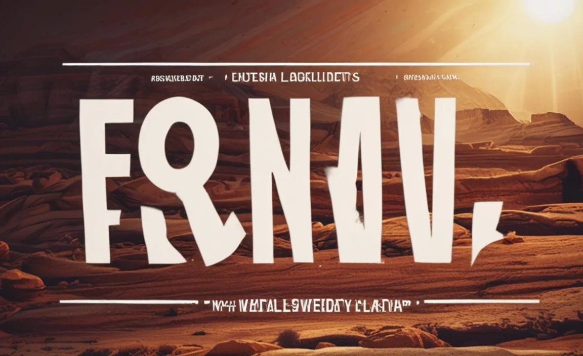
Discover how to skillfully use the iconic South by Southwest font to elevate your designs. This guide breaks down its unique characteristics, best applications, and simple pairing strategies for both print and digital projects, making it easy for any beginner to master.
Designing for impact often comes down to choosing the right elements, and typography plays a huge role. You might have seen a certain distinctive font used across posters, websites, and merchandise for a very popular event, and wondered how to get that same energetic, creative feel. It’s the South by Southwest font, and it’s more than just a typeface; it’s a statement. Getting it right can feel tricky, but don’t worry! We’re going to walk through exactly how to use it effectively, making your creative projects pop with personality.
Understanding the South by Southwest Font

What makes the South by Southwest font so special? It’s a custom font designed to reflect the vibrant, eclectic, and forward-thinking spirit of the SXSW festival. Think of it as shorthand for creativity, innovation, and a touch of artistic rebellion. It’s not a widely available commercial font you can download from a typical font library, which adds to its unique appeal. Instead, it’s a proprietary design that has become intrinsically linked with the brand it represents.
Key Characteristics
The font’s design is usually characterized by its bold, often sans-serif style, with unique ligatures and distinctive letterforms that give it a memorable and slightly edgy appearance. It’s designed to be eye-catching and communicate a sense of excitement and dynamism.
Bold and Impactful: Typically a substantial weight, ensuring it stands out.
Unique Letterforms: Often features unique curves, angles, or connections between letters.
Modern Yet Playful: Strikes a balance between contemporary design and a fun, approachable attitude.
Versatile (with caveats): While iconic, its strength lies in specific applications.
Why Use the SXSW Font Vibe?
You don’t need to use the actual SXSW font to capture its essence. The goal, for most designers and businesses, is to emulate the feeling it evokes: a blend of innovation, creativity, community, and a forward-looking perspective. If your project aims to communicate these themes, adopting a similar typographic style can be incredibly effective.
When to Consider This Style
Creative Festivals & Events: Obviously, anything related to arts, technology, or innovation festivals.
Startup Branding: For companies pushing boundaries in their respective industries.
Creative Agency Marketing: To showcase a bold and innovative approach.
Music & Arts Promotion: Posters, flyers, and digital assets for cultural events.
Educational Content on Innovation: To make learning materials more engaging.
Essential Tips for Using the South by Southwest Font Style

Since the official SXSW font isn’t publicly available for general use, designers often aim to capture its vibe through font choices and design elements that echo its characteristics. Here’s how you can achieve that SXSW feeling in your own work.
1. Choose a Bold and Expressive Sans Serif
The foundation of the SXSW look is often a strong, confident sans-serif font. Look for something with presence, but also some character.
Actionable Advice:
Explore Google Fonts: Many excellent free options exist. Look for fonts with ‘bold’ or ‘black’ weights that have a modern feel. Some great starting points include:
Montserrat: A geometric sans-serif with a strong, clean presence and multiple weights. It’s versatile for headlines and body text.
Oswald: A condensed sans-serif that’s excellent for headlines where space is tight, offering a punchy, impactful look.
Poppins: A geometric sans-serif with a friendly yet professional feel, available in many weights.
Consider Paid Fonts: If your budget allows, explore premium font foundries. Fonts like Proxima Nova or Gotham (popular choices in modern design) offer similar bold, clean aesthetics that can evoke the SXSW spirit.
2. Embrace Unique Pairings
The SXSW aesthetic isn’t afraid to mix things up. Pairing a bold sans-serif with a complementary font can add depth and visual interest, mirroring the eclectic nature of the festival.
Pairing Strategies:
Sans Serif Headline + Serif Body: Use a bold, distinctive sans-serif for your main headings and a highly readable serif font for longer blocks of text. This creates contrast and guides the reader’s eye.
Example Pair: A bold Montserrat for headlines and a classic Garamond for paragraphs.
Sans Serif + Monospace: For a more tech- or engineering-focused vibe, pairing a bold sans with a clean monospace font can work.
Example Pair: A strong Poppins for titles and a simple Roboto Mono for code snippets or data.
3. Leverage Ligatures and Customization (If Possible)
The official SXSW font often features custom ligatures (where two or more characters are joined into a single glyph, like ‘st’ or ‘fi’). If you’re working with fonts that offer stylistic alternates or ligatures, experiment with them. This can add that extra layer of unique design that sets your work apart.
How to Find and Use Them:
Font Features: Most advanced design software (like Adobe Illustrator or Photoshop) allows you to access OpenType features such as ligatures. Look for a “Glyphs” panel or contextual alternates settings.
Customization: For truly bespoke elements, consider working with a type designer or using tools to create custom letterforms that echo the SXSW style. This is usually for branding where uniqueness is paramount, such as for an event of a similar nature.
4. Color Palette: Vibrant and Contrasting
The SXSW brand often employs bold, energetic color palettes. Think bright, saturated colors that demand attention and convey excitement.
Color Tip:
High Contrast: Pair bright colors with darker neutrals (like deep charcoal or black) or even use a vibrant color as an accent against a clean white or off-white background.
Consider Your Audience: While SXSW is known for bold, ensure your chosen colors align with the message and audience of your project.
5. Layout and Hierarchy: Make it Dynamic
Effective use of space and visual hierarchy is key to making any typography shine, and the SXSW style is no exception. It’s about creating a dynamic flow that draws the viewer in.
Layout Techniques:
Asymmetrical Balance: Don’t always stick to perfect symmetry. Offsetting elements can create a more modern and engaging layout.
Clear Focal Points: Use your chosen bold font for prominent headlines that immediately tell the reader what’s important.
Negative Space: Don’t overcrowd your design. Ample white space (or negative space) helps your bold typography breathe and makes it easier for the reader to focus.
6. Application: Where Does it Shine?
The “SXSW font style” is best suited for projects demanding a modern, energetic, and creative touch. Overusing it in inappropriate contexts can make a design feel loud or unprofessional.
Best Application Examples:
Event Posters & Flyers: Where immediate impact is crucial.
Website Hero Sections: For a striking first impression.
Social Media Graphics: To grab attention in a busy feed.
Branding for Tech Startups: Emphasizing innovation and a bold future.
7. Readability is Still King (Especially for Body Text)
While we’re focusing on the bold, expressive style for headlines and key elements, don’t forget about readability for longer content. The SXSW aesthetic is about impact, but it’s also about communicating.
Balancing Boldness with Readability:
Use a Classic Serif: For paragraphs, blogs, articles, or any extended text, opt for a highly readable serif font. These fonts have been designed for comfortable reading over long periods. Examples include:
Merriweather: A well-balanced serif with a friendly feel.
Lora: A well-crafted serif that’s excellent for digital reading.
You can find excellent serif options on Google Fonts like Merriweather.
Mind the Weight: Even with bold headlines, ensure sufficient contrast with the background. Avoid using extremely light font weights for small text, which can strain the eyes.
Mimicking the SXSW Font: Fonts to Explore

Since the official South by Southwest font is proprietary, the best approach is to find commercially available fonts that capture its iconic spirit. Here are a few categories and specific examples that can help you achieve that SXSW-esque look and feel in your designs.
Bold Sans-Serif Fonts
These are the workhorses for grabbing attention. They are clean, impactful, and versatile, forming the backbone of many modern designs.
| Font Name | Key Characteristics | Best For | Example Use Case |
| :————– | :————————————————— | :——————————————— | :———————————————— |
| Montserrat | Geometric, clean, wide letterforms, many weights | Headlines, subheadings, UI elements, logos | Event branding, startup websites, bold statements |
| Poppins | Clean, geometric, friendly curves, balanced | Headlines, branding, digital interfaces | Creative agency marketing, app design |
| Academico | Strong, slab-serif inspired, industrial feel | Headlines, signage, powerful branding | Tech conferences, modern architectural firms |
| Lato | Semi-rounded, warm, semi-condensed, highly readable | Headlines, body text (lighter weights), logos | Educational materials, corporate branding |
| Bebas Neue | Tall, condensed, all caps, highly impactful | Short, impactful headlines, titles | Posters, attention-grabbing banners |
| Oswald | Condensed, versatile, good for tight spaces | Headlines, subheadings, impactful text overlays | Magazine covers, website headers |
Note: While Bebas Neue and Oswald are great for impact, they are often best used in all caps and for shorter phrases due to their condensed nature.
Display Fonts with Personality
For that extra flair, especially in more artistic or promotional contexts, a display font can add a unique edge. These are typically used sparingly for maximum impact.
Look for: Fonts with distinctive shapes, slightly quirky forms, or a retro-futuristic feel.
Example: Consider fonts that might have sharp angles or a slightly distressed texture if your project calls for it. However, the core SXSW vibe leans more towards clean, bold, and modern, so keep display fonts as accents rather than primary choices.
Pairing Sans-Serif with Serif for Balance
To achieve a professional and readable design that still incorporates the bold SXSW spirit, pairing a strong sans-serif headline font with a classic serif for body copy is a winning strategy.
Effective Serif Companions:
Merriweather: A very popular choice on Google Fonts, it’s designed for screens and offers excellent readability with a classic feel.
Lora: Another excellent serif with a contemporary feel, offering good contrast to bold sans-serifs.
Playfair Display: For a more high-contrast, elegant serif that can add a touch of sophistication to your pairings.
You can explore a vast collection of these fonts and more on platforms like Google Fonts.
When to Avoid the “SXSW Font Vibe”
While capturing the SXSW spirit can enhance many projects, it’s not a universal fit. Understanding when not to use this style is just as important as knowing when to embrace it.
Contexts Where it Might Not Fit
Highly Formal or Traditional Settings: Think legal documents, very traditional wedding invitations, or formal academic papers. The bold, dynamic nature can be jarring in these environments.
Ultra-Minimalist or Serene Branding: If your brand or project aims for extreme subtlety, calm, or a very understated aesthetic, the energetic SXSW vibe might overpower it.
Content Requiring Extreme Readability at Small Sizes: While sans-serifs are generally good for screens, overly stylized or very bold fonts can become difficult to read when shrunk down for tiny elements like footnotes or small app icons, unless a highly legible variant is chosen.
* Projects Aiming for a Vintage or Historical Feel: The SXSW aesthetic is distinctly modern and forward-looking. If your project requires a historical or purely vintage atmosphere, this font style would be inappropriate.
Frequently Asked Questions About the South By Southwest Font
Q1: Can I download and use the official South by Southwest font?
A1: No, the official South by Southwest font is a custom-designed typeface created specifically for the SXSW festival and is not publicly available for download or commercial use by others.
Q2: How can I get a similar look to the SXSW font?
A2: To achieve a similar look, focus on using bold, modern sans-serif fonts that have a strong presence and unique character. Explore free options on Google Fonts or consider premium fonts that offer a similar aesthetic.
Q3: What kind of projects is the “SXSW font style” good for?
A3: This style is excellent for projects related to innovation, technology, arts, and culture, such as event promotion, startup branding, creative agency marketing, and modern digital interfaces, where a dynamic and energetic feel is desired.
Q4: Is it okay to use a bold sans-serif for body text?
A4: It’s generally not recommended to use very bold sans-serif fonts for long blocks of body text, as they can be difficult to read for extended periods. It’s better to use them for headlines and subheadings and opt for a more readable font (often a serif or a lighter sans-serif) for paragraphs.
Q5: What are some free font alternatives that feel like SXSW?
A5: Great free alternatives on Google Fonts include Montserrat, Poppins, Oswald, and Lato. These offer bold weights and modern aesthetics that can capture the SXSW vibe.
Q6: Does the SXSW font have a specific color palette?
A6: While the font itself is one element, the SXSW brand often uses vibrant, contrasting, and energetic color palettes to complement its bold typography. When evoking the SXSW style, pairing your chosen fonts with dynamic colors is key.
Q7: What’s the difference between a sans-serif and a serif font?
A7: Sans-serif fonts (like Arial or Helvetica) do not have the small decorative strokes (serifs) at the ends of their letterforms, giving them a clean, modern look. Serif fonts (like Times New Roman or Garamond) have these small strokes, which traditionally aid readability in print for longer texts.
Conclusion: Designing with Impact
Capturing the spirit of the South by Southwest font is all about embracing boldness, modernity, and a creative edge. While the exact font might be off-limits, the principles behind its design are accessible to everyone. By selecting strong sans-serifs, experimenting with dynamic pairings, and paying attention to color and layout, you can imbue your own designs with that same innovative and energetic vibe.
Remember, typography is a powerful tool in your creative arsenal. Use these tips to confidently choose fonts that not only look great but also effectively communicate your message and resonate with your audience. Whether you’re designing for an event, a brand, or your own digital presence, aiming for clarity, impact, and a touch of unique personality will always lead to more successful and engaging designs. Happy designing!


