
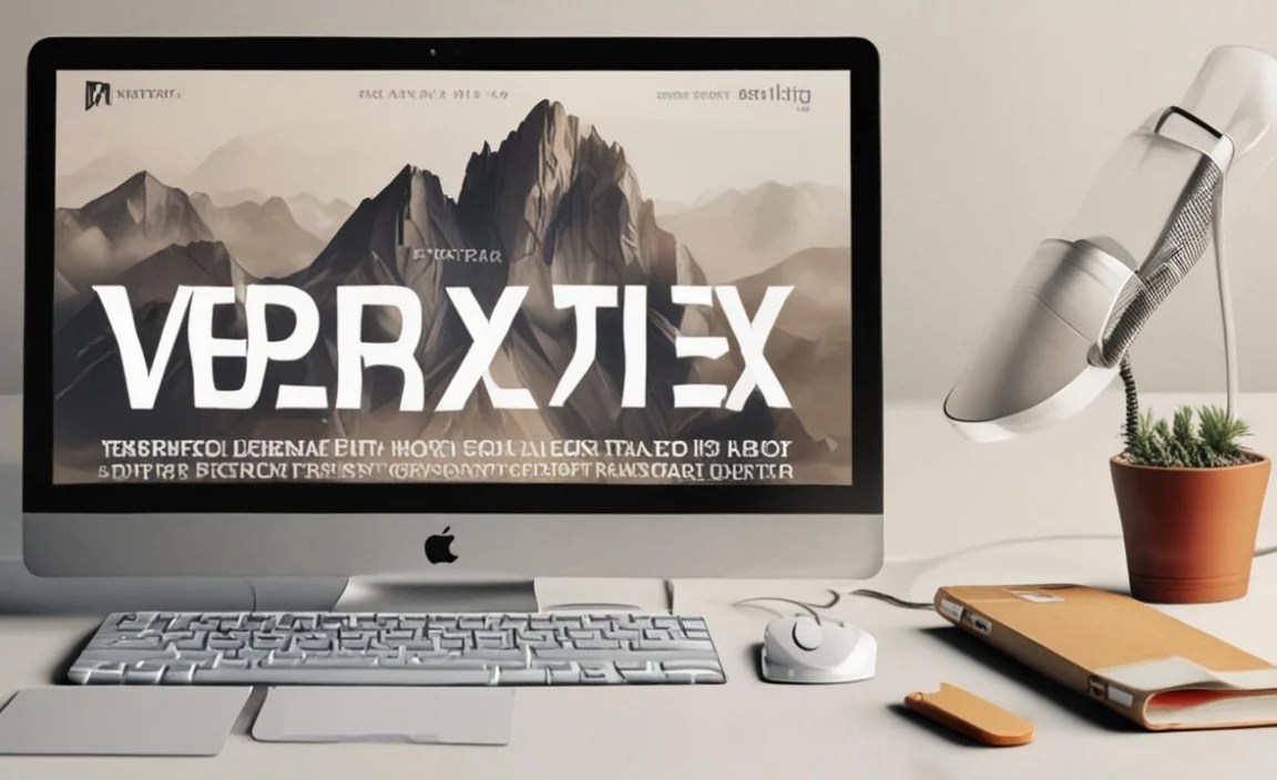
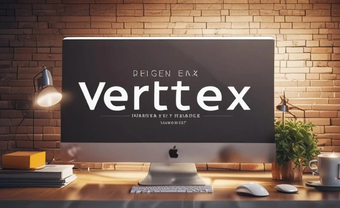
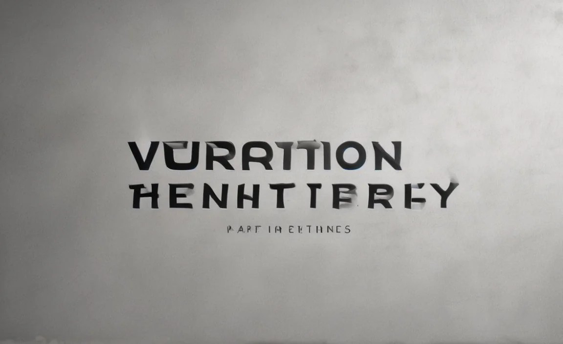
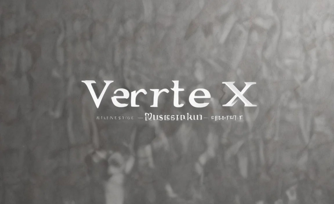
Vertex Font is a versatile typeface that offers clean lines and geometric forms, making it ideal for modern logos, headlines, and digital interfaces. It enhances readability and provides a sleek, professional look across various design projects.
Hello design enthusiasts! Linda Bennett here from FontAxis. Are you ever stuck trying to find that perfect font that just works? Maybe you’ve got a fantastic idea but your text looks… well, a bit plain. It’s a common puzzle! Choosing the right font can feel like a big decision, but it doesn’t have to be stressful. Today, we’re going to shine a spotlight on a design hero: the Vertex Font.
Think of it as your friendly neighborhood font, ready to elevate your projects from good to absolutely stunning. We’ll explore what makes Vertex so special and how you can use it like a pro, even if you’re just starting out. Get ready to discover a typeface that can truly transform your designs!
What Exactly is Vertex Font? Unpacking the Basics

At its heart, Vertex Font is a sans-serif typeface. This means it lacks those little decorative strokes, called serifs, that you often see on traditional fonts like Times New Roman. Sans-serif fonts are known for their clean, modern look and excellent readability, especially on screens. Vertex takes this a step further with its distinctive geometric construction. Imagine shapes like perfect circles and straight lines forming each letter – that’s the essence of Vertex.
This geometric foundation gives Vertex a feeling of structure and clarity. It’s not overly embellished; instead, it relies on its well-defined forms to make a statement. Because of this, it often feels very contemporary and futuristic, but also grounded and trustworthy. It’s the kind of font that looks at home on a cutting-edge tech brand’s website just as much as on a minimalist art gallery poster.
The key characteristics of Vertex Font that make it stand out include:
Geometric Construction: Precise curves and straight lines.
Clean Lines: Emphasizes simplicity and modernity.
Balanced Weight: Typically offers a good range of weights (from thin to bold) that maintain legibility.
Open Counters: The “holes” within letters like ‘o’ or ‘e’ are often quite open, which helps with readability at smaller sizes.
Why Vertex Font is Your Go-To Design Tool

So, why should Vertex Font be on your design radar? It’s more than just a pretty face; it’s a workhorse that solves many common design challenges. Here’s why it’s so essential:
1. Unmatched Readability for Digital and Print
In today’s world, a huge chunk of our visual information comes from screens – websites, apps, social media feeds. Fonts that are hard to read on a small screen can frustrate users and make your content feel inaccessible. Vertex Font, with its clear, unadorned letterforms and open counters, shines in digital environments.
Websites & Apps: Vertex ensures body text is easy to digest, and headlines pop without being distracting. Its clean nature means it scales beautifully across different screen sizes, from mobile phones to large desktop monitors.
User Interfaces (UI): For designers building apps or software, Vertex is a dream. Its predictable forms help users quickly identify buttons, labels, and other interface elements, leading to a smoother user experience.
Print Materials: While born for the digital age, Vertex doesn’t shy away from print. Brochures, flyers, business cards, and even book covers benefit from its crisp appearance. It provides a professional and straightforward tone that can be crucial for conveying information clearly.
2. Modern Aesthetic for Timeless Branding
When you’re building a brand, you want a visual identity that feels current but also has staying power. Vertex Font offers a distinctly modern aesthetic without being trendy or fleeting. Its geometric roots give it a sophisticated, almost architectural feel.
Logos: Vertex is a top choice for logo design. Its simple, strong letterforms are memorable and easily recognizable. A well-chosen Vertex variation can convey innovation, efficiency, or straightforwardness, depending on the context.
Brand Identity: Consistency is key in branding. Using Vertex across your website, marketing materials, and social media creates a unified and professional look. It signals to your audience that you are organized, forward-thinking, and pay attention to detail.
Versatility: Whether your brand is tech-focused, creative, or service-oriented, Vertex can adapt. It doesn’t impose a strong personality that might clash with your brand’s message; instead, it provides a solid foundation upon which you can build your unique identity.
3. Superior Versatility Across Design Applications
The beauty of Vertex Font lies in its adaptability. It’s not a font that’s good at just one thing; it excels in many different design scenarios.
Headlines and Titles: Vertex commands attention. Its strong geometric presence makes headlines stand out, drawing readers into your content.
Body Text: While bold, many weights of Vertex are perfectly legible for longer passages of text, especially in digital formats. Lowercase letters with open forms prevent fatigue during extended reading.
UI Elements: As mentioned before, its clarity is a huge asset for buttons, menus, and other interactive components.
Infographics and Data Visualization: When presenting data, clarity is paramount. Vertex Font helps keep charts, graphs, and figures easy to understand at a glance.
Display Purposes: For posters, signage, or even environmental graphics, Vertex can make a bold, clear statement.
4. A Solid Foundation for Font Pairings
No font exists in a vacuum. Understanding how to pair fonts is crucial for creating visually appealing and effective designs. Vertex Font’s neutral-yet-distinctive character makes it an excellent partner for other typefaces.
Pairing with Serifs: To add a touch of classic elegance or warmth, pair Vertex with a well-chosen serif font. The contrast between the clean sans-serif and the more traditional serif can create a dynamic and balanced look. Think Vertex for headlines and a classic serif for body text.
Pairing with Other Sans-Serifs: If you’re sticking within the sans-serif family, choose fonts with different characteristics. A more humanist sans-serif (one with more organic, calligraphic influences) can offer a softer contrast to Vertex’s geometric rigor.
Pairing with Display Fonts: For projects where you need a decorative or highly stylized font for special emphasis, Vertex can act as the reliable anchor. Use a unique display font for a specific word or phrase, and let Vertex handle the surrounding text.
Exploring the Vertex Font Family: Weights and Styles

A typeface is rarely just one style. Font families come with a range of weights and sometimes italics, offering designers flexibility. Vertex Font is typically no different. Understanding these variations is key to using the font effectively.
A typical Vertex Font family might include:
Thin / Ultra Light: For delicate, airy headlines or subtle secondary text.
Light: A lighter weight, good for subheadings or elegant body text.
Regular / Book: The standard weight, often the most balanced for general use.
Medium: Slightly bolder than regular, useful for more emphasis without being too heavy.
Semi-Bold: A noticeable jump in weight for strong headlines or calls to action.
Bold: For high impact headlines, key statements, or strong accents.
Black / Heavy / Ultra Bold: The heaviest weights, used for maximum impact, very short headlines, or design elements.
Additionally, many sans-serif families, including those inspired by or directly named “Vertex,” will offer an Italic version for each weight. Italics are traditionally used for emphasis, quoting, or stylistic variation within a block of text.
Example of Weight Usage:
| Purpose | Suggested Vertex Weight | Why it Works |
| Website Body Text | Regular or Medium | Clear, legible, and not too light or heavy. |
| Main Headlines | Bold or Black | Strong impact, ensures it’s seen immediately. |
| Subheadlines/Captions | Light or Regular | Provides hierarchy without overpowering. |
| Call-to-Action Buttons | Semi-Bold or Bold | Grabs attention and encourages interaction. |
| Subtle UI Labels | Thin or Light | Unobtrusive, clean, and modern. |
When selecting a specific Vertex font (or a font with a similar geometric, sans-serif style), consider the project’s primary goal. Is it to inform, to persuade, to delight? The weight you choose will significantly influence the message’s tone.
How to Use Vertex Font in Your Designs: A Practical Guide

Ready to put Vertex Font to work? Here’s a step-by-step approach to incorporating it into your projects.
Step 1: Define Your Project’s Goal
Before you even think about fonts, ask yourself: What am I trying to achieve with this design?
Is it a website landing page aiming to convert visitors?
Is it a brochure conveying detailed information?
Is it a logo for a startup?
Is it a social media graphic needing immediate impact?
Understanding the purpose will guide your font choices, including where Vertex might be best utilized.
Step 2: Select Your Vertex Font Variations
Based on your project’s goal, choose the appropriate weights from the Vertex family.
For a modern, clean website: Use Vertex Regular for body copy and Vertex Bold for headlines.
For a minimalist logo: Consider Vertex Medium or an all-caps Vertex Bold for a strong, memorable mark.
For an infographic: Use Vertex Light for data labels and Vertex Semi-Bold for section titles.
Step 3: Consider Font Pairing (If Needed)
If Vertex isn’t the only font you’re using, think about its partner.
Contrast is Key: Pair Vertex with a serif or a more humanist sans-serif to create visual interest.
Hierarchy: Assign roles. Vertex can be your primary headline font, while another font handles smaller text or specific details.
Mood: Does the pairing create the desired feeling? A modern Vertex with a vintage serif can be surprisingly effective.
Step 4: Implement with Care
Now, it’s time to apply the font in your design software (like Adobe Photoshop, Illustrator, Figma, Canva, etc.).
Spacing (Kerning & Tracking): Pay attention to the space between letters (kerning) and the overall spacing of a word or line (tracking). Geometric fonts like Vertex can sometimes look a bit too spaced out, so minor adjustments might be needed.
Size Matters: Ensure your chosen weights are sized appropriately for their role. Headlines should be significantly larger than body text.
Capitalization: Experiment with ALL CAPS, Title Case, and lowercase. Vertex often looks sleek in all caps for headlines, but ensure it remains readable.
Consistency: Use your chosen weights and styles consistently throughout the project.
Step 5: Test and Refine
Crucially, always preview your design in its intended context.
On Different Screens: Check how your website or app looks on various devices.
In Print: Print out drafts of your collateral to see how the font appears on paper.
Get Feedback: Ask a colleague or friend for their impressions, especially regarding readability.
When to Choose Vertex Font (And When to Consider Alternatives)

Vertex Font is a powerful tool, but like any tool, it’s best used in the right situations.
Ideal For:
Tech Companies & Startups: Conveys innovation, efficiency, and a forward-thinking approach.
Minimalist Designs: Its clean lines are perfect for simple, uncluttered aesthetics.
User Interfaces (UI) & Web Design: Excellent readability and modern feel for digital products.
Logos & Branding: Creates a strong, recognizable, and professional mark.
Infographics & Data Presentation: Ensures clarity and easy comprehension of information.
Headlines & Titles: Grabs attention with its confident, geometric presence.
When to Consider Alternatives:
Traditional or Formal Branding: If your brand needs to evoke a sense of history, deep tradition, or classic elegance, a serif font might be more appropriate.
Highly Emotional or Organic Content: For deeply personal stories, handcrafted goods, or designs aiming for a very warm, human touch, a more humanist sans-serif or a script font might better fit the mood.
Extensive Body Text in Print (for some weights): While legible, very geometric sans-serifs in lightweight versions can sometimes be tiring for very long, dense blocks of print text compared to serifs. However, this is highly dependent on the specific typeface and context.
When You Need a Whimsical or Decorative Feel: Vertex is straightforward. If your project calls for playful, decorative, or highly unique lettering, a display or script font would be a better fit.
It’s also worth noting that specific fonts named “Vertex” can vary. For instance, some might be more purely geometric, while others incorporate subtle humanist touches. Always explore the specific characteristics of the Vertex-style font you are considering. For a deeper dive into font categories, resources like Fonts.com’s guide to Serif Fonts can help differentiate them.
Vertex Font in Action: Real-World Examples
Seeing Vertex Font (or fonts with its characteristics) used in the wild can be incredibly inspiring. While specific brand names can change their typography, the style is prevalent.
Tech Gadget Packaging: Notice how many sleek electronics boxes use clean, geometric sans-serifs for product names and features. This communicates modernity and precision.
App Interfaces: Think about popular apps you use daily. Many rely on fonts that share Vertex’s clarity for navigation, buttons, and text explanations. Google’s own Material Design system often favors fonts with geometric sans-serif properties for its clean interfaces.
Architectural Firm Logos: The strong, structured forms of geometric sans-serifs align perfectly with the precision and design-focus of architecture.
Financial Service Websites: These often use clear, trustworthy fonts. A geometric sans-serif like Vertex can convey stability and professionalism without appearing stuffy.
Modern Art Museum Branding:** For exhibitions that aim to be cutting-edge and accessible, a font like Vertex can provide a clean, contemporary framework.
These examples show how a well-chosen, clear typeface like Vertex can reinforce a brand’s message and enhance the user’s experience.
Frequently Asked Questions About Vertex Font
Let’s address some common questions beginners might have about using Vertex Font.
What is the main benefit of using a geometric sans-serif font like Vertex?

The primary benefit is its extreme clarity and modern aesthetic. Geometric sans-serifs are highly legible, especially on screens, and convey a sense of efficiency, innovation, and straightforwardness. They provide a clean foundation for any design.
Can I use Vertex Font for body text in a printed book?

Yes, you can, especially if you choose a regular or medium weight and ensure adequate line spacing. However, if you find yourself needing very long stretches of dense text for a printed book, some designers prefer serif fonts for their subtle cues that can aid readability over extended periods. Experiment and see what feels best!
How do I know if a font is “geometric”?
Geometric fonts are characterized by letterforms constructed from simple geometric shapes, such as perfect circles, squares, and straight lines. Look for a noticeable uniformity in the construction of letters like ‘o’, ‘a’, ‘c’, and ‘e’, where curves are often circular. Examples include Futura and Montserrat.
Is Vertex Font copyrighted? Where can I find it?

Typography is a complex field regarding intellectual property. Many fonts, including those named “Vertex” or inspired by geometric sans-serif styles, are commercial products subject to licensing. You can often find them on reputable font marketplaces like MyFonts, Adobe Fonts, or specific foundry websites. Always check the license to ensure you’re using it legally for your project’s intended purpose.
How does Vertex Font compare to Helvetica or Arial?

Helvetica and Arial are also sans-serif fonts but lean more towards the “neo-grotesque” style, meaning they have a slightly more organic feel and less emphasis on perfect geometric shapes compared to truly geometric sans-serifs like Vertex. Vertex will typically feel more modern, clean, and structured due to its pure geometric construction.
What’s the best way to pair Vertex Font with another font?

The most common and often most effective pairing is with a contrasting serif font. Use Vertex for clear headlines or a modern UI, and pair it with a classic serif for body text to add warmth and tradition. You can also pair it with a more humanist sans-serif for a softer, more approachable feel.
Conclusion: Embrace the Power of Clarity with Vertex Font
As we’ve explored, Vertex Font isn’t just another typeface; it’s a strategic design asset. Its clean, geometric foundation provides unparalleled clarity and a distinctly.


