
Unlock the unique charm of Fingerline fonts! Discover how these playful, hand-drawn styles can elevate your designs, making them approachable and distinctive. This guide will show you why Fingerline fonts are a fantastic choice for adding personality and warmth to your projects, from branding to web design. We’ll explore their characteristics, best uses, and how to pair them effectively, making your design process simple and fun.
Hello design enthusiasts! Linda Bennett here from FontAxis. Ever feel like your designs are missing a little spark? Something that makes them instantly likeable and memorable? That’s where fonts come in, and today, we’re diving into a truly special category: Fingerline fonts. These aren’t your everyday typefaces; they bring a unique, personal touch that can transform a good design into a great one. Think friendly, approachable, and wonderfully distinctive. If you’re looking to add a dash of personality without sacrificing clarity, you’ve come to the right place. We’ll break down exactly what makes Fingerline fonts so special and how you can use them to make your projects shine. Let’s explore how these delightful fonts can bring effortless design and undeniable charm to your work!
What Exactly is a Fingerline Font?

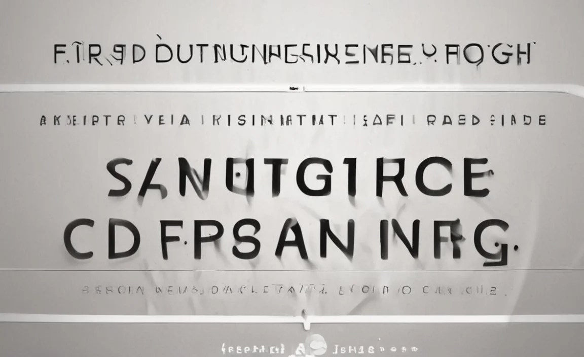
Imagine someone sketching letters with their finger – that’s the essence of a Fingerline font! These fonts mimic the organic, imperfect strokes of handwriting, but with a playful, often simplified twist. They’re characterized by soft, rounded terminals, a distinct lack of sharp serifs, and a general feeling of lightness and fluidity. Think of them as being born from a quick, confident stroke, rather than meticulously crafted calligraphy or rigid industrial design. They often have a slightly uneven baseline, giving a charming, handmade feel that’s instantly relatable. Without being overly formal, Fingerline fonts manage to convey approachability and a human touch, making them a favorite for many creative applications. They are part of the broader category of “hand-drawn” or “casual” fonts, but with their own unique, finger-drawn aesthetic.
Key Characteristics of Fingerline Fonts
- Organic Strokes: Lines are not perfectly straight or uniform, mimicking the natural flow of a finger drawing.
- Rounded Terminals: Ends of strokes are typically soft and rounded, rather than sharp or squared off.
- Casual Form: Letters often have a relaxed, informal construction, feeling approachable and friendly.
- Slightly Uneven Baseline: Sometimes the letters might appear to “dance” slightly, adding to the handmade charm.
- Open Counters: The inner spaces within letters (like in ‘o’ or ‘a’) are usually wide and clear, aiding readability.
- Light and Airy Feel: Despite their hand-drawn nature, they often feel light and don’t weigh down a design.
- Varied Line Weight: While not extremely drastic, there can be subtle variations in stroke thickness, adding to the hand-drawn quality.
Why Choose a Fingerline Font for Your Designs?

In a world often dominated by sleek, geometric designs, Fingerline fonts offer a refreshing contrast. They inject personality, warmth, and a touch of playful sophistication into any project. Their inherent charm makes them incredibly versatile, allowing them to break down barriers and connect with an audience on a more personal level. When you need your brand or message to feel welcoming, authentic, and distinctly human, a Fingerline font is an excellent choice. They can make complex information feel more digestible and simple designs feel more engaging. Choosing a Fingerline font isn’t just about selecting a typeface; it’s about embracing a design philosophy that values approachability and genuine connection.
When and Where to Use Fingerline Fonts Effectively

Fingerline fonts shine brightest when you want to convey a sense of friendliness, creativity, or simplicity. They are perfect for projects aiming for an informal, personal, or whimsical tone. However, their power lies in strategic application. Let’s explore some ideal scenarios:
1. Branding and Identity
- Startups and Small Businesses: Especially those with a friendly, community-focused, or handcrafted ethos (e.g., artisanal bakeries, local coffee shops, craft stores).
- Creative Agencies and Freelancers: To showcase a unique, personal, and approachable style.
- Children’s Brands: Their playful nature is naturally appealing to younger audiences.
- Personal Blogs and Websites: Adding a distinctive voice to your online presence.
2. Marketing and Advertising
- Social Media Graphics: For a quick, engaging, and eye-catching aesthetic.
- Invitations and Announcements: Particularly for informal events like birthday parties, casual weddings, or community gatherings.
- Flyers and Posters: For events or promotions that aim for a casual, inviting vibe.
- Product Packaging: Especially for artisanal, organic, or handmade goods.
3. Web and UI Design
- Headings and Subheadings: To add personality and break up blocks of text.
- Call-to-Action (CTA) Buttons: To make them more inviting and less corporate.
- Illustrative Content: When paired with illustrations or iconography, they reinforce a playful theme.
- Landing Pages: For campaigns or brands that want to feel immediately accessible and unique.
4. Editorial and Content
- Magazine Titles or Section Headers: For publications with a lifestyle, creative, or approachable focus.
- Book Covers: Especially for fiction, children’s books, or non-fiction aimed at a general audience.
- Infographics: To make data feel more digestible and less intimidating.
Important Note on Readability: While Fingerline fonts are fantastic for adding character, they are often best used for shorter pieces of text, like headlines, subheadings, or short blurbs. For extensive body text, especially in digital formats, ensuring legibility is crucial. A highly decorative Fingerline font might become difficult to read in small sizes or long paragraphs. Always prioritize clarity for your main content.
When to Exercise Caution (Or Avoid) Fingerline Fonts
While Fingerline fonts are versatile, they aren’t a one-size-fits-all solution. Certain contexts call for a more traditional or formal typeface to maintain professionalism and clarity. Here’s when you might want to tread carefully:
- Formal Legal or Financial Documents: These require utmost seriousness and a traditional, authoritative font.
- Technical Manuals or Scientific Papers: Clarity and precision are paramount, demanding highly legible, often sans-serif or serif fonts.
- Corporate Branding (Very Traditional): For established, conservative corporations, a Fingerline font might appear too casual or detract from a serious image.
- Extended Body Text in Print: On printed pages with dense text, highly stylized fonts can strain the eyes.
- High-Function UI Elements Requiring Extreme Readability: Think error messages or critical instructions where every letter must be instantly recognizable.
Comparing Fingerline Fonts with Other Typeface Categories

Understanding where Fingerline fonts fit in the typography landscape can help you make informed choices. Let’s briefly compare them to their more common cousins:
| Typeface Category | Key Characteristics | Fingerline Font Comparison |
|---|---|---|
| Serif Fonts | Have small decorative strokes (serifs) at the ends of letter lines. Often perceived as traditional, formal, and classic. Examples: Times New Roman, Georgia. | Fingerline fonts lack serifs. They are more casual and modern compared to the structured feel of most serifs. |
| Sans Serif Fonts | Lack serifs. Often perceived as clean, modern, and minimalist. Examples: Arial, Helvetica, Open Sans. | Fingerline fonts are a type of casual sans serif but with a distinct hand-drawn, organic, and often rounded quality. Standard sans serifs are typically more geometric and uniform. |
| Script Fonts | Mimic handwriting or calligraphy. Can range from formal and elegant to very casual and brush-like. Examples: Pacifico, Great Vibes. | Some casual script fonts can feel similar, but Fingerline fonts usually have a more distinct “drawn” quality rather than flowing cursive. They are generally less intricate than most scripts. |
| Display Fonts | Designed for large sizes and headlines. Often highly decorative and unique. Examples: Impact, Bebas Neue (can overlap greatly). | Fingerline fonts can function as display fonts due to their unique character, but they are a more specific sub-category focusing on a hand-drawn, approachable aesthetic, often with less extreme visual flair than some display types. |
| Handwritten/Hand-Drawn Fonts | A broad category including various styles that look like they were created by hand. | Fingerline fonts are a specific style within the broader handwritten/hand-drawn category, emphasizing a particular “finger-drawn” or quickly sketched look with rounded, soft forms. |
Tips for Using Fingerline Fonts Effortlessly in Your Designs
Adding a touch of Fingerline font magic is easy once you know a few tricks. Here’s how to make them work hard for you:
1. Embrace the Contrast
- Pair with a Neutral Sans Serif: For body text, a clean, legible sans serif font provides a solid foundation and lets your Fingerline font headliner pop. Think of it as the steady rhythm to your friendly melody.
- Use for Highlights: Apply Fingerline fonts to specific words or short phrases that you want to draw attention to, making sure they stand out.
2. Consider Your Audience and Message
- Authenticity is Key: Does the font genuinely reflect the personality of your brand or message? If you’re selling luxury diamonds, a super cartoony Fingerline might not be ideal. But for a children’s book? Perfect!
- Match the Tone: Ensure the font’s vibe matches the overall theme. A playful Fingerline font suits a friendly invitation, not a serious legal notice.
3. Prioritize Readability (Especially Online)
- Headline Hero: Fingerline fonts excel as headings, subheadings, or short captions. They grab attention quickly.
- Body Text Caution: For long paragraphs, especially on screens, opt for a highly readable font. Fingerline fonts can sometimes be tricky for sustained reading due to their casual nature. Test them on different devices at various sizes.
- Adequate Size and Spacing: Ensure your Fingerline font is large enough and has enough line spacing (leading) and letter spacing (kerning) to remain clear.
4. Don’t Overdo It
- Less is More: Typically, using one or two Fingerline fonts in a design is sufficient to add character without overwhelming the visual space. Let them be the accent, not the entire outfit.
- Strategic Placement: Think about where the eye needs to go first. Use Fingerline fonts to guide the viewer’s attention to key information or branding elements.
5. Test, Test, Test!
- Preview on Different Platforms: What looks good on your desktop may render differently on a mobile phone. Always check how your chosen font appears across various devices and screen sizes.
- Get Feedback: Ask a friend or colleague to review your design. Do they find it appealing? Is it easy to read? Fresh eyes can catch potential issues.
Finding Great Fingerline Fonts: Resources and Inspiration
The world of typography is vast, and finding the perfect Fingerline font can be a delightful treasure hunt! Here are some excellent places to start your search and draw inspiration:
1. Google Fonts
- Overview: Google Fonts offers a massive library of free, open-source fonts that are easily accessible and web-ready. It’s an excellent starting point.
- How to Search: Use keywords like “handwriting,” “casual,” “playful,” or browse categories like “Display” and then filter by style.
- Examples: Look for fonts that have a slightly irregular, rounded, and friendly appearance. Even within the “sans serif” category, you might find some with hand-drawn qualities.
- Link: Visit fonts.google.com.
2. Adobe Fonts
- Overview: Included with Adobe Creative Cloud subscriptions, Adobe Fonts provides a curated collection of high-quality typefaces.
- How to Search: Similar to Google Fonts, use descriptive keywords and explore classifications. Adobe’s browsing filters are quite robust.
- Examples: Fonts that feel hand-drawn, slightly quirky, or have an “organic” feel often fall into this appealing category.
- Link: Explore at fonts.adobe.com.
3. Creative Market and MyFonts
- Overview: These platforms are marketplaces for premium fonts, offering an enormous range of unique and expertly crafted typefaces from independent designers. You’ll often find more niche and distinctive Fingerline styles here, but they typically come with a cost.
- How to Search: Utilize their extensive tagging and categorization systems. Search terms like “finger drawing,” “quirky handwritten,” “casual script,” or “playful informal sans” can yield great results.
- Tip: Keep an eye out for sales and bundles to get the best value.
- Links:
4. Font Squirrel
- Overview: A fantastic resource for free, commercially usable fonts. Font Squirrel curates high-quality free fonts, often with excellent licensing.
- How to Search: Use their “handwritten” or “script” categories and preview fonts in a way that best suits your need.
- Link: Discover at www.fontsquirrel.com.
5. Inspiration Gallery and Behance
- Overview: Platforms like Dribbble and Behance aren’t direct font sources, but they are goldmines for visual inspiration. Designers often showcase their work using unique fonts, and sometimes they even share font names or links.
- How to Search: Look for designs that have the aesthetic you’re aiming for and see what typography they’ve used. Type hashtags like #typography, #fontdesign, #branding.
- Links:
Exploring Specific Fingerline Font Examples
While the term “Fingerline font” isn’t a formal classification, it evokes a very specific feeling. Here are a few examples of fonts that capture that essence, categorized by their feel:
Playful & Energetic: These fonts have a bouncy, cheerful quality, perfect for youthful brands or lighthearted content.
- Pacifico (Google Fonts): A very popular script font with bold, flowing, and friendly strokes. It has a distinct retro, hand-lettered feel.
- Indie Flower (Google Fonts): A more casual, slightly wobbly sans-serif that genuinely looks like it was written with a marker.
- Chelan (Font Available on various marketplaces): Often features a playful, uneven baseline and rounded, open forms that are very inviting.
Clean & Approachable: These have a refined hand-drawn touch, suitable for more sophisticated but still friendly applications.
- Quicksand (Google Fonts): While technically a geometric sans-serif, its rounded terminals and open shapes give it a very soft, approachable, and almost “fingerline-ish” feel, especially in its lighter weights.
- Nunito (Google Fonts): Similar to Quicksand, Nunito has rounded stroke endings that make it feel very soft and friendly, offering excellent readability.
- Varela Round (Google Fonts): Another excellent example.


