
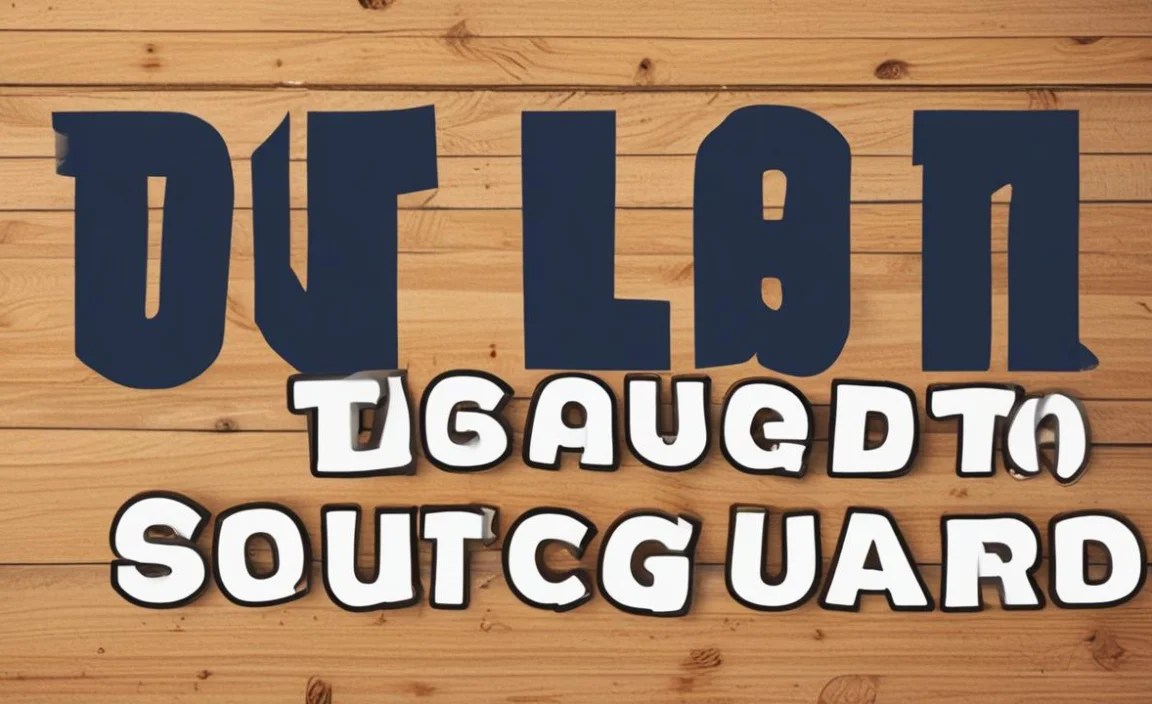
The “Tune Squad font” isn’t a single, officially named typeface, but rather a style inspired by the animated lettering from Space Jam. To effectively use this playful, bold, and often slightly retro sans-serif style in your designs, focus on its key characteristics: chunky strokes, rounded edges, and a dynamic, energetic feel. This guide breaks down how to achieve that Tune Squad vibe for effortless and impactful design.
Ever stumbled upon a design that just screams fun, energy, and a touch of cartoonish charm? Chances are, you’re seeing the influence of the “Tune Squad font” style. This isn’t one specific font you can download from a single source, but rather a recognizable aesthetic that evokes the vibrant, bold lettering seen in iconic animated visuals, most famously from the movie Space Jam. Trying to capture that playful spirit can be tricky if you don’t know where to start. Don’t worry, though! We’re here to demystify this beloved typographic style and give you the essential tips to effortlessly incorporate it into your own projects. Get ready to inject some serious personality into your designs!
Understanding the “Tune Squad Font” Vibe

When we talk about the “Tune Squad font,” we’re not referring to a singular, trademarked typeface but rather a distinct visual style. This style is characterized by its bold, impactful presence, often featuring rounded edges and a slightly condensed or expanded feel that adds to its dynamic appeal. Think energetic, friendly, and unmistakably animated. It’s the kind of lettering that makes you want to jump into the action!
The core elements that define this style include:
-
- Bold Weight: The letters are typically thick and substantial, making them highly visible and commanding attention.
- Rounded Terminals: Many letters end in soft, rounded shapes rather than sharp, straight cuts. This contributes to a friendly and approachable feel.
- Geometric Foundation: While playful, the underlying structure is often based on simple geometric forms, giving it a clean foundation despite its animated appearance.
- Expressive Counterforms: The inner spaces of letters (like the ‘o’ or ‘a’) are often generous and well-defined, enhancing readability even at a glance.
- Occasional Slight Imperfections or Stylizations: Sometimes, you’ll see subtle variations or exaggerated strokes that give it an authentic hand-drawn or animated quality.
This style is incredibly versatile, moving beyond just cartoon posters. It’s perfect for branding that wants to feel fun and accessible, event invitations that need a pop of excitement, social media graphics, or even titles in presentations where you want to grab attention immediately.
Finding Fonts That Capture the Tune Squad Feel

While there’s no single “official” Tune Squad font, many excellent typefaces capture its essence. The key is to look for fonts that share those core characteristics we just discussed: boldness, roundedness, and a lively personality. Here are some categories and specific examples to get you started on your font hunt:
1. Bold & Rounded Sans-Serifs
These are your go-to. They offer maximum impact with a friendly, approachable design. Look for fonts with generous x-heights and clear, simple letterforms.
Examples:
-
-
- Baloo 2: This is a fantastic open-source option with a wonderfully rounded, friendly appearance. It’s highly geometric and readable, making it a strong contender.
- Fredoka One: Another free and widely available font, Fredoka One is super bold and has very pronounced rounded terminals, giving it a chunky, eye-catching look.
- Nunito: While it has a lighter feel in its different weights, Nunito’s boldest versions are substantial and exceptionally friendly with their rounded forms.
- Cooper Hewitt: Designed with clear signage in mind, its bold weights are robust and possess a certain retro charm with subtle rounding.
-
2. Display Fonts with Personality
For a more direct nod to animation, explore display fonts. These are designed for headlines and short bursts of text, where personality is paramount. They might have slightly more exaggerated features.
Examples:
-
-
- Bangers: This Google Font is explicitly designed with comic books and an energetic feel in mind. It’s bold, slightly distressed, and full of character.
- Luckiest Guy: Another great Google Font, this one is bubbly, rounded, and oozes a playful, retro vibe that’s perfect for a Tune Squad feel.
- Bubblegum Sans: As the name suggests, this font is all about being round, soft, and fun. It’s great for projects aiming for a highly cheerful and informal tone.
-
3. Geometric Sans-Serifs with Bold Weights
Some basic geometric sans-serifs can achieve the look when used in their heaviest weights and perhaps with slight customization. Their clean structure provides a solid base for a bold, energetic feel.
Examples:
-
-
- Montserrat Black: Extremely popular and versatile, its heaviest weight is incredibly bold and impactful, with clean, geometric shapes that can feel very dynamic.
- Poppins Bold: Similar to Montserrat, Poppins in its boldest weights offers a strong geometric foundation with friendly, rounded corners that fit the bill.
-
When searching on font libraries like Google Fonts (which offers free, high-quality fonts), Adobe Fonts, or commercial sites like MyFonts, use keywords such as “bold,” “rounded,” “display,” “fun,” “cartoon,” “bubble,” or “geometric.”
Essential Tips for Effortless Design
Now that you know how to find fonts that fit the Tune Squad style, let’s talk about how to use them effectively. It’s all about context and complementary choices.
1. Use it for Headlines and Key Statements
This style of font is rarely suitable for body text. Its boldness and distinct personality are best reserved for headlines, titles, subheadings, or short, impactful calls to action. Think of it as the star player – it needs the spotlight!
Why it works: These fonts are designed to grab attention. Using them for longer passages would be overwhelming and difficult to read. They excel when they have space to breathe and make a strong first impression.
2. Pair Wisely with Complementary Fonts
A bold, playful display font needs a reliable partner for the rest of your content. For body text, opt for simple, highly readable sans-serifs or classic serifs. This contrast ensures your main message stands out without sacrificing readability.
Pairing Suggestions:
-
-
- Tune Squad Style Font + Clean Sans-Serif: (e.g., Open Sans, Lato, Roboto) – Great for a modern, approachable feel.
- Tune Squad Style Font + Simple Serif: (e.g., Merriweather, Source Serif Pro) – Can add a touch of classic balance to the playful headline.
- Tune Squad Style Font + Monospace Font: (e.g., Source Code Pro, Inconsolata) – For a quirky, techy, or editorial vibe.
-
The goal is hierarchy and balance. The fun font draws them in, and the simple font keeps them engaged.
3. Leverage Color for Maximum Impact
The Tune Squad aesthetic often thrives on vibrant colors. Use bright, energetic hues for your “Tune Squad” styled text. Yellows, bright blues, reds, and oranges can all work beautifully. Consider contrasting colors against a simpler background to make the text pop even more.
Color Palette Ideas:
-
-
- Bright Yellow text on a Royal Blue background.
- Electric Orange text on a Black background.
- White text with a thin, bright accent outline on a colorful graphic.
-
4. Consider Letter Spacing (Kerning)
While many of these fonts are designed to look good right out of the box, sometimes adjusting the spacing between letters (kerning) can make a big difference, especially for longer headlines. Too much space can make it feel disjointed, while too little can make it feel cramped.
Tip: Most design software (like Adobe Illustrator, Photoshop, or even Canva) allows you to adjust kerning. Look for options like “Optical” or “Metrics” kerning, or manually adjust the space between specific letter pairs if needed.
5. Don’t Overdo It
This is crucial. A little bit of this energetic style goes a long way. Using too many different bold, playful fonts, or using them in too many places, can make a design look cluttered, unprofessional, and even juvenile. Stick to one or two key fonts and use them strategically.
The rule of thumb: Let one font be the star, and the other(s) be the supporting cast. This ensures clarity and a polished look.
6. Adapt for Digital vs. Print
For Digital: Ensure the font files you choose are web-optimized (if embedding on a website). Screen resolutions can sometimes make very thin strokes or highly stylized fonts appear jagged. Bold, rounded fonts generally hold up well on screens.
For Print: Ensure you are using high-resolution font files for crisp printing, especially for very large-format applications like posters. The chunky nature of these fonts is usually forgiving in print.
Applying the Tune Squad Style in Practice: A Case Study

Let’s imagine you’re designing a promotional graphic for a fun, upcoming local sports event. You want it to feel exciting, energetic, and welcoming to families.
The Challenge:
Create a social media graphic that announces the event, highlights key details (date, time, location), and encourages sign-ups. The brand personality is playful and community-focused.
The Solution using Tune Squad Font Principles:
-
-
- Headline: “Join the Fun Fest!” – Use a font like Luckiest Guy or Fredoka One. Choose a bright, energetic color, perhaps a bold orange or electric blue, against a clean white or subtly patterned background.
- Sub-headline/Key Detail: “Community Sports Day” – A slightly less bold but still friendly font like Baloo 2 or Nunito Bold would work here. A complementary color, maybe a slightly darker shade or a contrasting hue, can create visual separation.
- Event Details (Date, Time, Location): Here’s where you bring in your supporting font. A clear, readable sans-serif like Lato Regular or Open Sans in a neutral color (dark grey or black) will make these important pieces of information easy to digest. Keep the font size readable.
- Call to Action: “Sign Up Now!” – You could loop back to the headline font for this, or use the sub-headline font again if it’s clear and impactful. Bold it and make it stand out, perhaps with a button shape.
- Visual Elements: Incorporate simple, graphic elements that echo the playful, rounded nature of the chosen fonts – perhaps some abstract shapes, simple illustrations of sports equipment stylized with rounded edges, or even a subtle confetti or starburst effect in the background.
-
Why this works:
The bold, friendly headline draws immediate attention and sets a fun tone. The supporting fonts ensure all necessary information is clear and accessible. The thoughtful use of color and complementary design elements ties the whole piece together, creating a cohesive and impactful graphic that perfectly captures the desired playful, energetic vibe without feeling chaotic.
Choosing the Right Font for Different Design Projects

The “Tune Squad font” aesthetic isn’t a one-size-fits-all solution, but understanding its principles allows you to adapt it. Consider the project’s purpose and audience:
| Project Type | When Tune Squad Style Works Best | Recommended Approach | Example Fonts (Tune Squad Vibe) |
|---|---|---|---|
| Children’s Books/Magazines | Titles, character names, playful section headers | Use sparingly for maximum impact. Pair with clean body text. | Bangers, Luckiest Guy, Bubblegum Sans |
| Event Flyers/Posters (e.g., parties, festivals, community events) | Main event title, promotional slogans | Excellent for creating excitement and draw attention. | Fredoka One, Baloo 2, Montserrat Black |
| Branding (especially for quirky or family-friendly brands) | Logo wordmarks, tagline, website headlines | Use as a strong accent within a larger brand system. Consistency is key. | Nunito Bold, Poppins Bold, Cooper Hewitt (bold) |
| Social Media Graphics | Headlines, quotes, calls to action | Highly effective for eye-catching posts. Ensure readability on small screens. | Any of the above, depending on the specific tone |
| Educational Materials (e.g., worksheets for young learners) | Section titles, instructions, playful encouragement text | Helps make learning materials more engaging and less intimidating. | Baloo 2, Bubblegum Sans |
Remember that the goal is always to enhance communication, not to hinder it. The “Tune Squad font” style is a fantastic tool for conveying energy and fun, but thoughtful application is what makes it truly effective.
Resources for Finding Fonts
To easily find fonts that match the Tune Squad aesthetic, you’ll want to explore a few reliable sources. Here are some of our favorites for discovering both free and premium typefaces:
-
-
- Google Fonts: A vast library of high-quality, open-source fonts that are all free to use for personal and commercial projects. It’s an excellent starting point for finding rounded, bold sans-serifs. Visit fonts.google.com.
- Adobe Fonts: If you’re an Adobe Creative Cloud subscriber, you have access to a huge library of premium fonts that can be synced directly to your desktop and web projects. Explore fonts.adobe.com.
- Font Squirrel: This site curates free fonts for commercial use and provides valuable tools for web font embedding. It’s a great place to find unique display and sans-serif options. Check them out at fontsquirrel.com.
- MyFonts: A massive marketplace for commercial fonts. If you’re looking for something highly specific or a font with extensive character sets and weights, MyFonts is the place to go. You can often find excellent display fonts here. Browse at myfonts.com.
-
When searching on these platforms, remember to use descriptive keywords like “rounded bold,” “geometric sans,” “display fun,” “cartoon style,” or “energetic.” Don’t be afraid to experiment with different weights and styles to see what best captures the specific feel you’re aiming for.
Frequently Asked Questions (FAQ) about Tune Squad Font for Design
Q1: Is “Tune Squad Font” a real font name?
A1: No, “Tune Squad font” isn’t an official font name. It refers to a style of lettering, most famously seen in Space Jam, characterized by bold, rounded, and energetic letterforms. You’ll find fonts that mimic this style.
Q2: Where can I find fonts that look like the Tune Squad font?
A2: Look for bold, rounded sans-serif or display fonts. Popular free options include Baloo 2, Fredoka One, Bangers, and Luckiest Guy, available on platforms like Google Fonts. Commercial sites like MyFonts also offer many similar styles.
Q3: Can I use this type of font for body text?
A3: Generally, no. Bold, stylized fonts like the “Tune Squad” style are best suited for headlines, titles, and short, impactful phrases. They are too visually dominant and can be hard to read for longer passages of text.
Q4: What colors work best with this font style?
A4: Bright, energetic, and contrasting colors typically work best. Think bold primaries like red, yellow, and blue, or vibrant neons. These colors complement the playful and dynamic nature of the font style.
Q5: How do I make my design look professional when using such a playful font?
A5: The key is balance and pairing. Use the fun font for a headline and pair it with a clean, highly readable sans-serif for all other text. Keep your layout organized, use a limited color palette, and ensure ample white space.


