
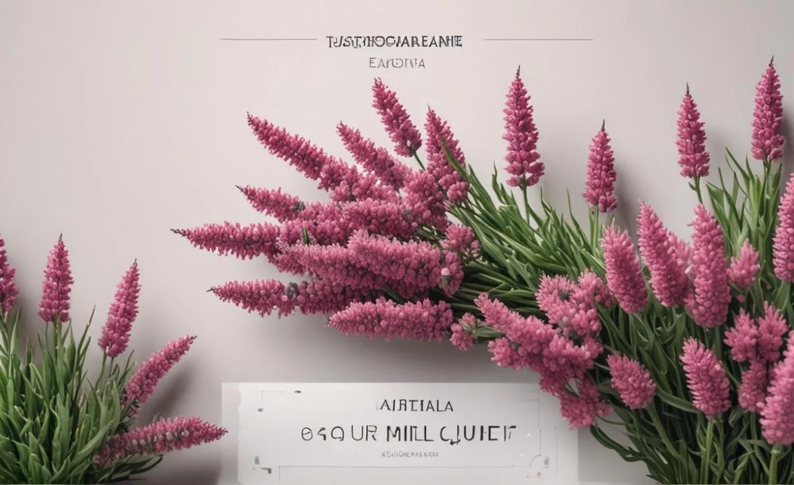
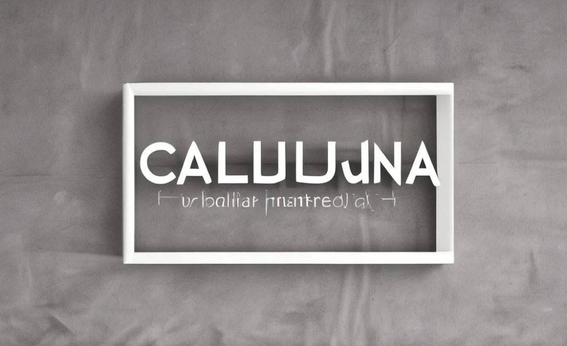
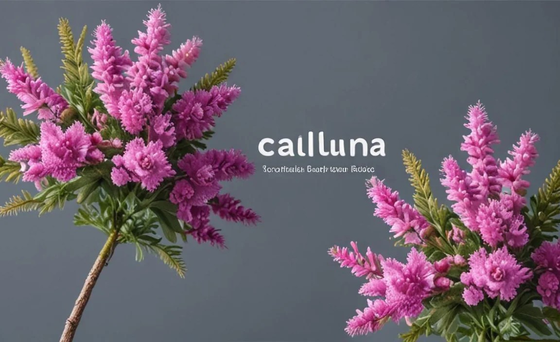
Calluna Font is a versatile and elegant serif typeface, perfect for adding a touch of sophistication and readability to both print and digital designs. It excels in body text, headlines, and branding, making it an essential tool for designers seeking clarity and style. Discover why Calluna is a must-have in your font library.
Choosing the right font can feel like a puzzle, can’t it? You want something that looks good, is easy to read, and perfectly captures the feel of your project. Sometimes, fonts are too playful, or too serious, or just plain hard to read.
It’s a common challenge for designers, bloggers, and business owners alike. But don’t worry! Today, we’re diving into a font that solves these problems with grace and style: Calluna Font. Get ready to discover how this beautiful serif can elevate your designs from ordinary to outstanding.
What is Calluna Font? A Designer’s Delight

Calluna isn’t just another font; it’s a carefully crafted piece of digital art designed for modern use. Created by designers at the independent type foundry Jos Buivenga (Exljbris Font Foundry), Calluna is a serif typeface that bridges the gap between classic elegance and contemporary design needs. Think of it as the friendly, knowledgeable designer who always knows the right thing to say and wear – it’s approachable yet refined.
What makes Calluna so special? It’s a confident and legible serif font. Its roots are in old-style serifs, but with a twist that makes it feel fresh and perfectly suited for today’s screens and print materials. The designers aimed for a font that offers both character and excellent readability, which is a dream combination for anyone working with text.
Why Calluna Font is an Essential Design Tool

In the world of design, having a reliable and versatile font is like having a trusty Swiss Army knife. Calluna Font fits this description perfectly. It’s not a one-trick pony; it shines in a multitude of applications, making it an invaluable asset for any creative toolkit.
Readability That Shines
The primary job of most fonts is to be read. Calluna excels here. Its open counters (the spaces inside letters like ‘o’ or ‘e’), clear letterforms, and well-balanced stroke weights ensure that text is comfortable to read, even at smaller sizes or for extended periods. This is crucial for everything from website body text to long articles and reports.
Versatility Across Mediums
Whether you’re designing a crisp magazine layout, a modern website, an impactful logo, or even just a simple social media graphic, Calluna adapts beautifully. It’s available in various weights (from light to bold, and even italics), giving designers flexibility to create hierarchy and emphasis. This adaptability means you often don’t need a whole font family; Calluna can handle many of your needs.
Brand Personality and Tone
Calluna carries a distinctive personality. It’s often described as sophisticated, friendly, and slightly informal, while still maintaining a sense of professionalism. This makes it an excellent choice for brands that want to convey warmth and trustworthiness without appearing overly corporate or stuffy. It’s a font that invites the reader in.
A Champion of Pairings
Great design often involves combining different typefaces. Calluna is a fantastic choice for pairing. Its gentle serif qualities allow it to sit comfortably alongside sans-serif fonts, or even more decorative display fonts, creating visual interest without a clash. We’ll explore some pairing ideas later!
Exploring the Calluna Font Family
A font family isn’t just one style; it’s a collection of variations designed to work together harmoniously. Calluna offers a robust set of styles that provide the flexibility needed for complex design projects. Understanding these variations helps you leverage their full potential.
The Core Styles
At its heart, Calluna Font typically includes:
- Regular: Your go-to for straightforward, readable body text.
- Italic: Perfect for emphasis, quotes, or adding a touch of flair.
- Bold: For headlines, subheadings, or making standout elements.
- Light: For a delicate, airy feel, suitable for subtler accents.
Extended Collections
Depending on where you license Calluna, you might find even more options, such as:
- Semibold, Extra Bold, Black: For stronger typographic impact when needed.
- Thin: For exceptionally fine, minimalist treatments.
- Various Italic weights: To match the corresponding upright styles.
Having these different weights and styles allows for a rich typographic hierarchy. You can use a lighter weight for captions, regular for body copy, and a bold weight for a strong headline – all within the same font family, ensuring visual consistency.
Where to Use Calluna Font: Practical Applications
The best design tools are those you can practically use everywhere. Calluna Font is incredibly adaptable, finding its place in a wide array of design scenarios. Let’s look at some prime examples:
Web Design and User Interfaces (UI)
On the web, readability is paramount. Calluna’s clear letterforms render beautifully on screens, ensuring your website visitors have a pleasant reading experience. It’s excellent for:
- Body text: Long-form articles, blog posts, product descriptions.
- Headlines and subheadings: Breaking up content and guiding the reader.
- Navigation menus: Clear and concise labels.
- UI elements: Buttons, forms, and labels in web applications.
Many modern websites use Calluna or similar robust serifs to add a touch of sophistication and improve readability. You can find great examples of web typography best practices discussed by resources like the Web.dev Typography guide from Google, which emphasizes readability for accessibility and user experience.
Branding and Identity
For businesses and personal brands, a font is a key part of their visual identity. Calluna’s friendly yet elegant tone can help:
- Logos: Creating a memorable and distinctive mark.
- Marketing materials: Brochures, flyers, advertisements.
- Stationery: Business cards, letterheads.
- Social media graphics: Consistent visual voice across platforms.
A brand that uses Calluna might be aiming for a modern, approachable, yet sophisticated image. It avoids the sternness of some traditional serifs and the casualness of some scripts.
Print Design
Calluna’s heritage as a serif font makes it a natural fit for print. It brings a timeless quality to:
- Books and e-books: Providing comfortable reading for long narratives.
- Magazines and newspapers: Adding a classic feel to articles and features.
- Report and document design: Professional and clear presentation of information.
The clarity of Calluna ensures that even dense blocks of text in print remain accessible and inviting.
Editorial and Publishing
In magazines, journals, and newspapers, typesetters often select fonts that balance aesthetic appeal with readability across varying column widths and paper stocks. Calluna’s robust structure and distinct character make it a strong contender for editorial layouts.
Calluna Font vs. Other Font Types: A Snapshot

Understanding where Calluna fits in the broader typographic landscape helps clarify its unique strengths. Let’s compare it to other common font categories:
| Font Type | Key Characteristics | When Calluna Excels | Calluna’s Role |
|---|---|---|---|
| Serif Fonts (e.g., Times New Roman, Garamond) |
Have small decorative strokes (serifs) at the ends of letter strokes. Often seen as traditional, formal, elegant. | When you want elegance and readability for body text, but with a more modern, friendly feel than very traditional serifs. | A contemporary, approachable serif. |
| Sans Serif Fonts (e.g., Arial, Helvetica, Open Sans) |
Lack serifs (“sans” means “without”). Often perceived as clean, modern, minimalist, neutral. | For pairings to create contrast, or for UI elements where extreme clarity is needed. Also for a modern, clean look where a serif isn’t desired. | Offers a softer, more characterful alternative to many neutral sans serifs. |
| Slab Serif Fonts (e.g., Rockwell, Arvo) |
Thick, block-like serifs. Often feel sturdy, bold, industrial, or retro. | For strong headlines or titles where a bold, sturdy presence is needed, but perhaps Calluna’s regular weight is too subtle. | More refined and less overtly bold than most slab serifs. |
| Script Fonts (e.g., Pacifico, Great Vibes) |
Mimic handwriting or calligraphy. Can be elegant, casual, or ornate. | Rarely used for body text. Best for accent words, invitations, or decorative elements where Calluna might be too serious. | Provides a grounding, readable text that complements where a script might be too much. |
| Display Fonts (e.g., Impact, novelty fonts) |
Designed for large sizes and short phrases. Often highly stylized, decorative, or attention-grabbing. | For very large, impactful headlines or logos where extreme character is required. Calluna’s style might be too subdued for this. | A more versatile, readable option for headlines where display fonts might be overwhelming. |
As you can see, Calluna occupies a sweet spot. It offers the readability and character of a serif but with a modern sensibility that makes it more versatile than strictly traditional serifs and more distinctive than many neutral sans serifs. This makes it a true workhorse in a designer’s toolkit.
Tips for Designing with Calluna Font
Leveraging Calluna’s strengths is easy, but a few tips can help you make the most of it. Think of these as nudges in the right direction from your friendly design mentor.
1. Embrace the Weights for Hierarchy
Don’t be afraid to mix and match weights from the Calluna family within a single design. Use a bold weight for your main headline, a regular weight for subheads, and perhaps a lighter weight for captions or descriptive text. This creates a visual path for the reader’s eye.
2. Pair It Smartly
Calluna plays wonderfully with sans-serif fonts. Try pairing it with a clean, geometric sans-serif like Montserrat or a humanist sans-serif like Open Sans for a balanced look. For example:
- Headline: Calluna Sans Bold
- Body Text: Open Sans Regular
This combination offers the classic appeal of a serif for the main title and the modern, clean readability of a sans-serif for the supporting text. Remember to ensure adequate contrast between their styles so they complement rather than compete.
3. Consider Letter Spacing (Kerning and Tracking)
While Calluna is well-designed out of the box, fine-tuning spacing can elevate your text.
- Kerning: Adjusting the space between specific pairs of letters (like ‘AV’ or ‘Wo’) to make them look visually even.
- Tracking: Adjusting the overall spacing between characters in a word or sentence.
For body text, default tracking is usually best. For large headlines, slightly increased tracking can sometimes improve legibility.
4. Test on Different Devices and Sizes
What looks great on your high-resolution monitor might render differently on a mobile screen or when printed on a textured paper. Always test Calluna in its intended use case. For web, check it on various browsers and devices. For print, print out samples. This is a crucial step in ensuring your design is effective everywhere.
5. Use Italics for Emphasis and Style
Calluna’s italics are generally elegant and very readable. Use them sparingly for emphasis within a paragraph, for foreign words, or to denote specific terms. They add a touch of sophistication without screaming for attention.
Sourcing Calluna Font: Where to Get It

Accessing Calluna Font is straightforward, as it’s available through several reputable sources. Knowing where to look ensures you get legitimate, high-quality font files.
Desktop Licenses
For use in design software like Adobe Photoshop, Illustrator, InDesign, or Affinity Designer, you’ll need a desktop license. These are typically purchased through:
- MyFonts: A primary vendor for Jos Buivenga’s fonts, MyFonts offers individual font families and licenses.
- Fontspring: Another excellent source for font licensing with a user-friendly interface.
- Jos Buivenga (Exljbris): Checking the foundry’s own website might also lead you to purchasing options or more information about the font’s origin.
Web Licenses
If you plan to use Calluna on a website, you’ll need a web license. This allows the font to be served to users’ browsers. Web licenses are also available through sources like MyFonts and Fontspring, often priced based on the estimated monthly traffic to your site.
Open Source and Free Options
While Calluna itself is a premium font that requires licensing, it’s good to know that many designers also rely on excellent free and open-source fonts. For instance, the Google Fonts library offers a vast selection of high-quality typefaces that are free for commercial and personal use, such as Lato, Roboto, and Merriweather. These can serve similar needs for readability and style, especially for beginners or those on a budget. However, should you need the specific charm and features of Calluna, investing in a license is the way to go.
Frequently Asked Questions About Calluna Font
Here are some common questions beginners often have about Calluna Font:
What kind of font is Calluna?
Calluna is a modern serif typeface. It features classic serif characteristics combined with contemporary design elements, making it feel both elegant and approachable.
Is Calluna Font free?
No, Calluna Font is a premium typeface and requires a license for use, whether for desktop or web design. Licenses can be purchased through various font marketplaces and foundries.
What is Calluna Font best used for?
Calluna is excellent for body text in both print and digital formats due to its high readability. It also works wonderfully for headlines, branding, logos, and editorial design, lending a touch of sophistication and warmth.
Can I use Calluna Font on my website?
Yes, you can use Calluna on your website, but you will need to purchase a web font license. This allows the font files to be legally displayed on your site for visitors.
How does Calluna Font compare to other serif fonts like Times New Roman?
Calluna is generally considered more contemporary and less formal than Times New Roman. It has a more open feel and a friendlier character, making it a better fit for modern digital applications and branding that aims for warmth.
What are some good sans-serif fonts to pair with Calluna?
Clean and humanist sans-serifs pair very well with Calluna. Examples include Open Sans, Lato, Montserrat,Roboto, or Lato. These provide a nice contrast while maintaining an overall harmonious look.
Where can I purchase a license for Calluna Font?
You can purchase licenses for Calluna Font from reputable online font marketplaces such as MyFonts, Fontspring, or directly from the foundry if available.
Conclusion: Make Calluna Your Design Ally
We’ve explored the many facets of Calluna Font, from its elegant design to its surprising versatility. It’s clear why Calluna isn’t just a font choice, but an essential tool for designers, bloggers, and businesses looking to communicate with clarity, style, and a touch of warmth.
Whether you’re crafting an entire website, designing a brand identity, or laying out a magazine, Calluna offers a dependable and sophisticated solution. Its excellent readability ensures your message is received, while its friendly character makes your designs inviting. Learning to pair it, explore its weights, and apply it thoughtfully will undoubtedly elevate your projects. So, consider adding Calluna Font to your design arsenal. You might just find it becomes your go-to for creating beautiful, effective, and memorable designs.


