
The Mortal Kombat font is instantly recognizable, evoking a sense of brutal combat and iconic gaming. To use it effectively, focus on its bold, sharp characteristics for impactful titles, headlines, and branding that demands attention. This guide reveals how to wield this powerful font like a seasoned kombatant.
Ever get that thrill from a fighting game’s title screen? A huge part of that comes from the font used. The Mortal Kombat font is a prime example – it’s not just text; it’s a statement. It’s sharp, it’s edgy, and it screams action. Many creators, from game fans designing fan art to businesses wanting a bold brand identity, are drawn to this distinctive typeface. But how do you use such a powerful font without it looking out of place or overwhelming your design? It can feel a bit daunting, like learning a Fatality for the first time! Don’t worry. We’re going to break down exactly how to choose, use, and style fonts inspired by Mortal Kombat. We’ll cover everything from where to find them to how to make them work beautifully in your projects. Get ready to level up your design skills!
Understanding the “Mortal Kombat Font” Vibe

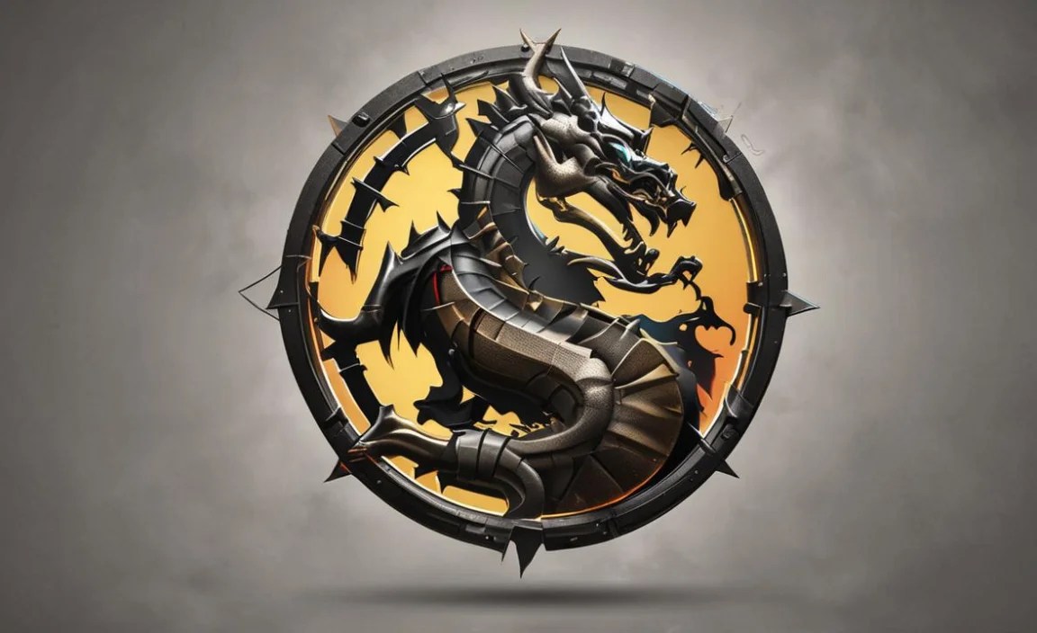
When people talk about the “Mortal Kombat font,” they’re usually referring to a distinct style that’s characterized by sharp edges, a strong, often condensed, sans-serif structure, and a generally aggressive or impactful feel. It’s not just one single font but a category of typefaces that capture the essence of the famous fighting game franchise. Think of it as the visual equivalent of a roundhouse kick – direct, powerful, and instantly memorable.
The original Mortal Kombat logo and in-game text often feature custom lettering designed to embody the game’s fierce combat and dark fantasy themes. These fonts typically have:
- Sharp Angles and Points: Like the edges of a blade or a warrior’s stance.
- Bold Weight: To convey strength and power.
- Condensed or Extended Forms: Creating a commanding presence.
- Distressed or Textured Effects: Suggesting battle-worn grit.
- Unique Ligatures or Character Shapes: Adding a custom, exclusive feel.
This aesthetic is all about making a statement. It’s for designs that need to grab attention, convey intensity, and leave a lasting impression. It’s the visual punch that complements the in-your-face action of the game.
Where to Find Mortal Kombat-Inspired Fonts

While the exact font used in the official Mortal Kombat logo is a custom creation, there are many fantastic alternatives available that capture its iconic spirit. You can find these fonts on various online platforms, ranging from free resources to premium font marketplaces. When searching, use terms like “fighting game font,” “action font,” “display font,” “sharp sans serif,” or “Mortal Kombat font free” (though be cautious about “free” versions of commercial fonts, as they can sometimes be unofficial or lack full character sets).
Here are some popular and reliable places to start your search:
- Google Fonts: Offers a vast library of free, high-quality fonts. While you might not find a direct copy, you can discover sans-serif fonts with sharp characteristics.
- DaFont: A huge repository of free fonts, often including many fan-made or inspired-by fonts. Be sure to check the license for each font to understand how you can use it.
- Font Squirrel: Curates high-quality free fonts, many of which are commercially licensed, making them great for branding and design projects.
- MyFonts: A leading marketplace for premium fonts. You’ll find a wide selection of professional display fonts here that can perfectly capture the Mortal Kombat feel.
- Creative Market & Envato Elements: These platforms offer a subscription-based or per-item purchase model for unique fonts, graphics, and design assets, often including highly stylized display fonts.
Popular Font Categories to Explore
When looking for fonts that evoke the Mortal Kombat style, consider these categories:
- Slab Serif Fonts: These often have strong, blocky serifs that can feel very impactful and bold, similar to the chunky feel of some game titles.
- Geometric Sans-Serifs: Fonts with clear, simple shapes and sharp angles can lend a modern, aggressive edge.
- Display Fonts: These are designed for headlines and short bursts of text, prioritizing style and impact over long-form readability. Many “game” or “action” themed display fonts fit the bill.
- Stencil Fonts: Some stencil fonts have a rugged, military-grade feel that can align with the gritty nature of Mortal Kombat.
Essential Tips for Using the Mortal Kombat Font (or its Kin)

Once you’ve found a font that resonates with the Mortal Kombat aesthetic, the next step is to use it wisely. A font this powerful needs careful handling to ensure it enhances, rather than detracts from, your design.
1. Embrace the Power of Headlines and Titles
This is where fonts inspired by Mortal Kombat truly shine. Their inherent boldness and sharp details make them perfect for grabbing immediate attention. Use them for:
- Game Titles and Subtitles: The most obvious and effective use.
- Event Banners: For gaming events, tournaments, or parties.
- Website Headers: To create an immediate impact on a landing page.
- Promotional Posters: For new releases, sales, or announcements.
- Social Media Graphics: Especially for announcements or striking visuals.
Pro Tip: Keep the text short and impactful. Longer sentences can become difficult to read and lose their intended punch.
2. Contrast is Key: Pair with Readable Fonts
A font as aggressive as the “Mortal Kombat font” can quickly overwhelm a design if used everywhere. The secret to a balanced and professional look is pairing it with a more neutral, highly readable font. This is crucial for:
- Body Text: Standard paragraphs of information should use clean sans-serifs or simple serifs.
- Subheadings: Often, a simple sans-serif in a lighter weight works well.
- Navigation Menus: Clarity is paramount here.
- Captions and Labels: Ensure these are easy to understand at a glance.
Consider pairing your strong display font with fonts like:
- Open Sans
- Lato
- Roboto
- Merriweather (for a touch of serif contrast)
A good rule of thumb is to contrast strong with simple, and bold with light. This visual hierarchy ensures that the most important elements stand out while the supporting text remains accessible.
3. Master the Art of Spacing (Kerning and Leading)
For fonts with sharp angles and condensed forms, proper spacing is vital. Poor spacing can make the text feel cramped, illegible, or even physically uncomfortable to look at.
- Kerning: This is the adjustment of space between individual letter pairs. Fonts with sharp points (like ‘A’, ‘V’, ‘W’) can sometimes overlap or leave too much space depending on their neighbors. Manually adjusting kerning can clean this up significantly. For example, the space between ‘W’ and ‘A’ might need to be tighter.
- Leading: This is the space between lines of text. For bold, condensed fonts, increasing the leading slightly can improve readability, preventing the sharp edges of one line from visually clashing with the line above or below.
Many design software applications (like Adobe Photoshop, Illustrator, Affinity Designer) offer precise controls for kerning and leading. Even basic text editors sometimes allow for line spacing adjustments.
A study on typography and user experience highlights how subtle adjustments in line spacing can dramatically impact readability and user perception. For instance, when studying how people read online, researchers at Applied Ergonomics found that adjusting leading and letter spacing directly affected the speed and accuracy of reading.
4. Consider Context and Target Audience
A font that screams “Mortal Kombat” is perfect for a gaming-related project but might be a bit too aggressive for a wedding invitation or a corporate annual report. Always ask yourself:
- What is the emotion I want to convey? Intense? Playful? Serious?
- Who is my audience? Will they understand and appreciate this style?
- Where will this design be seen? On a small mobile screen? A large banner?
For instance, if you’re designing a website for a sports training facility, a sharp, bold font could work for sections discussing intense training regimens, but the main content should be in something more accessible. It’s about strategic application.
5. Experiment with Styles and Effects
The “Mortal Kombat” look can be enhanced with various design treatments:
- Outline Effects: Adding a subtle outline can make glyphs pop.
- Gradients: Metallic or fiery gradients can amp up the drama.
- Shadows and Glows: Be careful not to overdo it, but a well-placed drop shadow or inner glow can add depth.
- Distressing: Applying a grunge or distressed texture can give it a battle-worn, authentic feel, reminiscent of the game’s art style.
- Color: Bold, high-contrast colors often work best. Think reds, blacks, golds, and icy blues.
When applying effects, use them sparingly. The font itself is strong; effects should complement, not compete with, its inherent design.
6. Font Licensing: A Crucial Step
This is incredibly important, especially if you’re using fonts for commercial projects. Always check the license agreements:
Commercial Use: If you plan to use the font for a business, logo, product, or anything that generates revenue, you need a font with a commercial license. Many free fonts found on sites like Dafont are for personal use only.
Read the Fine Print: Licenses can vary. Some might allow embedding in PDFs, while others restrict it. Some might have limits on the number of users or installations. Understanding these terms prevents legal issues down the line.
For official guidance on font licensing, you can refer to resources like the U.S. Copyright Office, which offers insights into copyright protection for typefaces.
Practical Font Pairings Inspired by Mortal Kombat
Let’s get into some concrete examples of how you might pair a “Mortal Kombat”-style font. We’ll assume a bold, sharp sans-serif for our primary display font.
Scenario 1: Gaming Blog Post Title
Headline Font: A sharp, aggressive display sans-serif (e.g., a font with triangular serifs or strong diagonal cuts). Think impactful and slightly menacing.
Body Text Font: A clean, highly readable sans-serif like Lato or Open Sans. This ensures that the actual content is easy to digest.
Subheadings: The same readable sans-serif, perhaps in a bolder weight or a different color, to differentiate from body text but still maintain harmony with the headline.
Why it works: The striking headline draws readers in, and the simple body text allows for comfortable reading of articles, reviews, or guides. The contrast is clear and functional.
Scenario 2: Fighting Game Tournament Poster
Main Title Font: A true “Mortal Kombat” style font – very bold, perhaps customized with effects like metallic gradients or sharp outlines. This should be the largest, most dominant element.
Event Details (Date, Time, Location): A condensed, bold sans-serif that is still legible from a distance. It needs to communicate crucial information clearly, but with a hint of urgency.
Sponsors/Logo Text: A simpler, smaller sans-serif to ensure all logos are readable and appear professional.
| Design Element | Recommended Font Style | Example Use Case |
|---|---|---|
| Main Title/Headline | Bold, Sharp Display Sans-Serif (Mortal Kombat-esque) | “KOMBAT KLASH 2024” |
| Key Details (Date/Time/Location) | Condensed Bold Sans-Serif | “OCTOBER 26TH | 7 PM | ARENA HALL” |
| Supporting Information/Fine Print | Clean, Simple Sans-Serif | Website URL, registration details |
| Call to Action (e.g., “REGISTER NOW”) | Bold Sans-Serif, possibly same family as headline but lighter weight | “JOIN THE FIGHT!” |
Why it works: The most impactful elements use the “Mortal Kombat” style, creating excitement. Essential information is clear and legible, ensuring people can attend. This balance is crucial for event promotion.
Beyond the Font: Designing with Intensity
Remember, a font is just one piece of the puzzle. To truly capture the spirit of Mortal Kombat, consider these design elements in conjunction with your typeface:
- Color Palette: Dark, brooding colors (blacks, deep blues, grays) mixed with intense accents (blood red, electric blue, fiery orange, or stark white) are common themes.
- Imagery: Use high-contrast, dynamic imagery. Think action shots, powerful characters, or symbolic representations of combat.
- Layout: Asymmetrical layouts can convey energy and dynamism. Use sharp lines and geometric shapes to echo the font style.
- Visual Effects: Subtle textures, grunge overlays, or motion blur can enhance the feeling of action and intensity.
Great design is about synergy. When the font, colors, imagery, and layout all work together, you create a powerful and cohesive experience that resonates with your audience.
FAQ: Your Mortal Kombat Font Questions Answered
Q1: Is the “Mortal Kombat Font” an actual font I can download?
A1: The exact lettering used in the official Mortal Kombat logo is a custom typeface designed specifically for the franchise. However, many fonts are heavily inspired by this style and can be found on font websites by searching for terms like “fighting game font” or “action display font.”
Q2: Where can I find free fonts that look like the Mortal Kombat font?
A2: You can find free, inspired fonts on sites like DaFont or Font Squirrel. Just search using keywords like “Mortal Kombat,” “fighting game,” “action,” or “sharp,” but always check the license for personal vs. commercial use.
Q3: Can I use a Mortal Kombat-style font for my business logo?
A3: You absolutely can, provided you use a font that has a commercial license. Many highly stylized display fonts are available for purchase that capture the same powerful aesthetic, ensuring you’re legally compliant for branding.
Q4: Is this type of font good for reading long articles?
A4: No, fonts with a strong “Mortal Kombat” style are generally considered display fonts. They are designed for impact and headlines, not for extended blocks of text. For body copy, always opt for clear, highly readable fonts like sans-serifs or simple serifs.
Q5: How do I make a sharp font look less aggressive if needed?
A5: You can soften the impact by using it in a lighter weight, a less intense color, increasing line spacing (leading), and pairing it thoughtfully with a much softer, more rounded font for supporting text. Sometimes, reducing the sharpness of angles in editing software can also help.
Q6: What are the best colors to use with a Mortal Kombat-style font?
A6: Bold, high-contrast colors work best. Think about the game’s palette: deep blacks, blood reds, electric blues, fiery oranges, metallic silvers, and stark whites. These colors enhance the font’s inherent drama and power.
Q7: Can I modify a downloaded font to better match the Mortal Kombat style?
A7: While technically possible with font editing software, modifying fonts often requires advanced skills and can infringe on copyright unless the license explicitly allows modification. It’s generally safer and more practical to find existing fonts that closely match the style you’re after.


