
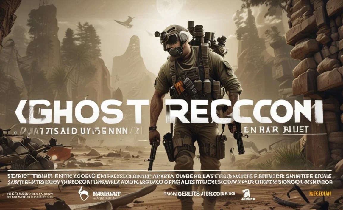
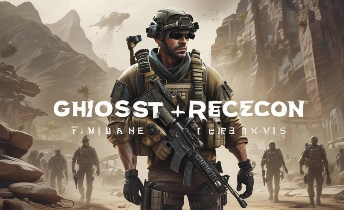
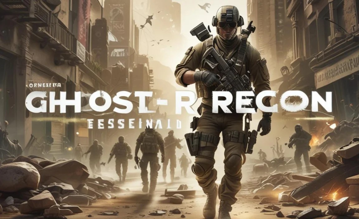
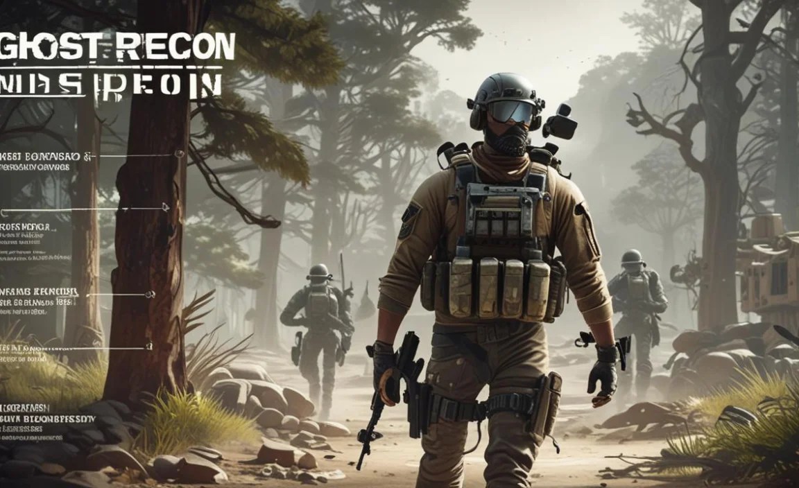
The “Ghost Recon Font” is a distinct, often military-inspired sans-serif typeface that evokes a sense of tactical precision and modern warfare. While there isn’t one single official “Ghost Recon font” used across all titles, the series typically employs bold, geometric sans-serifs with sharp edges and clear readability, perfect for game titles, UI elements, and marketing materials. This guide will help you identify and use similar fonts for your own projects.
Ever scroll through game art or design inspiration and spot a font that just screams “action,” “tech,” or “military ops”? You might be looking at something inspired by the Ghost Recon universe. It’s that clean, strong look that grabs your attention. But finding that exact font can feel like a mission in itself.
Many people wonder, “What font is that?” or “How can I get that cool tactical look for my own designs?” It’s a common quest for designers, gamers, and anyone aiming for a sharp, modern aesthetic. Don’t worry, it’s not as complicated as infiltrating an enemy base.
We’re going to break down the visual style, explore similar font families, and give you practical tips. You’ll learn how to find and use fonts that capture that distinct Ghost Recon feel. Get ready to elevate your designs with this essential guide!
Understanding the “Ghost Recon Font” Aesthetic
The Ghost Recon series, known for its tactical stealth gameplay, often features a visual identity that mirrors its theme. The “Ghost Recon font” look is characterized by a few key elements:
- Sans-Serif Boldness: It’s almost always a sans-serif font, meaning it lacks the little decorative strokes (serifs) at the ends of letters. This gives it a clean, modern, and direct feel.
- Geometric Construction: Many of the fonts lean towards geometric shapes. Think perfect circles for O’s and C’s, and straight lines for many strokes. This results in a precise, almost manufactured look.
- Sharp Edges and Angles: While geometric, the letters aren’t always soft. You’ll often find sharp terminals (the end of a stroke) and chiseled angles, adding to the edgy, tactical vibe.
- High Readability: Despite the stylistic choices, these fonts are designed for clarity. This is crucial for game interfaces where information needs to be understood instantly.
- Sense of Authority and Technology: The overall impression is one of reliability, advanced technology, and a no-nonsense approach.
This distinct aesthetic is what draws many designers to recreate or emulate the style for their own projects, be it for a gaming website, a tech blog, or even a sharp personal branding project.
Exploring the “Ghost Recon Font” Family
While Ubisoft, the creator of Ghost Recon, uses custom or modified fonts for many of its game titles and logos, the principles behind their choices align with several readily available font families. The core idea is to find something that balances impact with clarity.
Here are some categories and specific font examples that capture the “Ghost Recon font” spirit:
Geometric Sans-Serifs (The Closest Relatives)
These fonts are built on simple geometric shapes like circles and straight lines. They often have a clean, modern, and slightly futuristic feel, making them prime candidates for that tactical look.
- Orbitron: This is a popular choice that embodies a futuristic, geometric sensibility. It’s widely available and designed for display purposes, making it great for headlines. Its sharp angles and distinct character shapes give it a strong, almost sci-fi military feel.
- Aldrich: Inspired by early 20th-century geometric sans-serifs, Aldrich offers a strong, condensed, and somewhat utilitarian feel. It’s highly legible and has a no-nonsense character that works well for titles and important information.
- Nasalization: Popular for its distinct, almost stencil-like openings in letters like ‘O’ and ‘P’. This font has a very strong, technological, and sometimes military feel, often seen in sci-fi and gaming contexts.
- Exo 2: A versatile geometric sans-serif that balances technical precision with a friendly openness. It comes in many weights, making it suitable for both headlines and body text, and its clean lines fit the tactical aesthetic.
Grotesque/Neo-Grotesque Sans-Serifs (For Clarity and Strength)
These are some of the earliest sans-serif fonts, known for their straightforward and objective appearance. Modern interpretations often add a bit more character and polish, fitting the need for both strength and readability.
- Roboto: While known for its widespread use on Android, Roboto’s design is a unique blend of mechanical and friendly. Its geometric roots combined with open curves provide excellent readability and a modern, dependable feel.
- Montserrat: Inspired by old posters and signs in the Montserrat neighborhood of Buenos Aires, this font has a strong geometric foundation but also a friendly, approachable quality. It’s excellent for headings and adds a touch of urban grit.
- Oswald: A reworking of the classic Alternate Gothic sans serif, Oswald is a condensed, strong, and highly readable font. Its tall, narrow form makes it perfect for fitting a lot of text into a small space without sacrificing impact.
Industrial/Technical Sans-Serifs (For a Grittier Edge)
These fonts often have a slightly rougher, more utilitarian look, suitable for conveying ruggedness and functionality. They might feature more pronounced ink traps or slightly harsher angles.
- Bank Gothic: This is a classic choice for that bold, wide, and impactful look often associated with futuristic or military designs, including many game titles. Its capitalized-only nature and strong presence make it a go-to for headlines.
- Michroma: A more stylized geometric sans-serif with a distinctive uppercase-only style. It has a very strong, almost blocky appearance with unique cuts and angles, making it stand out.
Fonts Used in Ghost Recon Games (Specific Examples)
It’s challenging to pinpoint the exact font used for every Ghost Recon title, as game studios often commission custom typefaces or heavily modify existing ones for their branding. However, based on visual analysis of game logos and in-game UIs, fonts with characteristics similar to:
- Matrix (often seen in earlier titles, known for its angular, tech feel)
- Bank Gothic (or similar wide, condensed sans-serifs for titles)
- Custom geometric sans-serifs with sharp terminals and clear, legible forms.
These examples provide a strong starting point for finding fonts that evoke the same powerful, tactical essence. Remember to check licensing if you plan to use them for commercial projects.
How to Find and Use “Ghost Recon Font” Style Fonts

Finding the perfect font is an ongoing discovery. Here’s a breakdown of how you can search for and effectively implement fonts that capture that Ghost Recon vibe in your own creative work.
Step-by-Step Font Hunting
Your font-finding mission doesn’t require special ops training. Follow these steps:
- Identify Your Needs: Are you looking for a title font, UI elements, or something for marketing materials? The context will influence the best choice.
- Start with Keyword Searches: Use terms like “geometric sans-serif,” “technical font,” “military font,” “futuristic font,” or “block font” on font websites.
- Explore Font Libraries: Websites like Google Fonts, Adobe Fonts, Font Squirrel, and DaFont are excellent resources.
- Analyze Similar Designs: Look at official Ghost Recon art, game UI, and marketing. Note the characteristics of the fonts used. Apps like WhatTheFont or Font Identifier can sometimes help even with images.
- Test Font Characteristics: Load potential fonts into a design program or text editor. Check their weight, spacing, x-height (the height of lowercase letters like ‘x’), and overall mood.
- Consider Licensing: Always check the license. Google Fonts and Font Squirrel often offer free licenses for commercial use, while others may require purchase.
Where to Find These Fonts
Here are some reliable places to start your search:
- Google Fonts: A vast library of free, open-source fonts. Excellent for modern and versatile options. Try searching for “geometric.”
- Adobe Fonts: If you have an Adobe Creative Cloud subscription, this is a treasure trove of high-quality fonts accessible for commercial use.
- Font Squirrel: Curates a collection of completely free fonts for commercial use, often with excellent quality and variety.
- MyFonts / FontShop: These are professional marketplaces where you can purchase commercial fonts. They have an extensive selection but are not free.
- DaFont: A huge collection, but be very careful to check the license for each font. Many are free for personal use only.
Implementing the Font in Your Designs
Once you’ve found your font, how do you make it work?
- Headlines and Titles: This is where bold, geometric sans-serifs shine. Use them for maximum impact.
- User Interface (UI): For menus, labels, and important notifications, focus on readability. Choose a font with clear letterforms and good spacing.
- Subheadings: A slightly lighter weight of your headline font or a complementary sans-serif can work well.
- Body Text: Generally, the most distinct “tactical” fonts are not ideal for long paragraphs. Opt for a more neutral, highly readable sans-serif for body copy to ensure comfort for the reader.
- Pairing: Combine your bold, tactical font with a simpler, highly readable font (like Open Sans, Lato, or a neutral serif) for body text. This contrast makes your main font pop and keeps your content accessible.
Font Characteristics to Look For
When evaluating potential fonts, consider these specific design traits:
Key Character Features
These details make a big difference in the font’s personality and function:
- Letterform Angles: Are they sharp or rounded? Sharp angles contribute to a more aggressive or futuristic feel.
- Terminals: The very end of a stroke. Sharp, chiseled terminals add a technical edge, while flat or rounded ones are softer.
- Open vs. Closed Counters: The “counter” is the enclosed or partially enclosed space in letters like ‘o’, ‘a’, ‘e’, ‘p’. Open counters (like in a clean ‘o’) improve readability, especially at small sizes.
- Stroke Contrast: The difference in thickness between thick and thin strokes. Sans-serifs often have little to no contrast, contributing to their uniform, modern look.
- Apertures: The opening in letters like ‘C’, ‘S’, ‘a’, ‘e’. Wider apertures generally mean better readability.
Weight and Width
These properties dictate how a font appears and how much space it occupies:
- Weight: Bold, Black, or Extra Bold weights are typical for striking titles. Light or Regular weights are better for less prominent text or when pairing with a heavier headline font.
- Width: Condensed or Narrow fonts are great for fitting more text horizontally, which can be useful for technical readouts or impactful display text. Regular width is standard, while Expanded or Wide fonts can feel more authoritative but take up more space.
Comparing Font Styles: Sans-Serif vs. Others
Understanding different font classifications helps you appreciate why a sans-serif is usually the go-to for the “Ghost Recon font” look, and how it differs from other styles.
| Font Style | Key Characteristics | Typical Use Cases | “Ghost Recon Font” Relevance |
|---|---|---|---|
| Sans-Serif | No serifs (little feet/strokes). Clean, modern lines. Often geometric or humanist. | Websites, apps, UI, headlines, corporate branding, minimalist design. | High. This is the core style. Geometric sans-serifs are particularly relevant for their technical and precise feel. |
| Serif | Has serifs. Traditional, classic feel. Often associated with readability in print. | Books, newspapers, formal documents, traditional branding, academic use. | Low. Generally too traditional and ornate for the modern, tactical look. |
| Slab Serif | Thick, block-like serifs. Bold and robust. | Headlines, posters, branding needing a strong, sturdy feel. | Medium-Low. Can sometimes work if the serifs are very geometric and the overall feel is industrial, but less common than sans-serif. |
| Script | Mimics handwriting or calligraphy. Elegant or casual. | Invitations, logos, personal branding, decorative elements. | Very Low. Almost never fits the practical, tactical, or technological aesthetic. |
| Display | Highly stylized, unique. Designed for large sizes and impact. Can be any type (sans, serif, etc.). | Large titles, posters, logos. | Medium. A display sans-serif with geometric or stencil-like qualities could fit perfectly. |
As you can see, the sans-serif category, especially its geometric and technical sub-styles, is where you’ll find the closest matches to the “Ghost Recon font” aesthetic. Their inherent clarity and modern structure make them ideal for conveying a sense of advanced technology and operational readiness.
Best Practices for Using Tactical Fonts
Using a font with a strong, tactical personality requires a thoughtful approach to ensure it enhances your design rather than overpowering it.
Readability is Key
Even the coolest-looking font is useless if people can’t read it. Always prioritize legibility, especially for essential information.
- Test in Context: View the font at the size and on the background it will be used. Does it hold up?
- Use Appropriate Weights: A thin, delicate version of a strong font might lose its impact, while an overly heavy font can be difficult to read in large blocks.
- Sufficient Spacing: Ensure letters have enough space between them (kerning) and words have enough space between them (tracking) for comfortable reading.
Pairing with Other Fonts
Your primary “Ghost Recon style” font is often best used strategically. Pairing it with a more neutral friend is a smart design move.
- Headline & Body Contrast: Use your bold, tactical font for titles and subheadings. Then, choose a highly readable sans-serif or a simple serif font for your main body text. This creates visual hierarchy and ensures your content is accessible.
- Complementary Styles: When pairing sans-serifs, look for subtle agreements in their construction. For example, a geometric sans-serif headline might pair well with a humanist sans-serif body font that has slightly more organic shapes.
- Avoid Font Overload: Stick to one or two, maybe three, fonts for a project. Using too many different typefaces can make your design look chaotic and unprofessional.
When to Use and When to Avoid
Consider the overall mood and purpose of your project.
Good Use Cases:
- Gaming websites and communities
- Tech company branding
- Science fiction or military-themed projects
- Marketing for action-oriented products or services
- Creating a bold, impactful headline
- User interface elements in digital products
When to Be Cautious:
- Formal or traditional branding
- Projects requiring a soft, gentle, or whimsical tone
- Extensive blocks of body text where readability is paramount
- Children’s educational materials
- Highly personal or emotional content that doesn’t align with the font’s strong personality.
Remember, a font is a tool. The “Ghost Recon font” style is powerful, but like any powerful tool, it’s most effective when used with intention and skill.
FAQ: Your Ghost Recon Font Questions Answered
Got lingering questions about fonts, especially those with that tactical edge? Here are some common queries and their straightforward answers.
What is the official font used in the Ghost Recon logo?
Ubisoft often uses custom-designed or heavily modified fonts for its game titles to ensure unique branding. While specific official fonts can change between games in the series, they consistently lean towards bold, geometric sans-serifs with strong, sharp characteristics that convey a modern, tactical, and technological feel.
Are there any free fonts similar to the Ghost Recon font style?
Yes! Many free fonts capture the essence. Excellent options include Orbitron, Aldrich, Montserrat, Exo 2, and Oswald, all available on platforms like Google Fonts or Font Squirrel. These offer similar geometric structures and strong, clear.


