
Looking for the best script fonts for branding? Choose elegant, readable script fonts that reflect your brand’s personality, evoke emotion, and make a memorable impression. Consider readability, versatility, and style to ensure your chosen script font elevates your brand identity effectively.
Choosing the perfect font for your brand can feel a bit like picking a signature outfit. It needs to feel just right and say a lot about who you are. Script fonts, with their flowing lines and stylish flair, are often used to add a touch of personality and sophistication. But with so many beautiful options out there, how do you know which ones are the best script fonts for your branding? Don’t worry, we’re going to break it down. We’ll explore why script fonts work so well for brands and guide you through selecting the most stunning and effective ones.
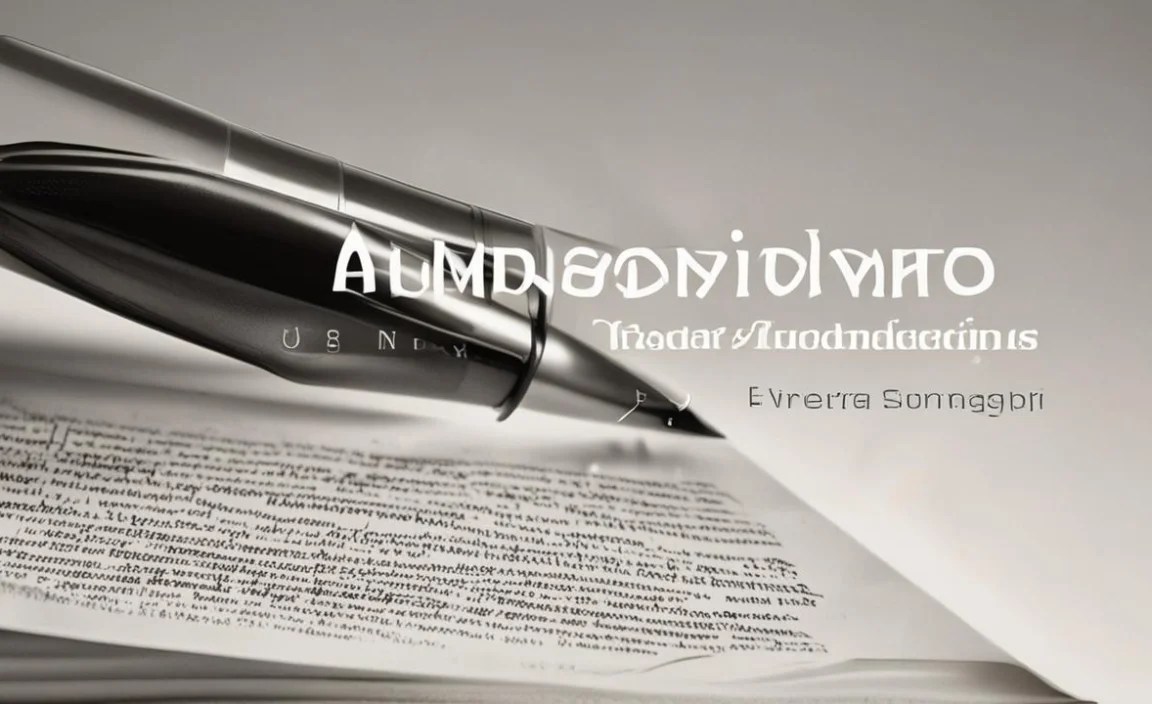
Why Script Fonts Make a Statement in Branding
Script fonts mimic the art of handwriting. They can range from elegant and formal to casual and playful. This natural, human touch is incredibly powerful for branding because it helps connect with your audience on an emotional level. A well-chosen script font can instantly communicate elegance, creativity, luxury, warmth, or a friendly vibe, depending on its style. It’s like giving your brand a distinct voice and personality, making it more relatable and memorable.
Understanding Script Font Categories
Not all script fonts are created equal! They come in different flavors, each suited for different branding needs. Knowing these categories will help you narrow down your search for the perfect fit.
Formal Scripts: These fonts are inspired by traditional calligraphy and copperplate handwriting. Think elegant flourishes, smooth strokes, and a generally sophisticated look. They are perfect for luxury brands, wedding invitations, or anything aiming for an air of prestige and tradition.
Casual Scripts: These are more relaxed and free-flowing, often resembling everyday handwriting. They feel approachable, friendly, and sometimes a little quirky. Brands looking to convey warmth, creativity, or a personal touch often find success with casual scripts.
Handwritten Scripts: Similar to casual scripts, these often have a very personal, artistic feel. They can look like they were drawn or written with a brush or pen by an artist. They are fantastic for artisanal products, creative agencies, or brands that want to feel handmade and unique.
Display Scripts: These are designed to grab attention and are often highly stylized, with unique ligatures and dramatic flourishes. They are best used sparingly, like for headlines or logos, where their decorative nature can shine without overwhelming the reader.
Monoline Scripts: These fonts have a consistent stroke weight, similar to a marker or ballpoint pen. They appear neat and precise, offering a clean, modern take on script typography. They can be a great choice when you want the elegance of a script without excessive ornamentation.
Key Considerations When Choosing Script Fonts for Your Brand

Selecting a script font isn’t just about aesthetics; it’s about strategic decision-making. Here’s what to keep in mind to make sure your chosen font is a success:
1. Readability is Paramount
This is the golden rule. No matter how beautiful a script font is, if people can’t easily read it, it’s not a good choice for branding, especially for longer text.
Context Matters: For headlines, logos, or short taglines, you have more freedom to play with decorative scripts. For website body text, marketing emails, or product packaging that needs detailed information, opt for simpler, highly legible script fonts.
X-Height and Letter Spacing: Look for fonts with a decent x-height (the height of lowercase letters like ‘x’). Ample spacing between letters (kerning) also significantly improves readability.
Test It Out: Always try the font in different sizes and contexts. Print it out, view it on various screens, and ask others for their opinion.
2. Brand Personality Alignment
Your font is a direct extension of your brand’s voice. Does the script font feel like your brand?
Luxury & Elegance: Formal or classic scripts with graceful curves.
Modern & Chic: Clean monoline scripts or slightly stylized casual scripts.
Warm & Friendly: Relaxed, approachable casual scripts.
Creative & Artistic: Unique handwritten or display scripts.
Whimsical & Fun: Playful scripts with bouncy baselines.
3. Versatility and Application
Think about where you’ll be using this font.
Logos: A distinct script font can make a memorable logo.
Headlines & Titles: Adds a stylish flourish to key text.
Call-to-Action Buttons: Can draw attention to important prompts.
Social Media Graphics: Adds personality to posts.
Website Design: Can be used for headings or sparingly for accents.
Print Materials: Business cards, brochures, packaging.
4. Licensing and Usage Rights
This is crucial for businesses. Always check the font license to ensure you can use it for commercial purposes. Free fonts often have restrictions, while paid fonts typically offer more flexible commercial licenses. Websites like Google Fonts clearly state licensing information for their fonts under an Open Font License (OFL), allowing for wide commercial use. Reputable font foundries (e.g., MyFonts) provide detailed licensing terms for their commercial fonts.
Top Script Fonts for Branding: Our Curated Selection
Now for the fun part! Here are some of the best script fonts that have proven their worth in the branding world. We’ve selected them for their readability, personality, and versatility.
| Font Name | Style/Vibe | Best For | Why We Love It | Link/Where to Find |
|---|---|---|---|---|
| Brush Script MT | Casual, artistic, slightly retro | Logos, headlines, informal branding | Classic and widely recognized. Has a hand-painted feel that’s approachable and energetic. | Often pre-installed on operating systems; also available via Font Meme for download. |
| Great Vibes | Elegant, sophisticated, calligraphic | Luxury brands, wedding invitations, sophisticated logos | Beautiful, flowing strokes with a classic feel. It’s legible for its style and evokes class. | Google Fonts (Free) |
| Pacifico | Casual, friendly, brush-like | Lifestyle brands, food blogs, social media, youthful brands | A very popular, highly readable informal script. It feels warm, inviting, and fun. | Google Fonts (Free) |
| Dancing Script | Playful, energetic, handwritten | Creative businesses, craft brands, personal blogs | It has a delightful bounce and charm, feeling personal and dynamic. Good for accents. | Google Fonts (Free) |
| Alex Brush | Casual, bouncy, modern | Startups, tech, creative agencies needing a friendly touch | A clean, readable casual script that doesn’t feel overly formal or whimsical. Easy to pair. | Google Fonts (Free) |
| Satisfy | Unique, flowing, artistic | Artisanal products, handmade goods, distinctive branding | From the Impallari Type foundry, it has a distinctly artistic and slightly vintage flair. Wide letterforms. | Google Fonts (Free) |
| Sacramento | Monoline, delicate, personal | Minimalist brands, personal branding, elegant accents | A clean, thin monoline script that feels very personal and refined. Excellent for subtle elegance. | Google Fonts (Free) |
How to Pair Script Fonts with Other Typefaces
Script fonts are rarely used alone for all brand typography. To create a balanced and professional look, you’ll want to pair them with complementary fonts. The trick is to create contrast and hierarchy.
1. The Script & Sans-Serif Combo
This is a classic for a reason!
Why it works: Sans-serif fonts are clean, modern, and highly readable. Pairing them with an elegant or casual script creates a beautiful balance between formality and friendliness, or sophistication and approachability.
How to do it: Use your script font for your logo, headlines, or important accents. Use a clean sans-serif for body text, subheadings, and other informational content.
Great Sans-Serifs to Try: Open Sans, Lato, Montserrat, Roboto, Raleway.
2. The Script & Serif Combo
For a more traditional or literary feel.
Why it works: Serif fonts (like Times New Roman) often convey trust, tradition, and expertise. Pairing a script with a serif can create a sophisticated, timeless, and established brand identity.
How to do it: Use a formal script for a logo or a key headline, and a well-chosen serif for accompanying text. This pairing can feel quite editorial.
Great Serifs to Try: Playfair Display, Merriweather, Lora, PT Serif.
3. Script with Another Script (Use with Caution!)
This is advanced and can be tricky.
Why it works (sometimes): If you have two scripts that are dramatically different in style (e.g., a very formal script and a very casual, handwritten script), you might be able to create visual interest.
When to avoid: Generally, using two similar script fonts will clash and look messy. If you’re a beginner, stick to pairing scripts with sans-serifs or serifs.
Pro-Tip: When pairing, ensure your script font isn’t too busy or ornate, as this can make it difficult to read alongside another font. Always test your pairings on your actual design mockups.
Where to Find Amazing Script Fonts
The internet is a treasure trove of amazing fonts! Here are some excellent places to start your search:
Google Fonts: A fantastic resource for free, high-quality fonts with open licenses, perfect for commercial use and web projects.
Adobe Fonts: If you have an Adobe Creative Cloud subscription, you get access to a vast library of premium fonts that are also licensed for commercial use.
MyFonts and Fontspring: These sites offer a huge selection of both free and premium fonts from independent designers and foundries. You’ll find cutting-edge and unique designs here, but always check the licensing carefully for commercial use.
Creative Market: Another excellent marketplace for fonts, often with bundles or sales, featuring a wide range of styles.
DaFont/Font Squirrel: While these sites offer many free fonts, be extra diligent about checking the licenses. Many free fonts are only for personal use. Font Squirrel often has a good selection of free fonts with commercial licenses.
Practical Steps to Implementing Script Fonts in Your Branding
Ready to put this knowledge to use? Follow these steps to seamlessly integrate script fonts into your brand’s visual identity.
1. Define Your Brand’s Personality: Before looking at fonts, list the top 3-5 adjectives that describe your brand (e.g., playful, sophisticated, reliable, innovative, artisanal).
2. Identify Key Uses: Where will your script font primarily live?
Logo?
Headlines?
Taglines?
Call-to-actions?
Digital accents?
3. Browse and Curate: Start exploring fonts from the resources mentioned above. Filter by “script” or “handwriting” style. Look for a few options that align with your brand personality and intended uses.
4. Test for Readability:
Download or preview the font.
Type out your brand name, a short tagline, and a sentence or two.
Check how it looks at different sizes (very small for business cards, larger for banners).
Consider how it reads on screen versus in print.
5. Consider Pairing: Once you have a top script font choice, find 1-2 complementary fonts (usually a sans-serif or serif) to use for body text and consistent brand messaging. Ensure there’s clear contrast and visual hierarchy.
6. Check Licensing: Double-check that your chosen fonts have the appropriate commercial license for your business needs. This is non-negotiable.
7. Create a Mini Style Guide: Document your chosen fonts, their intended uses, and any specific guidelines (e.g., “use Great Vibes for main headlines only, always paired with Lato for body text”). This ensures consistency across all your marketing materials.
Common Pitfalls to Avoid with Script Fonts
Even the most beautiful script can cause problems if misused. Be aware of these common mistakes:
Overuse: Using a script font for everything will make your brand look cluttered and unprofessional. Limit it to where it makes the most impact.
Poor Readability: Choosing a script that’s too decorative or has very thin strokes for important information.
Inconsistent Spacing: Some script fonts have awkward letter spacing (kerning) by default. You might need to adjust this manually in design software or avoid fonts that have this issue.
Unlicensed Fonts: Using fonts that you haven’t properly licensed for commercial use can lead to legal trouble.
Clashing Styles: Pairing a script with a font that has a completely conflicting personality, making the overall design feel disjointed.
FAQs About Script Fonts for Branding
Q1: Can I use a script font for my entire website?
A1: Generally, it’s not recommended. Script fonts are best used for titles, headlines, or decorative elements. For body text, a highly readable sans-serif or serif font is essential for a good user experience.
Q2: Are free script fonts safe to use for my business?
A2: Some free fonts have commercial licenses, but you must check the license carefully. Many “free for personal use” fonts cannot legally be used for business branding. Always verify the license agreement.
Q3: How do I choose between a formal and a casual script font?
A3: Consider your brand’s core personality. Formal scripts suit luxury, tradition, and elegance, while casual scripts are better for warmth, approachability, and creativity.
Q4: My script font looks too different on different devices or browsers. What can I do?
A4: This is often related to font rendering. Using web-safe fonts or embedding fonts correctly using CSS or font services like Google Fonts can help ensure consistency across different platforms and devices.
Q5: When is it okay to use a very decorative script font?
A5: Very decorative scripts are best reserved for prominent but short uses like logos, specific headlines that need high impact, or unique branding elements where readability is less critical than visual flair.
Q6: How can I make sure my script font stands out without being unreadable?
A6: Choose scripts with clear letterforms and adequate spacing. Test them at various sizes and on different backgrounds. Often, using a slightly bolder weight or ensuring good contrast with the background helps improve legibility.
Conclusion: Crafting Your Brand’s Unique Voice with Script Fonts
Selecting the best script fonts for your branding is an exciting step towards defining your visual identity. By understanding the different styles, prioritizing readability, aligning with your brand’s personality, and making informed pairing choices, you can harness the power of script typography to create a truly memorable and engaging brand experience.
Remember, a font is more than just letters; it’s a feeling, a tone, and a key part of your brand’s story. Whether you’re aiming for timeless elegance with Great Vibes, a friendly touch with Pacifico, or artistic flair with Satisfy, there’s a script font out there waiting to give your brand that stunning, personal touch. Go forth, experiment, and let your brand’s unique voice shine through!


