
The “Wanted Font” design trend evokes the Wild West, featuring bold display fonts that demand attention. Ideal for posters, headlines, and branding, these fonts offer a unique, historical character. Explore essential styles and how to effectively integrate them for striking, memorable designs.
Wanted Font: Essential & Stunning Designs
Ever seen a poster that just pulls you in? It might be the raw energy, the bold statement, or that unmistakable, eye-catching lettering. Often, that’s the magic of a “Wanted Font.” These aren’t just any letters; they’re characters with personality, designed to stand out. They bring a touch of history and a whole lot of visual punch.
But what exactly is a “Wanted Font,” and how can you use it to make your own designs unforgettable? Don’t worry, it’s simpler than it looks! We’ll break down this exciting style, show you the essential types, and guide you on how to make them work for you. Get ready to add some serious flair to your projects!
What is a “Wanted Font”? The Wild West of Typography

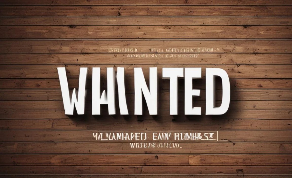
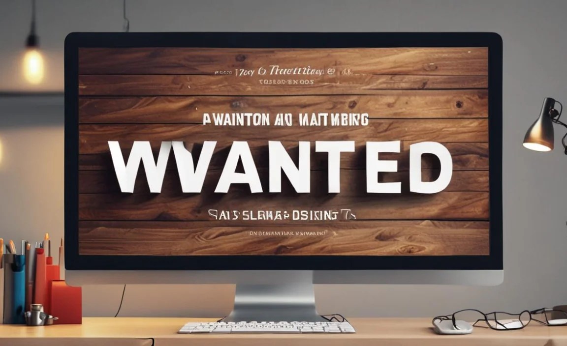
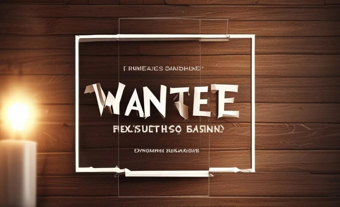
The term “Wanted Font” is a nod to the iconic Wild West era, specifically the “Wanted” posters that were a staple of that time. These fonts are characterized by their decorative, often elaborate, and highly legible styles. Think strong serifs, distressed textures, and a general sense of urgency and importance.
These aren’t subtle fonts. They’re designed to be noticed, just like a poster announcing a reward for a notorious outlaw. They carry a historical weight and a visual narrative that’s immensely appealing in various design contexts today.
Key Characteristics of “Wanted Fonts”:
- Bold & Heavy Strokes: They often feature thick, prominent lines that give a sense of strong presence.
- Decorative Flourishes: Expect ornate details, sometimes including serifs that are dramatic, extended, or ornamented.
- Distressed Textures: Many designs mimic the look of aged paper, print imperfections, or weathered ink.
- High Readability (at a distance): Despite their embellishments, they are generally designed to be read easily, especially when used for headlines or titles.
- Historical & Nostalgic Feel: They evoke a specific time period, lending character and a story to the design.
Why Are “Wanted Fonts” So Popular Today?

In a digital world flooded with clean, minimalist designs, there’s a growing appreciation for fonts that offer depth, character, and a sense of history. “Wanted Fonts” tap into this trend by providing:
- Unique Branding: They can create a memorable and distinct brand identity that breaks away from the norm.
- Narrative Power: Instantly tell a story or set a mood, perfect for themed events, historical projects, or adventurous branding.
- Visual Impact: Their boldness makes them excellent for grabbing attention on posters, social media graphics, and website hero sections.
- Nostalgic Charm: They appeal to a sense of retro coolness and a desire for tangible, classic aesthetics.
It’s this blend of historical resonance and undeniable visual power that makes “Wanted Fonts” a compelling choice for designers looking to add a unique edge to their work.
Exploring Essential “Wanted Font” Styles
When we talk about “Wanted Fonts,” we’re not referring to just one specific typeface. Instead, it’s a category that encompasses several styles that share those core characteristics. Understanding these styles will help you pick the perfect font for your needs.
1. Classic Western Display Fonts
These are the fonts that most closely resemble those found on actual Wild West wanted posters. They are often thick, condensed, and feature strong, slab-like serifs. Many have a slightly distressed or textured appearance, mimicking old printing techniques.
- Best For: Titles, headlines, posters, thematic event invitations, and branding that needs a strong, historical Western feel.
- Keywords: Western, Slab Serif, Display, Vintage, Saloon.
2. Elaborate Serif Fonts (Victorian-Inspired)
While not strictly “Wanted” posters, many Victorian-era display fonts share a similar level of ornamentation and boldness. These fonts might have very exaggerated serifs, decorative ligatures, and a general air of grandeur. They offer a more sophisticated, yet still striking, vintage feel.
- Best For: Luxury branding, invitations, book covers, and designs that aim for a rich, historical, or slightly ostentatious look.
- Keywords: Victorian, Ornate Serif, Decorative, Antique, Grand.
3. Distressed and Textured Fonts
This is less about a specific typeface structure and more about the finish. Many fonts, including Western and Victorian styles, come with pre-built textures or can be easily “distressed” using design software. This adds a layer of authenticity and a handcrafted feel, as if the lettering has been through a lot.
- Best For: Creating an authentic, aged look. Great for grunge aesthetics, historical reenactments, or any project where visual depth and character are key.
- Keywords: Textured, Distressed, Grunge, Aged, Rusted.
4. Hand-Drawn Display Fonts with a Vintage Vibe
Some modern interpretations of the “Wanted” aesthetic come in the form of hand-drawn fonts. These aim to capture the organic feel and imperfections of hand-lettered signs and posters from past eras. They can range from rough and bold to more refined and elegant scripts.
- Best For: Craft breweries, artisanal brands, organic products, and designs that want a friendly, yet impactful, vintage touch.
- Keywords: Hand-drawn, Vintage Script, Brush, Lettering, Artisan.
Choosing the Right “Wanted Font” for Your Project
Selecting the perfect font is crucial for ensuring your message is communicated effectively and with the desired impact. Here’s a step-by-step approach:
Step 1: Define Your Project’s Goal
What are you trying to achieve with this font?
- Are you aiming for a playful, thematic feel (e.g., a Western-themed party)?
- Do you need a bold headline that stops people in their tracks?
- Is it for branding that needs a unique, historical narrative?
- Are you trying to convey a sense of urgency or importance?
Step 2: Consider the Context and Audience
Who are you trying to reach, and where will they see this design?
- A font for a wedding invitation will be very different from one for a rock concert poster.
- Think about the overall aesthetic of your brand or event. Does a distressed, bold font fit?
- Ensure the font is legible for your intended viewing distance and medium (print vs. digital).
Step 3: Evaluate Readability
This is paramount, especially with decorative fonts. While “Wanted Fonts” are meant to be bold, they still need to be readable.
- Test the font at the intended size. Can you read it easily?
- Are the letterforms distinct, or do they blend together?
- Avoid overusing highly decorative fonts for body text. They are best suited for headlines and short phrases.
Step 4: Experiment with Pairings
A “Wanted Font” is often best used as a statement piece. Pair it with something simpler and more neutral for body text.
- Example: Use a bold Western Display font for your headline, and a clean Sans Serif like Open Sans or Lato for the accompanying paragraph.
- Consider contrast: pair a heavy font with a light one, or a decorative font with a plain one.
For inspiration on font pairing, resources like Google Fonts’ pairing guides offer excellent examples of how to combine typefaces effectively.
Step 5: Check Licensing
Before downloading and using any font, especially for commercial projects, always check its licensing terms. Some fonts are free for personal use but require a purchase for commercial applications.
Practical Applications for “Wanted Fonts”
The striking nature of “Wanted Fonts” makes them incredibly versatile for specific design needs. Here are some popular applications:
1. Poster Design
This is perhaps the most natural fit. Whether for an event, a movie, a band, or a sale announcement, a “Wanted Font” instantly gives a poster a dynamic and attention-grabbing quality. It conveys urgency and excitement.
2. Event Invitations
Planning a themed party, a wedding with a rustic or vintage vibe, or a special anniversary? A “Wanted Font” for the key details (like the couple’s names or the event title) can set the perfect tone.
3. Branding and Logos
Businesses looking for a distinctive identity can leverage “Wanted Fonts.” This is especially effective for:
- Craft breweries
- Bars and restaurants
- Antique shops
- Historical attractions
- Creative agencies wanting a bold, memorable mark
Remember to use them judiciously in logos – they work best when the font itself is the ‘brand’ or complements a simple icon.
4. Website Headers and Headlines
A compelling headline can dictate a user’s engagement with a webpage. Using a “Wanted Font” for a website’s main heading can create immediate visual interest and intrigue, making visitors want to explore further.
5. Social Media Graphics
In the fast-scrolling world of social media, you need to capture attention instantly. A bold, well-chosen “Wanted Font” in a graphic for an announcement, quote, or promotion can make your post stand out from the feed.
6. Album Art and Book Covers
For music genres like folk, Americana, country, blues, or even certain indie rock, a “Wanted Font” can perfectly encapsulate the spirit of the music. Similarly, on book covers, they can signify adventure, mystery, historical fiction, or a gritty narrative.
Tips for Using “Wanted Fonts” Effectively
Here are some insider tips to ensure your “Wanted Font” designs are stunning, not cluttered:
- Less is More: Use these fonts sparingly, primarily for titles, headlines, or very short phrases.
- Balance is Key: Always pair them with a clean, readable font for body text. A simple sans-serif or a classic serif works wonders.
- Consider the Texture: If a font has an intentional distressed texture, ensure your background and other design elements complement it. Avoid putting a heavily textured font over an equally busy background.
- Hierarchy: Use these bold fonts to establish a clear visual hierarchy. The “Wanted Font” should likely be the most dominant element.
- Color Matters: Experiment with colors that enhance the historical or bold feel. Deep reds, browns, black, and off-whites are common.
- White Space is Your Friend: Give your bold font plenty of breathing room. This helps it stand out and prevents the design from feeling overcrowded.
Popular “Wanted Font” Typefaces to Explore
While the aesthetic is broad, some typefaces are frequently recognized and used within this style. Many of these can be found on platforms like Adobe Fonts, MyFonts, or even for free on Google Fonts (though Google’s selection might be more subtle). Here are a few examples of styles and characteristics to look for:
| Font Style/Characteristic | Typical Features | Example Use Cases |
|---|---|---|
| Classic Western Display | Thick, often condensed, slab serifs, sometimes with spurs or ornate details. | Wild West themed events, saloon signage mockups, adventure movie posters. |
| Victorian Show Font | Elaborate, decorative serifs, often with high contrast and detailed flourishes. | Luxury invitations, historical dramas, ornate signage. |
| Distressed/Vintage Slab | Slab serif structure with added texture, wear, or grunge effects. | Craft beer brands, artisan shops, retro posters. |
| Hand-Lettered Western | Irregular, organic lines, embodying a hand-drawn feel with a Western character. | Farmaceutical branding, organic products, rustic decor. |
When searching, use terms like “Western font,” “Slab Serif Display,” “Vintage Font,” “Antique Font,” or “Saloon font” to find excellent options. For instance, look for fonts with names that evoke this era or style. Always preview the font with your text to see how it looks and feels.
Beyond the Visuals: Understanding Typography Principles
While “Wanted Fonts” are about making a statement, good design still hinges on fundamental typographic principles. The basics of typography, like kerning (adjusting space between letters), leading (space between lines), and contrast, are still critical.
Even with bold, decorative fonts, paying attention to these details can elevate your design from amateur to professional. For instance, ensuring adequate spacing between the letters in a “Wanted” headline prevents it from looking like a solid, unreadable block. Similarly, consistent line spacing in any accompanying text ensures it’s comfortable to read.
These principles come from a long tradition in graphic design. Historical examples, like the evolution of the Garamond typeface used for centuries, show how careful attention to detail in letterforms and spacing contributes to timeless readability and aesthetic appeal.
Frequently Asked Questions (FAQ)
What exactly is a “Wanted Font”?
A “Wanted Font” is a style of typeface inspired by the lettering on old Wild West wanted posters. These fonts are typically bold, decorative, and designed to be highly visible, evoking a sense of history, urgency, and character.
Are “Wanted Fonts” only for Western-themed designs?
No, while they originated from Western posters, their bold and decorative nature makes them versatile. They can be used for any design that needs a strong statement, a vintage feel, a touch of nostalgia, or a dramatic headline.
Where can I find good “Wanted Fonts”?
You can find them on font marketplaces like MyFonts, Adobe Fonts, or even browse collections on Google Fonts using keywords such as “Western,” “Slab Serif,” “Vintage Display,” or “Decorative” for inspiration.
Are “Wanted Fonts” easy to read?
Generally, they are designed for high impact and readability in short bursts, like headlines. However, their decorative nature means they are not suitable for long passages of body text, which requires simpler, more legible fonts.
How do I pair a “Wanted Font” with other fonts?
The best approach is to pair a bold “Wanted Font” with a simple, clean sans-serif or serif font. This contrast ensures the decorative font stands out as a headline while the supporting text remains easily readable.
Can I use “Wanted Fonts” for commercial projects?
Yes, but always check the font’s license. Many fonts are available for commercial use, but some may require a paid license. Ensure you have the correct rights before using them for branding or selling products.
What makes a font “distressed”?
A “distressed” font has intentional imperfections designed to mimic aging, wear, or printing errors. This can include roughened edges, subtle cracks, faded ink effects, or a generally rough texture, adding a vintage or authentic feel.
Conclusion
The “Wanted Font” aesthetic offers a powerful way to inject personality, history, and undeniable impact into your designs. From adding a dramatic flair to your posters to establishing a unique brand identity, these fonts are more than just lettering; they’re storytelling tools.
By understanding their characteristics, exploring the various styles, and applying them thoughtfully with an eye for readability and balance, you can harness their vintage charm and bold presence. Remember to pair them wisely, use them strategically, and always check those licenses. So go ahead, embrace the spirit of the Wild West, and let your designs make their own bold announcement!


