
The official “Space Jam: A New Legacy” font is a custom-designed typeface that evokes a nostalgic, retro, yet futuristic feel, specifically crafted for the movie. While not a publicly available font, its distinct style can be emulated using similar commercially available or free fonts that capture its energetic and bold character.
Ever wondered about that electrifying font used in “Space Jam: A New Legacy”? It’s a question many design lovers and fans alike ask when they see its unique style. The movie’s title treatment has a special charm, blending the classic vibe of the original “Space Jam” with a fresh, modern twist. Finding that exact font can feel like searching for a hidden easter egg, but don’t worry!
Here at FontAxis, we love dissecting the visual elements that make movies and brands pop. This guide is your friendly roadmap to understanding the “Space Jam: A New Legacy” font and, more importantly, how to find or create a similar look for your own projects. We’ll break down its characteristics and point you toward fantastic alternatives. Let’s dive in!
Understanding the “Space Jam: A New Legacy” Font Style

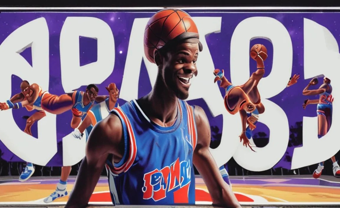
“Space Jam: A New Legacy” features a dynamic and custom-designed typeface for its title. This font is not a standard, off-the-shelf option you’d find in a typical font library. Instead, it was likely created by the film’s graphic design team to perfectly match the movie’s aesthetic. This aesthetic blends the nostalgic, beloved elements of the original 1996 film with the vibrant, digital, and sometimes chaotic energy of its 2021 sequel, all while incorporating elements of the Warner Bros. multiverse.
The key characteristics of this custom font include:
- Bold and Chunky: The letters are thick and substantial, giving a sense of power and presence.
- Slightly Distorted or Stretched: There’s often a subtle unevenness or widening in the letterforms, adding a touch of playfulness and dynamism. This makes it feel less static and more alive, perfectly fitting the Looney Tunes’ whimsical nature.
- Retro-Futuristic Vibe: It manages to feel both like it belongs in a classic cartoon and a modern digital world. Think of classic comic book lettering mixed with the glow and glitches of a videogame.
- Energetic and Playful: The overall impression is one of fun, action, and adventure, much like the Looney Tunes themselves.
- Often Used with Outline or Shadow Effects: In its movie usage, the font is frequently enhanced with outlines, gradients, or shadows to make it stand out against busy backgrounds and add depth.
Because it’s a custom design, you won’t be able to download the “Space Jam: A New Legacy” font directly. However, the good news is that its distinctive style is achievable with other fonts that share similar traits. Our goal is to help you find those perfect stand-ins!
Why Finding the “Space Jam: A New Legacy” Font is Tricky (and What to Do About It)

As mentioned, the primary reason the specific “Space Jam: A New Legacy” font is elusive is that it’s a proprietary design. Movie studios often commission custom lettering for their titles to ensure a unique brand identity that can’t be replicated easily. This exclusivity protects their visual assets and makes the title treatment instantly recognizable.
However, for graphic designers, students, bloggers, or anyone looking to capture that high-energy, playful vibe, this custom nature can be frustrating. You might be working on a sports-themed design, a retro revival project, or even a fan poster, and the “Space Jam” aesthetic is just what you’re after. The good news is that the design world thrives on inspiration! Many fonts share the core DNA of this custom typeface.
The Strategy: Emulation Over Replication
Instead of searching endlessly for the exact font, we’ll focus on finding fonts that emulate its key features. This means looking for typefaces that are:
- Bold and impactful
- Slightly off-kilter or dynamic
- Possessing a retro or somewhat nostalgic feel
- Suitable for display purposes (titles, headlines)
This approach not only helps you achieve a similar look but also expands your font toolkit with versatile options that can be useful for many other projects.
Key Font Categories to Consider
When searching for fonts that capture the spirit of the “Space Jam: A New Legacy” font, you’ll want to explore a few main categories. These categories represent different styles that share common characteristics with the movie’s title design.
1. Chunky Sans-Serifs
These are fonts without the little decorative strokes (serifs) at the ends of letters. When they are very thick and bold, they provide that impactful, solid feel seen in the movie’s title. Look for ones that might have a slightly rounded or softened edge, or a bit of width to them.
2. Display Fonts or Decorative Fonts
Display fonts are designed specifically for headlines and titles, where impact is more important than readability in long blocks of text. Many display fonts incorporate unique styling, distortion, or character that can mimic the playful and custom feel of the “Space Jam” font. This is where you’ll find fonts with a lot of personality.
3. Retro or Vintage-Inspired Fonts
The “Space Jam” aesthetic often taps into a sense of nostalgia. Fonts that are inspired by mid-20th-century signage, comic books, or vintage advertising can share that familiar yet exciting quality. These might have a slightly irregular baseline, unique letter shapes, or a generally “hand-drawn” feel, even if they are digitally produced.
4. Distorted or Experimental Fonts
Some fonts play with perspective, stretching, or other visual effects. While these need to be used carefully to maintain readability, they can sometimes capture the dynamic, slightly warped feel that adds so much character to the “Space Jam” title. Think of fonts that look like they’re bouncing or moving.
Top Font Alternatives for “Space Jam: A New Legacy” Style

Now for the exciting part! Finding great fonts that echo the style of the “Space Jam: A New Legacy” title font. We’ve curated a list of fantastic options, ranging from free to premium, that you can use to achieve a similar look and feel. Many of these are excellent for titles, logos, and other prominent design elements.
Free Font Options (Great for Budgets!)
These fonts can be downloaded and used for personal or commercial projects (always check specific licensing, usually found on the font download page). They offer a lot of bang for your buck, or in this case, no bucks at all!
- Impact: This is a classic. While a bit simpler, its extreme boldness and condensed nature can serve as a base for a similar feel, especially if you add effects. It’s widely available and often pre-installed on operating systems.
- Bebas Neue: Very popular for its clean, tall, and condensed style. While not distorted, its strong presence is undeniable. You can sometimes achieve a “wobbly” effect by slightly staggering letters or using a font editor.
- Luckiest Guy: This font from Google Fonts is a fantastic choice! It’s a bold, rounded, and slightly uneven sans-serif that screams retro comic book. It has a playful bounce to its baseline, which is very reminiscent of energetic titles.
- Lobster: While technically a script font, Lobster has a certain boldness and retro flair that can work for titles. It’s very dynamic and has a strong personality.
- Oswald: Another versatile option from Google Fonts, Oswald is a remake of an old “Alternate Gothic” font. It has a strong, condensed character that can be very impactful.
Premium Font Options (For That Extra Edge)
These fonts often offer more character, variety, and professional polish. While they come with a cost, they can be invaluable additions to a designer’s toolkit.
- ChunkFive: This slab serif font is a favorite for headlines. It has a strong, blocky feel with thick serifs, giving it a sturdy and retro vibe. It’s bold and has a slightly condensed feel.
- Archive: A geometric sans-serif with a lot of weight. Its clean lines and substantial presence make it a good base, and you can often find variations or distort it slightly for added flair.
- Arnold Schwarzenegger: This font is inspired by vintage movie posters and has a strong, retro, all-caps feel with a slightly distressed texture. It provides an authentic vintage effect.
- Superfunky: As the name suggests, this font aims for fun and vibrancy. It often features rounded edges and a playful design well-suited for energetic titles.
Where to Find These Fonts
Most free fonts can be found on platforms like Google Fonts, DaFont, or Adobe Fonts if you have a Creative Cloud subscription.
Premium fonts are typically available through marketplaces such as MyFonts, Fontspring, or directly from the foundries that create them.
Font Pairings: Complementing Your “Space Jam” Style Font
Choosing a standout font for your main title is only half the battle. Just like in “Space Jam,” where the vibrant characters interact with different backgrounds and elements, your chosen title font needs complementary fonts for body text, subtitles, or other details. These pairing fonts should enhance, not compete with, your main display font.
Body Text Font Principles for a “Space Jam” Vibe
For body text (the longer paragraphs of text), readability is key. You want a font that is clear and easy to read on screens and in print, even at smaller sizes. Here’s what to look for:
- Readability: Choose a font with clear letterforms and good spacing.
- Contrast: Select a font that offers a visual difference from your display font. If your display font is chunky and rounded, a cleaner, more classic sans-serif or a simple serif font can work well.
- Tone Alignment: While it shouldn’t shout, the body font should still feel appropriate for the energetic, fun, or slightly retro theme.
Recommended Font Pairings
Let’s say you’ve chosen “Luckiest Guy” for your title. Here are some ideas for body text fonts that would pair beautifully:
| Display Font (Example) | Recommended Pairing Font | Why it Works |
|---|---|---|
| Luckiest Guy (Bold, Playful) | Open Sans (Google Fonts) | A highly readable, neutral sans-serif that won’t clash. Its simplicity provides a clean contrast. |
| Luckiest Guy (Bold, Playful) | Lato (Google Fonts) | Similar to Open Sans, Lato is friendly and highly readable, offering a softer feel than some neutral sans-serifs. |
| ChunkFive (Bold, Slab Serif) | Merriweather (Google Fonts) | A classic serif font that’s great for reading on screens. Its slightly robust nature can hold up well against a strong slab serif title. |
| ChunkFive (Bold, Slab Serif) | Roboto (Google Fonts) | A modern sans-serif designed for readability across various media. It provides a clean, contemporary counterpoint to a vintage-style title. |
| Bebas Neue (Condensed, Bold) | Source Sans Pro (Google Fonts) | A straightforward, highly legible sans-serif that balances the tall, compressed nature of Bebas Neue. |
When pairing fonts, consider creating a hierarchy. Your main “Space Jam” style font will be the star, perhaps used for the movie title or main headings. Subheadings could use a slightly less bold version of your title font or a complementary sans-serif. And body text should always prioritize clarity and ease of reading.
Applying the “Space Jam” Font Style in Your Designs
Now that you have a better understanding of the style and some great font options, let’s talk about how to effectively use them in your actual design projects. It’s not just about picking the font; it’s about how you use it.
Tips for Using Bold Display Fonts
Bold, impactful fonts like those emulating the “Space Jam” title are best used strategically:
- For Titles and Headlines: This is their primary purpose. They grab attention immediately.
- As Accents: A short, punchy word or phrase can be highlighted with this style.
- In Logos: If your brand or project has a fun, energetic, or retro feel, this type of font can form the basis of a memorable logo.
- Avoid for Long Text: These fonts are generally difficult to read in paragraphs.
Leveraging Font Features and Effects
The “Space Jam: A New Legacy” title uses more than just the letter shapes. Think about adding visual flair:
- Outlines: A contrasting or complementary outline can make your text pop, especially against busy backgrounds. This is a signature look in many animated titles.
- Gradients: Adding color gradients can give your text a vibrant, modern, or even metallic feel.
- Shadows and Glows: Subtle drop shadows or outer glows can add depth and dimension.
- Distortion: If your design software allows, very minor, intentional stretching or warping can mimic the dynamic feel. Be careful not to overdo this!
- Layering: Combine different fonts or styles. Maybe a bold base with a decorative element on top.
Color Choices
The colors you use are just as important as the font. Think about:
- Vibrant Palettes: Bright blues, reds, yellows, and oranges often convey energy and fun.
- Contrasting Colors: Use colors that stand out from your background to ensure your bold font is legible.
- Metallic or Neon: These can add a futuristic or high-tech edge.
Where Inspiration Helps
Look at movie posters, comic book covers, and retro video game art for more ideas on how to use bold, energetic typography. Websites like Behance or Dribbble can also be goldmines for typographic inspiration and examples of how creative professionals use fonts.
FAQ: Your “Space Jam Font” Questions Answered
Got more questions about the “Space Jam: A New Legacy” font? We’ve got you covered!
Q1: Is the “Space Jam A New Legacy Font” available for download?
A1: No, the exact font used for the “Space Jam: A New Legacy” title treatment is a custom, proprietary design created for the movie and is not publicly available for download.
Q2: What style of font is the “Space Jam A New Legacy Font” most like?
A2: It’s a highly custom, bold, chunky, and somewhat distorted sans-serif that blends retro comic book lettering with a futuristic, digital feel. Think energetic display fonts.
Q3: Can I use free fonts to get a similar effect?
A3: Absolutely! Fonts like Google Fonts’ “Luckiest Guy” or “Bebas Neue” offer similar boldness and playful character that can be adapted with design effects to get close to the “Space Jam” look.
Q4: What makes a font look “retro-futuristic”?
A4: This style often combines elements from past popular aesthetics (like mid-century design or 80s/90s graphics) with elements of technology, digital interfaces, OR space exploration, creating a unique blend of old and new.
Q5: How do I make a font look more energetic for a title?
A5: Use bold weights, consider slight distortions (stretching, skewing), add outlines or vibrant colors, and ensure good spacing to give it impact. Choosing a font with inherent character or a bouncy baseline also helps.
Q6: Where can I find font marketplaces for premium options?
A6: Popular and reputable font marketplaces include MyFonts, Fontspring, Creative Market, and Adobe Fonts (if you have a Creative Cloud subscription).


