A serious font isn’t just about looking professional; it’s about conveying authority, trust, and focused intent. Choosing the right serious font can dramatically elevate your work, making it more credible and impactful by building an immediate connection with your audience through thoughtful typography.
Ever struggle to find that perfect font that just… clicks? You want your work to feel polished, professional, and taken seriously, but sometimes the fonts you love just don’t seem to say “authority.” It’s a common design dilemma! Picking the right typeface is like choosing your outfit for an important meeting – it sets the tone. Don’t worry, though! We’re going to explore how to choose fonts that project seriousness and elevate everything you create, from presentations to your website.
This isn’t about boring text. It’s a creative superpower! We’ll break down what makes a font “serious,” explore different types, and give you practical tips to make smarter font choices. Get ready to give your projects a serious upgrade!
What Makes a Font “Serious”?
When we talk about a “serious” font, we’re not saying it has to be gloomy or overly formal. Instead, it implies a sense of:
- Gravitas: It carries weight and importance.
- Credibility: It builds trust and reliability.
- Clarity: It’s easy to read and understand, allowing the message to take center stage.
- Professionalism: It suggests competence and attention to detail.
- Intent: It effectively communicates focus and purpose.
Think about the fonts you see in established institutions, academic papers, or official documents. They usually have certain characteristics that contribute to this feeling. These fonts often prioritize readability without sacrificing style, and they communicate a certain level of maturity and thought.
The Pillars of Serious Typography: Serif vs. Sans Serif
The foundation of serious typography largely rests on two main categories: Serif and Sans Serif fonts. Understanding their core differences is key to making informed decisions.
Serif Fonts: The Traditional Authority
Serif fonts are characterized by the small decorative strokes, or “serifs,” at the end of the main strokes of letters. Think of the little feet on an “S” or “T.” These fonts have a long history and are often associated with tradition, stability, and elegance.
Why Serifs Feel Serious:
- Historical Roots: They evolved from ancient Roman inscriptions, giving them a timeless quality.
- Readability in Print: The serifs are believed to help guide the eye across longer blocks of text, making them excellent for books, newspapers, and lengthy documents. This focus on readability contributes to their perceived seriousness.
- Established Feel: They convey a sense of history and authority, often found in printed media like academic journals or classic literature.
Popular Serif Fonts for a Serious Tone:
- Garamond: Elegant, classic, and widely used in book publishing. Its balanced proportions lend themselves to readability and sophistication.
- Times New Roman: A very familiar and ubiquitous serif font, instantly recognizable for its formal and authoritative presence.
- Georgia: Designed for screen readability, Georgia offers a friendly yet serious feel, making it versatile for both print and digital.
- Merriweather: A popular choice for its slightly wider proportions and robust feel, readable on screens and offering a strong, traditional presence.
- Palatino: Known for its grace and well-defined serifs, Palatino adds a touch of refined authority.
Sans Serif Fonts: Modern Clarity
Sans serif fonts, as the name suggests (“sans” meaning “without”), lack these serifs. They feature clean lines and uniform stroke widths, giving them a modern, minimalist, and straightforward appearance.
Why Sans Serifs Feel Serious:
- Modernity: They often feel contemporary and forward-thinking.
- Clarity and Directness: Their clean appearance makes them highly readable, especially on digital screens, and conveys a sense of directness and efficiency.
- Versatility: They perform extremely well in headings, captions, and user interfaces where quick comprehension is crucial.
Popular Sans Serif Fonts for a Serious Tone:
- Open Sans: A highly legible and friendly sans serif, favored for its neutrality and excellent readability across various sizes and contexts.
- Lato: Known for its semi-rounded details, Lato feels warm yet stable, making it a strong choice for professional branding.
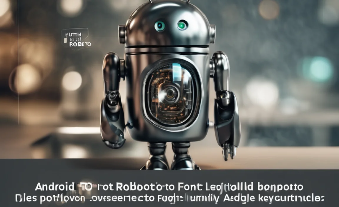
- Roboto: Developed by Google, Roboto is designed for optimal legibility on screens, balancing mechanical structure with friendly, open curves.
- Montserrat: Inspired by old posters from the Montserrat neighborhood of Buenos Aires, it has a geometric structure and a strong, modern character.
- Source Sans Pro: Adobe’s open-source sans serif, designed for excellent readability and a clean, professional look.
Beyond Serif and Sans Serif: Display and Script Fonts (Use with Caution!)
While serif and sans serif fonts form the backbone of serious typography, other categories exist. However, they require more careful consideration when aiming for a truly serious and impactful message.
Display Fonts: For Impact, Not Bulk
Display fonts are designed to grab attention. They often have distinctive shapes, unique styling, or bold characteristics. They are best used sparingly for titles, headlines, or short impactful statements where you want to make a strong visual impression.
When to Use Display Fonts for Seriousness:
- High-Impact Headlines: For a conference title, a section heading that needs to stand out, or a key takeaway.
- Brand Identity: A uniquely crafted display font can be the signature of a brand that wants to be memorable and distinctive.
- Supporting Role: They can add personality when paired with a more neutral, serious font.
Caution: Overusing display fonts or choosing ones with overly quirky or decorative elements can undermine a serious tone. Stick to those with clean, bold structures or sophisticated designs.
Script Fonts: Delicate or Dramatic – Handle with Care
Script fonts mimic handwriting, ranging from elegant calligraphy to casual handwritten notes. They can add a personal, artistic, or luxurious touch.
When to Use Script Fonts for Seriousness (Rarely):
- Founders’ Names/Signatures: For a touch of personal legacy.
- Luxury Branding: To convey exclusivity and high-end craftsmanship.
- Accents on Formal Invitations: For titles like “You are invited…”
Caution: Most script fonts are not suitable for conveying seriousness. They can appear too casual, whimsical, or difficult to read. If you must use one, choose a style that is clear, well-formed, and closely resembles formal calligraphy.
Key Characteristics of a “Serious” Font
Regardless of serif or sans serif, certain qualities make a font feel more substantial and trustworthy.
- Legibility: This is paramount. A serious font must be easy to read at all sizes. This means clear letterforms, good spacing, and distinct shapes.
- Neutrality: While fonts have personality, overtly playful or quirky fonts rarely convey seriousness. Neutrality allows your message to shine without distraction.
- Balanced Proportions: Letters should feel well-formed and harmoniously sized relative to each other.
- Consistent Stroke Weight: While some variation is fine, extreme contrasts or irregular stroke thickness can sometimes detract from a solid, serious feel.
- Open Forms: Letters with open counters (the enclosed or partially enclosed negative space in characters like ‘o’, ‘a’, ‘e’) and clear apertures (the opening in characters like ‘c’, ‘s’) improve legibility.
Choosing Your Serious Font: A Step-by-Step Guide
Ready to pick the perfect serious font? Follow these steps:
- Define Your Purpose: What is the main goal of your work? Is it to inform, persuade, instruct, or analyze? The purpose will guide your font choice. For a technical report, you’ll lean towards extreme clarity. For a company profile, a blend of authority and approachability might be best.
- Consider Your Audience: Who are you trying to reach? What are their expectations? A font that appeals to academics might differ from one that appeals to potential clients.
- Where Will It Be Used?
- Print? Consider fonts with good readability for long texts (like classic serifs).
- Web/Screen? Prioritize fonts designed for digital clarity (many sans serifs excel here).
- Headings vs. Body Text?
- Select a Primary Font: Choose one font that best embodies the serious tone you need. This will likely be a well-established serif or sans serif.
- Consider a Secondary Font (Optional): If you need variety or want to create visual hierarchy, select a complementary font. This could be:
- A serif for body text paired with a sans serif for headings (or vice versa).
- A more distinct font for a key element, balanced by a very neutral font elsewhere.
Tip: Look for fonts that share a similar x-height (the height of lowercase letters like ‘x’) or overall character width for better harmony.
- Test for Readability: Type out a few sentences in your chosen font(s). Does it look good in smaller sizes? Is it comfortable to read for more than a few seconds? Does it feel cluttered or airy?
- Align with Your Brand/Message: Does the font feel consistent with your overall brand identity or the message you’re trying to convey? A playful startup might not want the sternest serif, while a law firm would shy away from a bubbly script.
Font Pairing: Creating Harmony and Hierarchy
Pairing fonts is an art. When aiming for a serious tone, the goal is usually to create clear hierarchy and readability, not to make the fonts compete.
A common and effective strategy for serious work is to pair a serif with a sans serif. This contrast creates visual interest while maintaining balance.
| Primary Font (e.g., Headlines) | Secondary Font (e.g., Body Text) | Why It Works for Seriousness |
|---|---|---|
| Open Sans (Sans Serif) | Garamond (Serif) | Modern clarity in headlines, traditional readability in text. Creates a strong, trustworthy contrast. |
| Merriweather (Serif) | Lato (Sans Serif) | A robust, classic headline font paired with a clean, approachable sans for digestible content. |
| Montserrat (Sans Serif) | Georgia (Serif) | Bold, geometric headline font that anchors the text, while Georgia ensures comfortable reading for longer passages. |
| Roboto Slab (Slab Serif) | Source Sans Pro (Sans Serif) | A strong, slightly more condensed slab serif for impactful titles, paired with a highly legible, neutral sans serif for body copy. Slab serifs can feel very grounded and authoritative. |
Pro-Tip: When pairing, ensure your fonts share a common characteristic, like a similar x-height or stroke contrast, or at least complement each other in weight and style. Tools like Google Fonts’ Font Pair finder can be incredibly helpful for discovering compatible pairs.
Readability on Screen: A Modern Imperative
In today’s digital world, how your text appears on a screen is crucial. A font can look fantastic in print but struggle online. For serious work, screen readability equals credibility.
Fortunately, many modern fonts, especially sans serifs, are optimized for digital display. Key features to look for include:
- Higher x-heights: This makes lowercase letters appear larger and more distinct.
- Open apertures: The openings in letters like ‘c’ or ‘s’ are clearer.
- Well-defined letterforms: No confusing parallels between ‘i’ and ‘l’ or ‘0’ and ‘O’.
- Clear differentiation between similar characters: For example, the ‘I’ (capital i), ‘l’ (lowercase L), and ‘1’ (digit one).
Fonts like Roboto, Open Sans, Inter, and Montserrat are excellent examples of typefaces designed with screen readability as a priority. They maintain a serious, professional look while ensuring your audience can consume your content without strain.
For more on ensuring accessibility and readability online, the Web Content Accessibility Guidelines (WCAG) from the World Wide Web Consortium (W3C) offer invaluable guidance on best practices for web design, including typography.
When “Serious” Becomes “Solemn” or “Sterile”
It’s easy to go too far when aiming for seriousness. If your font choices feel:
- Too light or thin: Can make text feel weak.
- Too condensed or compressed: Might feel cramped and hard to read.
- Overly decorative or ornamented: Can distract from the message.
- Unfamiliar or avant-garde: May alienate your audience or cause confusion.
These can undermine the very seriousness you’re trying to project, making your work seem either overly academic, cold, or frankly, a bit gloomy. The goal is impact and trust, not to put your audience to sleep or make them feel intimidated by the design itself.
The sweet spot is a font that is clear, robust, and conveys competence without being dull. It should feel like a reliable tool that supports, rather than overshadows, your content.
Practical Applications: Elevating Different Projects
Let’s see how choosing a serious font can transform various creative endeavors.
For Bloggers and Content Creators
Your blog is your voice. A serious font makes your content more trustworthy. It signals that you’ve put thought into your presentation and that your message is worth reading and believing.
- Use: A clear sans serif like Lato for body text and a robust serif like Merriweather for headings, or vice-versa.
- Elevates: Articles, thought leadership pieces, tutorials, and reports.
For Business Owners and Branding
Your brand’s typography is a silent ambassador. A serious font builds a perception of stability, professionalism, and reliability, which is crucial for attracting and retaining clients.
- Use: A classic serif for formal communications (e.g., contracts) and a clean, modern sans serif for marketing materials and websites. Consider a unique sans serif for your logo to balance originality with authority.
- Elevates: Websites, brochures, business cards, proposals, and presentations.
For Students and Academic Work
Instructors often judge submissions not just on content but on presentation. A formal, serious font shows you’ve approached your work with scholarly diligence.
- Use: Universally accepted serifs like Garamond or Times New Roman for essays, and a clear sans serif like Arial or Calibri for footnotes or supplemental materials.
- Elevates: Research papers, theses, dissertations, and academic posters.
For Designers and Creative Professionals
Even in creative fields, seriousness can mean demonstrating a strong command of craft and an understanding of visual communication principles. A well-chosen serious font shows sophistication.
- Use: A sophisticated serif like EB Garamond for portfolio websites or design briefs, complemented by a geometric sans serif like Montserrat for project details.
- Elevates: Portfolios, case studies, design proposals, and brand guidelines.
Where to Find Serious Fonts
You don’t need to be a design guru to find excellent fonts. Here are reliable sources:
- Google Fonts: An enormous library of free, high-quality, open-source fonts. You can filter by category (serif, sans serif) and preview them instantly.
- Adobe Fonts: Included with most Creative Cloud subscriptions, offering a vast collection of premium fonts.
- Font Squirrel: A Curated selection of free fonts for commercial use, perfect for finding professional-grade typefaces. They also offer font identifiers.
- MyFonts / FontShop: For commercial fonts, these sites offer extensive libraries and often have sales, but require licensing fees.
When browsing, look at the font families. A well-designed font family will have multiple weights (light, regular, bold, italic) which are essential for creating hierarchy within your serious design.
Frequently Asked Questions (FAQ)
What’s the easiest way to choose a serious font?
Start by picking a well-