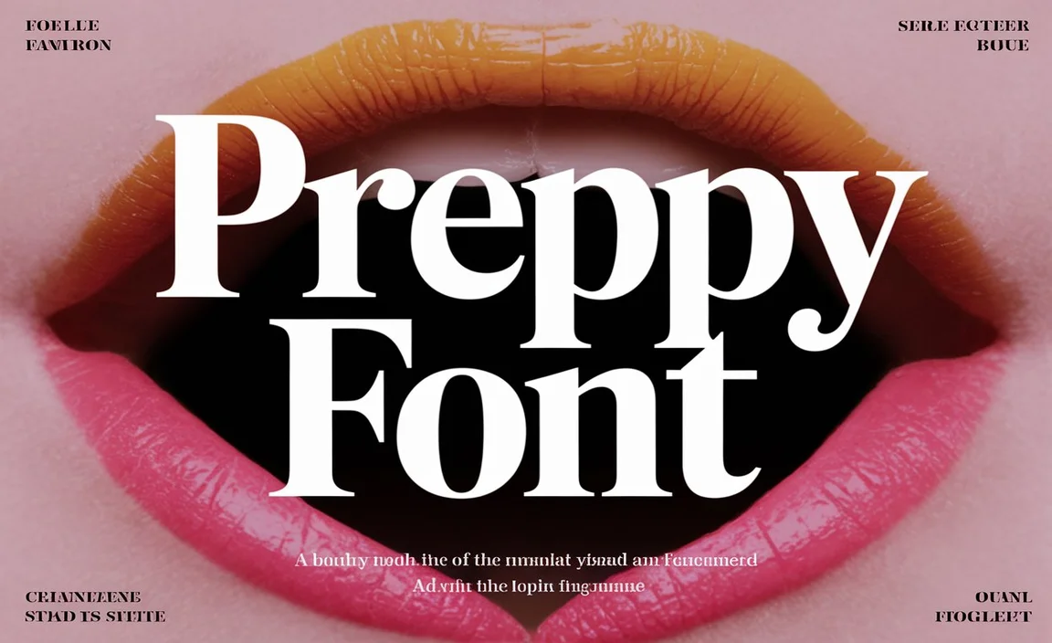
Typography plays a crucial role in the aesthetic of any project. For any venture, the right font elevates it to a whole new level. One such font that has gained significant recognition for its whimsical charm and captivating style is the Peter Pan font. This font, designed by Arthur Baker, carries a distinct blend of elegance and playfulness that brings the magic of J.M. Barrie’s Peter Pan to life in any project.
Let’s explore the details of the Peter Pan font& how you can incorporate it into your designs.
An Overview Of The Peter Pan Font
The Peter Pan font is inspired by the timeless story of Peter Pan, a young boy who never grows up and ventures to Neverland. Arthur Baker created the font to embody the wonder and imagination of Barrie’s world. It maintains a sense of timeless sophistication. This typeface is most commonly associated with the classic film adaptation of Peter Pan. It prominently features on the movie’s promotional materials, including the logo.
Font Family & Styles
The Peter Pan font belongs to the Baker Signet family. Designed by Arthur Baker, this font combines vintage elegance with subtle, whimsical elements that capture the spirit of adventure and childlike wonder. While the primary style is serif, it can also be used in bold or regular weights for different design effects.
In addition to the standard Baker Signet font, the Peter Pan font offers several variations that you can explore, including styles like Gothic, Curly, and Decorative. These styles allow for a range of visual effects, from classic looks to more modern, cartoon-inspired themes that evoke a sense of fun and imagination.
The Typography Behind The Peter Pan Font

The Peter Pan font combines several features that make it unique and visually appealing. The font has a vintage feel, thanks to its use of classic letterforms, yet its playful curves and flourishes add a decorative touch that ties perfectly with its inspiration from Barrie’s enchanting world.
Some key aspects of the font’s design include:
- Curly Elements: The font often incorporates curvy lines and loops that evoke the feel of handwriting. These curves also give the text a Celtic and sometimes Arabic touch, depending on the style, contributing to its versatile nature.
- Elegant Serifs: The serifs are not too sharp, giving it a softer, more approachable aesthetic. This makes it perfect for conveying themes of imagination and wonder.
- Gothic Influence: Some variations of the font incorporate Gothic elements, adding a hint of drama and mystery, which is ideal for projects that want to evoke an emotional response from readers.
How to Use the Peter Pan Font

The Peter Pan font is incredibly versatile and can be used in a variety of projects to achieve different effects. Below, we explore some great ways to incorporate the font into your designs.
1. Logo Design
Using the Peter Pan font in a logo design is a fantastic way to create a unique, memorable visual identity. Its whimsical and elegant style makes it perfect for companies in the entertainment industry, particularly those targeting children or young adults. The font’s curves and flourishes will add personality and charm to any logo, making it stand out from the competition.
2. Children’s Books
Given its ties to the Peter Pan story, the font naturally works well in children’s books and other related media. The font’s decorative and cartoon influences make it appealing to younger audiences, while the elegant serif design gives it a timeless quality that resonates with adults too.
3. Event Invitations and Greeting Cards
For events that require a magical or vintage atmosphere—such as birthday parties, Easter celebrations, or holiday events—the Peter Pan font provides the perfect balance of fun and sophistication. Whether it’s for a vintage wedding or a children’s themed party, this font adds a unique flair to the text.
4. Web and App Design
For web and app design, Peter Pan font can be used to evoke a sense of creativity, fantasy, or nostalgia. While the font can add a whimsical vibe to the user interface, it’s important to ensure that it remains legible at different sizes.
5. Marketing Materials
The Peter Pan font works well for promotional materials, especially when paired with a complementary vintage or modern design. It’s perfect for websites, flyers, brochures, and ads targeting parents or children’s products, services, and experiences.
6. Personal Projects
If you’re working on a personal design project—such as scrapbooking, journaling, or creating unique gifts—the Peter Pan font provides an elegant yet playful style that adds a personal touch.
Pairing the Peter Pan Font
When pairing the Peter Pan font with other typefaces, it’s important to maintain balance. Here are some great pairing options:
- Sans-Serif Fonts: Pairing Peter Pan with a clean, simple sans-serif font, such as Arial or Helvetica, can provide contrast and make the decorative elements of the Peter Pan font stand out.
- Serif Fonts: If you prefer a more cohesive look, pair Peter Pan with a complementary serif font, like Georgia or Merryweather, for a sophisticated and timeless style.
- Script Fonts: For a more whimsical or hand-crafted feel, pair Peter Pan with script fonts like Pacifico or Dancing Script.
Pros and Cons of the Peter Pan Font
Pros:
- Unique and Playful: Its decorative nature adds charm and fun to any design.
- Versatile Styles: The different styles (like Gothic, Curly, and Decorative) offer flexibility for various projects.
- Timeless Appeal: The font blends vintage and whimsical design, making it ideal for both contemporary and classic themes.
- Ideal for Children’s Projects: Its cartoon influences make it perfect for projects aimed at a younger audience.
Cons:
- Difficult to read when used at smaller sizes.
- Limited Professional Use
- Not Ideal for Large Blocks of Text
Where to Get the Peter Pan Font
The Peter Pan font and its variations are available for download from various font platforms. You can find the Baker Signet font on popular font websites, with licensing options for both personal and commercial use.
Conclusion
The Peter Pan font is a typeface that beautifully captures the spirit of adventure, wonder, and timeless charm. Whether you’re working on a vintage-inspired logo, designing for children, or creating whimsical invitations, the Peter Pan font adds an elegant yet playful element to your designs. By pairing it thoughtfully with other fonts and using it for the right project, you can create stunning visual experiences that captivate your audience.
FAQs
Can I Use The Peter Pan Font For Commercial Purposes?
Yes, the Peter Pan font is available for commercial use, but you will need to check the licensing details for any specific restrictions.
Is The Peter Pan Font Good For Large Blocks Of Text?
The Peter Pan font is best used for headlines or shorter text. Its ornate design may affect legibility in long paragraphs.
What Are The Different Formats Available For The Peter Pan Font?
The Peter Pan font is typically available in OTF (OpenType) and TTF (TrueType) formats, making it compatible with most design software and applications.
What Are The Best Tools For Pairing The Peter Pan Font With Other Fonts?
Tools like FontPair, Google Fonts, and Adobe Fonts offer great suggestions for pairing fonts, helping to create balanced and visually appealing combinations.
What Are The Best Practices For Typography Using The Peter Pan Font?
Limit its use to headlines or short phrases, avoid using small sizes, pair it with simple fonts for contrast, and maintain legibility with appropriate spacing.
What Are The Best Color Combinations For The Peter Pan Font?
Pair it with rich, contrasting colors like deep navy, forest green, or vintage gold to highlight its whimsical yet sophisticated aesthetic.
How To Create A Vintage Look With The Peter Pan Font?
Use warm, earthy tones, combine with textured backgrounds, and pair with complementary serif fonts like Georgia for a vintage and classic feel.
What Are The Recommended Font Sizes For The Peter Pan Font?
For headlines, use larger sizes (36pt or higher), and for subheadings or shorter text, consider 18-24pt to maintain readability while preserving the font’s charm.