Monday Font By Fenotype is a versatile, friendly sans-serif typeface perfect for bringing warmth and readability to a wide range of design projects, from branding and web design to editorial layouts and social media graphics. Its approachable style makes it an essential choice for designers seeking both personality and clarity.
Choosing the right font can feel like a puzzle, can’t it? You want something that looks great, is easy to read, and perfectly captures the feeling you want to share. Sometimes, the sheer number of options is overwhelming! But what if there was a font that felt both modern and welcoming, a true all-rounder? That’s where the Monday font family by Fenotype comes in. It’s designed to make your design life just a little bit easier and a lot more stylish. Let’s explore how this fantastic typeface can elevate your next project.
Discovering Monday Font By Fenotype: A Designer’s Delight
When exploring typography, you’ll often encounter fonts that lean heavily one way or another – super formal, or maybe a bit too quirky. The Monday font, crafted by Emmerine van der Poel of Fenotype, strikes a delightful balance. It’s a sans-serif typeface, meaning it doesn’t have the little decorative strokes (serifs) at the ends of its letters. This gives it a clean, contemporary feel. However, Monday isn’t cold or sterile. It has a distinct personality that’s approachable, warm, and incredibly versatile.
Think of it as the font equivalent of a friendly conversation. It’s clear and easy to understand, but it also has a touch of charm that makes you want to keep reading. This makes it an excellent choice for designers who want their message to connect with their audience on a more personal level, without sacrificing professionalism or readability.
The Design Philosophy Behind Monday
Fenotype, known for its distinctive and often personable typefaces, created Monday with a clear vision: to offer a font that excels in both digital and print applications. The design emphasizes:
- Legibility: Every character is carefully formed to be easily recognizable, even at small sizes or on low-resolution screens. This is crucial for website content, mobile apps, and any design where clarity is paramount.
- Warmth and Friendliness: Unlike some rigid sans-serifs, Monday incorporates subtle curves and a generous x-height (the height of lowercase letters like ‘x’) that make it feel more inviting.
- Versatility: With multiple weights and styles, Monday can adapt to many different design needs – from bold headlines that grab attention to light body text that’s a pleasure to read.
This thoughtful approach means the Monday font doesn’t just look good; it performs beautifully, serving your design’s purpose effectively. It’s a testament to why understanding a font’s design intent can be so helpful when choosing one.
Why Monday Font is an Essential Design Tool
In the world of design, having a go-to font is like having a trusty tool in your workshop. Monday Font By Fenotype earns its spot in many designers’ arsenals for several key reasons. It bridges the gap between functional and expressive, making it suitable for a vast array of applications.
Versatility Across Design Needs
Monday isn’t a one-trick pony. Its design adapts beautifully whether you’re crafting a bold brand identity, a functional app interface, or an engaging blog post. Here’s where it shines:
- Branding & Logos: Its friendly yet professional tone makes it perfect for logos and brand messaging that needs to feel approachable and trustworthy.
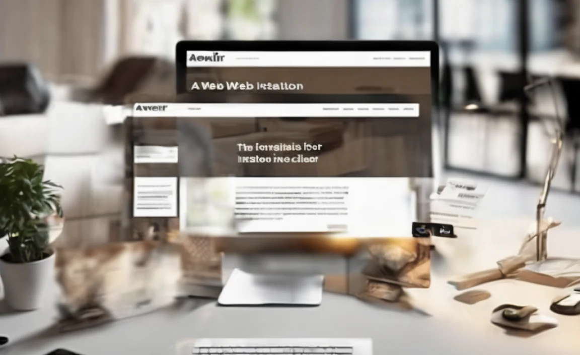
- Web Design: For websites, readability is king. Monday’s clear letterforms ensure that your text is easy to scan and digest, improving user experience.
- Editorial Design: Whether it’s a magazine layout, a book, or a brochure, Monday can handle everything from catchy headlines to comfortable body copy.
- UI/UX Design: In user interfaces, consistency and clarity are vital. Monday’s clean lines and distinct characters help create intuitive and user-friendly designs.
- Social Media Graphics: For eye-catching social posts, Monday offers a contemporary feel that draws attention without being overly distracting.
The Power of Multiple Weights and Styles
A font family that offers various weights (like Light, Regular, Medium, Bold, Black) and styles (like Italic) provides incredible flexibility. Monday is no exception. This means you can create visual hierarchy and express different tones within the same project, all while maintaining a cohesive typographic voice.
For instance, you can use a bold weight for a striking headline, a regular weight for body text, and an italic for emphasis. This variation keeps your design dynamic and guides the reader’s eye effectively. This is a fundamental principle in graphic design, and a font family like Monday makes it easy to implement.
Readability and Accessibility
In today’s digital-first world, readability isn’t just a preference; it’s a necessity. Accessibility standards, such as those outlined by the Web Content Accessibility Guidelines (WCAG), emphasize that content should be perceivable, operable, understandable, and robust. Typography plays a huge role in making content understandable.
Monday’s design prioritizes clear letter distinction and generous spacing, which aids readability for all users, including those with visual impairments or cognitive differences. This focus on clarity ensures that your message is communicated effectively and inclusively.
Exploring Monday Font’s Characteristics
Let’s take a closer look at what makes Monday’s design so effective. Understanding these elements can help you appreciate why it works so well and how to best utilize it in your designs.
Letterform Details
While Monday is a sans-serif, it avoids being overly geometric or strictly minimalist. It has a humanist touch, with subtly open counters (the enclosed or partially enclosed negative space in letters like ‘o’ or ‘e’) and slightly rounded terminals, giving it a softer, more organic feel. This makes it less rigid than some technical sans-serifs.
Key characteristics include:
- Open Apertures: Letters like ‘c’, ‘e’, and ‘s’ have openings that are relatively wide, which improves character recognition and reduces the chance of letters blurring together, especially at small sizes.
- Friendly Curves: Subtle, smooth curves prevent the font from feeling too sharp or geometric, adding a layer of warmth.
- Generous X-Height: A taller x-height means the lowercase letters are large relative to the uppercase letters. This generally leads to better readability for body text, as the main reading characters are more prominent.
The Typographic Spectrum: Where Monday Fits
Fonts can be broadly categorized. Understanding where Monday fits helps in pairing it effectively:
- Sans-Serif: As mentioned, Monday belongs to this large and popular category. Sans-serifs are generally seen as modern, clean, and approachable.
- Grotesque/Gothic vs. Humanist Sans-Serifs: Grotesque sans-serifs (like Helvetica) are often more neutral and geometric. Humanist sans-serifs (like Frutiger or Monday) draw inspiration from handwriting and have more variation in stroke width and open forms. Monday leans towards the warmer, more humanist side of sans-serifs.
This positioning means Monday pairs well with a variety of other fonts. It can stand on its own as a versatile workhorse or complement more decorative or traditional typefaces.
Practical Applications: How to Use Monday Font
Knowing what a font is, is one thing. Knowing how to use it effectively is where the magic happens. Here are some practical tips and examples for incorporating Monday Font By Fenotype into your designs.
Pairing Monday with Other Fonts
A great design often uses a combination of fonts to create contrast and hierarchy. Monday’s friendly nature makes it surprisingly easy to pair:
- With Serifs: For a classic yet modern feel, pair Monday with a well-chosen serif font. The contrast between sans-serif and serif is a timeless combination. A more traditional serif like Merriweather or a more contemporary serif can create a beautiful balance. Use Monday for headings and the serif for body text, or vice versa, depending on the desired emphasis.
- With Display Fonts: If you have a more decorative or artistic display font for a specific headline or accent, Monday is an excellent choice for the supporting text. It provides a stable, readable foundation that lets the more expressive font shine without clashing.
- Within the Monday Family: Simply using different weights and italics from the Monday family is a very effective way to create hierarchy and visual interest. Heavy for a main title, regular for subheadings, and light for body text is a simple but powerful strategy.
Designing for Different Media
Web Design:
- Body Text: Use Regular or Medium weights for paragraphs. Ensure text size is at least 16px for comfortable reading on most screens.
- Headlines: Bold or Black weights work excellently for main titles. Consider using a slightly larger x-height variant if available to maximize impact.
- Navigation & UI Elements: Light or Regular weights are usually best for menus, buttons, and labels to keep interfaces clean.
Print Design:
- Brochures & Flyers: Monday is great for headlines and subheadings, offering a friendly, direct tone. Its readability also makes it suitable for smaller chunks of body copy.
- Business Cards: A well-chosen weight of Monday can convey professionalism and approachability for your brand on a business card.
- Editorial Layouts: Use multiple weights to guide the reader through articles, from prominent feature titles to introductory paragraphs and smaller captions.
Creating Visual Hierarchy
Visual hierarchy is how you arrange elements to show their order of importance. Typography is a key tool for this. With Monday, you can achieve this by varying:
- Weight: Using heavier weights for more important text (like main titles) and lighter weights for less important text (like body copy).
- Size: Larger font sizes naturally draw more attention.
- Style: Italics can be used for emphasis or for specific types of content like quotes.
- Color: While not a font characteristic itself, color is often used in conjunction with font choices to distinguish different text elements.
For example, a website’s main title might be Monday Black, the section heading Monday Bold, and the body text Monday Regular. This simple system makes the page structure instantly understandable.
Monday Font vs. Other Popular Sans-Serifs
It’s helpful to see how Monday compares to other commonly used fonts. This isn’t to say one is definitively better, but rather to understand their unique strengths.
| Font Family | Primary Classification | Key Characteristics | Best For |
|---|---|---|---|
| Monday (Fenotype) | Humanist Sans-Serif | Warm, friendly, highly readable, versatile weights, open apertures. | Branding, web design, UI/UX, editorial, blogs. |
| Helvetica | Neo-Grotesque Sans-Serif | Neutral, objective, highly legible, geometric structure, wide usage. | Corporate branding, signage, informational design, where neutrality is key. |
| Open Sans | Humanist Sans-Serif | Optimized for web, friendly, highly legible across devices, neutral yet approachable. | Websites, mobile apps, user interfaces, general purpose. |
| Montserrat | Geometric Sans-Serif | Inspired by old posters, modern, clean, distinct geometric shapes, strong personality. | Headlines, branding, display text, websites aiming for a bold, contemporary look. |
| Proxima Nova | Humanist Sans-Serif | Hybrid feel (geometric meets humanist), clean, versatile, very popular in web design. | Websites, apps, branding, editorial – a modern workhorse. |
As you can see, Monday often finds itself in good company with fonts like Open Sans and Proxima Nova, appreciated for their balance of clarity and personality. However, Monday often has a unique warmth that sets it apart, making it a preferred choice when a touch of friendliness is desired alongside professional clarity.
Where to Find and Use Monday Font
Acquiring and using high-quality fonts is essential for professional design. Fortunately, accessing fonts like Monday by Fenotype is straightforward.
Licensing and Purchase
Fonts are digital assets, and like most assets, they require licensing for use. Fenotype offers its typefaces for purchase directly through their website or through various reputable font marketplaces.
To find and license Monday Font:
- Fenotype Official Website: This is the direct source and often offers the full range of weights and styles. Check fenotype.co for availability.
- Font Marketplaces: You can also find Fenotype fonts on popular platforms like MyFonts, Fontspring, or Adobe Fonts (if it’s part of their library). Always check the specific license terms for web, app, or desktop use.
Different licenses exist for different uses. Desktop licenses are for installing the font on your computer to use in design software. Web licenses (often priced per pageview or monthly) allow you to use the font on your website. App licenses are for embedding in mobile applications.
Getting Started: Simple Implementation
Once you have the font files and the appropriate license, implementation is usually simple:
- Desktop Use: Install the font files (.otf or .ttf format) onto your operating system (Windows or macOS). They will then appear in your design applications like Adobe Photoshop, Illustrator, InDesign, or even word processors.
- Web Use: For websites, you’ll typically use CSS `@font-face` rules to load the font files from your server or use a service like Google Fonts (if available) or Adobe Fonts. This ensures consistent display across different browsers. Most font marketplaces provide code snippets to help you implement this.
Tips for Maximizing Monday’s Potential
- Experiment with Weights: Don’t stick to just one weight. Play with the spectrum from Light to Black to create dynamic designs.
- Track and Kerning: For headlines or specific titles, slight adjustments to tracking (overall letter spacing) and kerning (space between specific pairs of letters) can make a big difference in visual appeal. Many design programs allow this.
- Context is Key: Always consider the overall project and audience. Monday is friendly, but might not be the best choice for a highly formal legal document or a starkly minimalist art exhibition poster.
Frequently Asked Questions About Monday Font By Fenotype
What kind of font is Monday by Fenotype?
Monday by Fenotype is a sans-serif typeface. It’s characterized by its friendly, warm, and highly readable design, often leaning towards the humanist style with open apertures and subtle curves.
Is Monday Font suitable for body text?
Yes, Monday Font is excellent for body text, especially in digital applications. Its high readability, clear letterforms, and open counters ensure that paragraphs are comfortable to read, even at smaller sizes.
Can I use Monday Font for branding?
Absolutely. Its approachable yet professional demeanor makes it a fantastic choice for logos and brand identities that aim to convey warmth, trustworthiness, and modern appeal.
How does Monday Font compare to Helvetica?
Helvetica is a neo-grotesque sans-serif known for its neutrality and geometric structure. Monday, as a humanist sans-serif, offers more warmth and a friendlier personality due to its subtly softer letterforms and open apertures, making it feel less rigid.
Where can I buy a license for Monday Font?
You can typically purchase licenses for Monday Font directly from the Fenotype website (fenotype.co) or through authorized font marketplaces like MyFonts or Fontspring.
Does Monday Font come with different weights?
Yes, the Monday font family usually offers a range of weights, from light to bold and sometimes heavier variations, as well as italic styles, providing great flexibility for design hierarchy.
Is Monday Font free or paid?
Monday Font by Fenotype is a premium typeface and requires a paid license for use. While some fonts are free, high-quality, professionally designed typefaces like these are typically sold to support the designers and foundries.
Conclusion: Embrace the Clarity and Charm of Monday Font
In the dynamic world of design, the quest for the perfect typeface is ongoing. Fonts are more than just letters; they are carriers of tone, style, and meaning. Monday Font By Fenotype