
The Justice World Tour Font is a bold, angular sans-serif typeface, reminiscent of industrial or stencil lettering, designed to convey energy and impact. Finding exact matches or similar, accessible fonts is key for replicating its powerful aesthetic.
Hello, design enthusiasts! Have you ever seen a tour poster or album art and thought, “Wow, that font is amazing!”? Sometimes, it’s the typography that truly elevates a design from ordinary to extraordinary. The Justice World Tour art captured attention with its distinct and powerful font. If you’re curious about what makes it tick or want to achieve a similar vibe in your own projects, you’re in the right place! It can be tricky when you love a specific font but don’t know its name or where to find it. Don’t worry, we’ll break it down together. This guide will help you understand the Justice World Tour font and find great alternatives, making your design journey much smoother!
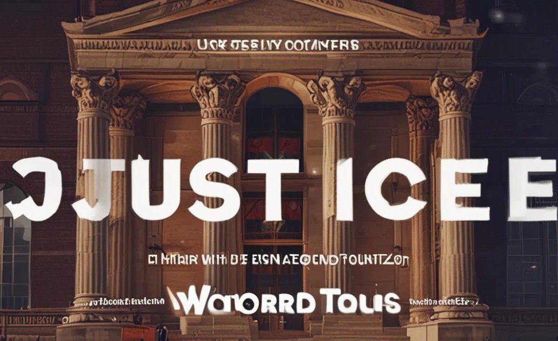
Understanding the “Justice World Tour Font” Aesthetic

When we talk about the “Justice World Tour Font,” we’re referring to the distinct typographic style seen across much of Justice’s visual material, especially during their world tours and album campaigns. This isn’t typically a single, commercially available font but rather a curated look that combines specific characteristics. The overall impression is one of bold, raw, and impactful energy, often with a gritty or industrial feel.
Key characteristics often associated with this style include:
- Boldness: The letters are thick and substantial, demanding attention.
- Angularity: Sharp edges and straight lines are prevalent, giving a sense of precision and force.
- Geometric Influence: Many characters have a uniform, almost constructed feel, derived from basic geometric shapes.
- Industrial/Stencil Feel: There’s often an allusion to stenciled lettering, perhaps with slight imperfections or a utilitarian appearance.
- Monochromatic Palette: While not a font characteristic itself, the frequent use of black and white in Justice’s branding further accentuates the font’s visual weight and starkness.
This aesthetic choice perfectly complements Justice’s electronic music style, which often features powerful beats, distorted sounds, and a strong, sometimes confrontational, presence. It visually communicates urgency, power, and a no-nonsense attitude.
The Hunt for the Exact Font: Is There One?

For many designers and fans, the first instinct is to find the exact font used. In the case of prominent design campaigns like Justice’s, this can be a bit of a rabbit hole.
Justice’s Visual Identity: A Collaborative Effort
Justice’s visual identity is famously crafted by the French design agency So Me. So Me is known for its distinctive graphic style, which has become synonymous with the Justice brand. Often, when a designer like So Me creates a campaign, they might:
- Modify existing fonts: They may take a commercially available font and alter its letterforms to create a unique look.
- Custom lettering: In some instances, entirely custom lettering is drawn for a specific project.
- Use font families strategically: They might combine different weights or styles from a font family to achieve a particular effect.
This means there might not be a single, publicly available font file that is the Justice World Tour font. The closest you’ll find are fonts that share its core characteristics. Think of it like discovering a signature dish at a restaurant – the chef uses specific ingredients and techniques, but the exact proportions and secret touches might be proprietary. We can, however, recreate the essence of that dish with accessible ingredients.
Key Characteristics to Look For in Similar Fonts

To find fonts that capture the spirit of the Justice World Tour font, let’s break down the specific design elements to focus on. This will empower you to search effectively and make informed choices.
1. Strong Geometric Structure
Many of the letters in the Justice aesthetic are built on simple geometric shapes like circles, squares, and straight lines. Characters like ‘O’, ‘A’, ‘E’, and ‘M’ often have perfectly symmetrical or distinctly geometric constructions. This gives the typeface a modern, almost architectural feel.
2. Bold or Extra-Bold Weights
The impact of the Justice World Tour font comes from its sheer visual weight. You’ll want to gravitate towards fonts that offer very heavy or black weights. These are the workhorses for headlines, titles, and any element that needs to stand out prominently. A light or regular weight would completely undermine the intended effect.
3. Sharp, Defined Angles
Look for fonts where the terminals of strokes meet at sharp, clean angles rather than being rounded or flared. This is particularly noticeable in letters like ‘N’, ‘V’, ‘W’, and ‘Z’. This sharpness adds to the assertive and dynamic personality of the font.
4. Minimalistic or Absent Serifs
The style leans heavily towards sans-serif. This means no little feet (serifs) at the ends of strokes. The clean, unadorned lines of sans-serif typefaces are crucial for achieving that modern and direct look.
5. Potential for Stencil or Industrial Feel
While not every font in this category will have a built-in stencil quality, some might. You might also find fonts that, due to their robust construction and sharp edges, feel like they could be stenciled. This is about the overall character rather than a specific feature like cut-out sections (unless those are part of a specific font choice).
Top Font Alternatives to the Justice World Tour Font

Now, let’s dive into some practical font recommendations. These fonts share many of the characteristics we’ve discussed and are excellent choices for projects aiming for a similar bold, modern, and impactful aesthetic. I’ve chosen fonts that are widely available and often have robust family options.
1. Archivo Black (Google Fonts)
Why it works: Archivo is a versatile sans-serif font family that includes a very strong black weight. It’s designed for high-performance displays and has a tall x-height, which contributes to its readability and impact. The letterforms are solid, geometric, and have a slightly condensed feel that adds to its boldness. It’s a fantastic free option.
| Font Family | Weight(s) Similar to Justice Aesthetic | Key Features | License | Best For |
|---|---|---|---|---|
| Archivo | Black, ExtraBold | Tall x-height, uniform character widths, clear geometric construction. | Open Font License (OFL) | Headlines, Posters, Album Art, Branding |
2. Montserrat (Google Fonts)
Why it works: Montserrat is inspired by old posters and signs in the Montserrat neighborhood of Buenos Aires. It’s a geometric sans-serif that, especially in its heavier weights, possesses a strong, clean, and modern appeal. The ‘O’ is perfectly round, and many letters are built from simple geometric shapes. Its versatility makes it a go-to for many designers.
| Font Family | Weight(s) Similar to Justice Aesthetic | Key Features | License | Best For |
|---|---|---|---|---|
| Montserrat | Black, ExtraBold | Geometric, versatile, friendly yet bold, excellent range of weights. | Open Font License (OFL) | Branding, Web Design, Headlines, Packaging |
3. Bebas Neue (Google Fonts)
Why it works: Bebas Neue is an incredibly popular, condensed sans-serif. While it’s quite narrow, its sheer boldness and sharp, almost stencil-like qualities in certain letterforms can evoke the aggressive energy of the Justice style. It’s fantastic for compact, impactful headlines where space is a consideration.
| Font Family | Weight(s) Similar to Justice Aesthetic | Key Features | License | Best For |
|---|---|---|---|---|
| Bebas Neue | Regular (but feels very bold due to condensed nature) | Highly condensed, uppercase focus, sharp edges, impactful. | Open Font License (OFL) | Short Headlines, Logos, Titles where space is limited |
4. Anton (Google Fonts)
Why it works: Anton is a display-oriented sans-serif typeface that is very bold and condensed. It’s designed to grab attention. Similar to Bebas Neue, its condensed nature makes it incredibly powerful for headlines. The sharp, blocky style aligns well with the industrial, impactful aesthetic.
| Font Family | Weight(s) Similar to Justice Aesthetic | Key Features | License | Best For |
|---|---|---|---|---|
| Anton | Regular (very bold due to condensed nature) | Extremely bold, condensed, display-focused, impactful and modern. | Open Font License (OFL) | Title Cards, Posters, Large Headlines |
5. Impact
Why it works: A classic for a reason, Impact is an extremely bold and condensed sans-serif. It’s been a staple for impactful display typography for decades. Its sheer width-slashing boldness is hard to beat for immediate visual power. While it might feel a bit dated to some, its raw strength is undeniable and aligns with certain aspects of the Justice aesthetic.
| Font Family | Weight(s) Similar to Justice Aesthetic | Key Features | License | Best For |
|---|---|---|---|---|
| Impact | Regular (inherently very bold and condensed) | Extremely bold, condensed, high contrast, immediate impact. | System Font (often pre-installed) or Commercial License | Memes, Extreme Headlines, Emergency Signage (historically) |
6. Gotham (Commercial)
Why it works: While not as overtly aggressive as some others, Gotham and its heavier weights embody a modern, geometric, and confident voice. Its clean lines and robust presence, especially in ‘Black’ or ‘Narrow Black’ weights, offer a sophisticated take on boldness that can be highly effective. It’s a very versatile and popular choice in branding.
| Font Family | Weight(s) Similar to Justice Aesthetic | Key Features | License | Best For |
|---|---|---|---|---|
| Gotham | Black, Narrow Black | Geometric, well-balanced, versatile, confident, modern. | Commercial License (Hoefler&Co.) | Corporate Branding, Web Design, Display Typography |
How to Use These Fonts Effectively
Choosing the right font is only half the battle! How you use it is what brings your design to life. Here are some tips for leveraging these bold, impactful fonts like the Justice World Tour font:
1. Headlines and Titles are Key
These fonts are designed to be seen. Use them for your main titles, headings, and any text that needs to grab immediate attention. Their boldness ensures they cut through the visual noise.
2. Keep Body Text Legible
Avoid using these heavy fonts for long paragraphs of body text. Their weight can make them hard to read over extended periods. Pair them with a simpler, more legible sans-serif or even a clean serif font for supporting copy. A good rule of thumb, according to typography experts like those at the Penn State University Libraries, is to ensure sufficient contrast in weight and style between headlines and body text for optimal readability.
3. Embrace Negative Space
Bold fonts benefit from breathing room. Give your typography ample white space (or negative space) around it. This prevents the design from feeling cluttered and allows the strength of the font to shine without overwhelming the viewer.
4. Experiment with All Caps
Many of these fonts, especially the more condensed ones, look incredibly powerful when used in all capital letters. This can further enhance the industrial or commanding feel.
5. Consider Letter Spacing (Kerning & Tracking)
For all-caps headlines with bold fonts, fine-tuning letter spacing can make a big difference. ‘Tracking’ (overall letter spacing in a word or phrase) can be adjusted to make the text feel more open or tighter. For extremely bold fonts, slightly increased tracking can improve legibility.
6. Color Contrast is Crucial
As seen in Justice’s visual identity, high contrast is often employed. Black text on a white background, or vice versa, makes these bold fonts extremely impactful and legible. When using color, ensure there’s enough contrast for the text to remain readable and prominent.
Beyond the Font: Achieving the “Justice” Vibe
While the font is a critical element, the overall “Justice World Tour” aesthetic is a comprehensive design language. To truly capture that vibe, consider these additional design elements:
1. Stark Color Palettes
Often, Justice’s visuals rely on strong contrasts and limited palettes. Think black, white, and maybe a single accent color (like red or yellow) if any. This simplicity amplifies the impact of the typography and imagery.
2. Gritty Textures and Effects
There’s often a raw, almost distressed quality to their artwork. This can be achieved through photographic textures, rough edges, or digital distortion effects applied to both images and text. This adds a layer of authenticity and edge.
3. High-Impact Imagery
The typography often works in tandem with striking, sometimes stylized or abstract, photography or illustrations. The imagery is usually bold and memorable, complementing the font’s energy.
4. Minimalist Layouts
Despite the bold elements, the overall layouts are often quite clean and minimalist. This ensures the focus remains on the artwork, the band’s logo, and the essential information. It’s about intentional sparsity.
5. Logo Integration
The Justice “cross” logo is iconic and is often integrated seamlessly with the typography. When finding your font, consider how it would stand alongside a prominent logo or symbol.
Where to Find and Use Fonts
Getting these fonts into your workflow is straightforward. For Google Fonts, installation is usually a breeze:
- Visit Google Fonts: Go to fonts.google.com.
- Search and Select: Find the font you want (e.g., Archivo, Montserrat). Click on it.
- Choose Styles: Select the weights you need, especially the bold ones.
- Embed or Download: You can then choose to ‘Embed’ the font by copying the provided CSS code to link it directly into your website, or click the download icon to get the font files (OTF, TTF) to install on your computer.
For commercial fonts like Gotham, you’ll need to purchase a license from the font foundry’s website (e.g., Hoefler&Co.). Licensing is crucial for commercial use and ensures you’re using fonts legally. Always check the specific license terms for any font you use. Resources like Graphic Design Resources offer helpful explanations on font licensing.
Frequently Asked Questions
What is the main characteristic of the Justice World Tour font?
The main characteristic is its bold, angular, and geometric sans-serif structure, designed to convey a powerful, impactful, and often industrial aesthetic.
Is there one official font used by Justice?
No single, publicly available font is officially designated as the “Justice World Tour Font.” Their visual identity is often a custom design or a heavily modified existing font, primarily created by designer So Me.
Can I use Google Fonts for commercial projects?
Yes, most fonts on Google Fonts are under open-source licenses like the Open Font License (OFL), which allows for free use in both personal and commercial projects, including web design and print.
How do I make a font look “industrial”?
Look for fonts with sharp edges, stencil-like qualities, monospaced elements, or very geometric constructions. Pairing them with textures, gritty backgrounds, and limited color palettes can enhance the industrial feel.


