
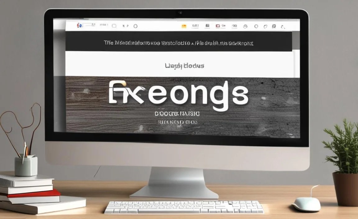
Creating a compelling logo with Google Fonts is achievable! Focus on selecting a font that reflects your brand’s personality, ensuring readability across different sizes, and understanding basic design principles. With a few smart tips, you can design a memorable Google Font logo that truly stands out.
Choosing a font for your logo can feel a little daunting, right? It’s like picking the perfect outfit for a big event – it needs to look great, feel right, and tell a story. Many of us get stuck staring at endless lists of fonts, wondering which one will best represent our brand. Don’t worry, you’re not alone! The good news is, with Google Fonts offering such a vast and free library, we have incredible resources at our fingertips. This guide will walk you through the essential design tips to create a fantastic logo using Google Fonts, making the process fun and manageable.
Why Google Fonts are a Smart Choice for Logos
Google Fonts has truly revolutionized how we access high-quality typography. With over 1,000 font families available, all free to use for personal and commercial projects, it’s an accessible powerhouse for designers and businesses alike. This means you can have a professionally designed look without the hefty price tag usually associated with premium font licenses.
Beyond affordability, Google Fonts are optimized for web use, ensuring your logo will look crisp and clear on screens of all sizes. They’re also well-supported, meaning they’re regularly updated and tested for compatibility. This makes them a reliable and practical choice for building a strong visual identity.
Understanding Font Categories for Your Logo
Before diving into specific Google Fonts, it’s helpful to understand the different types of fonts and what they communicate:
- Serif Fonts: These have small decorative strokes, or “feet,” at the ends of characters. Think of classic books and newspapers. Serif fonts often convey tradition, formality, authority, and trustworthiness. Examples include “Merriweather” and “Lora.”
- Sans Serif Fonts: Sans serif means “without serif.” These fonts are clean, modern, and straightforward, lacking those extra decorative strokes. They are excellent for readability, especially online, and suggest modernity, minimalism, and approachability. Popular choices include “Open Sans,” “Lato,” and “Roboto.”
- Display Fonts: These are designed for larger sizes and feature unique, often decorative or artistic styles. They are perfect for headlines, posters, and, crucially, logos where you want to make a strong statement. They can range from elegant scripts to bold, quirky designs. “Pacifico” and “Playfair Display” are good examples.
- Script Fonts: Mimicking handwriting or calligraphy, script fonts can add a personal, elegant, or casual touch. They are best used sparingly and when readability isn’t compromised, often for brands that want to feel luxurious, artisanal, or friendly. Think “Great Vibes” or “Dancing Script.”
Essential Design Tips for Your Google Font Logo
Now, let’s get down to the practical steps for creating a standout logo. It’s about more than just picking a pretty font; it’s about strategic choices that build recognition and trust.
1. Define Your Brand’s Personality
This is the absolute first step. What feeling do you want your brand to evoke? Are you playful and creative, or serious and professional? Elegant and luxurious, or simple and accessible? Your logo font should be a visual reflection of this personality.
- For Tech Startups: Look towards clean, modern sans serifs like “Montserrat” or “Nunito Sans.”
- For Bakeries/Artisan Shops: Consider friendly script fonts like “Cookie” or slightly more decorative serifs like “Playfair Display.”
- For Legal Firms/Consultancies: Traditional serifs like “Garamond” (though not directly on Google Fonts, similar feel can be found in “EB Garamond”) or strong, clean sans serifs like “Source Sans Pro” work well.
- For Creative Agencies: A unique display font or a carefully paired sans serif and serif combination can showcase innovation.
2. Prioritize Readability Above All Else
Your logo needs to be legible at various sizes – from a tiny favicon on a website to a large banner at an event. A font that looks intricate and beautiful on your screen might become an illegible mess when scaled down.
Test, test, test! Type out your brand name in potential fonts and then resize them drastically. If it becomes hard to read, it’s not the right choice for your logo.
Key Readability Factors:
- X-height: The height of lowercase letters like ‘x’. A larger x-height generally improves readability.
- Letter Spacing (Kerning): The space between individual letters. Some fonts have awkward kerning that can be fixed, others are better left untouched. Logos often benefit from slightly adjusted kerning for a polished look.
- Stroke Contrast: The variation between thick and thin strokes in a letter. High contrast can be elegant but harder to read at small sizes.
3. Less is More: Simplicity Wins
Overly decorative or complex fonts can make a logo look cluttered and unprofessional. Simple, classic fonts allow your brand name to be the focus. A clean font communicates clarity and confidence.
Consider timeless sans serifs and well-balanced serifs. They have stood the test of time for a reason – they are versatile and enduring.
4. Consider Font Pairing (If Applicable)
Sometimes, a logo doesn’t just use one font. You might use a display font for your main brand name and a simpler font for a tagline. When pairing fonts, aim for contrast that complements, rather than competes.
A common and effective pairing is a sans serif with a serif font. For example, a bold sans serif for the main name and a lighter serif for a descriptor. Or, use two different weights/styles of the same font family for a cohesive yet varied look.
Helpful Pairing Resources:
Platforms like Fontjoy can help you discover visually compatible font pairings by using AI. Another great starting point is understanding basic typography principles for pairing, which you can learn more about from resources like Typography.com’s education section.
5. Unique Isn’t Always Better
While it’s tempting to choose the most unique or quirky font you can find, remember its purpose. A logo’s primary job is to be recognizable and representative. A font that is too unusual can be a barrier to easy recognition and recall.
Think about how a font will look alongside your brand colors and any graphic elements. Does it enhance them, or does it clash?
6. Test Across Different Mediums
Google Fonts are generally optimized for digital, but how will your logo look when:
- Printed on stationery?
- Embroidered on merchandise?
- Engraved on a product?
- Shown as a small icon (favicon)?
- On a billboard?
This testing is crucial. A sans serif font like “Source Serif Pro” might work better than a delicate script when printed small, for example.
Popular Google Fonts for Logo Design & Their Strengths
Let’s look at some consistently reliable Google Fonts that many designers turn to for logo creation:
| Font Name | Type | Best For Brands That Want To Convey | Logo Use Cases |
|---|---|---|---|
| Open Sans | Sans Serif | Approachability, Clarity, Friendliness, Professionalism | Versatile; great for tech, small businesses, general branding, taglines. High readability. |
| Lato | Sans Serif | Stability, Seriousness, Warmth, Modernity | Excellent for corporate logos, finance, education. Feels solid and reliable. |
| Montserrat | Sans Serif | Urban, Geometric, Chic, Versatile | Fashion, design studios, modern cafes, startups. Has a strong geometric presence. |
| Roboto | Sans Serif | Mechanical, Futuristic, Clean, Efficient | Tech companies, apps, modern product branding. Very clean and functional. |
| Merriweather | Serif | Trust, Tradition, Sophistication, Authority | Publishing, law, luxury goods, educational institutions. Conveys a sense of heritage. |
| Playfair Display | Serif | Elegance, Luxury, Romance, High-End | Fashion boutiques, spas, wedding planners, premium services. Best for larger logo text. |
| Pacifico | Display/Script | Playfulness, Whimsy, Nostalgia, Approachability | Bakeries, ice cream shops, children’s brands, creative services. Use with caution for legibility. |
| Poppins | Sans Serif | Geometric, Clean, Modern, Geometric | Web design, tech, educational platforms, minimalist brands. Distinctive geometric feel. |
Common Pitfalls to Avoid
Even with the best intentions, it’s easy to stumble. Here are a few common mistakes to watch out for:
- Using too many fonts: Stick to one or two at most for brand recognition.
- Ignoring legibility: A pretty font that no one can read is useless.
- Choosing trendy fonts: Trends fade. Opt for fonts that have lasting appeal.
- Not testing at different sizes: This is where many logos fail.
- Over-decorating: Keep the focus on your brand name or symbol.
Advanced Techniques: Crafting a Unique Look
Once you’ve chosen a Google Font, you can enhance its impact:
- Adjusting Letter Spacing (Kerning): Manually tweak the space between letters in your brand name for a perfect, balanced look. This is a hallmark of professional logo design.
- Weight Variations: Use a bold weight for impact and a light weight for a subtitle, all within the same font family.
- Capitalization: Experiment with all caps, title case, or lowercase to see which best fits your brand’s voice.
- Color: While not part of the font itself, how your chosen font interacts with your brand colors is vital.
- Combining with Graphics: A strong font can stand alone, but it can also be beautifully integrated with an icon or symbol.
Where to Find and Use Google Fonts
Google Fonts is incredibly user-friendly:
- Explore: Visit the Google Fonts website. You can filter by category, popularity, or even style.
- Select: Click on the font you like to see its different weights and styles.
- Download (Optional): For logo design and desktop use, you can download the font files by clicking the “Download family” button. This gives you more control in design software like Adobe Illustrator or Figma.
- Use in Design Tools: Many web design tools (like Squarespace, Wix) and design software integrate with Google Fonts directly, making them easy to select within your workspace.
Remember, Google Fonts are licensed under the Open Font License (OFL), meaning they are free for commercial use without needing extensive licensing fees. This is a huge advantage for budding businesses.
FAQ: Your Google Font Logo Questions Answered
What is the easiest Google Font to use for a beginner logo?
For beginners, sans serif fonts like “Open Sans,” “Lato,” or “Montserrat” are excellent choices. They are highly readable, versatile across many industries, and have a clean, modern feel that’s hard to get wrong.
Can I use a script font for my logo?
Yes, you can use script fonts for logos, but with caution. They are best for brands where a personal, elegant, or casual touch is paramount. Always ensure the script font is still legible, especially at smaller sizes, and test it on various applications.
How many fonts should I use in my logo?
For maximum impact and brand recognition, it’s best to use no more than one or two fonts in your logo. Typically, this means a primary font for your brand name and perhaps a secondary font for a tagline or descriptor if needed.
What’s the difference between a logo font and a website font?
A logo font is specifically chosen for your brand mark – it’s part of your visual identity. Website fonts are used for body text, headings, and navigation on your site. While they should be complementary, the logo font is about making a distinct, memorable statement, whereas website fonts prioritize readability and user experience across content.
How do I make my Google Font logo look unique?
You can make a common Google Font unique through creative kerning (letter spacing), adjusting weights, thoughtful color application, and integrating it with custom graphic elements or icons. Even a simple font can feel exclusive when expertly applied.
Do I need to pay to use Google Fonts for my logo?
No, all Google Fonts are free to use for any purpose, including commercial logo design, thanks to the Open Font License (OFL).
How do I choose a Google Font that matches my brand’s industry?
Consider the common typography used in your industry. For example, finance and law often use robust serifs or strong sans serifs, while creative fields might use more expressive fonts. However, don’t be afraid to break the mold if it authentically represents your brand’s unique personality.
Conclusion
Designing a logo with Google Fonts doesn’t have to be a complex challenge. By understanding your brand’s personality, prioritizing readability, keeping your design clean, and testing across different mediums, you can create a powerful and memorable visual identity.
Explore the vast library of Google Fonts, experiment with pairings, and don’t be afraid to tweak letter spacing for that perfect professional polish. A well-chosen font is a foundational element of a strong brand, and with these tips, you’re well on your way to crafting a Google Font logo that speaks volumes about who you are.


