
Gille Classic Font offers elegant readability and timeless appeal, making it a powerful choice for adding a touch of sophistication to any design project. Its balanced design works wonderfully for both headings and body text, ensuring your message is both clear and stylish.
Choosing the right font can feel like a puzzle. You want something beautiful, but also easy to read. Sometimes, fonts look great in big titles but become a jumbled mess in paragraphs. It’s a common hiccup for many creatives. But don’t worry! There’s a font that gracefully bridges this gap, bringing both charm and clarity to your work. Today, we’re diving into the world of the Gille Classic Font to unlock its design potential. Get ready to see how a single typeface can elevate your projects.
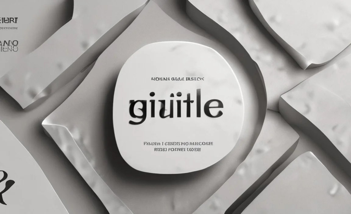
Unpacking the Power of Gille Classic Font

The Gille Classic Font is a gem in the world of typography. It’s the kind of font that doesn’t shout for attention but earns it through its sheer elegance and sensible design. Imagine a friendly, yet sophisticated handshake for your audience – that’s Gille Classic for you. It’s a serif font, which means it has those little decorative strokes at the ends of letters, giving it a traditional and authoritative feel. But don’t let “classic” fool you; this font feels fresh and perfectly at home in contemporary designs.
What Makes Gille Classic Stand Out?
Think of Gille Classic as your reliable design sidekick. It’s exceptionally versatile, which is a huge win when you’re juggling different design needs.
Timeless Elegance: It carries an air of sophistication without being stuffy. This makes it perfect for brands that want to convey tradition, quality, or a premium feel.
Superb Readability: This is where Gille Classic truly shines. The designers created it with clarity in mind. The letterforms are well-spaced, the x-height (the height of lowercase letters without ascenders or descenders) is generous, and the contrast between thick and thin strokes is balanced. This means it’s a dream to read, whether it’s a short headline or a lengthy article.
Versatile Application: From impactful headlines to comfortable body text, Gille Classic adapts beautifully. It’s also a fantastic choice for logos, branding materials, and even user interfaces where legibility is key.
A Brief History and Design Philosophy
While the exact origins of every font can be a deep dive, fonts like Gille Classic often draw inspiration from historical typefaces like Garamond or Baskerville. These classic serif designs have been refined over centuries for optimal readability and aesthetic appeal. The philosophy behind such fonts is usually about creating a clear, harmonious visual rhythm on the page. They aim for a natural flow of reading, guiding the eye smoothly from one letter to the next, word to word, and line to line. This focus on the reader’s experience is what gives Gille Classic its enduring power.
Gille Classic vs. Other Font Types: A Quick Comparison
Understanding how Gille Classic fits into the broader font landscape helps appreciate its unique strengths.
Serif vs. Sans Serif
This is the most fundamental distinction.
Serif Fonts: Have small flourishes (serifs) at the ends of strokes. They often evoke tradition, trust, and elegance. Gille Classic is a prime example. They are traditionally favored for long-form printed text due to their readability.
Sans Serif Fonts: Lack these flourishes. They appear clean, modern, and minimalist. Think Arial or Helvetica. They are highly popular for digital interfaces and headlines due to their sharp, clean appearance on screens.
Where Gille Classic Excels: Its serif nature provides a comforting familiarity and perceived authority. Crucially, its design means it doesn’t suffer from the screen jaggedness sometimes found in older serif fonts, making it a strong contender for both print and digital readability.
Display Fonts
Display fonts are designed for impact and are typically used in large sizes for headlines, posters, or logos. They often have unique, decorative, or bold personalities.
Where Gille Classic Excels: While Gille Classic can be used for headlines, it’s not purely a display font. This means it retains its readability and elegance even when scaled down, making it far more versatile than most display fonts for longer texts.
Script Fonts
Script fonts mimic handwriting or calligraphy, ranging from formal and elegant to casual and playful.
Where Gille Classic Excels: Script fonts are all about personality and flourish. They are rarely suitable for body text. Gille Classic offers a different kind of elegance – one that is structured, reliable, and universally accessible, making it a safer and more broadly applicable choice for professional materials.
Key Design Features of Gille Classic

Let’s get a little closer to the details that make Gille Classic so effective.
Balanced Stroke Contrast
The difference between the thickest and thinnest parts of the letters in Gille Classic is deliberate. It’s not extreme, which is good! Too much contrast can make fine details disappear at small sizes or on lower-resolution screens. Gille Classic’s moderate contrast creates visual interest and helps define letterforms without sacrificing legibility. This makes it comfortable to read for extended periods.
Generous X-Height
The x-height refers to the height of lowercase letters like ‘x’, ‘a’, and ‘c’. A larger x-height generally contributes to better readability, especially at smaller sizes. Gille Classic typically features a generous x-height, meaning its lowercase letters are relatively tall compared to its capitals and ascenders (the parts of letters like ‘h’ or ‘b’ that go up). This makes words appear clearer and easier to distinguish.
Open Counterforms
The “counter” is the enclosed or partially enclosed negative space within a letter, like the hole in ‘o’ or ‘p’. Gille Classic often has relatively open counterforms. This means these spaces are not cramped. Open counters prevent letters from blurring together, which is a common problem with tightly designed fonts, especially at smaller sizes.
Serif Style
The serifs themselves are often well-defined but not overly ornate. They usually have a slight bracket (a smooth curve where the serif meets the stroke) that helps them blend harmoniously with the rest of the letter. This “humanist” touch adds warmth and sophistication.
Practical Applications: Where to Use Gille Classic Font

The beauty of Gille Classic lies in its adaptability. Here are some fantastic ways to leverage its design power:
1. Branding and Logos
For businesses aiming for a classic, trustworthy, or premium image, Gille Classic is an excellent foundation.
Logotypes: Using “Gille Classic” for a company name can instantly convey heritage and quality.
Taglines: Short, impactful taglines can benefit from its elegant readability.
Brand Guidelines: As a primary or secondary brand font, it lends a consistent, sophisticated tone.
A great example of a brand that might use Gille Classic could be a high-end jeweler, a boutique hotel, or a respected law firm.
2. Website Design
Readability is paramount on the web. Gille Classic delivers this with style.
Headings (H1, H2): Its elegance makes headings pop without being overwhelming.
Body Text: For blogs, articles, or e-commerce product descriptions, Gille Classic offers a comfortable reading experience that few fonts can match.
Navigation Menus: Its clarity ensures users can easily find their way around your site.
For websites focusing on content-rich experiences, such as online magazines, educational platforms, or even personal portfolios, Gille Classic is a strong choice. Tools like Google Fonts or Adobe Fonts often offer similar, highly legible serif options if Gille Classic itself isn’t directly available. Exploring these platforms will reveal many comparable fonts designed with web readability in mind.
3. Print Materials
This is where classic serifs traditionally shine, and Gille Classic is no exception.
Brochures and Flyers: Its ability to look good in larger sizes for headlines and small for details makes it ideal.
Books and Magazines: Perfect for body copy, ensuring readers can engage with content for hours.
Business Cards and Stationery: Communicates professionalism and attention to detail.
Packaging: Adds a touch of sophistication to product packaging.
Consider a well-designed literary journal or a gourmet food brand’s packaging – these are spaces where Gille Classic would feel right at home. In print, its serifs help guide the eye across lines of text on paper, a subtle but significant aid to reading speed and comprehension.
4. User Interface (UI) Design
In UI, clarity is king. Gille Classic can bring a touch of refinement without sacrificing usability.
Labels and Buttons: Clear, legible text is crucial for intuitive interfaces.
Information Panels: For applications that present a lot of information, its readability is a major plus.
Onboarding Flows: Guiding new users through an app requires clear, non-distracting text.
Apps focused on productivity, journaling, or learning might benefit from the calm, focused aesthetic Gille Classic provides.
Pairing Gille Classic with Other Fonts

No design is an island, and font pairing is an art form. Gille Classic plays well with others!
Pairing with Sans Serifs
This is a classic and highly effective combination. Pairing Gille Classic (serif) with a clean sans serif creates a beautiful contrast that highlights different elements of your design.
For Headlines: Use Gille Classic for a more impactful, classic heading.
For Body Text: Pair it with a modern sans serif for excellent digital and print readability.
Good Sans Serif Companions:
Open Sans: Highly readable, friendly, and versatile.
Lato: Geometric yet warm.
Montserrat: Geometric with a strong personality.
Roboto: A neo-grotesque, highly optimized for screens.
For example, you might use Gille Classic for your main headings and Open Sans for all your paragraph text on a blog. This approach adds visual hierarchy and interest.
Pairing with Other Serifs
While Gille Classic itself is versatile, if you want to use multiple serifs, choose ones with different characteristics to create contrast.
Pairing with a Slab Serif: A slab serif has thick, block-like serifs. Gille Classic can provide the elegance while the slab serif adds a robust, grounded feel.
Pairing with a Modern Serif: A modern serif has more dramatic stroke contrast. Gille Classic can offer an anchor of readability.
Be careful not to overuse serif fonts. Usually, one primary serif like Gille Classic and perhaps a secondary serif for specific accents is sufficient for maintaining clarity.
Pairing with Display Fonts
If you have a specific display font for a dramatic title, Gille Classic is an excellent choice for accompanying text.
Headline: A bold, decorative display font.
Subheadings/Body Text: Gille Classic to ensure readability and add a touch of class.
This ensures that while your title grabs attention, the rest of your content remains accessible and easy to digest.
Tips for Using Gille Classic Effectively
Beyond just picking the font, how you use it makes all the difference.
1. Pay Attention to Font Weights
Gille Classic likely comes in various weights (e.g., Light, Regular, Bold, Italic).
Regular: Your go-to for body text.
Bold: Use sparingly for emphasis within paragraphs or for subheadings.
Italic: Excellent for quotes, foreign words, or subtle emphasis.
Light: Can be beautiful for very large, airy headlines, but use with caution for readability.
Using too many weights can make a design feel cluttered. Stick to one or two weights for clarity.
2. Master Leading and Tracking
Leading (Line Spacing): This is the vertical space between lines of text. For Gille Classic body text, a leading of about 120-150% of the font size is a good starting point (e.g., 16pt font size might have 19-24pt leading).
Tracking (Letter Spacing): This is the overall spacing between characters in a block of text. Gille Classic generally has well-balanced tracking, but for very specific headlines or for fine-tuning readability, you might adjust it subtly. Avoid drastic changes.
Understanding these typographic controls, often available in design software like Adobe InDesign or even word processors, is crucial for maximizing comfort and legibility. For web design, browser developers handle much of this, but using CSS properties allows for fine-tuning.
3. Hierarchy is Key
Use Gille Classic’s different weights and sizes to guide the reader’s eye.
Your largest size/boldest weight for the main title.
A slightly smaller size for subheadings.
A comfortable, readable size for body copy.
This creates a clear visual path, making it easy for your audience to understand the structure of your content.
4. Test Across Devices and Sizes
What looks gorgeous on your large desktop monitor might render differently on a small smartphone screen. Always test your designs.
Web: Check how your Gille Classic text appears on various browsers and devices.
* Print: Produce proofs to ensure the font is legible at intended sizes.
The official guidelines for web content accessibility, such as those provided by the Web Content Accessibility Guidelines (WCAG), emphasize the importance of clear and readable text for all users. Gille Classic supports these principles.
Common Challenges and Solutions
Even with a great font, you might encounter small hurdles.
| Challenge | Solution |
| :—————————– | :————————————————————————————————— |
| Too much text in Gille Classic | Break up long paragraphs with subheadings, bullet points, or images. Use a lighter font weight for less crucial text. |
| Readability issues on screen | Ensure sufficient contrast with the background. Test at various zoom levels. Consider slightly increased line-spacing. |
| Headlines feel too generic | Pair Gille Classic headlines with a more distinctive sans-serif or a carefully chosen display font for a contrasting element. |
| Overuse of bold/italics | Rely on size and placement for hierarchy. Use formatting sparingly for essential emphasis only. |
| Kerning issues up close | For display text or logos, manual kerning (adjusting space between specific letter pairs) might be needed. |
Kerning: A Brief Note
Kerning is the fine-tuning of space between specific pairs of letters (like “WA” or “Vo”) to create visually pleasing spacing. While Gille Classic is well-kerned out-of-the-box, for large display text or logos, a designer might manually adjust kerning to achieve perfect balance. Most everyday usage won’t require this level of detail.
Frequently Asked Questions about Gille Classic Font
Q1: Is Gille Classic a serif or sans serif font?
A1: Gille Classic is a serif font. This means it has small decorative strokes (serifs) at the ends of letter strokes, giving it a classic and elegant appearance.
Q2: Is Gille Classic good for body text?
A2: Yes, absolutely! Gille Classic is renowned for its excellent readability, making it a fantastic choice for body text in both print and digital designs. Its balanced design ensures comfort for long reading sessions.
Q3: Can I use Gille Classic for web design?
A3: Definitely. While originally a print font, Gille Classic is well-suited for web use due to its clear letterforms and balanced design. It often appears on platforms like Google Fonts or Adobe Fonts, ensuring good web performance.
Q4: What kind of feeling does Gille Classic evoke?
A4: Gille Classic evokes feelings of elegance, tradition, sophistication, trustworthiness, and quality. It’s a reliable and classic choice that lends a sense of gravitas to any design.
Q5: What fonts pair well with Gille Classic?
A5: Gille Classic pairs wonderfully with clean sans-serif fonts such as Open Sans, Lato, or Montserrat. This combination creates a nice contrast between classic elegance and modern simplicity.
Q6: Where can I find the Gille Classic font?
A6: You can often find Gille Classic or similar high-quality serif fonts through font marketplaces like MyFonts, or included in subscription services like Adobe Fonts. Many digital design platforms also offer comparable well-crafted serif fonts.
Q7: Is Gille Classic suitable for modern designs?
A7: Yes! While it has classic roots, the balanced and clean design of Gille Classic makes it surprisingly versatile. It can lend a touch of timeless sophistication to even the most contemporary projects, bridging the gap between traditional and modern aesthetics.
Conclusion: Embracing the Enduring Appeal of Gille Classic
Typography is more than just picking pretty letters; it’s about conveying your message effectively and beautifully. The Gille Classic Font offers a powerful blend of timeless elegance and essential readability, making it a go-to choice for designers, students, and businesses alike. Whether you’re building a brand, designing a website, or laying out a print document, Gille Classic provides a foundation of clarity and sophistication that resonates with audiences.
By understanding its design features, exploring its versatile applications, and mastering the art of font pairing, you can harness the full power of Gille Classic. It’s a font that works hard, looks beautiful, and ensures your message is not only seen but truly appreciated. So, next time you’re looking for a typeface that speaks volumes with grace and clarity, remember Gille Classic. It’s a classic for a reason, and its enduring appeal continues to make it an indispensable tool in any designer’s toolkit.


