Choosing the right font size for mobile devices plays a crucial role in user happiness and overall experience. As mobile screen sizes vary widely, designers must focus on mobile typography principles to ensure readability and accessibility. A well-optimized font size enhances mobile app design, making text elements easier to read and interact with.
The Importance Of Font Sizes In Mobile App Design
Mobile devices come with different screen sizes, requiring responsive font sizes to adapt to various viewports. In app design, selecting an appropriate base font size ensures text readability across smaller screens and larger ones. Google Fonts and system fonts offer a variety of typefaces that can be used to create a visually appealing mobile experience.
Typography in mobile app design includes factors such as font weight, line height, and line length, which directly affect user engagement. Proper text size improves legibility and enhances the usability of mobile apps, making it easier for users to consume information without strain.
Material Design Guidelines For Mobile Typography
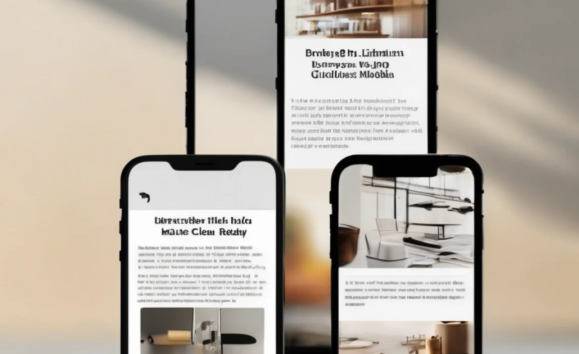
Google’s Material Design guidelines provide valuable insights into choosing the right font size for mobile screens. They recommend a minimum font size to ensure readability while maintaining the design’s aesthetic appeal. Mobile typography should balance between aesthetics and function, ensuring that both primary and secondary text remain legible across different sizes.
For smaller screens, designers should consider a larger font size to prevent text from appearing too small. Responsive design principles allow text elements to adjust according to the screen size, creating a seamless experience across different mobile versions.
Key Factors Influencing Mobile Font Sizes
Several factors determine the effectiveness of font sizes in mobile app design:
- Screen Size: Different screen sizes demand flexible font sizes to maintain readability.
- Viewport Size: Designing with viewport size in mind ensures that the right font size is applied across various devices.
- Typography Choices: Selecting the right typeface and font style enhances the user experience.
- Line Height and Line Length: Proper spacing between lines and text width ensures better readability.
- Font Weight: Adjusting font weight helps differentiate between body font size and secondary text.
Responsive Font Sizes for Mobile View
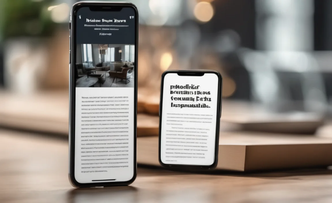
Responsive design plays a crucial role in mobile web typography. Using responsive font sizes allows text to scale appropriately across devices, maintaining consistency and readability. Whether it’s a web design or a mobile app, designers should establish a base font size that works well across all platforms.
Minimum font size recommendations should always be considered to ensure content remains readable even on small screens. Designers can achieve scalability using relative units such as percentages or “em” instead of fixed pixel values.
Choosing the Right Font Size for Different Devices
Selecting the right font size involves understanding the different font needs for each device. Mobile screens require careful consideration of factors such as pixel density, font weight, and the intended use of the content. For instance, a mobile version of a website might require larger font sizes than a desktop counterpart to accommodate touch interactions and smaller screen real estate.
Balancing Readability and Aesthetic Appeal
Striking the right balance between readability and aesthetics is essential when designing mobile apps and websites. A type size that is too small can frustrate users, while a larger font size may disrupt the design flow. UI design principles should prioritize user comfort by ensuring a harmonious blend of text size, font style, and overall design.
Printer-Friendly Pages and Mobile Typography
While mobile typography primarily focuses on screen readability, designers should also consider how content appears when printed. Creating a printer-friendly page requires careful adjustments to font sizes and text elements to ensure legibility in different formats.
FAQs
What Is The Best Font Size For Mobile Screens?
The best font size varies, but a base font size of 16px is commonly recommended for readability.
Why Is Responsive Font Sizing Important?
Responsive font sizes ensure that text remains legible across different screen sizes and devices.
How Does Font Weight Impact Readability On Mobile?
Proper font weight enhances contrast, making text easier to read and improving accessibility.
Should I Use System Fonts Or Google Fonts For Mobile Apps?
Both options work well; system fonts provide faster load times, while Google Fonts offer more variety.
What Is The Minimum Font Size For Accessibility?
A minimum font size of 12px is generally recommended for accessibility compliance.
How Can I Ensure My Mobile Typography Is User-Friendly?
Use appropriate line height, font weight, and responsive font sizes to optimize readability.

