
The font used for credit card numbers, often called the OCR-B font, is a specialized character set you might not think about often. Its readability is crucial for automated systems and human verification, ensuring secure transactions. Understanding its characteristics can offer insights into design for clarity and accuracy.
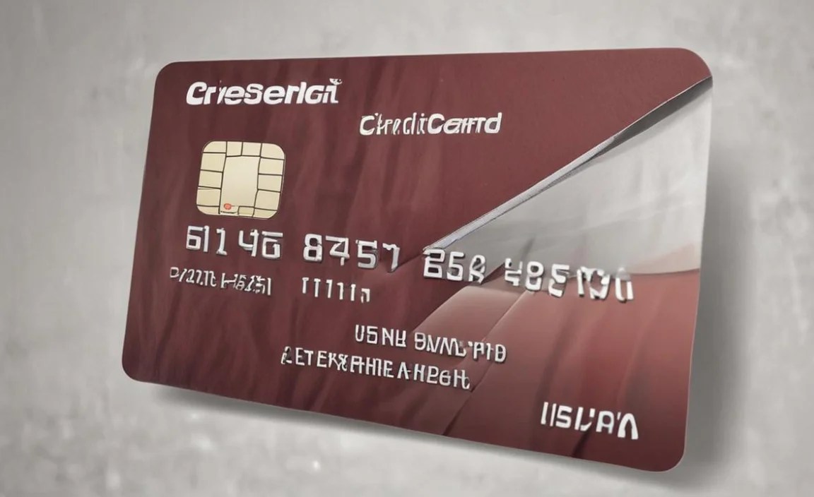
When you look at a credit card, you see those raised numbers, right? They’re not just random digits; there’s a whole system behind how they look and are read. This special font ensures your card can be read by machines quickly and accurately, making payments smooth and secure. It’s a fascinating bit of design often overlooked.
We’ll dive into why this font matters, explore its unique features, and even touch on how you can use similar principles in your own design projects. Get ready to unlock the secrets of the credit card number font!
Why the “Credit Card Number” Font is More Than Just Numbers

The numbers on your credit card aren’t just for show; they’re designed for a very specific purpose: to be read by machines. This is especially true for the embossed numbers that get magnetically read. The font chosen needs to be clear, distinct, and easy for optical character recognition (OCR) systems to interpret, while also being legible for humans. This balance of machine and human readability is key.
Think about it: every time you swipe, insert, or tap your card, a system is scanning those numbers. If the font were smudged, oddly shaped, or too fancy, those transactions could fail, leading to frustration and delays. The font is a silent guardian of seamless commerce.
The Role of Optical Character Recognition (OCR)
Optical Character Recognition, or OCR, is the technology that allows computers to “read” text from images. For credit cards, OCR systems are trained to recognize specific shapes of characters. The font used on credit cards is carefully designed so that each number has a unique and easily distinguishable shape. This minimizes the chance of errors when the system is scanning your card details.
This precision in character design is why you won’t find bubbly, handwritten, or highly stylized fonts on your bank cards. The focus is purely on accuracy and reliability, ensuring that the digital representation of your card number perfectly matches the physical one.
Meet the Star: OCR-B, The Standard for Security
The font you’ll most commonly find on credit cards, particularly the embossed ones, is called OCTIVAR, often referred to as OCR-B. This isn’t a font you’d typically use for body text in a book or for a stylish website header. Its design is driven by functionality.
OCR-B was developed in the 1960s under the guidance of the European Computer Manufacturers Association (ECMA) to ensure compatibility between different computer systems and machines. The International Organization for Standardization (ISO) has also standardized it, making it a global benchmark for machine-readable characters. You can explore the ISO standards related to character recognition and fonts at the official ISO website.
Key Characteristics of OCR-B
What makes OCR-B so special? It’s all in the details, designed to prevent misinterpretations by machines. Here are its core features:
- Distinct Character Shapes: Each number has a unique silhouette that’s very different from other numbers. For instance, the ‘1’ is a simple vertical line, clearly separate from ‘7’ or ‘L’. Similarly, ‘0’ is perfectly round, easily told apart from ‘8’ or ‘B’.
- Open Apertures: Characters like ‘0’, ‘4’, ‘6’, ‘8’, ‘9’, and ‘B’ have very open spaces (apertures) within them. This prevents them from looking like solid blobs to scanning machines, ensuring they are recognized correctly.
- Uniform Stroke Width (Mostly): While not perfectly monolinear, the strokes are generally uniform. This consistency helps OCR readers process the characters without getting confused by varying line thicknesses, which can happen in more stylized fonts.
- Legibility at Speed: The clear, separated forms allow scanners to read them at high speeds, which is crucial for processing thousands of transactions daily.
- Special Characters: Beyond just numbers, OCR-B also includes uppercase letters and some punctuation, all designed with the same machine-readability principles. Credit cards specifically use the numeric set.
Why Not More Visually Appealing Fonts?
You might wonder why banks don’t use a more elegant serif or a clean sans-serif font. The answer lies in the primary function: transaction processing. While aesthetic fonts might look pleasing to the human eye, they often have subtleties that confuse OCR systems. For example:
| Confusing Characters & Why | The Issue for OCR |
|---|---|
| 0 vs. O | In many fonts, a handwritten ‘0’ or a stylized ‘O’ can look very similar, especially when slightly blurred or at an angle. |
| 1 vs. I vs. l vs. 7 | These can have similar vertical strokes and serifs, making them hard to differentiate without clear, distinct shapes. |
| 6 vs. 9 | Similar curves can cause confusion if not perfectly rendered. |
| 3 vs. E | The curves and horizontal lines can overlap visually. |
OCR-B’s design aims to eliminate these ambiguities. Even though it might not win any beauty contests, it’s a champion of accuracy and reliability in the world of finance.
The Printing Process: Embossed vs. Flat
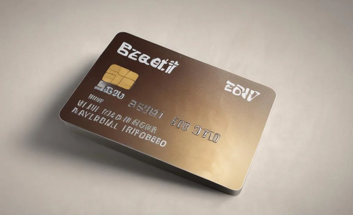
It’s worth noting that not all credit card numbers are printed in the same way. Your credit card likely has both embossed (raised) and flat (printed) numbers.
Embossed Numbers
These are the raised characters you can feel on the front of your card. Historically, this was the primary method for creating readable numbers for magnetic stripe readers and carbon copy imprints. The embossed characters are typically printed using a font very similar to, or directly in, OCR-B. The raised nature provides a distinct physical edge that helps the reader machine recognize the character without needing perfect image clarity. This makes them highly reliable even with older technology.
Flat Printed Numbers (Often on the back or for EMV chips)
Many cards also have flat printed numbers, often on the back (for reference or customer service) or around the EMV chip on the front. These are usually printed using standard fonts, similar to how other text appears on the card. While these are for human readability, the security features and the need for verification still mean that clarity is paramount. For the critical data processed by machines, embossed OCR-B remains the standard.
Beyond Credit Cards: Where Else Do We See OCR Fonts?

The principles behind OCR-B are so effective that these types of fonts are used in many other applications where fast, accurate machine reading is essential. It’s a testament to good design that a font created decades ago is still considered the gold standard for readability in critical systems.
- Checks: The routing number and account number at the bottom of a check are printed in MICR (Magnetic Ink Character Recognition) font. While MICR uses magnetic ink and a slightly different font set, the goal is identical: machine readability for automated processing. You can learn more about MICR on the Federal Reserve’s site.
- Passports and ID Cards: Machine-readable zones (MRZs) on passports and some identity cards use specialized fonts (often OCR-B or a variant) to store key information for automated border control systems.
- Shipping Labels: Barcodes and some alphanumeric codes on shipping labels are another example where machine readability is vital for logistics and tracking.
- Forms and Documents: Any official form designed for automated scanning and data entry might specify the use of an OCR-friendly font.
The common thread in all these examples is the need for a font that is unambiguous and can be captured reliably by a machine, often at high speeds. This is the silent power of functional typography.
Can You Use OCR-B (or Similar) Fonts in Your Designs?

While OCR-B is primarily for specialized machine-readable applications, its core principles of clarity and distinctiveness can inspire your own design work. If you’re aiming for extreme legibility, especially for technical documentation, product labels, or even certain navigational elements on a website, a font with similar attributes could be beneficial.
When to Consider OCR-Like Fonts:
- Coding or technical documentation where precise display of characters is paramount.
- Forms or interfaces where users are expected to enter specific codes or serial numbers.
- Branding for industries that value precision, reliability, and technical accuracy (e.g., engineering, finance, logistics).
- Accessibility features where clear distinction between similar characters is a priority for users with visual impairments or cognitive differences, though dedicated accessibility fonts are often better suited.
Finding and Using OCR-B and Alternatives
You can often find the OCR-B font for download online. Many reputable font foundries offer it, sometimes as a free resource. When searching, look for terms like “OCR-B,” “OCR font,” or “machine readable font.”
However, direct use of OCR-B in typical graphic design might look a bit stark or dated, as it wasn’t designed for aesthetic appeal. Instead, consider fonts inspired by its principles:
- Look for clean, geometric sans-serifs: Fonts like Montserrat, Lato, or Open Sans, while not OCR fonts, have very clear, open characters and minimal confusion between similar glyphs. Their geometric construction enhances readability.
- Prioritize open apertures: Choose fonts where letters like ‘0’, ‘6’, ‘9’, ‘a’, ‘e’, ‘g’ have clear internal spaces.
- Test for confusion: Print out or display potential fonts with commonly confused characters (0/O, 1/I/l, 6/9) side-by-side. See if they still look distinct.
- Consider context: A font that works for a technical manual might not suit a fashion brand. Always match typeface to your project’s purpose and audience.
The Future of Character Recognition and Fonts
While OCR-B has served us incredibly well, technology is always evolving. Modern OCR systems are becoming more sophisticated, capable of reading a wider variety of fonts with greater accuracy. This means that in the future, the requirement for highly specialized fonts like OCR-B might lessen, especially as technologies like AI and advanced image processing become more commonplace.
However, for critical applications where absolute certainty is required, and for systems that need to maintain backward compatibility with existing infrastructure, fonts like OCR-B will likely remain important for a long time. The core principle of designing characters for unambiguous machine interpretation will persist, even if the specific implementation changes.
Frequently Asked Questions About Credit Card Number Fonts
What font is used for credit card numbers?
The most common font used for credit card numbers, especially embossed ones, is OCR-B (Optical Character Recognition B). It’s specifically designed for clear machine readability.
Why do credit card numbers need a special font?
Special fonts like OCR-B are crucial because credit card numbers need to processed accurately and quickly by machines (OCR systems). These fonts have distinct shapes for each character to prevent misidentification during transactions.
Are all numbers on a credit card OCR-B?
Typically, the embossed numbers on the front of the card are in an OCR-B-like font to ensure machine readability. Flat printed numbers, often on the back, may use standard fonts, but clarity is still a priority.
Can I use OCR-B font on my website or in my designs?
Yes, you can find and use OCR-B font files for your designs. However, it’s designed for utility, not aesthetics, so it might appear stark. You can also choose fonts inspired by its clear, distinct characteristics.
What is the difference between OCR-A and OCR-B?
OCR-A is also an OCR font but has a more abstract, line-based design. OCR-B, used on credit cards, has a more conventional appearance but with specific modifications for machine readability and is generally considered more legible to humans than OCR-A.
How do embossed numbers differ from flat numbers in terms of font?
Embossed numbers are raised and are typically in OCR-B or a very similar font to ensure they can be read by magnetic or optical scanners even with imperfect impressions. Flat numbers are printed and might use standard.


