
Discover how specific cursive ‘L’ font designs can significantly boost student handwriting clarity and aesthetic appeal. This guide offers practical, beginner-friendly tips and visual examples to help students and educators master legible and beautiful cursive ‘L’ forms, making learning this crucial letter a joyful experience.
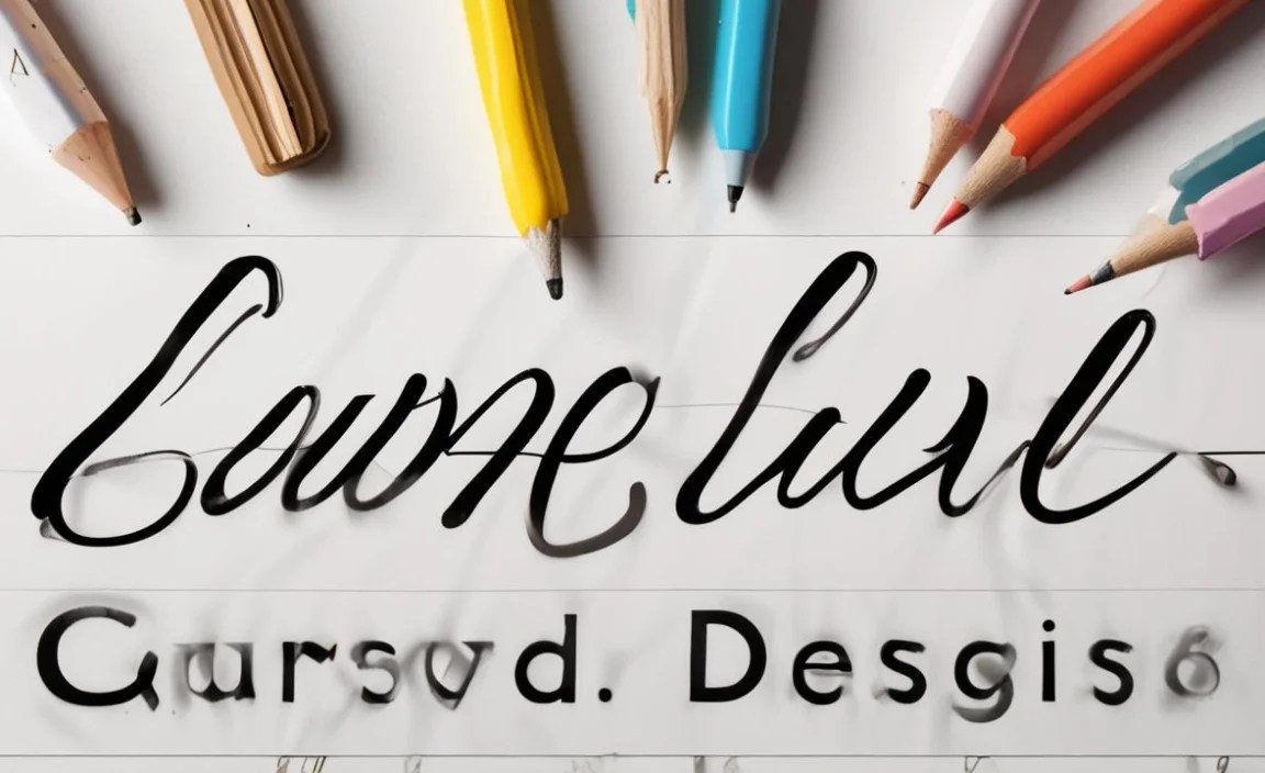
Cursive writing can sometimes feel like a beautiful but tricky dance of loops and lines. For many, the letter ‘L’ in cursive presents a unique challenge. Its graceful swoops look lovely when done right, but a slight misstep can make it look a little muddled. This is especially true for students just learning to form their letters. They need clear, easy-to-follow examples that build confidence. Learning to write a legible ‘L’ is more than just penmanship; it’s a building block for readable sentences and a polished personal style. We’ll explore simple, effective cursive ‘L’ designs that are perfect for students, making this letter easy to master and a joy to write.
Why the Cursive ‘L’ Matters for Students
The cursive capital ‘L’ and lowercase ‘l’ aren’t just letters; they are foundational elements in developing fluid and readable handwriting. For students, mastering these forms is a significant step in their literacy journey. A well-formed cursive ‘L’ contributes to the overall legibility of their work. When letters connect smoothly, sentences flow better, and the reader can easily follow the writer’s thoughts. This builds confidence and reduces frustration, making the learning process more enjoyable.
Think of it like learning to walk before you run. Strong foundational letters like the cursive ‘L’ are essential for building more complex words and sentences. When students struggle with a specific letter, it can create a bottleneck in their writing progress. This guide aims to unblock that bottleneck by focusing on proven, easy-to-replicate designs for the cursive ‘L’.
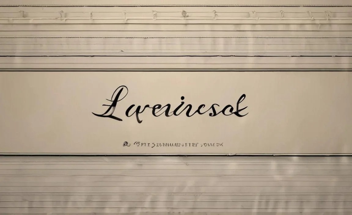
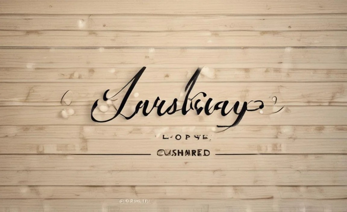
The Capital Cursive ‘L’: Graceful and Grand

The capital cursive ‘L’ is an elegant letter, often characterized by a prominent loop and a flowing tail. Its design allows for a beautiful connection to the letters that follow. The key to a good capital ‘L’ lies in its distinct loop and a clear downward stroke that guides the pen smoothly into the next character.
When introducing the capital ‘L’ to students, it’s beneficial to break down its formation into manageable steps. This approach demystifies the process and makes it less intimidating.
Step-by-Step: Forming the Capital Cursive ‘L’
- Start with a sweeping upward stroke: Begin just below the top line, curve up and to the right, forming a gentle arc.
- Create the main loop: From the peak of the upward stroke, sweep down and to the left, creating a large, open loop. This loop should extend down towards the baseline.
- The downward finish: Continue the stroke downwards, forming a straight or slightly curved line that goes below the baseline.
- Add the final flourish: As you come up from the downward stroke, add a small outward curve or tail. This can be a simple flick to the right, preparing for the next letter.
It’s important for students to understand that the size and shape of the loop can vary slightly while still maintaining legibility. The goal is to achieve a look that is both distinct and aesthetically pleasing, easily distinguishable from other capital letters.
Proven Capital ‘L’ Designs for Students
Here are a few variations of the capital cursive ‘L’ that are particularly effective for students, focusing on clarity and ease of formation:
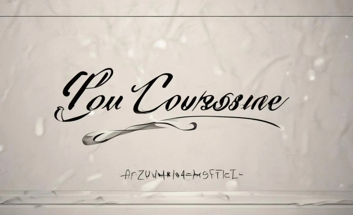
- The Classic Loop: This is the most standard form, emphasizing a well-defined oval loop that flows seamlessly from an upward stroke and down into a clear tail. It’s great for general use and ensures good readability.
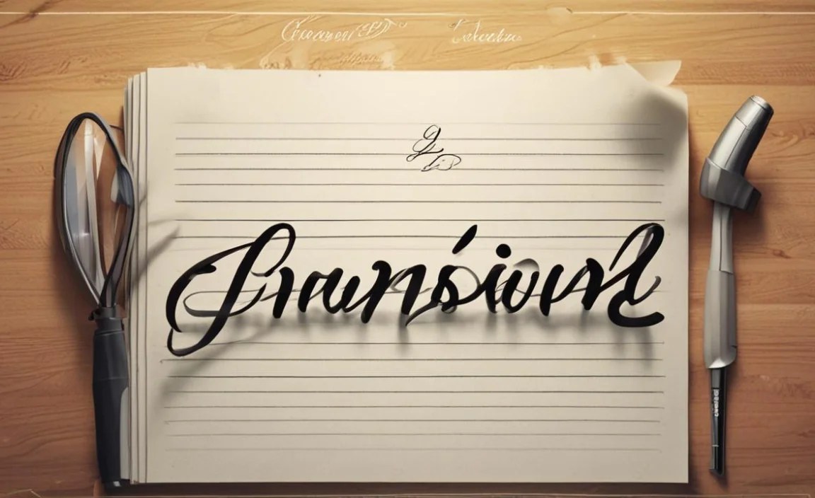
- The Simplified Loop: For younger learners or those struggling with fine motor skills, a slightly smaller, more compact loop can be easier to manage. The principle remains the same: an upward sweep, a contained loop, and a distinct downward stroke.
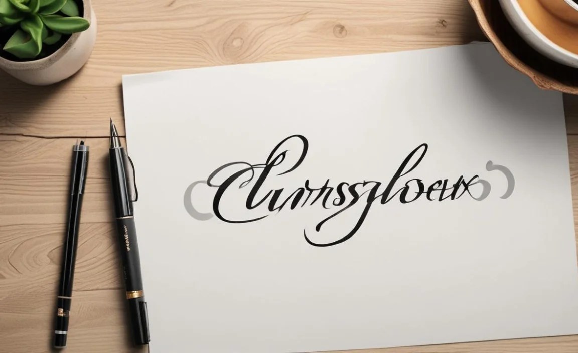
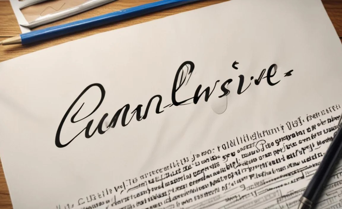
- The Extended Tail: Some styles feature a more pronounced tail on the ‘L’. This can add a touch of elegance and provide a strong anchor for connecting to the subsequent letter. This is often seen in more decorative script styles but can be adapted for legibility.
To help students visualize these, showing them examples is crucial. Many online resources and handwriting workbooks provide excellent visual guides. Organizations like the National Handwriting Association offer valuable insights and resources for improving penmanship.
The Lowercase Cursive ‘L’: Connecting Elegance
The lowercase cursive ‘l’ is a workhorse letter in cursive. It has a distinctive tall loop that reaches up to the top line, making it one of the most easily recognizable lowercase letters. Its height and flowing shape are key to its readability and its ability to connect smoothly with other letters.
Like its capital counterpart, breaking down the lowercase ‘l’ into simple steps helps students build the muscle memory needed for consistent formation.
Step-by-Step: Forming the Lowercase Cursive ‘L’
- Begin with an upward stroke: Start at the baseline and sweep upwards towards the top line, making a tall, narrow loop.
- Loop and descend: At the top line, sweep down and to the left, creating the main body of the loop. Continue this stroke downwards, past the baseline.
- Add the exit stroke: As you come up from below the baseline, add a small curve or outward flick to the right. This prepares the pen to connect to the next letter.
The height of the uppercase loop is essential. It should clearly reach the top writing line, differentiating it from letters like ‘e’ or ‘i’. The downward stroke should be clear, and the exit stroke should be subtle enough not to clutter the letter but prominent enough to indicate the start of the next connection.
Proven Lowercase ‘L’ Designs for Students
Here are some effective designs for the lowercase cursive ‘l’ that focus on clarity and ease of learning:
- The Standard Tall Loop: This is the classic cursive ‘l’ where the loop clearly goes up to the top line. It’s highly readable and forms a natural bridge to the next letter.
- The Rounded Loop: Instead of a sharp, narrow loop, this variation uses a more rounded shape at the top. This can sometimes be easier for younger students to form consistently and adds a softer feel to the writing.
- The Slight Bend Stroke: While the main stroke is downward, a slight, elegant bend can be incorporated before reaching the baseline, adding a bit of stylistic flair while maintaining legibility.
Students often benefit from tracing these letters first. Using dotted lines or guides helps them understand the path of the stroke. Resources like those found on the Handwriting Without Tears® can provide excellent printable worksheets and guidance.
Comparing Cursive ‘L’ Fonts: The Designer’s Eye
For graphic and web designers, understanding the nuances of how a cursive ‘L’ is presented in different font families is crucial for branding and design projects. While we’re focusing on handwriting, the principles of font design often mirror the goals of clear penmanship: readability, aesthetic appeal, and consistent style.
When choosing a font that includes a cursive ‘L’, designers look for several qualities:
- Legibility at various sizes: Does the ‘L’ look clear whether it’s small on a business card or large on a billboard?
- Flow and connection: How well does the ‘L’ connect with other letters in the script? Does it create a smooth, unbroken line?
- Distinctiveness: Is the ‘L’ easily identifiable and not easily confused with other characters?
- Overall aesthetic harmony: Does the ‘L’ fit the overall personality and style of the font family?
Consider these font types and their typical ‘L’ characteristics:
| Font Type | Typical Cursive ‘L’ Characteristics | Best For |
|---|---|---|
| Classic Script | Elaborate loops, sweeping tails, often decorative. | Invitations, formal announcements, elegant branding. |
| Modern Script | Cleaner lines, less ornamentation, often more streamlined loops. | Websites, personal blogs, contemporary branding. |
| Casual Script | Looser strokes, more like hurried handwriting, often with unique flourishes. | Social media posts, informal notes, friendly branding. |
| Handwritten Style (Sans/Serif) | Mimics handwriting but often simplified for digital readability. Loops might be less complex. | Everyday documents, marketing materials needing a personal touch. |
For students, the equivalent is choosing handwriting styles that prioritize clarity. Often, a slightly simplified, well-structured cursive ‘L’ is more effective for learning than an overly decorative one. Resources like Font Squirrel or Google Fonts can offer examples of cursive-style fonts and their letterforms, illustrating how designers approach characters like ‘L’.
Tools and Techniques for Mastering the Cursive ‘L’
Beyond just knowing the steps, certain tools and techniques can significantly aid students in mastering the cursive ‘L’. These methods focus on building muscle memory and understanding the proper flow of the strokes.
Essential Tools for Practice:
- Proper Writing Utensils: Pencils with a comfortable grip are ideal for beginners. As they progress, ballpoint pens or smooth-writing gel pens can help create a consistent line.
- Lined Paper: Paper with guide lines (top line, midline, baseline) is crucial. This helps students maintain consistent letter height and alignment.
- Handwriting Workbooks: Many workbooks are designed with step-by-step instructions and practice spaces specifically for cursive letters.
- Tracing Sheets: Printable or downloadable tracing sheets allow students to physically follow the correct stroke paths.
Effective Practice Techniques:
- Slow and Steady Practice: Rushing leads to errors. Encourage students to practice slowly, focusing on the correct formation of each stroke.
- Focus on One Letter at a Time: Master the capital and lowercase ‘L’ individually before trying to connect them in words.
- Repetition with Correction: Practice the letter repeatedly, and when an error is made, identify it and correct it on the next attempt.
- Exaggerate the Strokes (Initially): Sometimes, exaggerating the upward loop or the downward stroke can help students feel the proper movement and pressure.
- Connect to Known Letters: Once the ‘L’ is mastered, practice connecting it to letters the student already knows well, like ‘a’, ‘i’, or ‘o’.
Consistency is key. Short, frequent practice sessions are more effective than long, infrequent ones. Integrating cursive practice into daily activities, like writing a name or a simple word, can make it feel less like a chore and more like a useful skill.
The Impact of Good Cursive ‘L’ on Overall Writing
Mastering the cursive ‘L’, both capital and lowercase, has a ripple effect on a student’s entire handwriting. A well-formed ‘L’ is tall, has a distinct loop, and connects smoothly. When students achieve this consistently, their writing gains:
- Improved Legibility: The distinct shape of the ‘L’ makes it easy to read, which in turn helps with the readability of entire words and sentences.
- Enhanced Fluency: A correctly formed ‘L’ allows the pen to flow naturally to the next letter, contributing to smoother, faster writing.
- Increased Confidence: Successfully mastering a challenging letter like the ‘L’ boosts a student’s self-esteem and motivation to continue improving their handwriting.
- Better Visual Appeal: Consistent, well-formed letters create handwriting that looks neat, organized, and aesthetically pleasing. This can positively impact how their work is perceived.
Think about the letter ‘l’ in the word “level.” If each ‘l’ is formed correctly and connected properly, the word looks balanced and easy to read. If the ‘l’s are inconsistent, the word can appear jumbled. The same applies to words like “little,” “lovely,” and “learn.” The cursive ‘L’ is a pivotal letter in many common words.
Understanding the principles behind creating a good cursive ‘L’ can be applied to learning other cursive letters as well. It’s about understanding the balance of loops, strokes, and connections that make cursive a functional and beautiful form of writing.
Common Mistakes and How to Avoid Them
Even with the best intentions, students might encounter challenges when forming the cursive ‘L’. Identifying these common mistakes is the first step to correcting them and ensuring smooth progress.
Common Pitfalls for the Capital Cursive ‘L’:
- Loop too small or absent: The loop is the defining feature. If it’s too small, it can resemble a lowercase ‘l’. Ensure it extends sufficiently downwards.
- Loop awkwardly shaped: A loop that is too wide, squashed, or has a sharp angle can look messy. Aim for a smooth, oval or rounded shape.
- Stroke too short or too long: Both the upward and downward strokes need to be proportionate to the loop. Practice guides help maintain the correct letter height.
- Poor connection to the next letter: The final flourish needs to be clear to guide the pen into the next character.
Common Pitfalls for the Lowercase Cursive ‘L’:
- Loop doesn’t reach the top line: This is the most frequent error, making it look like a different letter. Emphasize reaching “all the way up.”
- Loop too wide: A wide loop can clutter the writing space and might be confused with other tall letters like ‘h’ or ‘k’.
- Downard stroke too curved or angled: The main downward stroke should be relatively straight to maintain height and allow smooth connection.
- Exit stroke missing or too prominent: A missing exit stroke hinders connection, while an overly large one can make the letter look untidy.
The key to avoiding these mistakes is consistent, deliberate practice with constructive feedback. Encouragement and positive reinforcement are vital. For educators and parents, providing clear demonstrations and corrections is invaluable. Remember, the goal is legible and confident writing, not perfect uniformity.
Frequently Asked Questions about Cursive L Font Designs
What is the easiest way to teach a child the cursive ‘L’?

Start with large, clear examples. Use tracing activities and break down the formation into simple, distinct movements: up, loop down, tail. Focus on one type (capital or lowercase) at a time until mastered.
Why is the uppercase cursive ‘L’ loop so important?

The loop is what distinguishes the capital ‘L’ visually from other letters and gives it its characteristic elegance. A well-formed loop ensures the letter is easily recognizable and contributes to the overall balance of the word.
Can a simple cursive ‘L’ still be stylish?
Absolutely! Even simple designs can be stylish through consistent neatness, proper spacing, and graceful connections. The beauty often lies in the fluidity and legibility rather than complex flourishes.
What are lowercase cursive ‘l’s used for in everyday writing?

They are used in countless common words like ‘love’, ‘like’, ‘learn’, ‘little’, and ‘hello’. Mastering the lowercase ‘l’ is crucial for writing clearly and fluently in everyday communication.
How can I make my cursive ‘L’ look less shaky?
Shakiness often comes from grip or speed. Ensure a relaxed grip on the writing tool and practice writing slowly and deliberately. Consistent practice with smooth writing instruments can also help build steadier lines.
Are there specific cursive ‘L’ fonts recommended for dyslexic students?
While specific ‘L’ font designs are less critical than overall font legibility, some fonts are designed to aid reading. For cursive, clarity is key. Look for fonts with distinct letter shapes and clear loops for the ‘L’, avoiding overly ornate or cramped scripts.
How does mastering the cursive ‘L’ impact overall handwriting speed?
Once the formation of the ‘L’ becomes automatic and the connections are smooth, it actually improves handwriting speed. Consistent letter formation reduces hesitation and allows for a more fluid, continuous flow of writing.
Conclusion: Crafting Confident Cursive ‘L’s
Mastering the cursive ‘L’, in both its capital and lowercase forms, is a rewarding journey for students. By focusing on proven, clear designs and employing effective teaching techniques, we can transform this potentially tricky letter into a strong, elegant component of beautiful handwriting. The journey from a wobbly ‘L’ to a confident, flowing stroke builds not just penmanship skills, but also boosts a student’s confidence and overall approach to writing.
Whether you’re a student eager to perfect your script, a parent guiding a young learner, or a designer seeking inspiration, understanding the principles of a good cursive ‘L’ is key.


