Typography plays a crucial role in user experience when designing a mobile app. The right font size ensures the text is legible and provides seamless navigation.
Optimizing mobile app font size is essential for enhancing user flow, making it easier to read, navigate, and interact with the app. In this guide, we will explore mobile app font size guidelines, the importance of text styles, and how to implement them effectively for better user experience across various devices.
Mobile App Font Size Guidelines
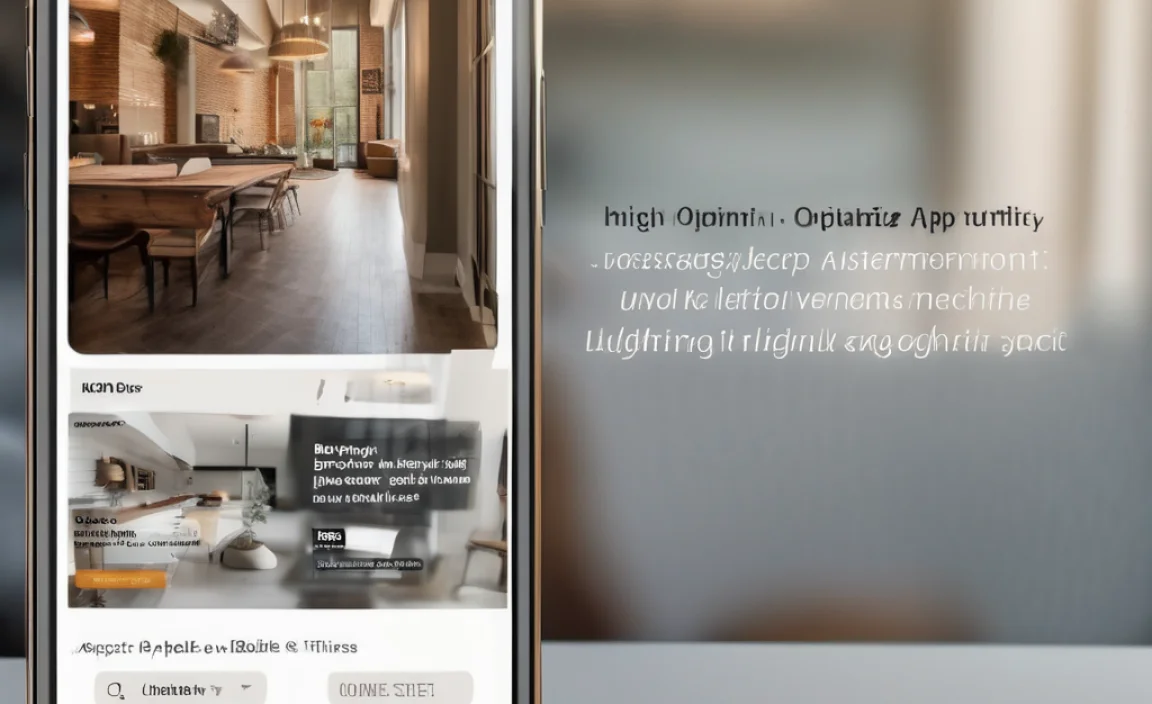
Mobile app design is all about clarity, and font size is key to achieving this. Choose the font size carefully. It should maintain a balance between legibility and aesthetic appeal. According to the human interface guidelines by Apple, font sizes should be adaptable to different screen sizes, ensuring that users don’t need to zoom in for readability.
The typical base font size for mobile typography is 16px, but this varies depending on the content. Text content such as body paragraphs typically uses a size ranging from 14px to 18px for a comfortable reading experience. In contrast, headings and important text styles are set to larger sizes. These sizes range from 22px to 32px.
When considering font size, it’s also important to factor in the line height and line length. A comfortable line height is generally 1.4 to 1.6 times the font size, depending on the type of content. For mobile design, keeping line length short, typically between 45 to 75 characters per line, improves readability.
Responsive Design and Accessibility
To ensure the text looks great on any device, responsive design is a must. This means the font size and layout adapt based on the screen size. Google Play and App Store guidelines emphasize the importance of making text accessible on different mobile devices by using flexible CSS pixels that scale correctly with mobile screen sizes.
For users with visual impairments, it is important to follow web content accessibility guidelines (WCAG), which recommend a minimum font size of 16px for body text. This ensures that the app remains readable even for users who rely on screen magnifiers or have limited vision.
Web accessibility is a key part of good app design. Choosing the right font size makes your app more inclusive. Ensuring the text size can be resized adds to accessibility. Use serif fonts like Georgia for body text. For headings, opt for serif fonts to differentiate text and increase contrast. This ensures non-text content remains accessible.
Mobile Typography and System Fonts
For mobile app design, choosing the right font family is critical. System fonts are highly recommended for mobile devices. SF UI Text is the preferred choice for iOS. Roboto is commonly used for Android apps. These fonts are optimized for mobile app design. They ensure clear and crisp text display across different screen sizes.
Another advantage of using system fonts is that they are familiar to users, providing a sense of consistency with the operating system’s native UI. However, custom fonts can be used when specific branding or stylistic needs arise. When selecting a custom font, ensure it maintains legibility and performance on mobile devices.
Font Pairing and Optical Size
When it comes to font pairing, it’s important to use a combination of fonts that complement each other. A good practice is pairing a serif font for headings with a sans-serif font for body text. This creates a visual hierarchy and makes content easy to digest. Be mindful of optical size adjustments, as different fonts can appear larger or smaller depending on their design, even when set at the same pixel size.
Font Weight and Text Styles
Incorporating bold or italic styles can also enhance readability. Bold italic text can highlight important information and create emphasis, but it should be used sparingly to maintain a clean design. When using text styles, always aim for consistency across the app to provide a cohesive look and feel.
Best Practices for Font Size in Mobile Apps
- Minimum Font Size: As mentioned earlier, ensure your body text is at least 16px to comply with accessibility standards and ensure clarity.
- Scaling: Use responsive design principles to ensure that text size adapts to different screen sizes. Employ fluid typography by using relative units like em or rem instead of fixed pixel sizes.
- Text Styles: Prioritize simplicity and clarity in your app’s typography. Avoid excessive text decoration, and keep font pairings to a minimum.
- Line Length: Keep text lines short for mobile screens to avoid eye strain and improve readability.
- Whitespace: Incorporate plenty of white space between text blocks to enhance the user flow and make the text feel less crowded.
Conclusion
Optimizing font size for mobile apps is a critical aspect of mobile app design that directly impacts user experience. By following the guidelines for mobile typography, responsive design, and accessibility guidelines, you can create a visually appealing and highly functional app. Whether you’re using Google fonts, system fonts, or custom fonts, the right font size and careful text styles will help you craft a seamless experience for users on any mobile device.
FAQs
What Is The Ideal Font Size For Mobile Apps?
The ideal font size is typically 16px for body text. Headings can range from 22px to 32px.
Why Is Font Size Important For Mobile User Experience?
A well-chosen font size ensures readability, reduces eye strain, and enhances the overall user experience.
What Are System Fonts, And Why Should I Use Them?
System fonts optimize mobile devices. They provide consistency with the device’s interface. This improves text clarity and legibility.
What Is The Minimum Font Size For Accessibility?
For web content accessibility guidelines, the minimum font size for body text should be 16px.
Can I Use Custom Fonts For My Mobile App?
Yes, but ensure the custom font is legible and performs well on mobile devices.
How Can I Ensure My App’s Font Scales Correctly On Different Screen Sizes?
Implement responsive design and use flexible CSS pixel units to allow text to scale with the screen size.
What Is Font Pairing, And How Does It Help?
Font pairing involves combining fonts that complement each other, creating a balanced visual hierarchy and improving readability.
What Role Does Line Height Play In Mobile Typography?
A proper line height (typically 1.4 to 1.6 times the font size) improves readability and prevents text from looking cramped.
How Can I Improve My App’s Typography?
Focus on font size, line length, text styles, and maintaining consistency across the app.
What Is The Optical Size In Typography?
Optical size refers to font size adjustments depending on the typeface’s design, ensuring it appears the right size visually.
What Are The Best Fonts For Mobile Apps?
Popular fonts include SF UI Text for iOS and Roboto for Android. These system fonts are optimized for mobile readability.

