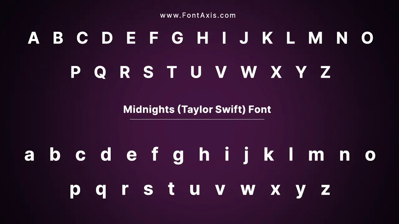
Taylor Swift’s tenth studio album, Midnights, released on October 21, 2022, is a perfect blend of introspective lyrics and refined, electronic pop production.
The album’s cover artwork features the Neue Haas Grotesk font, a sleek and modern typeface that complements the album’s themes of late-night introspection and emotional vulnerability. This font perfectly reflects the evolution of Taylor’s artistry, moving into a more experimental and sophisticated realm.
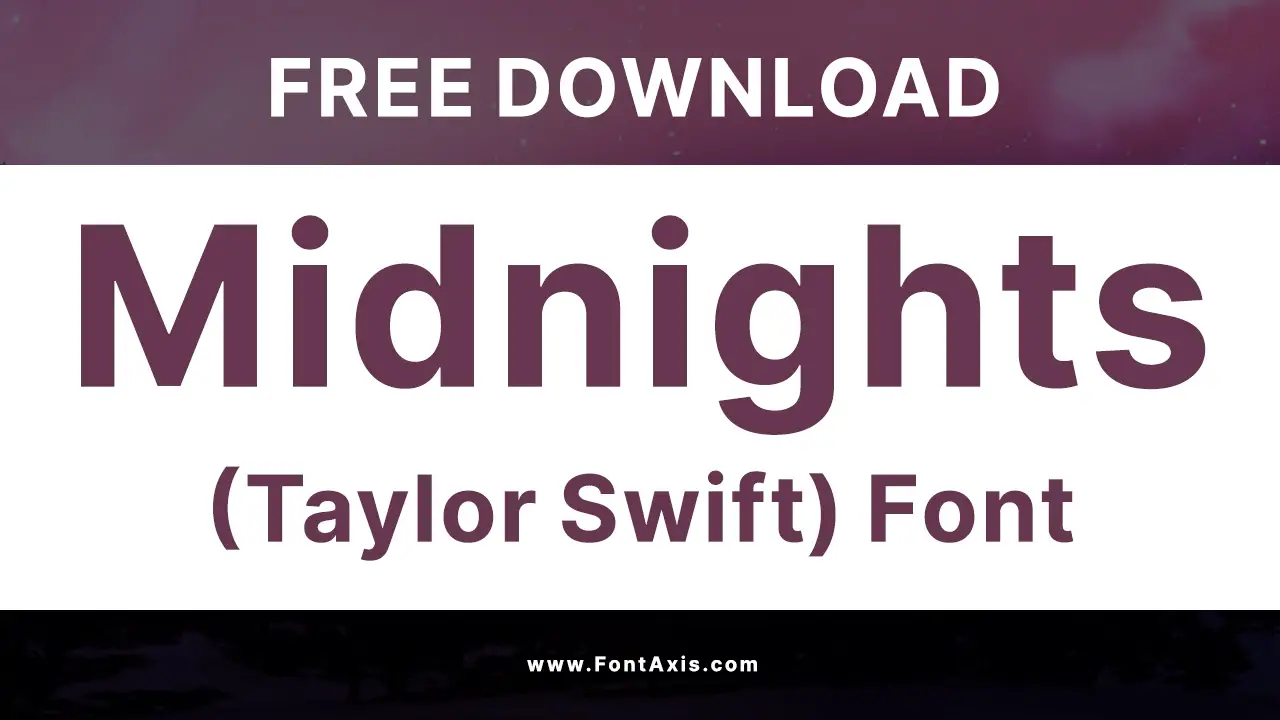
Midnights Font Details
| Font Name | Neue Haas Grotesk Display 65 Medium |
| Designer | Max Miedinger, with Eduard Hoffmann contributing to the original design; digitized by Christian Schwartz |
| Style | Sans-serif, geometric, modern with clean lines; offers a neutral and balanced aesthetic |
| Usage | Album title and song listings on the Midnights cover, official branding, and merchandise |
| License | Paid license required for commercial use |
Font Characteristics And Modifications
The Midnights album font is based on Neue Haas Grotesk, a typeface designed between 1957 and 1961. It was later adapted into what we now know as Helvetica.
The Display 65 Medium weight used in the Midnights album cover gives a sophisticated, minimalist feel that aligns perfectly with Taylor’s new era. The geometric forms and the clean, legible lines provide a modern look, making it an ideal choice for a pop music album that seeks to combine personal depth with mainstream appeal.
Similar Fonts To Midnights Font
If you’re looking for fonts that capture the sleek, contemporary feel of Neue Haas Grotesk, here are some great alternatives:
- SF Pro Display – A clean, geometric font used by Apple for a modern and tech-savvy look.
- Avenir – Another modern sans-serif typeface with a neutral and versatile style.
- Europa Grotesk – A geometric sans-serif with a similar clean aesthetic.
- Helvetica Neue – A close relative of Neue Haas Grotesk, offering similar neutrality and readability.
- Carla Sans – A minimalist sans-serif with a sleek, contemporary vibe.
Where To Use The Midnights Font
The Midnights font is incredibly versatile and works well across many design projects, particularly in pop music and branding. Here’s where you can use it:
- Album Covers: Create sleek, minimalist covers similar to the Midnights album.
- Logos and Branding: Ideal for logos, especially for brands that want to convey sophistication and modernity.
- Promotional Materials: Use the font for posters, flyers, and other promotional content for events or artists.
- Web Design: Perfect for creating clear, readable typography on websites, especially those focusing on modern, high-end aesthetics.
- Social Media: Great for creating engaging content or promotional posts related to pop music, albums, or personal projects.
Font Pairing Options
Because of its modern, geometric nature, Neue Haas Grotesk pairs well with simpler, more organic fonts. Here are a few fonts that complement it:
- Carla Sans Light – Offers a clean and refined look when paired with Neue Haas Grotesk.
- Bebas Neue – Bold and impactful, perfect for headlines that need to stand out.
- Satisfaction Font – A handwritten style that contrasts nicely with the sleek lines of Neue Haas Grotesk.
- Tortured Poets Department – Offers an artistic touch, working well for designs with an emotional or creative edge.
- Permanent Marker – Adds a more personal, hand-written feel while maintaining legibility.
Conclusion
The Midnights font – Neue Haas Grotesk Display 65 Medium – is a perfect fit for Taylor Swift’s Midnights album, capturing both its modernity and sophistication. Its clean lines and geometric design reflect Taylor’s new artistic direction, while its versatility ensures that it can be used across various media, from album covers to promotional campaigns.
Whether you’re a graphic designer or a Taylor Swift fan looking to create inspired artwork, Neue Haas Grotesk will elevate any project with its timeless, minimalistic appeal.
FAQs
1.What Is The Font Used On Taylor Swift’s Midnight Album Cover?
The font used is Neue Haas Grotesk Display 65 Medium.
2.Can I Use The Midnights Font For Free?
No, Neue Haas Grotesk requires a paid license for both personal and commercial use.
3.What Other Fonts Are Similar To The Midnight Font?
Fonts like SF Pro Display, Avenir, and Helvetica Neue are similar to Neue Haas Grotesk.
4.Who Designed The Neue Haas Grotesk Font?
Max Miedinger designed the original font with Eduard Hoffmann. Christian Schwartz later digitized and adapted it for modern use.
5.Where Can I Buy The Neue Haas Grotesk Font?
You can purchase Neue Haas Grotesk from font websites like Monotype and Linotype.

