The “Marriage Story” font is not a single, specific typeface, but rather the elegant and classic serif font shown in the movie’s iconic title sequence. It’s often identified as being similar to or inspired by fonts like Tiempos Text or Garamond due to its readable, slightly historical feel. Choosing a similar font for your own projects aims for sophistication, clarity, and a touch of timeless appeal.
Ever seen a movie or a book cover and thought, “Wow, that typography just feels right”? That’s the magic of a well-chosen font! The design world often grapples with finding that perfect typeface, and for many, the “Marriage Story font” has become a symbol of understated elegance and readability. If you’re looking to capture that same sophisticated vibe for your own branding, website, or design project, you’re in the right place. It can feel a bit tricky to pinpoint, but don’t worry! We’ll explore what makes that font so special and how you can easily find and use fonts that give you that same beautiful effect. Let’s dive in and unlock the secrets to timeless typography!
What IS the “Marriage Story Font”? Unpacking the Mystery
The term “Marriage Story font” usually refers to the specific typeface used in the opening and closing credits of Noah Baumbach’s critically acclaimed film, Marriage Story. It’s not a custom font created solely for the movie, but rather a typeface that embodies a particular aesthetic: classic, highly readable, and sophisticated. Think of it as a modern interpretation of traditional serif fonts – the ones with little “feet” or decorative strokes at the ends of letters.
When designers and fans talk about the “Marriage Story font,” they are often referencing a feeling or a style rather than a singular, named product. This style evokes a sense of seriousness, intellectual depth, and a touch of old-world charm. It’s a font that commands attention through its clarity and grace, making it perfect for titles, headings, and important text. Its timeless quality is likely why it resonates so much with people looking for a reliable and elegant typographic solution.
Why This Font Style Matters
The choice of typeface in a film’s title is a crucial design element. It sets the tone, hints at the story’s themes, and influences the audience’s initial perception. The font used in Marriage Story is a perfect example of this. It’s:
- Readable: Crucial for viewer comprehension, especially in fast-moving credits or important textual information.
- Elegant: Conveys a sense of sophistication and artistry, aligning with the film’s dramatic narrative.
- Timeless: Avoids fleeting trends, ensuring the design feels relevant and impactful for years to come.
- Balanced: Offers a harmonious visual flow, preventing distraction and allowing the content to shine.
This combination of qualities makes it a highly desirable style for designers tackling projects where clarity and a refined aesthetic are paramount. It signals professionalism and thoughtful consideration in design choices.
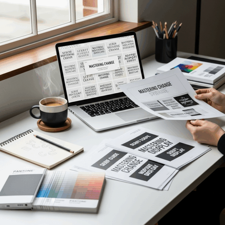
Identifying Similar Fonts: The “Marriage Story” Aesthetic
While there isn’t one single font officially named the “Marriage Story font,” several typefaces share its core characteristics. These fonts typically fall into the serif category, known for their readability and classic appeal. Let’s explore some of the closest relatives and what makes them so special:
Key Characteristics of “Marriage Story”-Style Fonts
When searching for fonts that capture the Marriage Story look and feel, keep an eye out for these features:
- Clear Serif Detail: The serifs are present but not overly ornate or heavy. They are well-defined and contribute to the letterforms’ structure.
- Moderate Stroke Contrast: There’s a noticeable difference between thick and thin strokes in the letters, adding visual interest without compromising legibility.
- Generous X-height: ‘X-height’ refers to the height of lowercase letters like ‘x’, ‘a’, and ‘o’. A generous x-height generally improves readability, especially at smaller sizes.
- Open Counters: The ‘counters’ are the enclosed or partially enclosed negative space within letters (like in ‘o’ or ‘p’). Open counters help with legibility.
- Slightly Condensed or Proportional Width: Not too wide, not too narrow. They feel naturally spaced and easy to read in blocks of text.
Top Contenders & Inspirations
Based on its visual cues, the font used in Marriage Story is often compared to, or at least heavily inspired by, fonts like:
1. Tiempos Text
This is a very popular and often cited font when discussing the Marriage Story aesthetic. Tiempos Text is a contemporary serif typeface meticulously designed for editorial use. It excels in setting long passages of text, offering excellent readability while maintaining a refined and serious appearance. Its balanced proportions and clear serifs make it a strong contender for embodying the film’s typographic style.
Why it works: Tiempos Text has a beautiful harmony of robustness and elegance. It feels grounded and authoritative, perfect for conveying serious themes. Its design prioritizes legibility in print, which translates wonderfully to screen applications as well.
2. Garamond (and its many revivals)
Garamond is one of the oldest and most respected typefaces in history, dating back to the 16th century. Revivals like Adobe Garamond, ITC Garamond, or EB Garamond offer different nuances, but they all share a distinct calligraphic grace and excellent readability. Garamond fonts often feature a lower x-height and a more delicate structure than Tiempos Text, giving them a slightly more traditional and perhaps academic feel.
Why it works: Garamond offers a sense of classic literature and historical gravitas. For projects aiming for a distinctly timeless or scholarly feel, Garamond and its kin are excellent choices. They communicate a certain intellectual depth.
3. Bodoni / Didot
These are examples of “Modern” serif typefaces, characterized by extreme contrast between thick and thin strokes and very thin, unbracketed serifs. While Marriage Story‘s font often leans more towards the readability of Tiempos or Garamond, elements of Bodoni and Didot can be found in their sharp, elegant lines. They are undeniably stylish.
Why it works for inspiration: They bring a high level of fashion and polish. If you love the stark elegance and dramatic contrast, exploring these can be insightful, though they might require more careful use for blocks of text compared to other options.
4. EB Garamond (Open Source Option)
For those looking for a free and high-quality option, EB Garamond is a fantastic choice. This open-source project meticulously digitizes historical Garamond designs, offering a wealth of characters and excellent rendering. It captures the essence of classic Garamond beautifully.
Why it works: It’s free, widely available, and offers the classic elegance associated with Garamond. It’s a smart pick for budget-conscious designers or students.
Where to Find These Fonts
Many of these fonts, or close approximations, can be found on popular font platforms:
- Google Fonts: Offers many free, high-quality options that can fit a similar aesthetic (e.g., EB Garamond, Noto Serif).
- Adobe Fonts: If you have an Adobe Creative Cloud subscription, you get access to a vast library, including Tiempos Text and many variations of Garamond, Bodoni, and others.
- MyFonts, Fontspring, Linotype: These are commercial marketplaces where you can purchase licenses for specific, high-end typefaces like Tiempos Text.
Always check the license agreements for any font you use, especially for commercial projects.
How to Use the “Marriage Story” Font Style Effectively
Choosing a font is only half the battle. Knowing how to use it is where the real design magic happens. The “Marriage Story” aesthetic, with its emphasis on clarity and sophistication, can elevate any project when applied thoughtfully.
Best Use Cases
Fonts with this classic serif style are incredibly versatile. Consider using them for:
- Movie Titles & Film Credits: Just like its inspiration!
- Book Covers & Interior Design: Especially for literary fiction, biographies, or academic texts.
- Branding for Professional Services: Law firms, financial advisors, consultancies, or any business that wants to project trust and professionalism.
- Website Headings & Subheadings: To add a touch of elegance and hierarchy to your online content.
- Invitations & Stationery: For weddings, formal events, or elegant personal correspondence.
- Magazine Layouts: For feature article titles and pull quotes.
Pairing Your Serif Font
No design exists in a vacuum! Your chosen serif font will likely need a companion. The key is to create contrast and complement, not compete.
1. Pairing with a Sans Serif Font
This is the most common and often most effective pairing strategy. Sans serif fonts (those without the little feet) offer a clean, modern counterpoint to a classic serif. Think of pairing Tiempos Text with something like:
- Lato: Friendly and versatile.
- Open Sans: Highly readable and neutral.
- Montserrat: Geometric and modern.
- Roboto: A strong, clean sans serif developed by Google.
Use the serif for your main headings or impactful quotes, and the sans serif for body text, captions, or call-to-action buttons. This creates a dynamic visual hierarchy.
Table: Serif & Sans Serif Pairing Suggestions
| “Marriage Story” Style Serif (e.g., Tiempos Text, EB Garamond) | Complementary Sans Serif (for Body Text/Subheadings) | Best For |
|---|---|---|
| Tiempos Text | Lato, Open Sans | Professional branding, websites, editorial content. |
| EB Garamond | Montserrat, Roboto | Literary projects, historical themes, formal invitations. |
| Bodoni / Didot (for emphasis) | Raleway, Source Sans Pro | Fashion-forward design, high-impact titles, luxury branding. |
2. Pairing with Another Serif Font?
This can be trickier. If you choose to pair two serif fonts, ensure they come from different families or have distinct characteristics. For example, you might pair a more classic, sturdy serif for headings with a lighter, more delicate serif for smaller text. Or, choose serifs that belong to the same superfamily but have different weights or widths.
Hierarchy and Readability
The goal is to guide the reader’s eye. Use font size, weight (boldness), and color to create a clear hierarchy.
- Headings: Larger size, maybe bold weight.
- Subheadings: Smaller than headings, perhaps regular or medium weight.
- Body Text: Comfortable reading size (typically 16px or larger for web), clear weight, and good line spacing.
Ensure sufficient contrast between text color and background color for optimal readability. For web content, adhere to accessibility standards. The Web Content Accessibility Guidelines (WCAG) recommend specific contrast ratios to ensure your text is readable for everyone.
Beyond the “Marriage Story Font”: Exploring Typographic Principles
While we’ve focused on the specific style inspired by Marriage Story, understanding the underlying principles of typography will empower you to make confident font choices for any project.
Understanding Font Classifications
Fonts are broadly categorized to help designers understand their characteristics and intended uses:
- Serif Fonts: As we’ve discussed, these have small decorative strokes (serifs) at the ends of letterforms. They are often associated with tradition, readability, and a classic feel. Examples: Times New Roman, Garamond, Tiempos Text.
- Sans Serif Fonts: These fonts lack serifs, giving them a clean, modern, and minimalist look. They are excellent for digital interfaces and headings where clarity is key. Examples: Arial, Helvetica, Open Sans.
- Script Fonts: These mimic handwriting or calligraphy. They can range from elegant and formal to casual and playful. Best used sparingly for decorative elements or short titles. Examples: Pacifico, Great Vibes.
- Display Fonts: These are highly stylized and attention-grabbing fonts designed for large sizes and short bursts of text, like headlines or logos. They often have unique personality but can be hard to read in smaller sizes or long paragraphs. Examples: Impact, Lobster.
The Importance of X-Height, Kerning, and Leading
These technical terms might sound intimidating, but they’re easy to grasp and make a big difference:
- X-Height: The height of lowercase letters like ‘x’, ‘a’, ‘c’. A larger x-height typically improves readability, especially at smaller sizes.
- Kerning: The adjustment of space between specific pairs of letters. Well-kerned type looks balanced and smooth. Most digital fonts have built-in kerning, but sometimes manual adjustments are needed for headlines.
- Leading: The vertical space between lines of text (pronounced “ledding”). Proper leading ensures text doesn’t feel too cramped or too spread out, significantly impacting readability.
Understanding these elements helps you refine your typography beyond just selecting fancy fonts. The principle of visual hierarchy, for instance, dictates how you use size, weight, and spacing to organize information effectively.
Choosing Fonts for Your Brand: A Practical Approach
Whether you’re a blogger, a small business owner, or a budding graphic designer, selecting fonts for your brand is a crucial step. The “Marriage Story” font style offers one path to sophistication, but consider:
- Your Brand Personality: Are you modern and minimalist, classic and elegant, playful and energetic, or professional and authoritative? Your fonts should reflect this.
- Your Target Audience: Who are you trying to reach? Different audiences respond to different typographic styles.
- Where Your Fonts Will Be Used: Websites have different requirements than print materials. Readability on screens is paramount for web design.
- Consistency: Choose a small font palette (usually 2-3 fonts) and stick with it across all your branding and marketing materials.
Creating Your Own Font Pairing
Don’t be afraid to experiment! Many designers use online font pairing tools to find harmonious combinations. Some popular ones include:
- Google Fonts’ Pairing Tool
- Fontjoy
- Canva’s Font Combinations Feature
These tools can help you discover new combinations and see how different font styles interact.
Frequently Asked Questions (FAQ)
What font is similar to the one in Marriage Story?
The “Marriage Story” font style is often likened to classic, readable serifs. Tiempos Text is a very close match. Other excellent options include revivals of Garamond (like EB Garamond), and similar editorial serifs designed for high legibility and a sophisticated appearance.
Is the Marriage Story font free?
The specific font used in Marriage Story (likely Tiempos Text or a similar commercial font) is not free; it requires purchasing a license for commercial use. However, high-quality free alternatives with a similar elegant serif style, such as EB Garamond, are readily available on platforms like Google Fonts.
Can I use a serif font for my body text on a website?
Yes, absolutely! Modern serif fonts with good readability, like Tiempos Text or EB Garamond, are excellent for body text on websites, especially for content-heavy sites like blogs or news outlets. Ensure the font has a generous x-height, good spacing, and is used at an appropriate size (e.g., 16px or larger) for optimal screen viewing.
What’s the best sans serif font to pair with a classic serif?
To complement a classic serif like the “Marriage Story” font, opt for a clean, versatile sans serif. Popular choices include Lato, Open Sans, Montserrat, Roboto, or Proxima Nova. The key is to create enough contrast so the fonts don’t compete but work together to establish a clear visual hierarchy.
How do I make my typography look professional like in Marriage Story?
To achieve a professional look: 1.