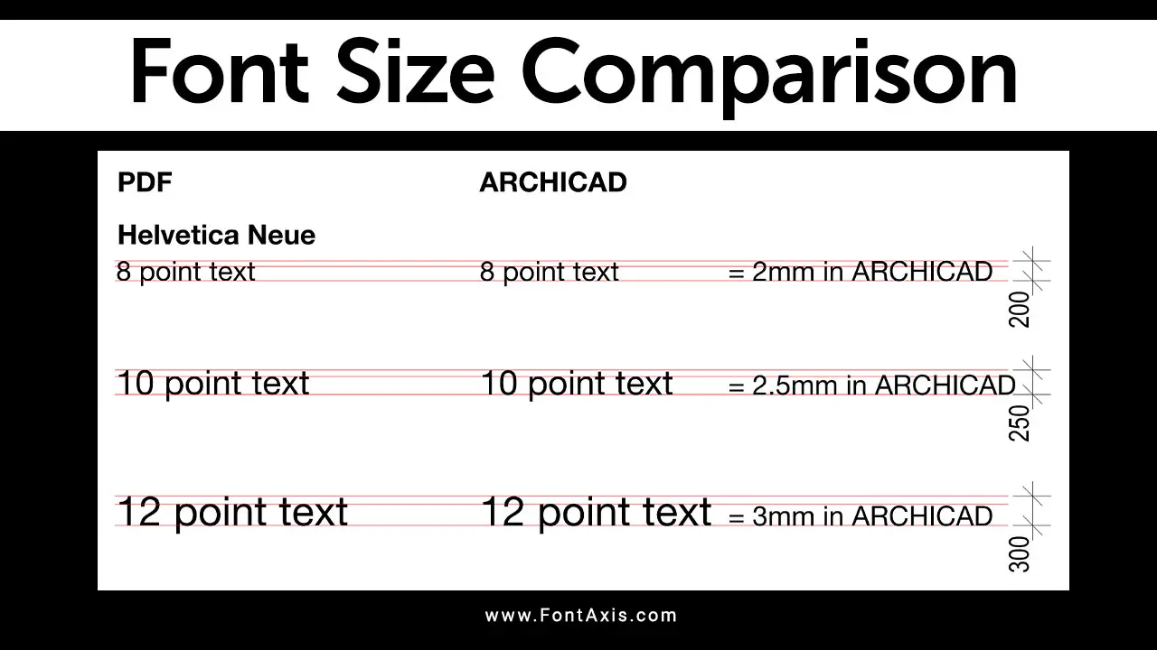
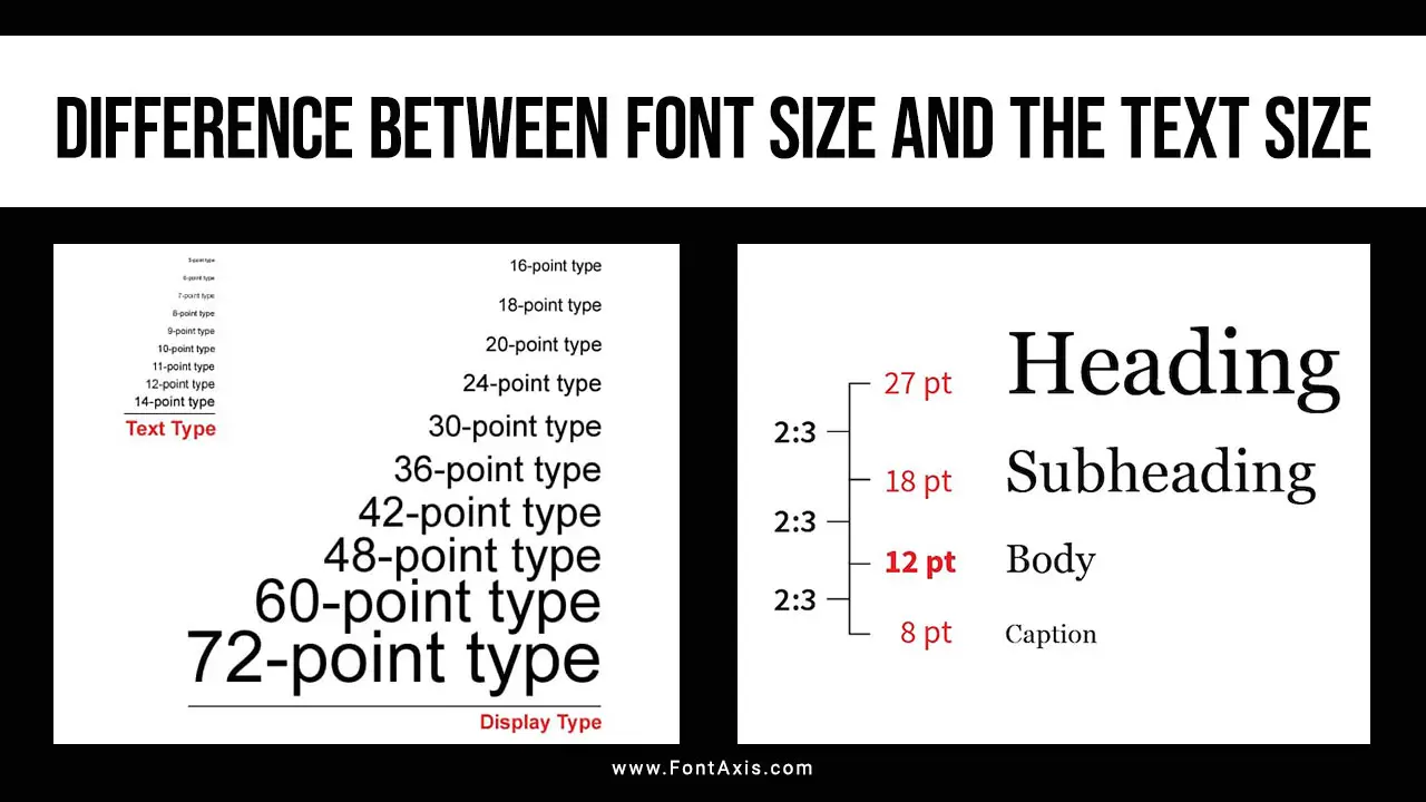
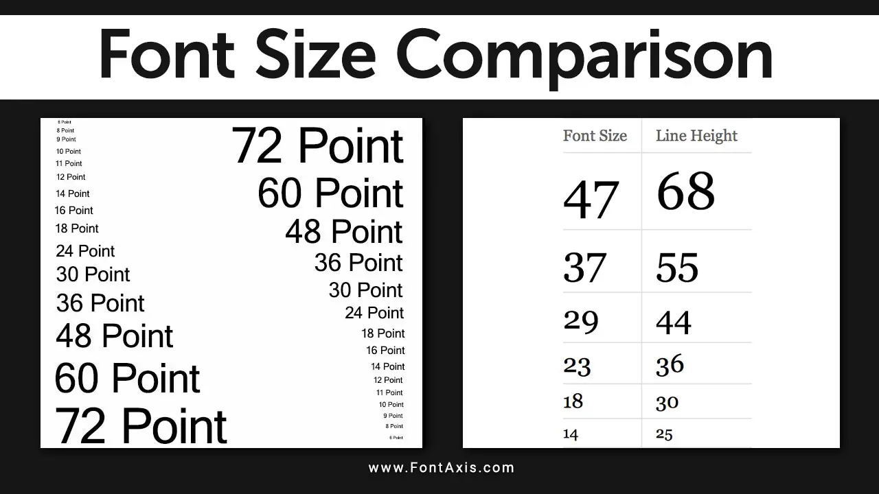
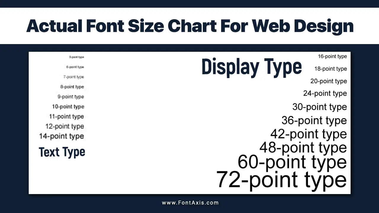
When it comes to typography, selecting the right font size is crucial for both printed material and web design. Understanding font size measurement can help you achieve optimal readability, whether for body text, captions, or labels.
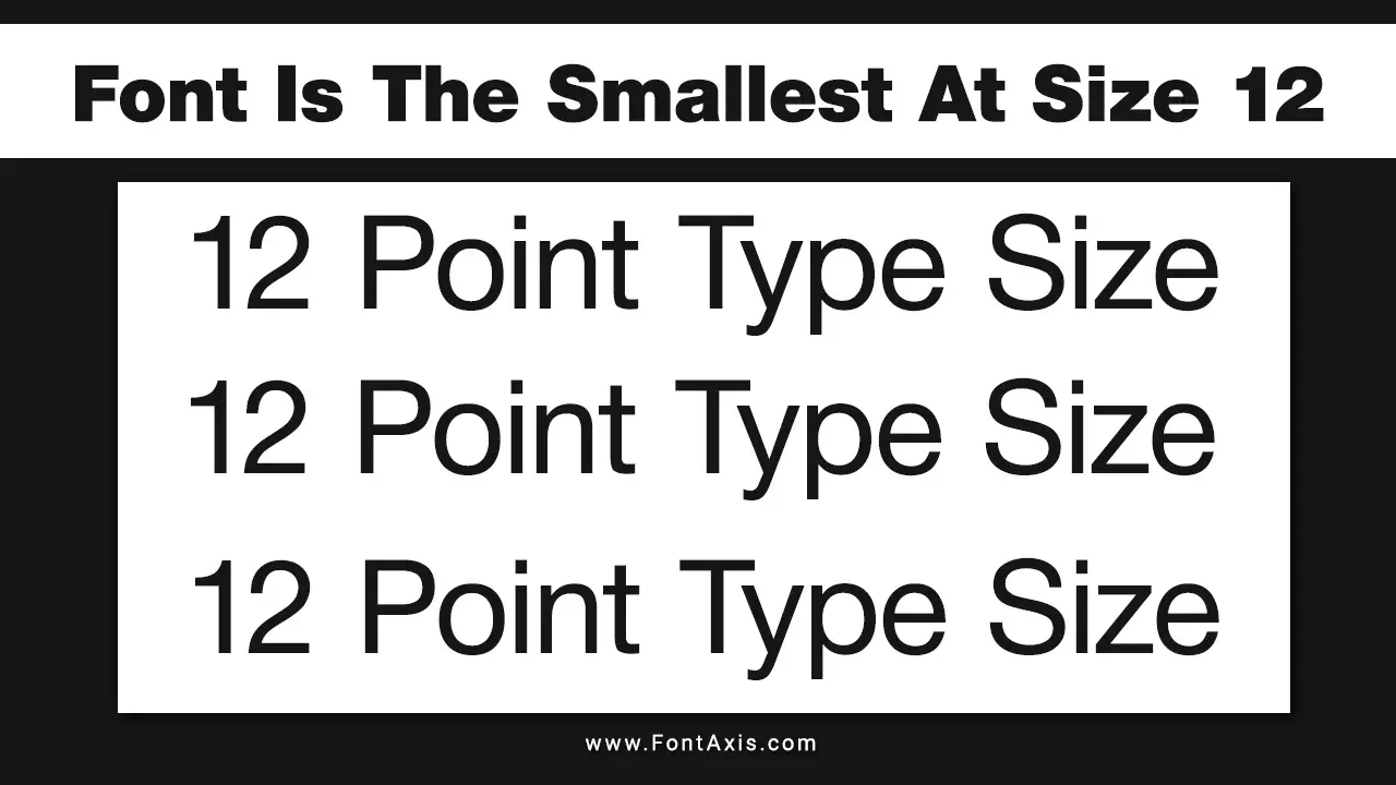
Font sizes are typically measured in points (pt) for printed material and pixels (px) for digital formats. A standard 12 point font is often considered the default font size, providing a balance between visibility and aesthetic appeal. However, depending on your specific needs, you may find that a smaller size is appropriate for fine print, or a larger size enhances the main content.
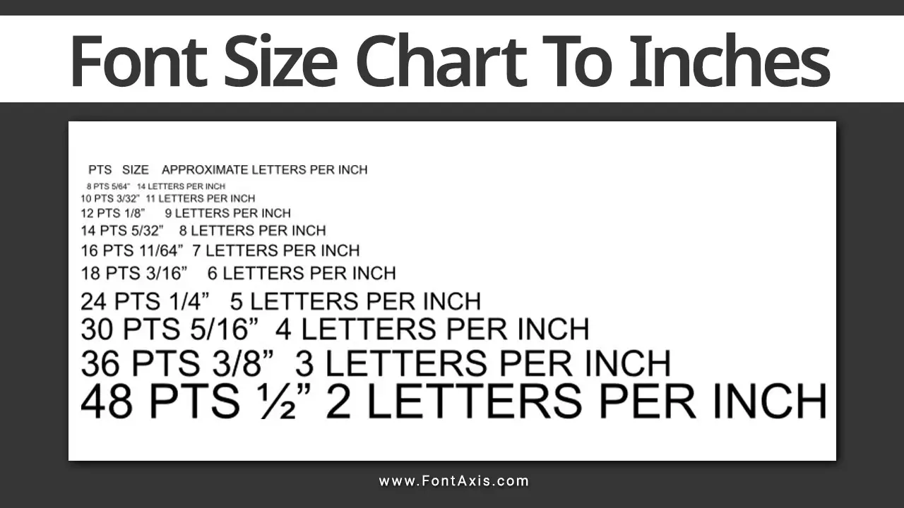
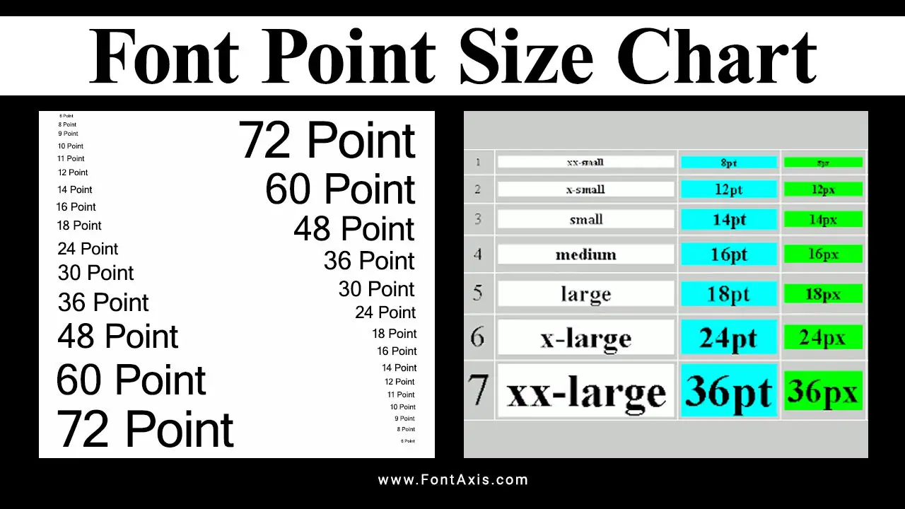
Font Size Chart For Rendering Text
| Font Size (pt) | Equivalent (inches) | Usage |
| 8 pt | 0.111 inches | Captions |
| 10 pt | 0.139 inches | Footnotes |
| 12 pt | 0.167 inches | Body text |
| 14 pt | 0.194 inches | Headings |
| 16 pt | 0.222 inches | Subheadings |
| 18 pt | 0.250 inches | Emphasis text |
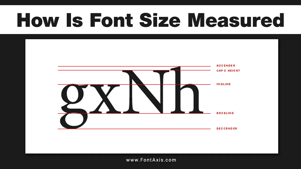
Note: Keep in mind that the cap height of different fonts can affect the appearance of the text. Due to the design of letters, a serif font might appear larger than a sans-serif font at the same point size.
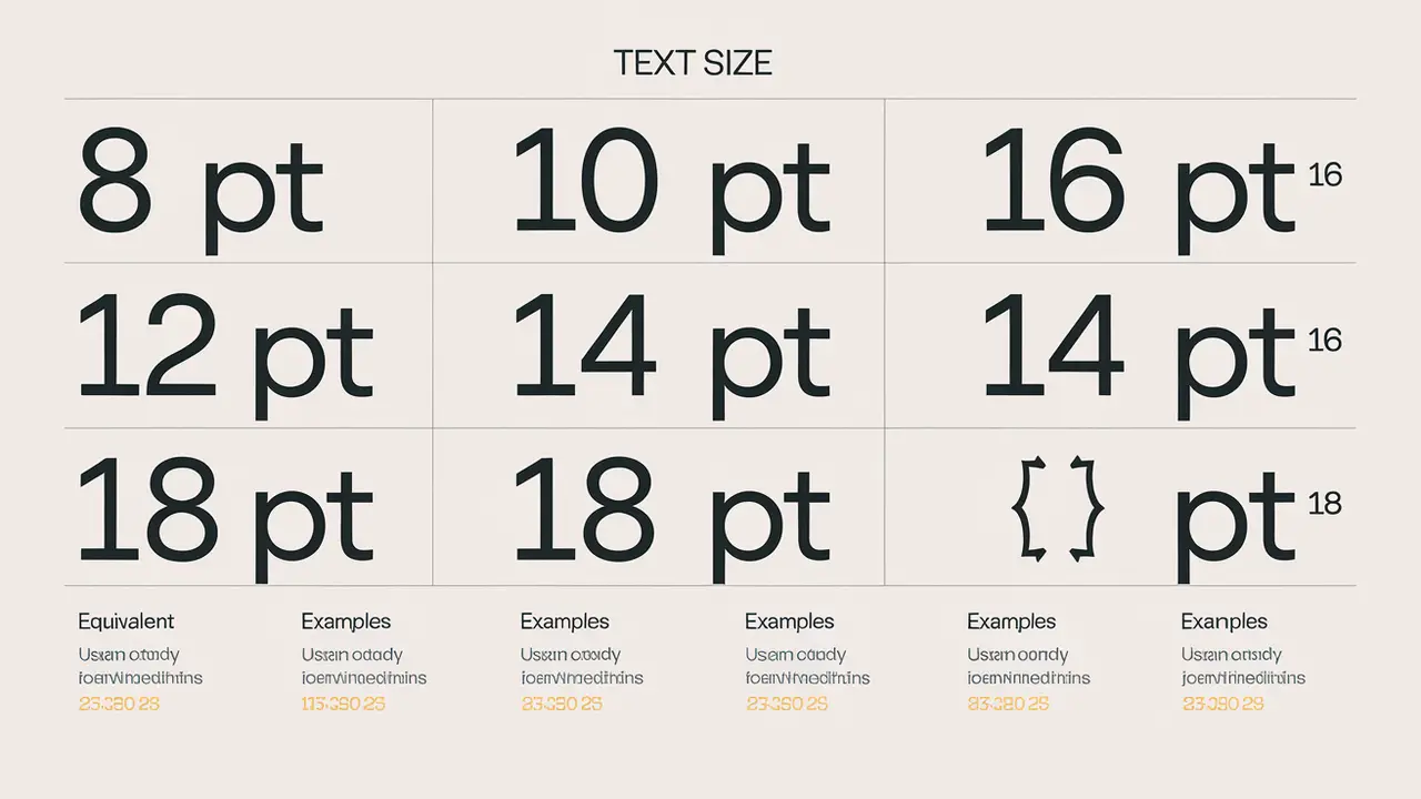
Measuring Font Sizes
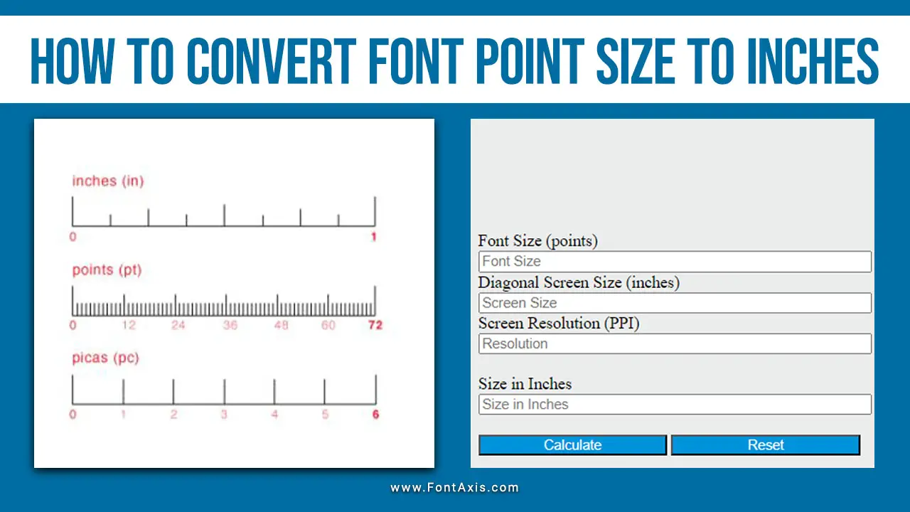
- Millimeters (mm) and centimeters (cm) can also be handy for more precise measurements, especially in printing.
- Screen resolution and size play critical roles in rendering text. For example, a high-resolution display’s optimal body font size may appear too small on a standard screen.
Optimal Sizes For Different Uses
- For web design, it’s common to use a minimum font size of 14 pixels for body text to enhance readability on screens.
- Always consider line height and line spacing to ensure that text is legible, especially for smaller sizes.
Practical Considerations
- Readability: The typical optimal size for body text for printed documents is 12 pt, which translates to approximately 0.167 inches. This size is widely popular for legibility.
- Screen Usage: Text sizes often need to be larger for digital media. A common recommendation is to use a body font size of 16 pt (about 0.222 inches) for better screen visibility.
- Hierarchy and Emphasis: To create a visual hierarchy, use larger point sizes for headings and subheadings. For example, 24 pt (0.333 inches) is suitable for main headings.
Conclusion
Using a font size chart to convert points to inches can help you make informed decisions about typography in both print and digital formats. By understanding these conversions and the implications of different sizes, you can enhance your documents’ readability and aesthetic appeal.
FAQs
1.What Is The Minimum Font Size For Printed Materials?
The minimum font size is generally at least 8 pt, though this cn vary depending on the design and audience.
2.How Does Screen Resolution Affect Font Size?
Higher screen resolutions allow for smaller font sizes to remain legible, while lower resolutions may require larger sizes.
3.What Is The Difference Between Points And Pixels?
Points are used for printed materials (1 pt = 1/72 inch), while pixels are the standard unit for digital text on screens.
4.Why Is Line Height Important?
Line height improves readability by providing adequate space between lines of text, especially in smaller font sizes.
5.Can I Use Different Fonts For The Same Text Size?
Yes, different fonts (typefaces) can have varying appearances at the same point size due to their design characteristics.

