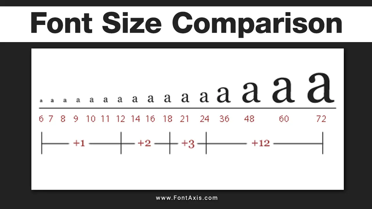
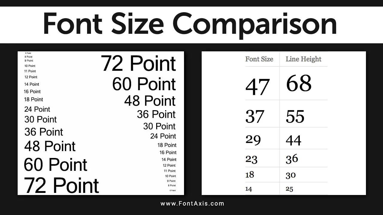
Font size plays a crucial role in the readability and design of text, both in print and digital media. When you think about size 12 font, especially in serif or sans serif fonts, it’s often considered the standard for body text.
However, different fonts can appear smaller or larger even at the same point size. Let’s explore why size 12 fonts sometimes feel smaller, and how to optimize font choices for clarity and readability.
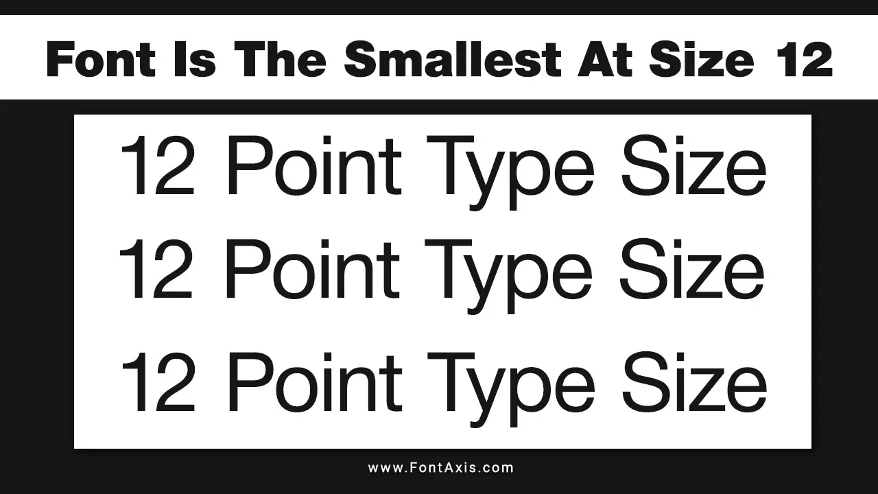
What Does “Font Is The Smallest At Size 12” Mean?
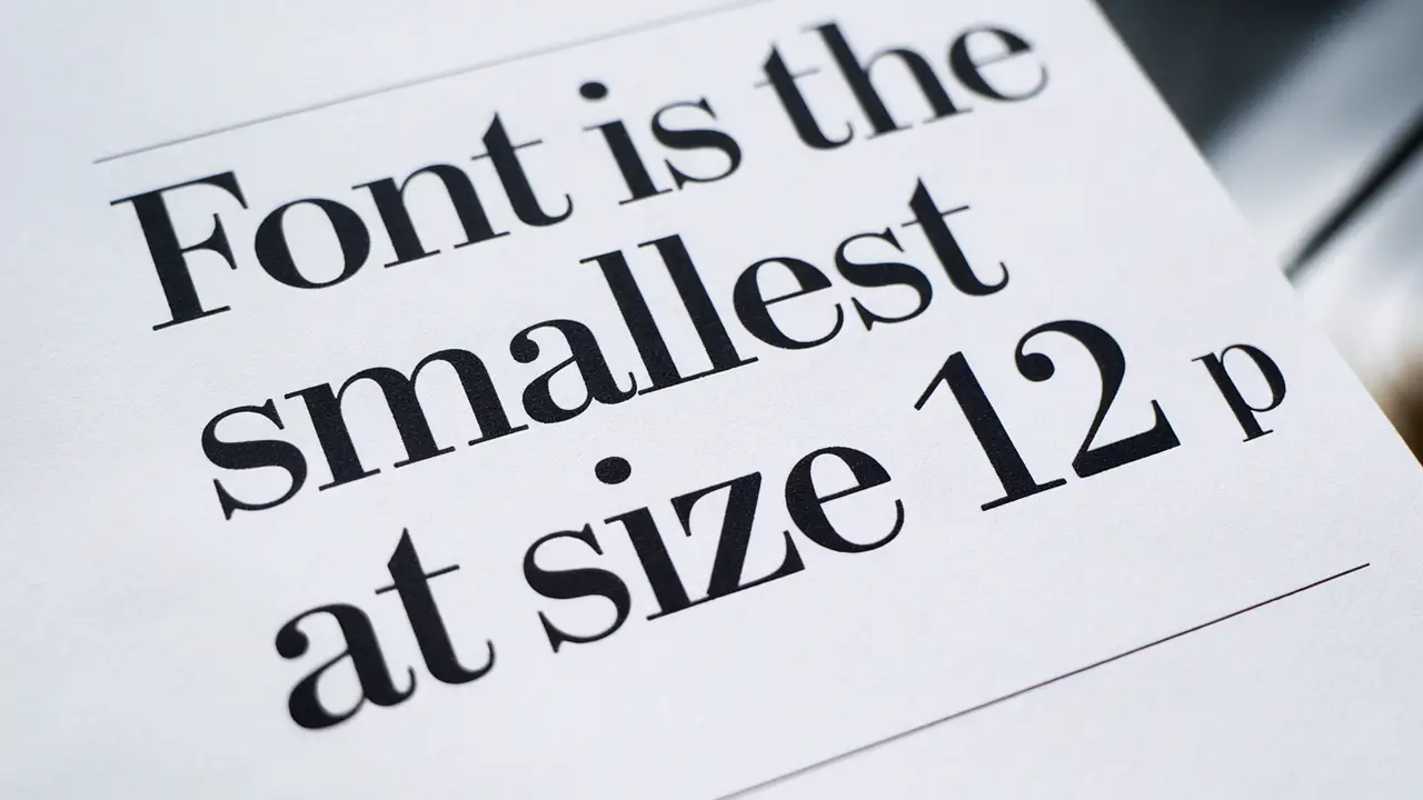
When we say the font is the smallest at size 12, we mean that some fonts, even when set at 12 pt, can visually seem smaller than others. This happens due to variations in font style, text height, and typography. Serif fonts, like Times New Roman, look more compact at 12 pt compared to sans serif fonts, such as Arial, which have more open shapes.
Key Factors That Affect Font Size Perception
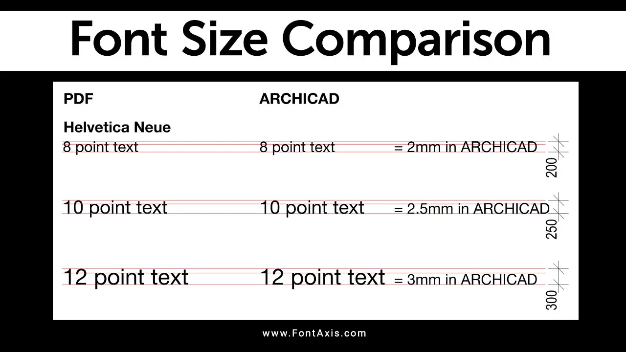
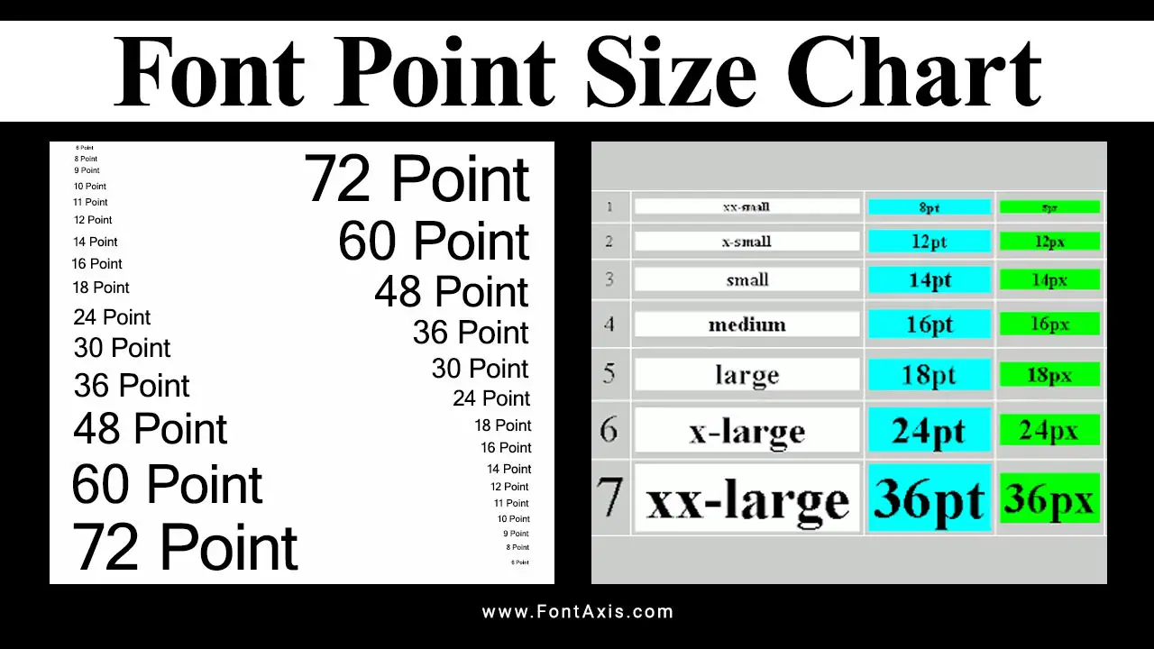
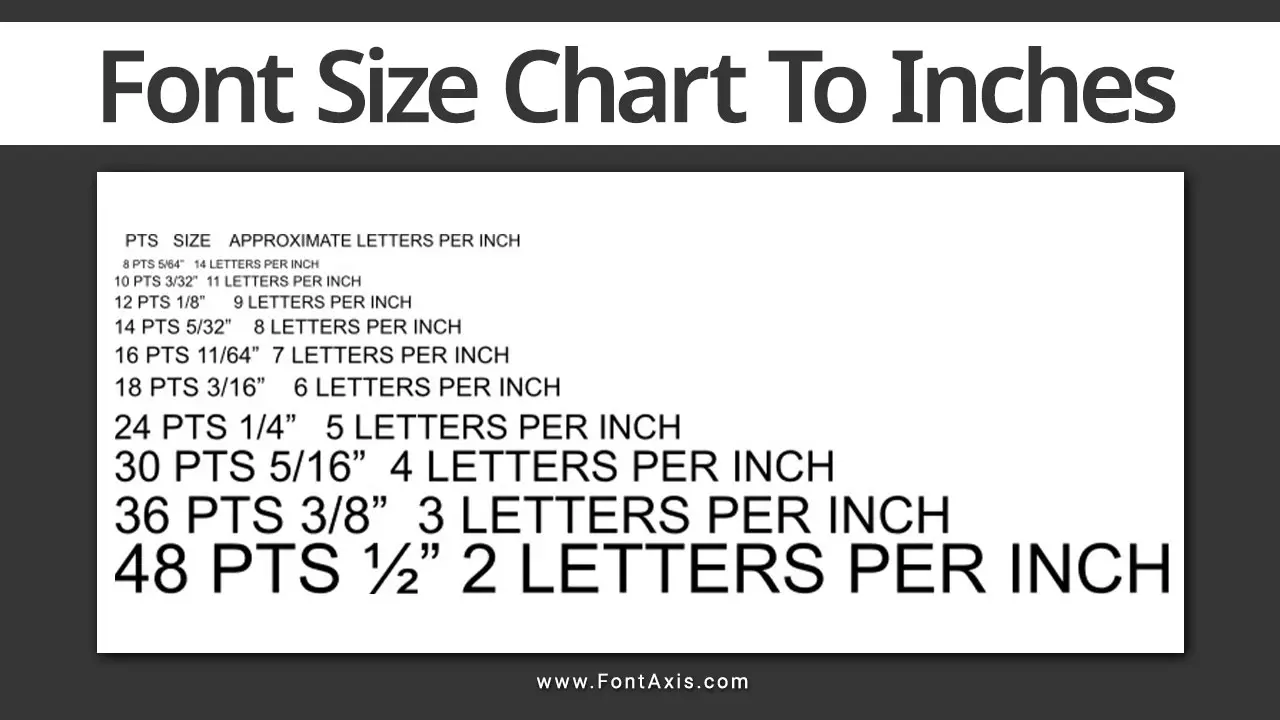
In typography, font size is measured in points (pt). A point is 1/72 of an inch. A standard body text size for printed materials or Microsoft Word documents is usually 12 pt. However, the visual size of the text depends on several factors, such as the font’s design, the line height, and even the screen size you’re viewing it on.
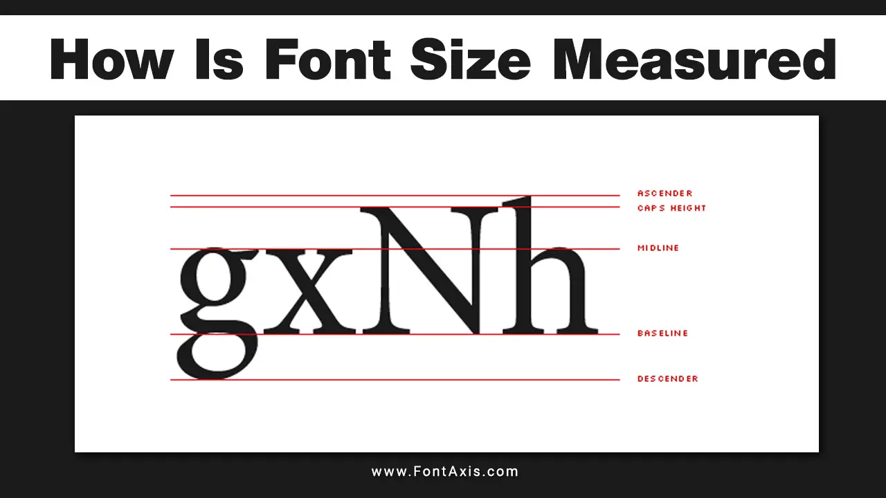
- X-Height: This refers to the height of lowercase letters, excluding ascenders and descenders. Fonts with a larger x-height often appear larger at the same point size.
- Ascenders and Descenders: Fonts with long ascenders (the parts of letters that extend above the x-height) or descenders (the parts that extend below the baseline) can affect how compact or open a font appears.
- Style and Design: Fonts that are more condensed or narrow will naturally take up less space than wider fonts, leading to a perception of smaller size.
List Of Smallest Fonts At Size 12
Based on these factors, several fonts stand out as particularly small at size 12:
- Arial Narrow: This is a condensed version of the standard Arial font. Its narrow characters allow more text to fit in a limited space while appearing smaller.
- Helvetica Condensed: Similar to Arial Narrow, Helvetica Condensed has a sleek and minimalist design that makes it a favorite in professional documents.
- Verdana: While Verdana is generally popular for its readability, its letters are wider. However, when compared to more traditional serif fonts, it can appear smaller due to its low x-height.
- Calibri: The default font for many applications, Calibri has a modern look. At size 12, it can seem smaller than more traditional fonts because of its shorter ascenders and descenders.
- Tahoma: Like Verdana, Tahoma is designed for screen readability. Its compact nature can make it seem smaller at size 12.
Why Does A 12 Pt Font Appear Smaller?
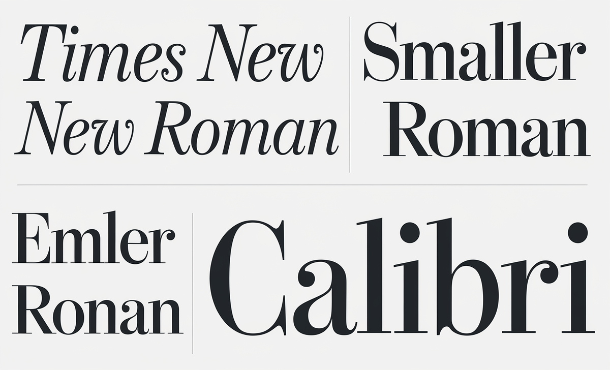
Different fonts use space differently. Serif fonts like Times New Roman may have more decorative elements, making the text seem smaller. On the other hand, Sans serif fonts like Calibri or Helvetica use more space within each letter, so they may appear larger, even at the same 12 point size. The characters’ relative size and design impact how big or small the text feels, which is essential in UI design or when working with digital type.
Font Size And Readability
Choosing the right font size for readability depends on both the font itself and the platform it’s being used on. For example, on smaller screens or for people with low vision, a larger font size or bold text may be required to ensure clarity. Font sizing also changes depending on zoom level, screen size, and whether you’re viewing printed material or digital text.
Tips For Working With Font Sizes
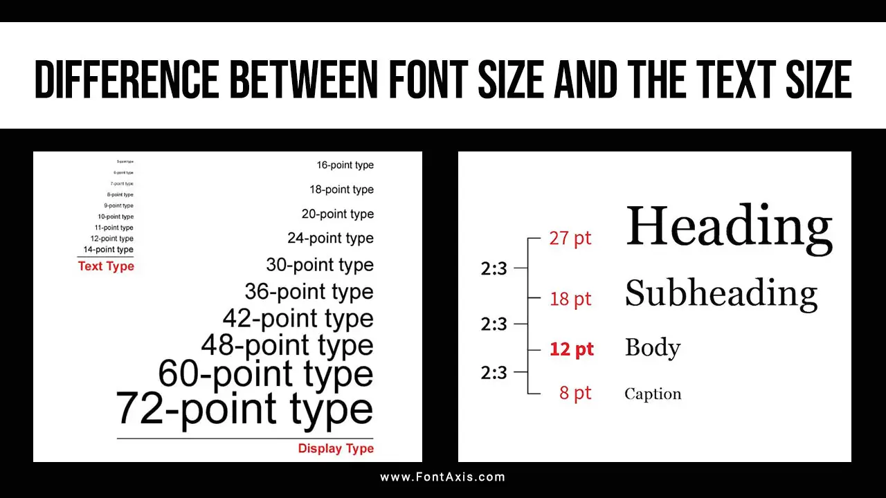
- Body Font Size: For long-form text, 12 pt is a common standard for readability. Adjusting the line length and line height ensures the text remains easy to read.
- Minimum Font Size: If you need to shrink the font, 10 pt is typically the minimum font size for legibility in printed text. On digital screens, even smaller sizes can be readable due to zooming.
- Smaller Font for UI Design: In UI design, a small font may be necessary, but it’s important to consider how it appears on different screen sizes.
Conclusion
Selecting the right font size is crucial for creating readable, accessible content. While 12-point font may be a standard, not all fonts behave the same at this size. Understanding the nuances of typography, font sizing, and their impact on different media will help you make better design decisions. Keep in mind the relative size of different fonts, and adjust the size as necessary to ensure legibility across all platforms.
FAQs
1.Why Does The Font Look Smaller At 12 Pt In Some Typefaces?
Fonts with small x-heights or serif designs often look smaller at the same point size compared to sans-serif fonts with larger x-heights.
2.What Is The Optimal Point Size For Body Text?
Typically, body text is most readable between 10-12 points for printed material and slightly larger for digital screens.
3.Why Do Serif Fonts Appear Smaller Than Sans-Serif Fonts?
Serif fonts have more intricate design details, including thin strokes and small decorative lines, which can make them appear smaller.
4.Is 12 Pt Font Size Too Small For Screen Text?
It depends on the device and zoom level. For smaller screens, a larger font size may be necessary to ensure legibility.
5.How Do I Choose The Right Font Size For Printed Material?
A 12-point serif font is typically standard for body text in printed documents, but larger sizes may be needed for titles or headings.
6.What Font Sizes Should I Use For Users With Low Vision?
Consider using larger fonts like 14-16 points, bold text, or high-contrast colors to improve legibility for low-vision users.
7.How Does Screen Size Impact Font Sizing?
Smaller screens, like those on mobile devices, require larger text to maintain readability, often between 16 and 18 points for body text.
8.What Is A Good Font Size For Captions Or Footnotes?
A 6-8 point font size is typically used for captions or footnotes, but depending on the font style and context, ensure it’s legible.

