
Discover the “Evolution Of Arabic Typography: Stunning Designs” to unlock rich visual heritage and modern design potential. Learn how historical scripts transformed into diverse, expressive digital fonts, enhancing branding and digital experiences with beauty and clarity.
Exploring Arabic typography can feel a bit overwhelming, especially with its beautiful, intricate styles. You might wonder how these elegant letterforms went from ancient manuscripts to the dynamic digital fonts we see today. Don’t worry, it’s a journey of fascinating evolution! This guide will take you through the history and stunning designs of Arabic type, making it easy to appreciate and even use.
We’ll uncover how tradition meets technology to create fonts that are both readable and breathtaking. Get ready to see Arabic typography in a whole new light!
The Rich Tapestry of Arabic Letterforms: A Journey Through Time

Arabic script is renowned for its beauty and expressiveness. Its evolution isn’t just about changing shapes; it’s a story tied to calligraphy, culture, and the advancement of technology. From ancient inscriptions to modern digital designs, Arabic typography has constantly adapted, reflecting both its deep historical roots and the demands of contemporary communication.
From Humble Beginnings: Early Arabic Scripts
The roots of Arabic typography lie in early calligraphic styles that emerged with the spread of Islam and the Arabic language. These styles were primarily used for religious texts and official decrees. They were functional but also carried immense artistic value.
Kufic Script: The Foundation
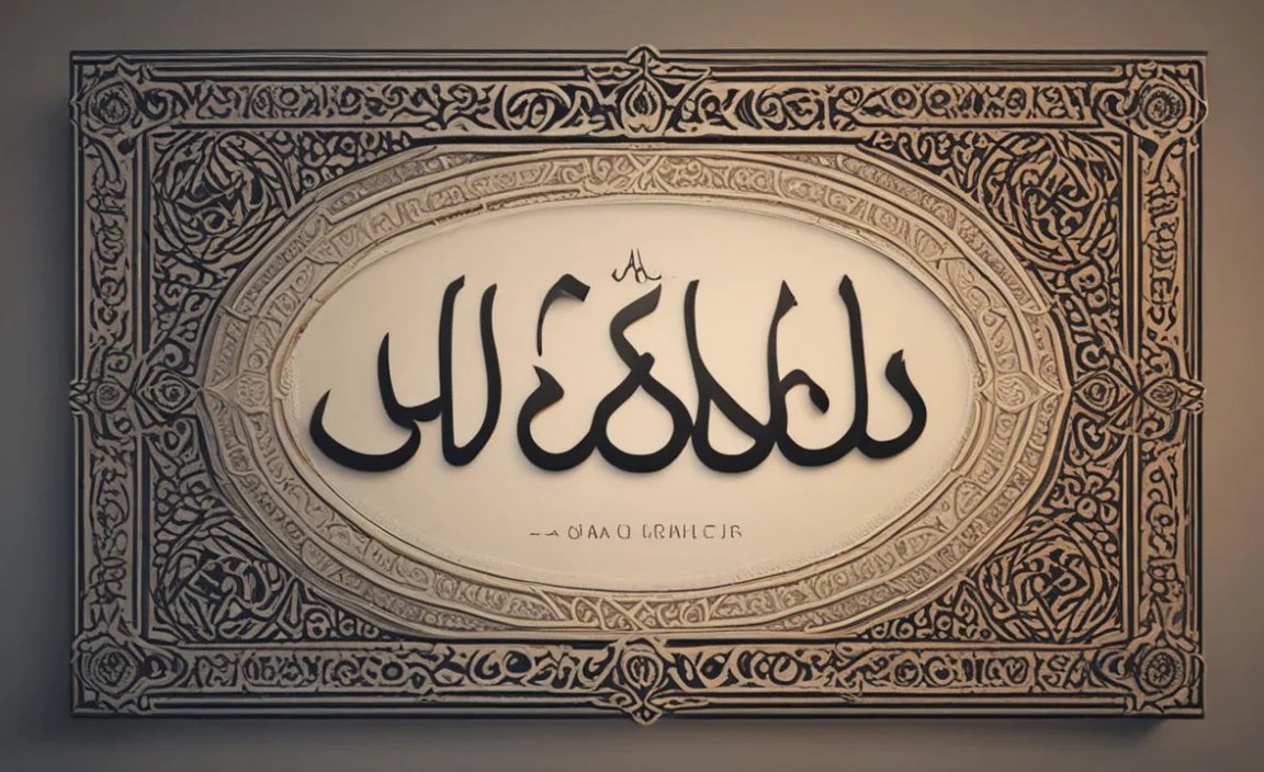
One of the earliest and most influential scripts is Kufic. Originating in the city of Kufa, Iraq, around the 7th century, Kufic is characterized by its angular, geometric forms. It’s upright, monumental, and highly stylized, lending itself beautifully to architectural inscriptions and early Quranic manuscripts.
- Characteristics: Angular, straight lines, geometric proportions, often without diacritical marks.
- Usage: Early Quran manuscripts, mosque decorations, coinage, and monumental inscriptions.
Think of the stunning geometric patterns you see on ancient Islamic buildings – much of that visual language stems from Kufic script. It’s a testament to its structural beauty and readability in a decorative context.
Naskh Script: The Evolution Towards Readability
As the need for easier and faster reading grew, especially for everyday documents and larger-scale Quran printing, Naskh script emerged. Developed around the 10th century, Naskh is more cursive and rounded than Kufic, making it far more suitable for extensive text. It became the standard for copying the Quran and is the ancestor of most modern Arabic fonts.
- Characteristics: Rounded forms, flowing curves, clear distinction between strokes, generally legible.
- Usage: Quranic manuscripts from the 10th century onwards, administrative documents, general literature.
Naskh was a significant step towards making Arabic text accessible to a wider audience, balancing aesthetic appeal with practical readability. This script laid the groundwork for the typefaces we use daily.
The Golden Age and Beyond: Diversification of Scripts
During the Islamic Golden Age, Arabic calligraphy flourished, leading to the development of several other distinct scripts. Each script served different purposes, from grand ceremonial documents to personal correspondence, showcasing the versatility and artistic depth of the Arabic language.
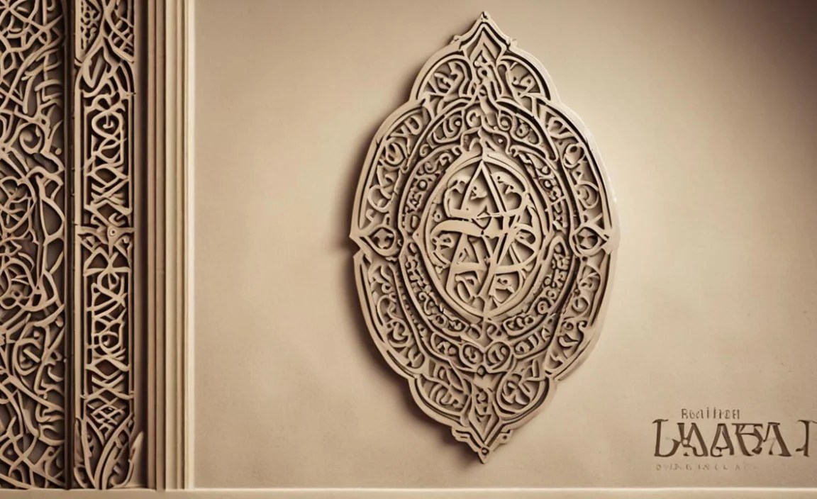
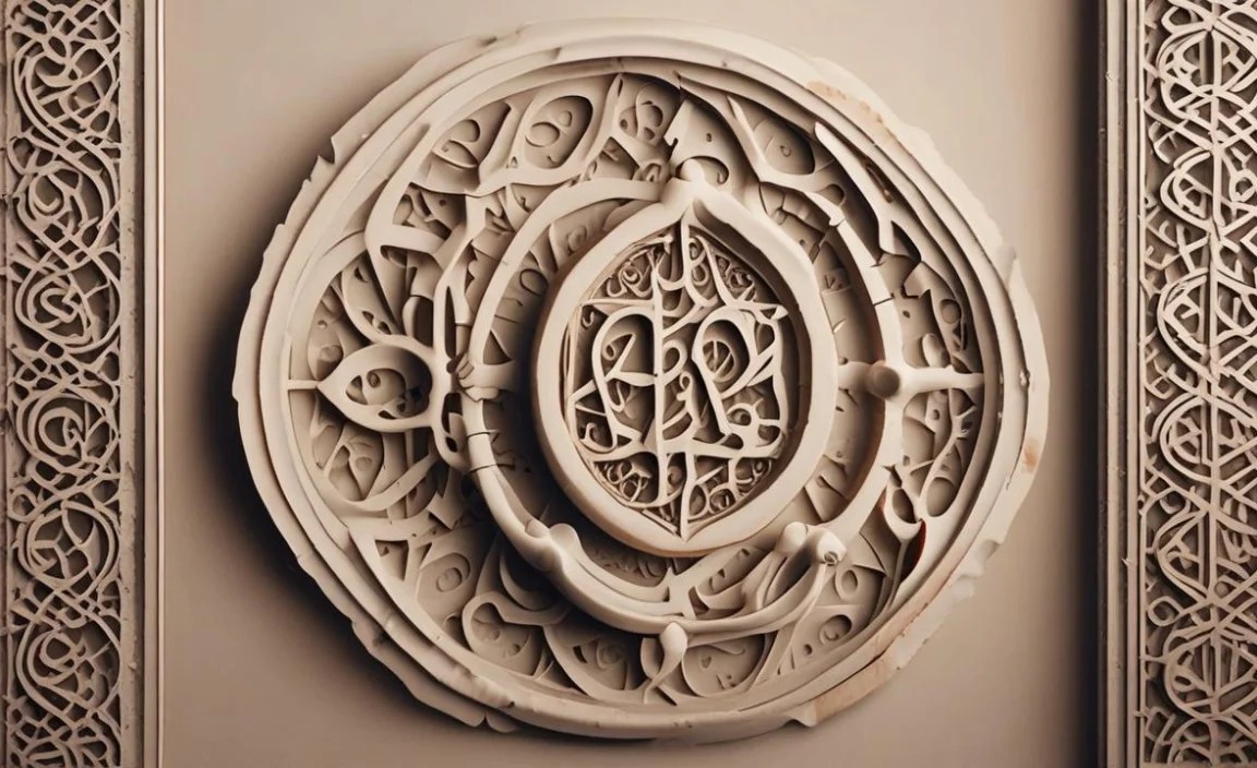
Thuluth Script: Grandeur and Ornamentation
Thuluth, meaning “one-third” (referring perhaps to its stroke thickness relative to other scripts), is known for its majestic appearance. It features long, elegant lines, pronounced curves, and often incorporates decorative flourishes. It’s a script of great beauty, often used for titles, headings, and decorative elements in manuscripts and architecture.
Diwani Script: Elegance and Flair
Diwani script emerged later, largely for official Ottoman court documents. It is characterized by its highly cursive, almost abstract style, with letters often flowing into one another without clear separation. It’s incredibly decorative and can be challenging to read for the uninitiated, making it more of an artistic or formal statement.
Ruq’ah Script: The Everyday Handwriting
In contrast to the more elaborate scripts, Ruq’ah is a more concise and simplified script, designed for speed and ease of writing. It’s the closest to modern everyday handwriting and is very efficient for rapid note-taking and informal correspondence.
The Dawn of Printing and Digital Age: Bridging Tradition and Technology
The advent of printing technology posed a unique challenge for Arabic script. Early printing presses struggled to replicate the ligatures (connected letters) and flowing nature of handwritten Arabic. This led to a period of adaptation and experimentation.
Early Printing Challenges
Metal typesetting for Arabic was complex due to the script’s cursive nature and the need for accurate reproduction of letterforms. Many early printed Arabic books relied on styles derived from Naskh, but they often lacked the fluidity and finesse of calligraphic works. The struggle was to find a balance between the mechanical process of printing and the organic beauty of the script.
The Digital Revolution
The digital age brought about the most significant transformation. With the rise of computers and graphic design software, Arabic typography experienced a renaissance. Designers could now meticulously craft digital typefaces that retained the essence of historical scripts while achieving clarity and consistency across different media.
- Vector Graphics: Software like Adobe Illustrator and font design tools allowed for precise creation of letterforms.
- Unicode Standard: Enabled the proper representation and rendering of Arabic characters, including context-dependent forms and ligatures.
- Global Reach: Digital fonts made it easier to disseminate Arabic content across the globe, from websites and apps to print publications.
This era saw the birth of countless Arabic fonts, ranging from faithful digital interpretations of classic scripts to entirely new, modern designs. Designers began to see Arabic typography not just as a means of conveying text, but as a powerful visual element in itself.
Exploring Stunning Arabic Typography Designs Today
Modern Arabic typography is a vibrant field where tradition meets innovation. Designers are constantly pushing the boundaries, creating typefaces that are not only functional but also visually captivating. This section dives into the kinds of stunning designs you can see and use today.
Modern Arabic Typeface Categories
Just like in Latin typography, Arabic fonts can be broadly categorized, each serving distinct design purposes.
Serifs (Has the historical context not been covered previously?) – Note: Arabic script traditionally does not have “serifs” in the Western perpendicular stroke sense. However, many modern digital fonts might incorporate stylistic flourishes that function similarly to serifs, adding weight or decorative elements. For clarity and beginner-friendliness, we can describe these as “decorative terminals” or “stylistic strokes.”
While not classic serifs, many contemporary Arabic fonts, especially those inspired by Kufic or designed for headings, incorporate distinctive stylistic strokes or decorative terminals. These can add a sense of tradition, formality, or artistic flair. They often enhance readability in display settings by providing visual anchors.
Sans-Serif (Kufi-inspired and Modern)
These are perhaps the most common and versatile Arabic fonts today, directly influenced by the geometric structure of Naskh and Kufic. They are characterized by clean lines and a generally uniform stroke width, making them excellent for body text, user interfaces, and modern branding. Many contemporary sans-serif Arabic fonts draw heavily from the balanced proportions of Naskh, ensuring high readability.
Note: In Arabic typography, the term “Kufi” is often used to describe modern geometric sans-serif styles, even if they don’t strictly adhere to the ancient Kufic script’s original characteristics, due to shared geometric principles.
Display Fonts: The Artistic Expressions
This category is where creativity truly shines. Display fonts are designed for impact and short bursts of text, like headlines, logos, posters, and branding elements. They often draw inspiration from historical scripts like Thuluth or are completely novel creations, featuring unique ligatures, intricate embellishments, or bold, unconventional shapes.
- Examples: Fonts designed for cultural festivals, artistic exhibitions, or luxury brand identities.
- Impact: They are chosen to convey a specific mood, evoke a cultural connection, or make a strong visual statement.
Script Fonts (Inspired by Cursive Styles)
While not identical to Western script fonts, some Arabic typefaces mimic the flowing, connected nature of cursive scripts like Diwani or Ruq’ah. These are often used for formal invitations, elegant branding, or to add a personal, artistic touch. They require careful pairing to ensure they don’t sacrifice readability.
Key Design Principles in Modern Arabic Typography
Creating effective and beautiful Arabic typefaces today involves balancing several factors:
Readability and Legibility
This remains paramount. A font must be easy to read, especially for extended periods. Designers carefully consider:
- Letterform Clarity: Ensuring each character is distinct and recognizable.
- Spacing: Appropriate kerning (space between letter pairs) and tracking (overall letter spacing) are crucial. For Arabic, the natural joining of letters is a key element.
- Contextual Forms: Arabic letters change shape depending on their position in a word (initial, medial, final, isolated). Modern fonts must handle these variations seamlessly.
Aesthetic Appeal and Cultural Resonance
Arabic design often carries deep cultural and historical significance. Beautiful Arabic typography can:
- Evoke Heritage: Drawing inspiration from historical calligraphy connects the design to a rich past.
- Convey Nuance: The style of a font can communicate formality, modernity, warmth, or luxury.
- Visual Harmony: A well-designed Arabic font complements the overall design of a webpage, publication, or product.
Technological Integration
Modern typefaces must work flawlessly in digital environments. This includes:
- Web Font Optimization: Ensuring fonts load quickly and display correctly across all browsers and devices.
- Rendering Engines: Compatibility with operating systems and software that correctly render Arabic script’s connecting properties.
- Variable Fonts: Emerging technologies allow for single font files with a range of weights, widths, and styles, offering greater flexibility.
Where to Find Stunning Arabic Fonts
The landscape of Arabic fonts has expanded dramatically, with many talented foundries and independent designers offering a wide array of choices.
Professional Type Foundries
Companies specializing in type design often have extensive libraries of high-quality Arabic fonts, meticulously crafted and tested. Examples include:
- Adobe Fonts: Offers a curated selection of Arabic fonts, often integrated into Adobe Creative Cloud subscriptions.
- Monotype: A major player with a vast collection of historical and contemporary typefaces.
- TypeTogether: Known for their high-quality, well-designed text families, some with Arabic counterparts.
Independent Designers and Marketplaces
Many talented designers and platforms offer unique and creative Arabic fonts:
- MyFonts: A comprehensive marketplace where you can discover and purchase fonts from numerous foundries and independent designers.
- Fontspring: Similar to MyFonts, offering a wide selection of commercially available fonts.
- Google Fonts: A fantastic resource for free, open-source Arabic fonts perfect for web and app design. Many are designed with excellent readability.
When choosing, always test the font in context to ensure it meets your design needs for both aesthetics and legibility.
Practical Tips for Using Arabic Typography in Your Designs
As a beginner exploring Arabic typography, integrating it into your projects can seem daunting. But with a few key tips, you can harness its beauty effectively.
1. Understand Your Message and Audience
Before selecting a font, consider what you want to communicate:
- Formality: Are you aiming for a traditional, academic, or a modern, casual feel?
- Emotion: Do you want to evoke elegance, warmth, excitement, or professionalism?
- Target Audience: Ensure the font is appropriate and accessible to the people you are trying to reach.
2. Prioritize Readability for Body Text
For longer passages of text, readability is king. Opt for:
- Naskh-derived fonts: These are generally the most legible for continuous reading.
- Clean Sans-serifs: Modern geometric Arabic fonts with clear letterforms are excellent choices.
- Sufficient Size and Line Spacing: Ensure your text is large enough and has adequate leading (space between lines) to prevent eye strain.
3. Leverage Display Fonts for Impact
Use more decorative or stylized Arabic fonts sparingly for:
- Headlines and Titles: To grab attention and set a tone.
- Logos and Branding: To create a unique visual identity.
- Short Captions or Quotes: Where readability isn’t compromised by the stylistic choices.
4. Pairing Arabic and Latin Fonts
When designing for multilingual audiences, pairing Arabic and Latin fonts requires care:
- Match the “Weight” and “Style”: Choose a Latin font that has a similar sense of formality, weight, and x-height (the height of lowercase letters) to your Arabic font.
- Consider the Source of Inspiration: If your Arabic font is Kufi-inspired (geometric, sans-serif), pair it with a geometric Latin sans-serif. If your Arabic font is more ornate, you might pair it with a Latin serif or a stylistic sans-serif.
- Test Thoroughly: Always view them side-by-side to ensure visual harmony and prevent jarring contrasts.
5. Test and Iterate
The best way to get it right is to:
- Use Font Previews: Most font websites allow you to type in your own text to see how it looks.
- Mock Up Designs: Create real design mockups (posters, website pages) to see how the fonts perform in context.
- Get Feedback: Ask colleagues or potential users for their opinions on readability and aesthetic appeal.
Examples of Arabic Typography in Action
Seeing how these principles are applied can be very inspiring. Here are a few scenarios where stunning Arabic typography makes a significant impact:
1. Branding and Logotypes
A bank or technology company might use a clean, geometric Kufi-inspired font for its logo to convey modernity, trust, and efficiency. Conversely, a luxury fashion brand might opt for a more elegant, flowing script-inspired typeface to communicate sophistication and exclusivity.
Consider the rebranding of Al Jazeera’s visual identity, which often showcases strong, contemporary Arabic typography that balances global reach with cultural identity.
2. Editorial Design
Magazines and book covers often use a mix of typefaces. A Naskh-based font might be used for the main article text, while striking Thuluth-inspired or custom display fonts could be employed for headlines, subheadings, or cover titles to add visual interest and cultural depth.
Publications focusing on art, culture, or history frequently utilize historically inspired Arabic fonts to enhance their thematic content.
3. User Interface (UI) Design
For apps and websites, readability is paramount. Designers often select clear, modern Arabic sans-serif fonts that are highly legible on screens of all sizes. Platforms like social media networks or e-commerce sites rely on these fonts to ensure a smooth user experience for Arabic speakers.
For instance, the design principles behind Google Fonts emphasize accessibility and web performance, which is crucial for global platforms serving diverse linguistic needs.
4. Calligraphy and Art
Beyond functional typography, Arabic calligraphy continues to thrive as an art form. Contemporary calligraffiti artists and digital artists blend traditional techniques with modern street art and graphic design. These creations are often highly expressive and push the boundaries of what Arabic letterforms can achieve visually.
| Script Type | Key Characteristics | Primary Usage Examples | Modern Impact |
|---|---|---|---|
| Kufic | Angular, geometric, static | Architecture, early manuscripts, decoration | Foundation for geometric sans-serifs, strong display use |


