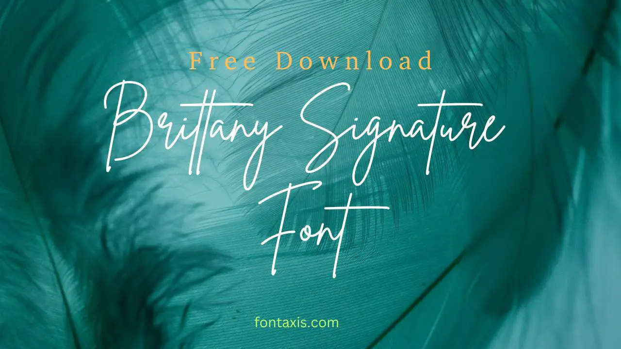
The “All Dogs Go to Heaven” font is a distinctive, playful script typeface that evokes warmth and nostalgia, often used to capture a whimsical or heartfelt tone in design projects. While not a single official font from the movie, it refers to the style of lettering seen in its title and promotional materials, characterized by its flowing, handwritten appearance.
Remember the first time you saw the title of “All Dogs Go to Heaven”? That charming, handwritten look just felt like adventure and friendship, right? For many of us, that specific font style sparks a wave of happy memories. It’s a look that’s hard to pin down, isn’t it? You might be designing a special invitation, crafting a heartwarming blog post, or just looking for that perfect touch of nostalgia for your next project.
Finding that exact, beloved font can feel like a treasure hunt. But don’t worry! We’re going to explore the world of fonts that capture that magical “All Dogs Go to Heaven” essence. We’ll break down what makes this style so special and guide you to finding something that brings that same joy to your creations. Let’s dive in and discover the perfect typeface together!
What Makes the “All Dogs Go to Heaven” Font Style So Loved?
The font style associated with “All Dogs Go to Heaven” is more than just letters on a page; it’s a feeling. It’s that sweet spot between playful and heartfelt, casual yet full of character. Let’s break down the elements that make this type of font so endearing and effective:
- Handwritten Charm: It genuinely looks like it was written with a pen or brush. Each letter has a unique flow and slight variation, giving it a personal and approachable feel. This makes designs feel more authentic and less corporate.
- Whimsical and Playful: The strokes often have a bounce and curve that suggests movement and fun. It’s not a rigid, formal typeface. Think of a child’s cheerful drawing, but with polished artistry.
- Nostalgic Appeal: For many, this style is tied to fond childhood memories of the movie. Using a font with this aesthetic can tap into that same warm, sentimental feeling for an audience.
- Expressive and Emotional: The flowing, cursive-like nature lends itself well to conveying emotion. It feels warm, friendly, and often a little magical, perfect for stories about connection and loyalty.
- Readability with Personality: While definitely decorative, the best versions of this style remain readable. The letters are distinct enough, and the flow guides the eye without being confusing. It balances personality with function.
Understanding Font Categories to Find Your Perfect Match
To truly find fonts that echo the “All Dogs Go to Heaven” vibe, it helps to know a little about how fonts are categorized. This way, you can confidently search for what you need. The style we’re looking for falls primarily under the “Script” category, but it often has elements that make it stand out.
Serif vs. Sans Serif: The Basics
Before we dive into script fonts, let’s quickly touch upon the two main families:
- Serif Fonts: These have small decorative strokes (serifs) at the ends of the main strokes of letters. Think of classic fonts like Times New Roman. They often feel traditional, formal, and elegant.
- Sans Serif Fonts: These fonts do not have serifs (“sans” means “without” in French). They are typically cleaner, more modern, and very readable, like Arial or Helvetica.
Script Fonts: Where the Magic Happens
This is our sweet spot! Script fonts mimic human handwriting. They can range from elegant and formal (like calligraphy seen on wedding invitations) to casual and playful. The “All Dogs Go to Heaven” style is firmly in the playful, casual, and personal end of the script spectrum.
Within script fonts, you’ll find:
- Formal Scripts: Very precise, often with elaborate flourishes, resembling formal calligraphy.
- Casual Scripts: More relaxed, like everyday handwriting; this is where our target style often lives.
- Display Scripts: Highly stylized, often with exaggerated features, meant for large headlines and titles rather than body text.
The “All Dogs Go to Heaven” lettering is a delightful example of a casual, slightly whimsical script font, sometimes bordering on display if used for large titles.
Fonts That Evoke the “All Dogs Go to Heaven” Spirit
While there isn’t one single, official “All Dogs Go to Heaven” font that you can download, many fonts capture its warm, handwritten, and slightly whimsical essence. Here are some types you can look for, along with example fonts that embody that spirit. These can be found on various font marketplaces and free font sites.
Example Fonts and Their Characteristics:
When searching, look for these qualities:
- Flowing Strokes: Letters connect naturally or have a clear flow between them.
- Varied Thickness: Similar to brush strokes, some parts of the letters might be thicker than others.
- Slight Imperfections: A touch of irregularity, like a tiny wobble or a slightly uneven baseline, adds to the handmade feel.
- Friendly and Rounded Forms: Letters are often curved and soft, avoiding sharp edges.
Here are a few example fonts and font styles to explore that capture a similar feeling:
| Font Name Example | Vibe/Description | Where to Look |
|---|---|---|
| Playlist Script | Very popular casual script. Free on Google Fonts. It’s friendly, bouncy, and has a handwritten feel that’s approachable and cheerful. | Google Fonts (Free) |
| Pacifico | Another classic free option (Google Fonts). It has a bit more of a retro, 1950s vibe while still being very legible and flowing. It’s instantly recognizable and friendly. | Google Fonts (Free) |
| Amatic SC | Though a sans-serif, its hand-drawn, uppercase-only style has a quirky, childlike charm that can evoke a similar whimsical feeling. Great for a slightly different take. | Google Fonts (Free) |
| KG Second Chances (by Kimberly Geswein) | A very popular free personal use font. It’s a flowing, handwritten script that feels personal and warm, often used for classroom materials and creative projects. | Font websites like DaFont, Google Fonts (check licenses) |
| Lobster | A well-known script font with a distinct retro, brush-script feel. It’s bold and decorative, perfect for headlines where you want a strong, charismatic presence. | Google Fonts (Free) |
| Various brush scripts (e.g., Brush Script MT, or modern options) | These fonts mimic the look of a brush pen or watercolor brush. They can range from very controlled to quite free-flowing and artistic. | Adobe Fonts, MyFonts, Envato Elements |
| Sacramento | A delicate, flowing script. It’s lighter and more whimsical than Lobster, offering a gentle, heartfelt, and very handmade feel. | Google Fonts (Free) |
How to Find and Use These Fonts for Your Projects
Now that you know what to look for, let’s talk about where to find these gems and how to use them effectively in your designs. It’s all about making smart choices that align with your project’s message.
Where to Source Your Fonts:
There are many places to find fonts, ranging from free to premium options. Always check the license to ensure you’re using the font correctly for your project (e.g., personal use vs. commercial use).
- Google Fonts: An excellent resource for free, high-quality fonts. Many popular casual script fonts are available here, making them accessible for everyone. You can easily preview them on your own text.
- Font Squirrel: Offers a curated list of free fonts for commercial use. They also have a great font identifier tool.
- DaFont: A massive archive of free fonts. Be sure to carefully check the license for each font, as many are for personal use only.
- Adobe Fonts: If you have an Adobe Creative Cloud subscription, you get access to a vast library of professional fonts, including many beautiful script and display options.
- MyFonts & Envato Elements: These are premium marketplaces where you can purchase individual fonts or subscribe for access to a large library. This is where you’ll find more unique and professionally crafted options.
Tips for Using “All Dogs Go to Heaven” Style Fonts Effectively:
These fonts are fantastic for adding personality, but they need to be used thoughtfully.
- Use for Headlines and Titles: This is where a script font shines. It grabs attention and sets a mood immediately. Think wedding invitations, event posters, or prominent website banners.
- Pair with a Simple Sans Serif or Serif: To ensure readability for longer text, pair your script font with a clean, simple font for body copy. A friendly sans serif or a classic serif can provide a balanced contrast. For example, pair Lobster with Open Sans or Lato.
- Don’t Overuse: Too much of a good thing can be overwhelming. Limit script fonts to one or two key areas in your design, like the main title and perhaps a subtitle or a short quote.
- Consider Readability: Some highly stylized script fonts can be difficult to read, especially at small sizes or for extended text. Always test how your chosen font looks in context. A font like Sacramento is delicate and often best kept larger, while Pacifico offers better readability for slightly longer phrases.
- Embrace the Whimsy: These fonts are perfect for projects that aim for a lighthearted, joyful, or sentimental feel. They work wonderfully for personal blogs, children’s brands, greeting cards, or anything that needs a touch of warmth and personality.
- Check Character Sets: Some informal scripts might lack certain characters or have limited language support. Ensure your chosen font includes any special characters or accents you might need.
Design Inspiration: Projects That Use This Style
Seeing how others have successfully incorporated fonts with a similar feel can spark your own creativity. These fonts are versatile and can bring a special touch to a variety of projects.
Creative Applications:
- Branding for Small Businesses: A pet bakery, a handmade craft store, a children’s book author, or a cozy cafe might use a font like this for their logo or tagline to instantly communicate warmth and approachability. For instance, a dog-walking service could use a playful script for their name alongside a clean sans-serif for their services.
- Event Invitations: Think birthday parties, baby showers, casual weddings, or anniversary celebrations. A script font adds a personal and festive touch that formal fonts often can’t replicate.
- Blog and Social Media Graphics: Creating eye-catching quote graphics or post titles for a lifestyle blog, a crafting channel, or a parenting website where a personal, friendly tone is key.
- Children’s Book Covers and Titles: The playful, handwritten nature is perfect for stories aimed at younger audiences, immediately signaling fun and wonder.
- Personal Projects: Journal covers, custom stationery, handmade gift tags, or even a personalized sign for a home office.
- Website Elements: Using a script font for a website’s main heading, a special call-to-action button, or a section title can add character and break up the monotony of sans-serif text. For a website focused on storytelling or creative arts, this can be particularly effective.
The key is to match the font’s personality to your project’s purpose. A font that feels like a warm hug for a bakery logo is perfect, but might be too much for a financial advisor’s website. As the Interaction Design Foundation notes, typography is crucial for communication, influencing user perception and guiding their actions. Choosing the right font is about making that communication warm, effective, and memorable.
Choosing the Right Font: Factors to Consider
Selecting a font isn’t just about picking one that looks pretty. It’s about making a conscious decision that aligns with your goals. When you’re aiming for that “All Dogs Go to Heaven” feel, keep these important factors in mind:
Key Considerations:
- Project Purpose: What is the main goal of your design? Is it to inform, entertain, persuade, or evoke emotion? A font’s style should support this purpose. A playful script is great for fun but not for serious reports.
- Target Audience: Who are you trying to reach? Children respond to different fonts than business professionals. The “All Dogs Go to Heaven” style is generally appealing to a broad audience, often evoking pleasant childhood or nostalgic feelings.
- Readability (Legibility and Readability): This is paramount.
- Legibility: How easily can you distinguish one letter from another? (e.g., ‘a’ from ‘o’, ‘l’ from ‘i’). Highly decorative scripts can sometimes suffer here.
- Readability: How easily can you read a block of text set in the font? This is where script fonts are often best used sparingly for titles, not paragraphs. Many of the fonts we’ve discussed, like Pacifico, are designed with good readability in mind for short phrases.
- Brand Personality: Does the font match the overall feeling and values you want to convey for a brand or personal project? Warm, friendly, whimsical, nostalgic?
- Technical Requirements: Consider the medium. Will it be on a website (web fonts), printed material, or both? Ensure the font is available and optimized for your intended use. For web use, factors like file size and rendering performance are important.
- Licensing: As mentioned earlier, always check the font’s license. Google Fonts are generally very permissive, but fonts from other