Boogaloo font offers a distinctive geometric slab-serif style, perfect for adding a playful yet organized feel to designs, making it a versatile choice for branding, headlines, and display text.
Hello design adventurers! Ever look at a design and feel an instant spark of personality? Often, that magic comes from the fonts chosen. But with so many options, picking the right one can feel like a puzzle. Today, we’re diving into a font that adds a whole lot of charm and structure: the Boogaloo font. It’s a super friendly geometric slab-serif that can bring a unique vibe to your projects. Stick around, and I’ll show you how to harness its creative power to make your designs pop!
What is the Boogaloo Font?
Boogaloo font is a typeface that stands out with its bold, geometric, and slightly retro feel. It belongs to the slab-serif category, meaning it has thick, block-like serifs (the little feet at the ends of strokes). But Boogaloo gives these serifs a rounded, friendly twist, setting it apart from more traditional slab-serifs.
Designed by heavier sources, Boogaloo is readily available on platforms like Google Fonts, making it accessible for everyone. Its character set is broad, supporting a good range of Latin-based languages, which is fantastic for international projects. This font isn’t just about looks; it’s built for clarity and impact, making it a powerful tool in any designer’s kit.
Why Choose Boogaloo Font for Your Design?
Choosing the right font is more than just picking something that looks “nice.” It’s about communicating a message, evoking an emotion, and ensuring your audience can easily read and engage with your content. Boogaloo font excels in several areas, making it a go-to for specific design needs.
Key Characteristics of Boogaloo Font:
Geometric Structure: The font is built on clean, geometric shapes. This gives it a modern, organized, and somewhat architectural feel.
Rounded Slab Serifs: Unlike sharp, defined serifs, Boogaloo’s serifs are soft and rounded. This adds a touch of warmth, playfulness, and a vintage or retro vibe.
High Readability: Despite its distinct style, Boogaloo is designed for legibility. The sturdy letterforms and balanced weight make it clear even at smaller sizes, though it shines brightest in larger contexts.
Versatile Weight: Boogaloo typically comes in a single, robust weight. This simplicity can be a strength, forcing designers to rely on strong layout and contrast rather than font variations.
Friendly and Approachable: The combination of geometric shapes and rounded serifs creates an inviting and accessible tone. It feels less formal and more open.
When to Use Boogaloo Font:
Boogaloo’s unique blend of structured geometry and friendly curves makes it ideal for a variety of applications where you want to convey a sense of fun, retro-modern style, or approachable professionalism.
Headlines and Titles: Its bold presence immediately grabs attention, making it perfect for making a statement.
Branding and Logos: For businesses that want to appear modern yet friendly, playful yet reliable, Boogaloo can be a fantastic choice. Think of artisanal cafes, tech startups with a creative edge, or eco-friendly brands.
Display Text and Short Paragraphs: While great for headlines, it can also work well for shorter blocks of text in posters, social media graphics, or websites where readability at a glance is key.
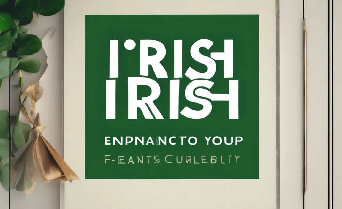
Retro-Themed Designs: If you’re aiming for a 70s vibe, a mid-century modern look, or a general retro aesthetic, Boogaloo fits right in.
Children’s Books or Educational Materials: Its fun and clear nature can appeal to younger audiences and children learning to read.
App and Game Interfaces: The geometric underpinnings and clear forms can translate well to digital interfaces that need to be both functional and visually appealing.
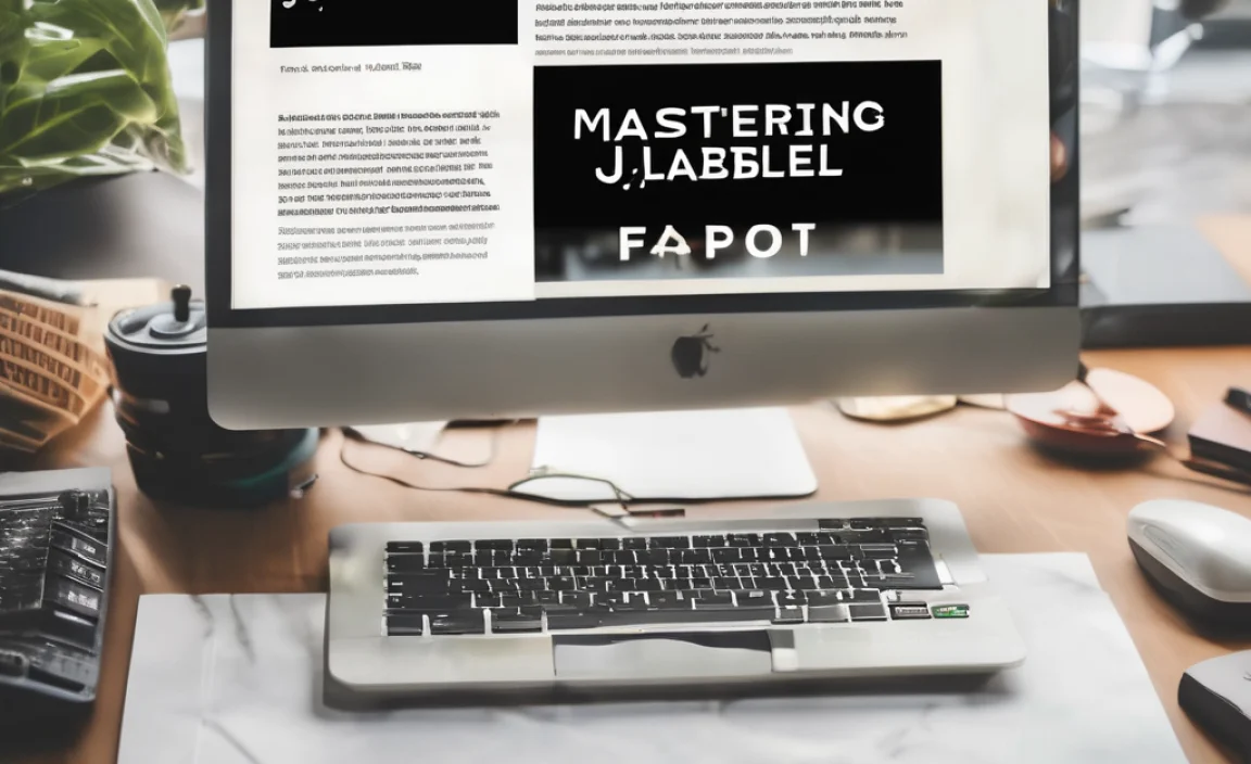
Mastering Boogaloo Font: Practical Design Tips
Simply choosing a font is only the first step. To truly make Boogaloo font sing in your designs, you need to understand how to pair it, where to use it for maximum impact, and how to balance its strong personality.
1. Pairings: Adding Complementary Fonts
Boogaloo’s strong character means it often needs friends that won’t clash. The best font pairings create contrast while maintaining harmony. For Boogaloo, here are some approaches:
For Body Text (Readability is Key):
Clean Sans-Serifs: Pair Boogaloo headlines with a simple, highly readable sans-serif for your body copy. Fonts like Open Sans, Lato, or Roboto offer excellent legibility in smaller sizes and a neutral tone that lets Boogaloo’s headlines shine.
Light Serif Fonts: If you want a more classic feel for your body text, a light, accessible serif like Lora or Merriweather can provide a nice contrast to Boogaloo’s boldness.
For Complementary Display Text:
Script Fonts: A playful script font can add another layer of personality, especially if the script itself has a rounded or slightly geometric quality. Use sparingly for accent words or decorative elements.
Thin Sans-Serifs: A very light or thin sans-serif can provide a delicate contrast to Boogaloo’s robust weight, creating visual interest in a carefully managed hierarchy.
Example Pairing Table:
| Purpose | Boogaloo Font Role | Complementary Font | Why it Works |
| :———- | :—————– | :—————– | :———————————————– |
| Headlines | Bold, commanding | Lato (Regular) | Clean, neutral sans-serif that doesn’t compete. |
| Body Text | Headlines/Titles | Open Sans (Light) | Highly readable, modern, and unobtrusive. |
| Subheads | Short, punchy | Merriweather (Italic) | A touch of serif contrast, clear and elegant. |
| Accents | Decorative | Pacifico (Script) | Adds a touch of informal flair, use with care. |
2. Creating Visual Hierarchy
Visual hierarchy is all about guiding the reader’s eye through your content. Boogaloo’s strong character makes it excellent for establishing primary levels of importance.
Use Boogaloo for the Most Important Elements: This means headlines, call-to-action buttons, or key phrases you want people to notice immediately.
Contrast Size and Weight: Pair Boogaloo headlines with much smaller or lighter-weight fonts for subheadings and body text. This creates clear visual breaks.
Leverage Color: Use contrasting colors for Boogaloo text against its background to make it pop even more.
Whitespace is Your Friend: Don’t cram Boogaloo text too tightly. Giving it space to breathe will enhance its impact and readability.
3. Application Case Studies: Boogaloo in Action
Let’s imagine a few scenarios where Boogaloo font proves its design power.
Scenario 1: A Hip Coffee Shop’s Menu
Logo: Boogaloo for the shop name adds a quirky, inviting feel.
Menu Headings: “Espresso Drinks,” “Pastries,” “Sandwiches” all in Boogaloo make sections easily identifiable and enticing.
Item Descriptions: A simple sans-serif like Noto Sans in a regular weight provides clarity for the actual drink or food names and prices.
Call to Action: “Try our new blend!” in Boogaloo for a special offer.
Scenario 2: A Tech Startup’s Landing Page
Main Headline: “Revolutionize Your Workflow.” Boogaloo here conveys innovation with a friendly, approachable edge.
Subheadings: Smaller, clean sans-serifs guide users through features.
Benefit Points: Bullet points in a highly readable sans-serif list out advantages.
CTA Button: “Get Started Free” button text uses Boogaloo for emphasis.
Scenario 3: A Retro-Inspired T-Shirt Design
Main Graphic Text: A phrase like “Good Vibes Only” in Boogaloo captures a nostalgic, fun mood.
Small Print: A simple sans-serif for the brand name or care instructions keeps it functional.
4. Accessibility Considerations
While Boogaloo is generally readable, always good to keep accessibility in mind.
Sufficient Contrast: Ensure there’s enough contrast between the font color and the background. Tools like the Web Content Accessibility Guidelines (WCAG) contrast checkers can help. For example, using dark Boogaloo on a light background is usually safe.
Avoid Overuse for Long Texts: For extensive reading, especially on screens, a more neutral, highly legible font might be better for the main body content to prevent eye strain. Boogaloo is best for shorter bursts of text.
Consider Font Uploader Tools: If you’re using Boogaloo for a website, ensure your font is properly loaded using tools and best practices for web fonts. For example, Google Fonts provides easy ways to embed their fonts into websites. Learn more about best practices at Google Fonts.
Exploring Boogaloo Font Alternatives
While Boogaloo is fantastic, other fonts share its spirit or offer a similar effect. If you’re looking to explore or need alternatives, consider these:
Fonts with a Similar Geometric Slab-Serif Feel:
Arvo: Another geometric slab-serif available on Google Fonts. Arvo tends to be a bit more conventional and structured, offering a more serious, yet still substantial, feel than Boogaloo. It has multiple weights, which is a significant advantage.
Josefin Slab: Offers a more delicate, slightly condensed geometric slab-serif feel. It’s excellent for headlines and display where a touch of elegance is desired, but might not have the same bold impact as Boogaloo. It also comes in lighter weights.
Rokkitt: A more robust slab-serif with a strong personality. Rokkitt has a bit more flair and can be a good alternative when you want a bold presence but with a slightly different character than Boogaloo.
Fonts with a Friendly, Rounded, or Retro Vibe:
Nunito / Nunito Sans: While a sans-serif, Nunito has beautifully rounded terminals that give it a very soft, friendly, and approachable feel, similar to Boogaloo’s warmth. Nunito Sans offers a more neutral sibling.
Poiret One: A very light, geometric sans-serif with a distinctive art-deco inspiration. It’s not a slab, but it shares a geometric foundation and can evoke a retro, stylish vibe.
* Quicksand: Another rounded sans-serif that is exceptionally friendly and playful. It’s a great choice when you need pure friendliness and simplicity.
Comparison Table: Boogaloo vs. Alternatives
| Font Name | Style Family | Key Characteristics | Best Use Cases |
| :———– | :——————- | :————————————————— | :——————————————— |
| Boogaloo | Geometric Slab-Serif | Bold, rounded serifs, retro, friendly, single weight | Headlines, branding, display text |
| Arvo | Geometric Slab-Serif | Structured, clear, multiple weights, a bit more formal | Headlines, logos, where more weights are needed |
| Josefin Slab | Geometric Slab-Serif | Lighter, condensed, elegant, distinct x-height | Creative headlines, vintage-inspired designs |
| Rokkitt | Slab-Serif | Strong, sturdy, classic slab impact, some flair | Bold headlines, impactful display text |
| Nunito | Rounded Sans-Serif | Very rounded, soft, highly approachable, friendly | Body text, buttons, playful branding |
| Quicksand | Rounded Sans-Serif | Soft, geometric, clean, extremely friendly | Children’s materials, informal UI elements |
Frequently Asked Questions About Boogaloo Font
Q1: Is Boogaloo font free to use?
A: Yes, Boogaloo is an open-source font available through platforms like Google Fonts. You can use it freely for both personal and commercial projects without worrying about licensing fees.
Q2: What type of font is Boogaloo?
A: Boogaloo is classified as a geometric slab-serif font. It features strong, geometric letterforms with thick, rounded serifs.
Q3: Can I use Boogaloo for body text?
A: While readable, Boogaloo is quite bold. It’s best suited for headlines, subheadings, or short display text. For long paragraphs, a lighter, more neutral font is generally recommended for better readability and to avoid reader fatigue.
Q4: What are the best fonts to pair with Boogaloo?
A: Clean, neutral sans-serif fonts like Open Sans, Lato, or Roboto are excellent companions for body text. Light serif fonts can also provide a nice contrast. The key is to choose fonts that complement its feel without competing.
Q5: Does Boogaloo font have different weights (like bold, italic)?
A: Typically, Boogaloo is available in a single, strong weight. This simplicity can be its strength, encouraging mindful design rather than relying on font variations. Its inherent boldness makes it stand out.
Q6: Where can I download Boogaloo font?
A: The easiest place to download Boogaloo font is from Google Fonts at fonts.google.com. Simply search for “Boogaloo” and follow the instructions to download and use it.
Q7: What kind of feeling does Boogaloo font evoke?
A: Boogaloo evokes a feeling of friendly, retro-modern, and approachable design. It’s playful yet structured, making it feel energetic and organized simultaneously.
Conclusion: Unleash the Power of Boogaloo
The Boogaloo font is more than just a typeface; it’s a design tool that can inject personality, structure, and a distinctive charm into your projects. Its geometric roots provide stability, while its rounded serifs offer an inviting warmth that’s hard to resist.
Whether you’re crafting a brand identity that needs to feel fresh and approachable, designing eye-catching headlines, or looking to add a retro flair to your digital or print work, Boogaloo has the essential design power to make it happen. Remember to pair it thoughtfully with complementary fonts, use it strategically to build visual hierarchy, and always consider your audience’s reading experience.
Don’t be afraid to experiment! Explore how Boogaloo can transform your next design from ordinary to memorable. It’s a font that’s ready to make a statement, and with these tips, you’re more than ready to let it. Happy designing!