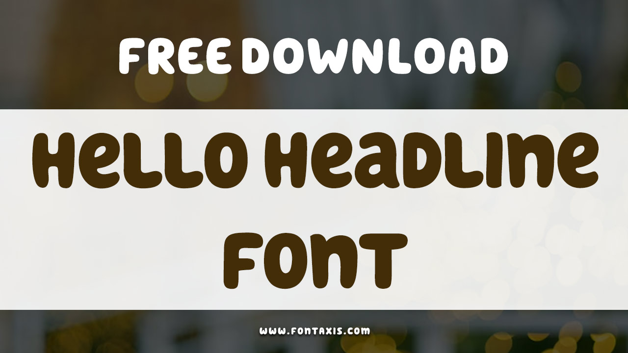
Have you ever noticed the cool letters on posters or signs? Fonts are everywhere! One special font is called Bevan Font. It’s bold and stands out. But why is it special? Let’s explore what makes the Bevan Font unique and how it’s used in design.
Key Takeaways
- The Bevan Font is bold and eye-catching.
- Designers love using it for posters and headlines.
- Bevan Font helps words stand out in a crowd.
- It was created by a talented designer.
- Using Bevan Font can make your project pop!
History Of Bevan Font

The Bevan Font has an interesting history. It was designed by Vernon Adams. He wanted to create a font that was bold and strong. He was inspired by old-style signs. These signs were used in shops and stores many years ago. To create Bevan Font, Vernon used modern technology. He made sure the font looked great on screens. This work paid off, as many designers use Bevan Font today.
- Vernon wanted a bold and strong font.
- Inspired by old-style shop signs.
- Made using modern technology.
- Looks great on screens.
- Popular among designers now.
- Perfect for projects needing boldness.
- Remains a favorite choice today.
Bevan Font is perfect for headlines and posters. Its bold style makes it stand out. This is why designers choose it for important words. When you see a headline in Bevan Font, it grabs your attention. It’s like the font shouts “Look at me!” Using Bevan Font can add a vintage feel to a project, making it memorable.
Fun Fact: The Bevan Font was first released in 2011, and it quickly became popular!
Who Was Vernon Adams?
Have you heard of Vernon Adams? He was a talented font designer. Vernon loved creating fonts that stood out. But why did he love fonts so much? Vernon believed that the right font could change how people felt. He worked hard to make fonts that were both beautiful and functional. His work has been used in many projects around the world. Vernon left a lasting legacy in the design world.
What Inspired Bevan Font?
Imagine walking down a street lined with old shops. Each shop has a unique sign above its door. These signs are bold and eye-catching. This was the inspiration for Bevan Font. Vernon wanted to capture the charm of these old signs. He combined this charm with the needs of modern design. The result was a font that’s both nostalgic and fresh. Designers can use it to add a touch of history to their work.
How Is Bevan Font Used Today?
Have you ever seen a poster and thought, “Wow, that stands out!”? It might have used Bevan Font. This font is popular for headlines, posters, and signs. Why is it used so often? Because it grabs attention! Designers love using it when they need something bold. Bevan Font can also be used in digital projects. It’s versatile and works in many design settings.
Characteristics Of Bevan Font

The Bevan Font has unique characteristics. Its letters are bold and spacious. This makes it easy to read from a distance. The font has a modern touch despite its vintage roots. It’s perfect for making words stand out. Bevan Font is also highly versatile. It can be used in many types of projects. Whether it’s a headline or an advertisement, Bevan Font fits right in.
- Bold and spacious letters.
- Easy to read from far away.
- Modern touch with vintage roots.
- Highly versatile in use.
- Perfect for headlines and signs.
- Attracts attention quickly.
- Consistent in all sizes.
Bevan Font’s boldness is its main appeal. The letters are evenly spaced, which helps with readability. Whether used in newspapers or websites, the font holds its charm. Designers appreciate how it maintains clarity even in smaller sizes. This makes it a reliable choice for various design needs.
Fun Fact: Bevan Font was named after Vernon Adams’ grandfather, who ran a printing business!
Why Choose Bold Fonts?
Why do designers choose bold fonts like Bevan? Bold fonts grab attention. When you see a bold headline, you stop and read it. This is why advertisers love them. Bold fonts can also convey strength and importance. They make the reader think, “This is something I need to know.” For designers, having a strong font like Bevan is essential. It makes messages clear and impactful.
What Makes Fonts Easy To Read?
Have you ever struggled to read a sign from far away? Fonts like Bevan make this problem disappear. The key is in the font’s design. Bevan Font has wide letters and clear shapes. This helps with readability at any distance. Another factor is letter spacing. Bevan Font has consistent spacing, making it readable. The font’s boldness adds to its clarity, ensuring messages are seen.
How Do Fonts Express Emotion?
Did you know fonts can show emotion? It’s true! Bevan Font feels bold and strong. This can make readers feel excited or curious. Designers use fonts to create a mood. If a project needs energy, Bevan Font is a great choice. The font’s bold style instantly brings attention. It’s like a loud voice saying, “Look here!” Different fonts evoke different feelings. Choosing the right one is key.
Comparing Bevan Font With Others

Bevan Font isn’t the only bold font out there. How does it compare with others? One popular font is Impact. Impact is also bold but has less spacing between letters. Another is Arial Black, known for its rounded edges. Bevan Font stands out with its vintage charm. Unlike other fonts, Bevan combines old style with modern needs. This makes it a favorite among many designers.
- Impact is bold with tight spacing.
- Arial Black has rounded edges.
- Bevan Font offers vintage charm.
- Combines old style with modern needs.
- Preferred by designers for headlines.
- Maintains clarity in various sizes.
- Widely used in digital projects.
When picking a font, designers consider many factors. They look at readability, style, and purpose. Bevan Font often wins because of its unique blend of features. It can be used in both print and digital media. This flexibility makes it a top choice for many creative projects.
Fun Fact: Bevan Font was included in Google Fonts, making it free for everyone!
| Font Name | Characteristics | Popular Use |
|---|---|---|
| Bevan | Bold, vintage charm | Headlines, posters |
| Impact | Bold, tight spacing | Advertisements |
| Arial Black | Rounded edges, bold | Digital media |
| Roboto Bold | Sleek, modern | Web design |
What Is Impact Font?
Have you ever seen text that looks super strong and bold? It might be Impact Font. This font is known for its thick letters and tight spacing. Why is it popular? Because it makes a statement! Advertisers love using Impact to grab attention. It’s seen in many posters and ads. While similar to Bevan, Impact has its unique style. Designers choose it when they want to make an impact.
How Does Bevan Differ From Arial Black?
What makes Bevan different from Arial Black? Both are bold, but they have distinct traits. Arial Black has round edges, giving it a softer look. Bevan, however, has a vintage feel. It combines boldness with a touch of classic style. This makes Bevan stand out. Designers use Arial Black for a modern feel. Bevan is chosen for its unique charm.
Why Is Roboto Bold Popular?
Have you come across Roboto Bold? It’s popular for web design. This font is sleek and modern. Its clean lines make it easy to read on screens. Roboto Bold is often used in apps and websites. Why do designers love it? Because it mixes simplicity with style. While different from Bevan, Roboto Bold is also a favorite for many projects. Its modern touch suits today’s digital world.
How To Use Bevan Font In Design

So, you want to use Bevan Font in your design? Here’s how! Start by deciding where you need bold text. Bevan is great for headlines and posters. It can also be used in logos. Make sure your text is clear and readable. Consider the color of your text and background. Bevan works well with high contrast colors. Once you set everything up, your design will pop!
- Choose where bold text is needed.
- Great for headlines and posters.
- Can be used in logos.
- Ensure text is clear and readable.
- Use high contrast colors.
- Check text and background combinations.
- Your design will stand out!
Using Bevan Font can transform a project. Its strong presence grabs attention. A few design tweaks can make it even better. Bevan is versatile and can fit various styles. Whether for a school project or an ad, it’s a reliable choice. Try out different designs to see what works best!
Fun Fact: Bevan Font can be downloaded for free from Google Fonts, making it accessible to everyone!
Where To Find Bevan Font?
Looking for Bevan Font? You can find it on Google Fonts. It’s available for free download. Why is this great? Because it means everyone can use it! Just search “Bevan Font” on the Google Fonts website. Once you find it, download and install it on your computer. Then, you can start using Bevan in your designs. This accessibility makes Bevan a popular choice for many designers.
What Colors Work Best With Bevan?
Are you wondering which colors complement Bevan Font? Bold fonts like Bevan stand out with high contrast colors. Imagine white text on a dark background. This makes the text pop! Bright colors can also work well. The key is to ensure readability. With the right color combo, Bevan Font will shine. Try different colors to see what fits your project best.
How To Pair Fonts With Bevan?
Do you want to pair Bevan Font with others? Choosing the right combo is key. Bevan works well with simpler fonts. Fonts like Arial or Helvetica are great options. Why use simpler fonts? They balance Bevan’s boldness. This creates a clear, attractive design. When pairing fonts, consider the overall look you want. Try different pairings to find the perfect match.
Conclusion
The Bevan Font is a designer’s best friend. Its boldness and vintage charm make it unique. It grabs attention and enhances projects. Bevan Font is versatile and easy to use. Whether for a headline or poster, it fits perfectly. Explore using Bevan Font in your designs. Let its bold style elevate your work!
FAQs
Question: Where can I download the Bevan Font?
Answer: You can download Bevan Font from Google Fonts. It’s free and easy to access. Search for “Bevan Font” and follow the download instructions. Once downloaded, install it on your computer to use it in your projects.
Question: Why is Bevan Font so popular?
Answer: Bevan Font is popular because of its bold style and versatility. Its vintage charm appeals to many designers. It stands out in headlines and posters, making it a favorite choice. Bevan’s boldness grabs attention, which is always a plus in design.
Question: How is Bevan Font used in digital projects?
Answer: Bevan Font is perfect for digital projects due to its readability. Its bold letters stand out on screens. Designers use it in websites, apps, and digital ads. Bevan Font ensures that important messages are noticed in digital media.
Question: What makes Bevan Font different from Impact?
Answer: While both are bold, Bevan Font has a vintage charm. Impact has tighter spacing and a modern look. Bevan combines old-style appeal with modern needs. This makes it a unique choice for various design projects.
Question: Can Bevan Font be used in logos?
Answer: Yes, Bevan Font can be used in logos. Its bold style makes logos stand out. Designers choose Bevan for its unique character. It helps create memorable logos that grab attention. Always consider readability when designing logos.
Question: Are there any similar fonts to Bevan?
Answer: Similar fonts include Impact and Arial Black. However, Bevan has its unique vintage style. Its charm and boldness set it apart. Designers often choose Bevan for projects needing a classic touch. Each font has its special features and uses.