When creating a business proposal, choosing the right font is crucial for making a strong impression and ensuring readability. The best font for a proposal enhances the aesthetic appeal and reflects professionalism.
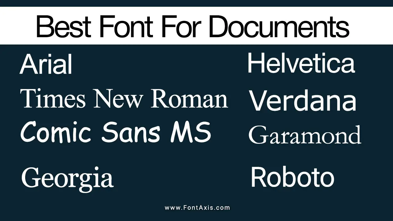
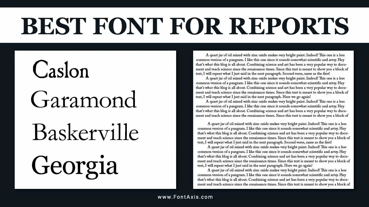
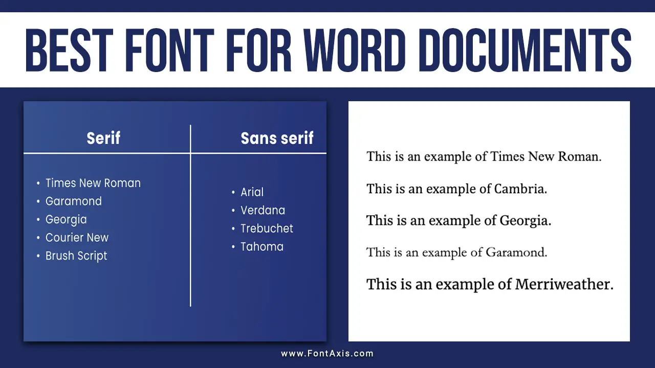
Popular choices for business proposals often include classic serif fonts such as Times New Roman, a standard font in many proposal templates. Serif fonts are known for their traditional feel, making them suitable for formal documents like grant proposals and project proposals.
However, sans serif fonts like Arial and Calibri are also effective, particularly in more modern contexts, as they provide a clean and straightforward look that aligns well with contemporary design principles.
Recommended Fonts For Proposal Body Text
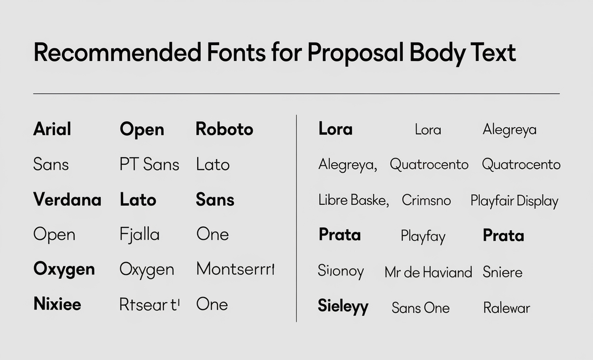
Sans Serif Fonts
- Arial
- Open Sans
- Roboto
- PT Sans
- Lato
- Verdana
- Source Sans Pro
- Oswald
- Fjalla One
- Oxygen
- Montserrat
- Nixie One
Serif Fonts
- Lora
- Alegreya
- Quattrocento
- Libre Baskerville
- Crimson Text
- Playfair Display
- Prata
Other Options
- Space Mono
- Archivo Narrow
- Mr De Haviland
- Sintony
- Julius Sans One
- Raleway
The best font for a business proposal should align with the nature of the proposal, whether it’s a book proposal or a grant proposal, while effectively communicating your ideas. The right font choice, combined with proper formatting and attention to detail, will help create a successful proposal that meets the specific needs of your audience.
When using Microsoft Word to draft your proposal, aim for a font size of 12 points, which balances readability and space efficiency. Your font choice can significantly impact the overall typography of the proposal.
For headings, consider using a different font style or a bolder version of your primary font to create a clear hierarchy that guides the reader through the document. This is especially important in proposal writing, where clarity and organization are key to a compelling proposal.
Don’t Forget About Color Scheme
In addition to the font type, pay attention to the color scheme and how it complements your text. A well-chosen color palette can enhance the visual element of your proposal document, making it more engaging.
Using text boxes strategically can also help to highlight specific information, drawing attention to your proposed solution or key points. While different fonts can serve various purposes, it’s essential to maintain consistency throughout the document to avoid confusion.
For those crafting a cover letter to accompany their business proposal, matching the font style with that of the proposal is a good idea to ensure a cohesive look. Related articles often suggest that a professional document should be aesthetically pleasing and easy to read. Therefore, considering your prospects and their preferences when selecting a font can greatly influence the success of your proposal submission.
Key Highlights
- The right font enhances your proposal’s credibility and persuasiveness.
- Serif fonts like Times New Roman project a traditional, trustworthy feel.
- Sans serif fonts like Arial offer a modern, clean aesthetic.
- Baskerville, a serif font, has been shown to increase reader trust.
- Avoid using too many font styles, as it can appear unprofessional.
- The ideal font size for body text in proposals is typically 12pt.
In the world of business proposals, every detail counts. While content is crucial, the font choice also plays a significant role. Different fonts evoke different feelings, influencing how readers perceive and engage with your proposal. Selecting the right font can be the small change that makes your proposal template stand out or become less effective.
Conclusion
Choosing the right font for your proposal is essential. It’s not just about aesthetics; the font influences how readers perceive and respond to your content. Understanding the effects of different fonts allows you to present a more professional and effective proposal.
Whether you opt for serif or sans serif, ensure they are easily read and visually appealing. The right font reflects your attention to detail and can significantly impact your proposal submission success.
Frequently Asked Questions
1.What Is The Most Professional Font For Proposals?
Times New Roman is widely regarded as a professional font for formal documents, conveying tradition and reliability.
2.How Does Font Size Impact Proposal Readability?
Font size is crucial for readability. A 12-point font is typically ideal for body text, ensuring comfort and clarity.
3.Can The Right Font Really Make A Difference In Proposal Acceptance Rates?
Absolutely. A suitable font enhances readability and improves your brand image, positively influencing engagement and success rates.
4.Are There Fonts That Should Be Avoided In Proposals?
Yes, avoid overly fancy or difficult-to-read fonts. Styles like Comic Sans can undermine professionalism and credibility.
5.How Many Font Styles Should Be Used Within A Single Proposal?
Limit your proposal to one or two font styles to maintain consistency and professionalism, avoiding clutter and confusion. By carefully selecting your font type and adhering to best practices in proposal writing, you can create a compelling proposal that captures attention and fosters trust.

