When it comes to typography, choosing the right font pairing can make a huge difference in the readability and aesthetic appeal of your design. One popular choice for font pairing is Baskerville, a classic serif typeface known for its elegant and timeless appeal.
In this guide, we will explore various font pairing options for Baskerville, discuss font combinations, and offer practical tips for using fonts like Libre Baskerville, Proxima Nova, Josefin Sans, and more in your web and graphic designs.
What Is Baskerville Font?
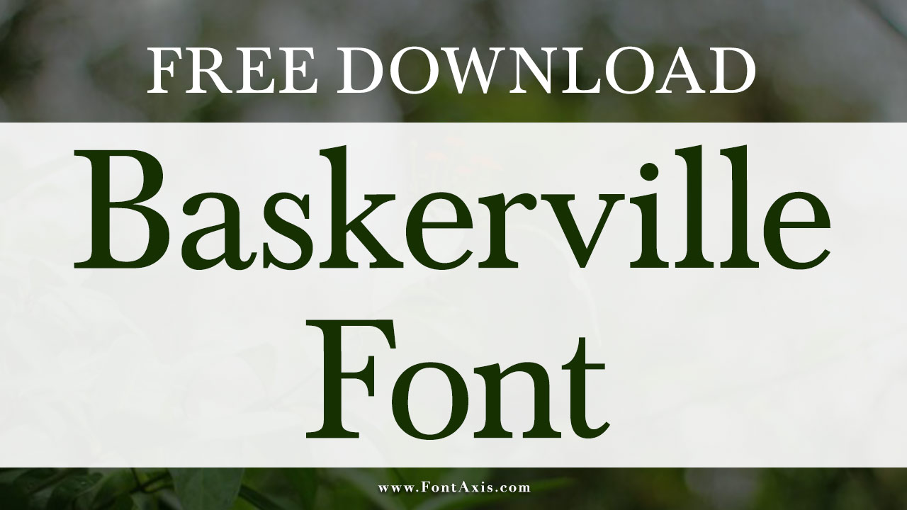
Baskerville is a serif font designed by John Baskerville in the 18th century. Known for its clean lines and high contrast between thick and thin strokes, it has become a popular choice for both print and digital designs. The Baskerville font pairing is often used in sophisticated projects because of its elegance and readability. Below are the font family and available weights:
Baskerville Font Family:
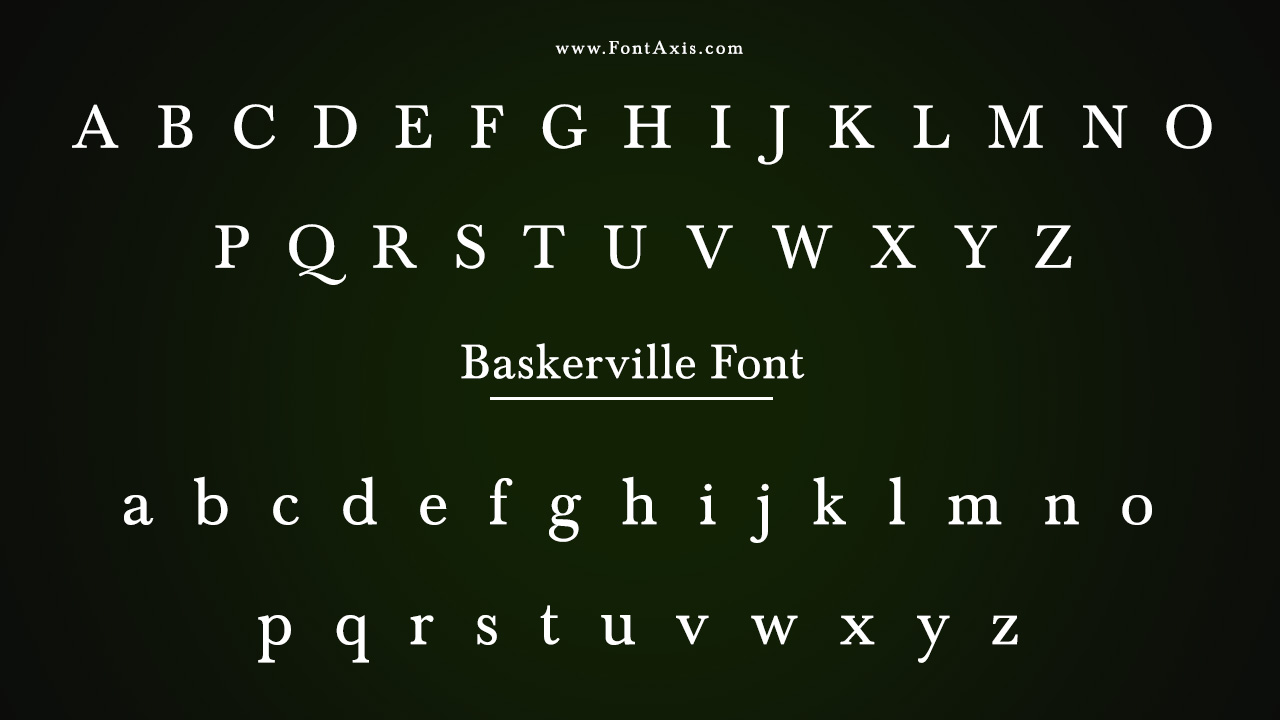
- Baskerville Regular
- Baskerville Italic
- Baskerville Bold
- Baskerville Bold Italic
- Baskerville Light
- Baskerville Light Italic
Available Weights:
- Regular (400)
- Italic (400)
- Bold (700)
- Bold Italic (700)
- Light (300)
- Light Italic (300)
There are several variations of this font, such as Libre Baskerville and Baskerville Old Face, that can be used to add variety while maintaining the essence of the original typeface. Libre Baskerville is available on Google Fonts and is a great choice for web use, especially for body text.
Why Font Pairing Matters
Font pairing is a crucial part of typography and can significantly impact how your design is perceived. Good font pairing ensures that the fonts complement each other, providing contrast without clashing. It helps establish a visual hierarchy, guiding the reader’s eye from the heading to the body text.
For website design, graphic design, and print projects, selecting the right font combination can elevate the overall design and ensure readability. Font pairing involves finding a balance between the fonts used for headings, body text, and even display fonts.
Best Fonts For Pairing With Baskerville
When pairing Baskerville, it’s important to consider fonts that either contrast or complement its traditional and authoritative feel. Here are some excellent font pairings that work beautifully with Baskerville:
1. Baskerville And Proxima Nova
A great font pairing involves combining a classic serif font like Baskerville with a modern sans serif font like Proxima Nova. The contrast between the serif typeface and the sans serif font provides balance, making the design feel both modern and sophisticated. Proxima Nova is perfect for headings or subheadings, while Baskerville works wonderfully for body text.
2. Baskerville And Libre Franklin
Another great combination is Libre Franklin, a sans serif font, with Baskerville. Libre Franklin is similar to Proxima Nova but offers a slightly more geometric feel. Pairing it with Baskerville creates a harmonious contrast, with Baskerville bringing elegance and Libre Franklin offering a clean, readable feel for the body font.
3. Baskerville And Helvetica Neue
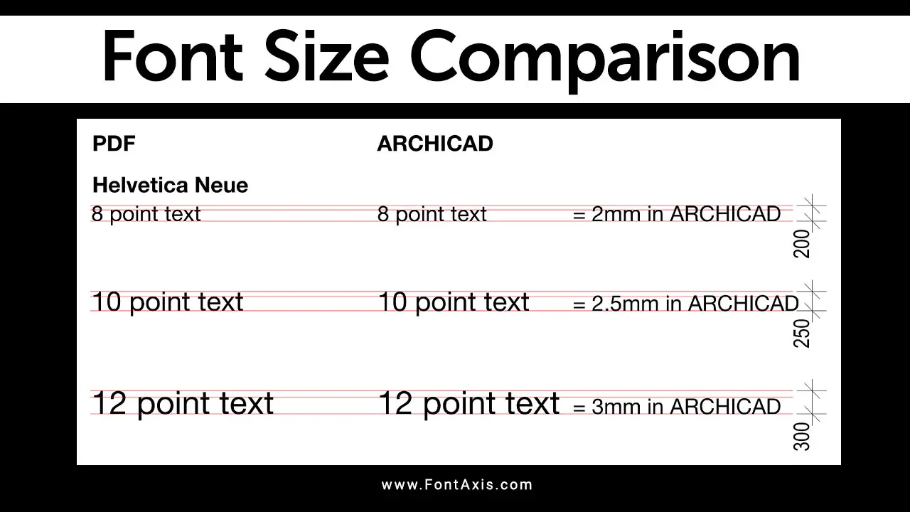
Helvetica Neue, a sans serif font, is a versatile font that pairs well with almost any serif font. The clean and neutral design of Helvetica Neue creates an attractive balance with the more traditional look of Baskerville. This combination works well for both website design and print materials, giving your design a modern yet classic feel.
4. Baskerville And Cormorant Garamond
For a more traditional approach, Cormorant Garamond pairs beautifully with Baskerville. Cormorant Garamond, a serif font itself, offers a more refined and delicate style compared to the boldness of Baskerville. This combination is perfect for high-end graphic design projects or literary pieces where elegance and readability are essential.
5. Baskerville And Montserrat Light
If you’re looking for a font combination that feels contemporary yet timeless, try pairing Baskerville with Montserrat Light. Montserrat Light is a sans serif font that adds a sleek, modern feel to your design. This combination works exceptionally well for headings, while Baskerville retains its classic touch in the body text.
6. Baskerville And Josefin Sans
For a more artistic and elegant design, consider pairing Baskerville with Josefin Sans. Josefin Sans is a sans serif font that features a geometric, modern look. This contrast between Baskerville’s classic elegance and Josefin Sans’ contemporary style creates a visually striking combination.
7. Baskerville And Noto Sans
Noto Sans is another excellent sans serif font that pairs well with Baskerville. The simple, clean lines of Noto Sans contrast nicely with the sophistication of Baskerville, creating an eye-catching layout that’s easy to read. This pairing is ideal for web design and professional documents.
8. Baskerville And EB Garamond
For a more classic approach, Baskerville and EB Garamond work beautifully together. Both are serif fonts, but they offer slightly different characteristics. EB Garamond has a more historical feel, while Baskerville is more modern. The result is a refined, elegant combination perfect for any high-end design project.
9. Baskerville And Space Mono
For a unique, modern design, try pairing Baskerville with Space Mono. This monospace font offers a futuristic vibe, making it a great choice for graphic design that blends classic style with a contemporary twist. This pairing is perfect for creative industries or tech-related designs.
Font Pairing Tips
When experimenting with font combinations, here are a few tips to help you get the most out of your Baskerville font pairing:
- Contrast is Key: When pairing serif fonts like Baskerville with sans serif fonts like Proxima Nova or Josefin Sans, ensure there is enough contrast to distinguish between headings and body text.
- Consider the Purpose: The font pairing should align with the purpose of the document or website. For example, a serif font like Baskerville works well for traditional, professional, or literary projects, while sans serif fonts are better suited for clean, modern designs.
- Don’t Overcomplicate: While it’s tempting to use multiple fonts, it’s often best to limit the number of fonts used in a design to 2-3. Too many fonts can create visual chaos and make the content harder to read.
- Font Size Matters: Consider adjusting the font size for optimal readability, especially for web design. Ensure that the body text is large enough to read comfortably but not too large that it overwhelms the reader.
Conclusion
Baskerville is a timeless and sophisticated serif font that works exceptionally well in various design contexts, whether it’s for web design, graphic design, or print materials. By pairing it with fonts like Proxima Nova, Libre Franklin, or Josefin Sans, you can create a perfect balance of elegance and modernity.
Proper font pairing not only enhances the aesthetic appeal but also improves readability and user experience. With the tips and examples provided, you can confidently experiment with Baskerville font pairing to craft stunning designs that stand out.
Frequently Asked Questions
1.What Is The Best Font To Pair With Baskerville?
Some of the best fonts to pair with Baskerville are Proxima Nova, Libre Franklin, Helvetica Neue, and Montserrat Light.
2.How Do I Pair Fonts For My Website?
Start with a serif font for the body text, like Baskerville, and pair it with a sans serif font for headings, such as Proxima Nova or Josefin Sans. Ensure there’s enough contrast between the two fonts for easy readability.
3.Can I Use Baskerville In Web Design?
Yes, Baskerville works well in web design, especially when paired with web-friendly fonts like Libre Baskerville (available on Google Fonts) or Noto Sans.
4.What Is A Good Font Combination For Print Materials?
For print materials, you can pair Baskerville with fonts like EB Garamond, Proxima Nova, or Josefin Sans to create an elegant and readable design.
5.What Are Adobe Fonts And How Can I Use Them With Baskerville?
Adobe Fonts offers a wide range of high-quality fonts that you can pair with Baskerville for both web and print designs. Fonts like Proxima Nova and Helvetica Neue are available in Adobe Fonts and can be used to complement Baskerville.
6.Can I Mix Multiple Fonts With Baskerville?
Yes, you can mix Baskerville with multiple fonts, but it’s important to maintain a harmonious contrast between the fonts. Use serif fonts for the body text and sans serif fonts for headings to create a balanced and visually appealing design. However, be cautious not to overuse different fonts, as this can make the design cluttered and confusing. Stick to 2-3 font choices for the best result.


