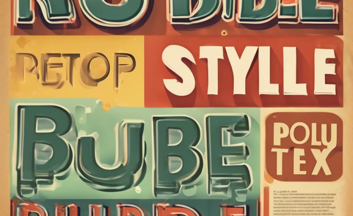
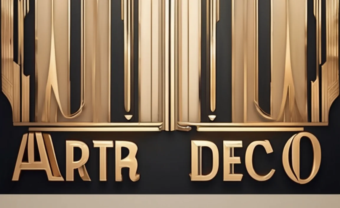
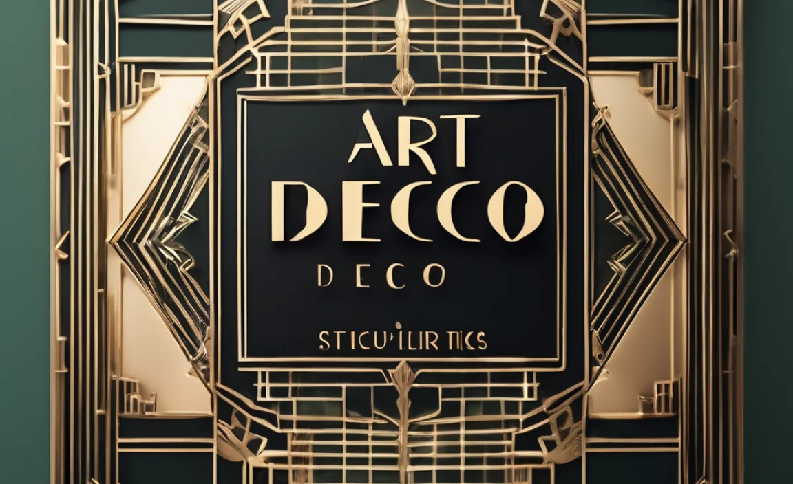
Have you ever seen letters that look like they came straight from a fancy movie set? These letters might be part of an Art Deco Font. This font style is full of character and charm. It can make anything look classy and stylish. Kids and adults love using it for signs, posters, and even party invitations.
What makes Art Deco Font so special? Imagine a world filled with towering skyscrapers and jazzy music. That’s the era when Art Deco was born. People back then loved things that looked sleek and modern. Art Deco fonts reflect that love for cool and beautiful designs.
Do you want to learn more about this amazing font? Let’s dive into the world of Art Deco Font and see why it’s still popular today!
Key Takeaways
- Art Deco Font is stylish and elegant.
- It was popular during the 1920s and 1930s.
- This font is used for signs, posters, and logos.
- Art Deco Font features bold and geometric shapes.
- Many designers and artists still use Art Deco today.
Characteristics Of Art Deco Fonts
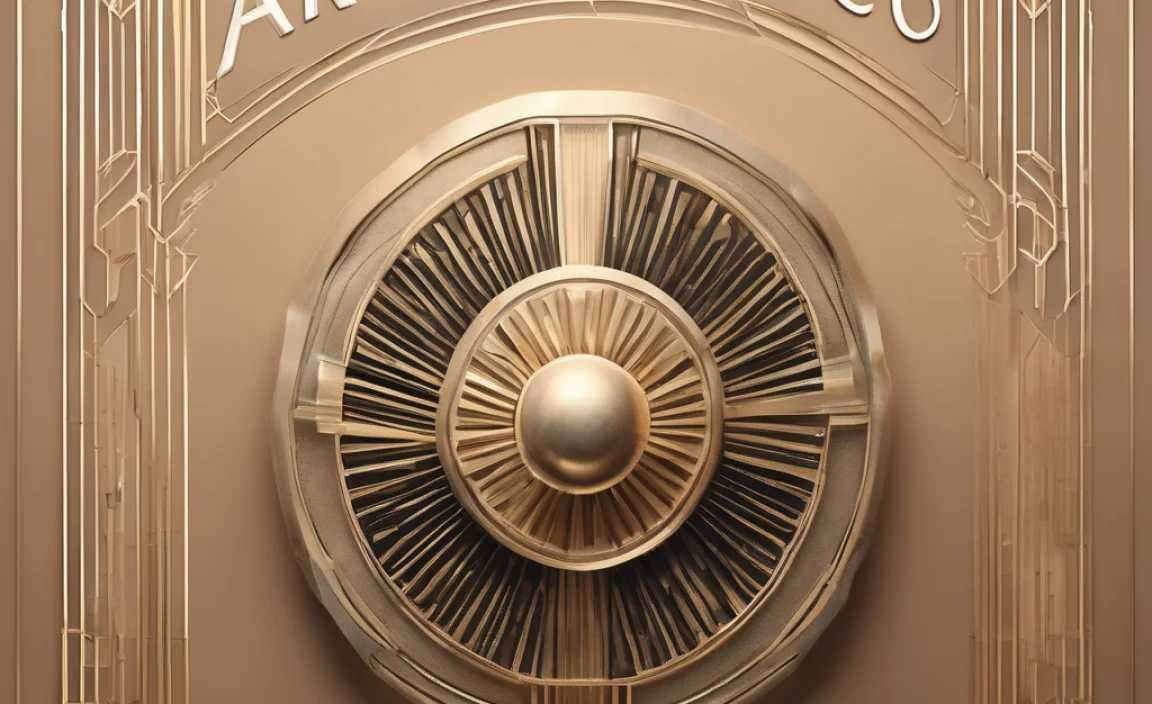
Art Deco fonts are fascinating because of their unique features. These fonts have bold and clean lines. They often use geometric shapes like triangles and circles. During the 1920s and 1930s, people loved these new and exciting styles. The world was changing fast, and this font was part of the ride. Art Deco reflects the spirit of adventure and modernity of that time.
- Bold lines and edges.
- Geometric shapes are common.
- Sleek and modern style.
- Reflects the 1920s and 1930s era.
- Used for various creative projects.
Imagine seeing a big, colorful poster from the past. Art Deco fonts made those posters stand out. The letters looked like they were dancing on the paper. This font brought images alive with its boldness and clarity. Even today, many designers look to Art Deco for inspiration. It continues to be a timeless style that turns heads wherever it’s used.
Fun Fact: Art Deco is inspired by ancient Egyptian and Aztec art!
Bold Lines And Edges
Have you ever seen a zigzag road sign? Art Deco fonts use similar bold lines and edges. These fonts make every word pop out. They are not shy or quiet. Why were bold lines so loved? Back in the day, cities were growing, and buildings reached for the sky. People wanted fonts that matched these strong and confident structures. Art Deco fonts were the perfect fit with their striking and dynamic look.
Geometric Shapes
Art Deco fonts love shapes like circles, squares, and triangles. These shapes make the fonts look balanced and neat. Imagine a toy with blocks of different shapes. Each block fits together to make something amazing. In the same way, geometric shapes fit together in Art Deco fonts. They create letters that are both fun and easy to read. Have you ever built something with blocks? Then you know why these shapes are so cool!
Sleek And Modern Style
Art Deco fonts have a sleek and modern style. This might seem surprising since they come from a long time ago. But that’s the magic of Art Deco. It’s like a classic car that never gets old. Do you know anyone who loves vintage things? Art Deco fonts are just like that. They bring an old-fashion charm that still feels fresh and exciting. This style is timeless, making it a favorite for many people.
Famous Uses Of Art Deco Fonts
Art Deco fonts are famous for being used in many iconic places. If you’ve ever walked through a city with skyscrapers, you might have seen them. Buildings, signs, and even theaters proudly display Art Deco style. It makes things look grand and important. These fonts show off their beauty in architecture and design. People admired their elegance and wanted to bring a touch of class to everything.
- Used in iconic buildings.
- Signage and advertisements.
- Posters and brochures.
- Theaters and cinemas.
- Brand logos and designs.
When you see an old movie theater, notice the letters on the sign. They are probably in an Art Deco font. This font adds magic to movie titles and makes them unforgettable. Even today, businesses use this font to capture attention. They know its power to attract eyes and leave a lasting impression. Art Deco fonts never fail to add a touch of glamour and sophistication to any setup.
Fun Fact: The famous Chrysler Building in New York is a masterpiece of Art Deco!
Used In Iconic Buildings
Have you ever seen pictures of the Empire State Building or the Chrysler Building? These are examples of places that use Art Deco design. The fonts on these buildings are just as impressive as the structures themselves. Imagine walking into a building and feeling like you’ve entered another world. That’s the power of Art Deco. It turns everyday places into extraordinary experiences.
Signage And Advertisements
Art Deco fonts are perfect for signs and ads. Why? Because they grab attention instantly. Imagine walking down a street and seeing a bright, bold sign. It makes you stop and look. That’s the effect of Art Deco fonts. They command attention and make you curious. Businesses love using them to stand out in a busy world. These fonts make any message loud and clear.
Posters And Brochures
Have you ever made a poster for school? Imagine using Art Deco fonts to make it extra special. These fonts were popular on posters and brochures in the past. They made every letter look like a tiny piece of art. People wanted their posters to look cool and eye-catching. Art Deco fonts were the perfect choice. They made sure everyone noticed and remembered the message.
How To Create Art Deco Fonts
Creating Art Deco fonts is like making a piece of art. Designers start with basic shapes. They use lines, angles, and curves to form letters. It’s like drawing a picture with letters. The process requires imagination and creativity. Designers think about the spirit of the 1920s and 1930s. They want to capture the excitement and elegance of that time. This makes every Art Deco font unique and special.
- Start with basic shapes.
- Use bold lines and angles.
- Create a sleek and modern look.
- Capture 1920s and 1930s spirit.
- Make each letter unique.
Imagine playing with building blocks. You choose different shapes to create something new. Creating Art Deco fonts is similar. Designers experiment with shapes and forms. They test different ideas until they find the perfect font. This creative process results in beautiful and distinctive fonts. Many designers enjoy this challenge and find it rewarding. Art Deco fonts continue to inspire and amaze.
Fun Fact: Many Art Deco designs are hand-drawn to capture their unique style!
Start With Basic Shapes
Building an Art Deco font begins with basic shapes. Have you ever used shapes to make a picture? Designers do the same. They use circles, triangles, and squares for their fonts. These shapes form the foundation of each letter. The result is a font that looks balanced and attractive. Crafting with shapes is fun and creative. It’s like turning a simple idea into something amazing.
Use Bold Lines And Angles
Why are bold lines important in Art Deco fonts? They give each letter strength and presence. Think of a cartoon superhero with bold, powerful lines. The letters feel strong and confident. Designers use these lines and angles to make the font eye-catching. They want people to notice the letters right away. Bold lines make sure that every word is easy to read and understand.
Create A Sleek And Modern Look
Art Deco fonts look sleek and modern. This style comes from the 1920s and 1930s. Imagine a shiny, new car that looks fast and exciting. Art Deco fonts have the same feel. They look fresh and elegant. Designers focus on making the fonts look clean and stylish. They want each letter to feel timeless and classic. This modern look is what makes Art Deco fonts so special.
Comparing Art Deco With Other Fonts
How does Art Deco compare to other fonts? Art Deco fonts are unique and stylish. They stand out with their bold lines and geometric shapes. Let’s think about some other font styles. Serif fonts have little lines at the end of each letter. Sans-serif fonts are simple and clean without these lines. Art Deco fonts are different. They have a distinct flair that others might lack.
| Font Style | Main Features | Common Uses |
|---|---|---|
| Art Deco | Bold, geometric, elegant | Posters, buildings, logos |
| Serif | Lines or strokes at ends | Books, newspapers, reports |
| Sans-serif | Clean, modern, no strokes | Websites, digital screens |
| Script | Flowing, cursive, elegant | Invitations, greeting cards |
- Art Deco features bold shapes.
- Serif has lines at the ends.
- Sans-serif is clean and simple.
- Script looks like cursive writing.
- Each font suits different uses.
Each font style has its own charm. It depends on what you need. Art Deco is perfect for bold and exciting designs. Serif fonts are great for readability. Sans-serif fonts are awesome for modern looks. Script fonts add a personal touch. Choosing the right font can make all the difference. It helps communicate your message in the best way possible.
Fun Fact: The first Art Deco designs appeared at a show in Paris in 1925!
Art Deco Has Bold Shapes
Art Deco fonts are all about bold shapes. Have you ever seen a pattern with repeating designs? Art Deco uses these patterns in letters. Each letter looks like a tiny piece of art. Designers love using these fonts for things that need to stand out. It’s like shining a flashlight in a dark room. The bold shapes make sure every letter is seen and admired.
Serif Fonts Have Lines
Serif fonts are different. They have small lines at the end of each letter. These are called serifs. Imagine drawing a letter and adding tiny tails. These tails help guide your eyes across the page. Serif fonts are often used in books. They make reading long texts easier. Each font type has its strengths. It’s all about choosing the right one for the job.
Sans-serif Is Clean And Simple
Sans-serif fonts are clean and simple. They don’t have any extra lines or strokes. Imagine a smooth, flat road without bumps. Sans-serif fonts are easy to read on screens and digital devices. They are a favorite choice for websites because they look modern and fresh. Each word looks clear and direct. This makes them perfect for conveying clear messages.
The Impact Of Art Deco Fonts Today
Art Deco fonts have left a lasting impact. Even today, people love using them. They are present in modern advertising, design, and branding. These fonts continue to inspire new creations. Artists and designers look to Art Deco for ideas. The fonts give a touch of elegance and history to any project. They connect the past with the present, creating something timeless.
- Still popular in modern design.
- Used in advertising and branding.
- Inspires new creative ideas.
- Connects past with present.
- Offers timeless elegance.
Imagine a world without Art Deco fonts. It would be less colorful and exciting. These fonts add character to everything. They make designs feel special and unique. Many people still choose Art Deco for logos and advertisements. This shows how powerful and appealing they are. They bring a touch of magic to the world of design.
Fun Fact: Art Deco design was influenced by the discovery of King Tut’s tomb!
Still Popular In Modern Design
Art Deco fonts continue to be popular. Designers use them in new and exciting ways. It’s like finding a treasure chest full of old coins. Each font has its own story and charm. Designers love giving them a fresh twist. They use these fonts in everything from websites to fashion. Art Deco fonts show that old styles never truly go out of fashion.
Used In Advertising And Branding
Have you ever seen a fancy ad that caught your eye? It might have used an Art Deco font. These fonts make brands look classy and memorable. Companies want to make a strong impression. Art Deco fonts help them do just that. The bold, elegant letters make sure the message sticks. People remember the brand and the font long after they see it.
Inspires New Creative Ideas
Art Deco fonts inspire creativity. Imagine having a toolbox full of amazing tools. Each tool helps you build something new. Art Deco fonts are like those tools for designers. They spark new ideas and bring old designs back to life. Artists love experimenting with them. They mix old and new styles to create something wonderful.
Creating Your Own Art Deco Project
Do you want to create your own Art Deco project? It’s fun and easy! Start by choosing an Art Deco font. Think about the colors and shapes you want to use. You can create a poster, a fun sign, or even a birthday card. Use bold lines and geometric shapes. Let your imagination run wild. The best part is, there’s no right or wrong way to do it. Just have fun and be creative!
- Choose an Art Deco font.
- Decide on colors and shapes.
- Create a poster or sign.
- Use bold lines and shapes.
- Have fun and be creative.
Think about the story you want to tell. Art Deco fonts can help bring it to life. Maybe you want to make a poster for a school project. Or perhaps a card for a friend’s birthday. Whatever you choose, Art Deco fonts will make it special. Your project will stand out and amaze everyone who sees it.
Fun Fact: There are many free Art Deco fonts available online!
Choose An Art Deco Font
Start your project by choosing the perfect Art Deco font. Do you want something bold and daring? Or perhaps something elegant and stylish? There are many Art Deco fonts to choose from. Each one has its own personality. Pick one that matches your vision. Once you have your font, you’re ready to create!
Decide On Colors And Shapes
Colors and shapes are important in any Art Deco project. Imagine a rainbow of colors and a puzzle of shapes. How do they fit together? Choose colors that match your theme. Use shapes like circles, squares, and triangles. These elements make your design exciting and fun. Experiment with different combinations. You’ll discover something amazing.
Create A Poster Or Sign
Have you ever made a sign for a lemonade stand? Creating an Art Deco sign is similar. Use your chosen font, colors, and shapes. Arrange them in a way that looks great. Add your own special touch. Maybe a splash of glitter or a fun border. Your sign will look fantastic. It’s a chance to show off your creativity and style.
Conclusion
Art Deco Font is a fascinating and timeless design. Its bold lines and geometric shapes make it unique. This style has inspired countless designers and artists. People love using it in modern projects. Whether you’re creating a poster or branding, Art Deco Font adds elegance. Embrace the charm of Art Deco, and let it spark your creativity!
FAQs
Question: What is Art Deco Font used for?
Answer: Art Deco Font is used for posters, signs, and logos. It adds elegance and style. Designers use it to create eye-catching advertisements and branding. Its bold lines make it perfect for projects that need to stand out.
Question: Why are Art Deco Fonts popular?
Answer: Art Deco Fonts are popular because of their timeless charm. They have a unique look with bold, geometric shapes. This makes them stand out. Many people love their elegant and stylish appearance. They bring a touch of class to any project.
Question: How do you create an Art Deco project?
Answer: To create an Art Deco project, start with an Art Deco Font. Choose colors and shapes that fit your theme. Use bold lines and geometric patterns. You can create posters, signs, or cards. Let your imagination guide you!