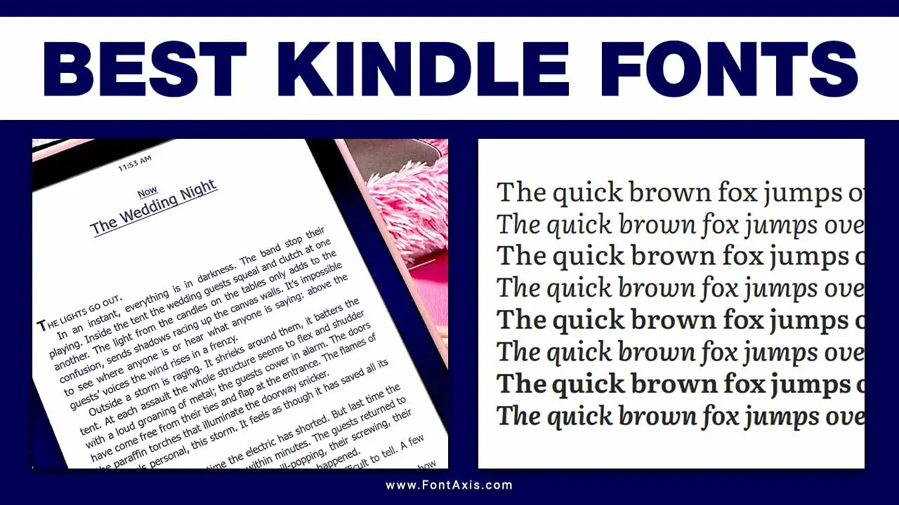
Finding the best font for your Kindle can greatly enhance your reading experience. The right font can make a huge difference in readability, eye comfort, and enjoyment, whether using a Kindle Paperwhite, Kindle Fire, or any other Kindle device. Here, we’ll explore some of the best Kindle fonts and how to optimize your Kindle for the best reading experience.

Top Kindle Fonts For Your Reading Pleasure

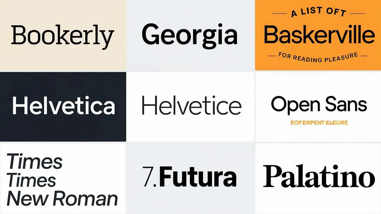
1. Bookerly
- Type: Serif Font
- Best For: Kindle Devices
- Description: Bookerly is Amazon’s own font, developed exclusively for Kindle devices. This font provides exceptional readability and mimics the look of a traditional physical book while offering maximum clarity on digital screens. Its well-spaced letters and clear lines make it an ideal choice for extended reading sessions.
2. Georgia
- Type: Serif Font
- Best For: eBooks, especially with long body text
- Description: A default option for many readers, Georgia is a favorite serif font due to its large x-height, which improves readability on smaller screens. Magazines, websites, and e-books often use it for body text. It’s also known for its bold, almost-black letters, making it easy on the eyes.
3. Baskerville
- Type: Serif Font
- Best For Kindle Unlimited and Books with Long Paragraphs
- Description: This elegant typeface brings a classic feel to your Kindle. It’s known for its high contrast and refined look, which works well with literature, classics, and academic texts. Many readers consider Baskerville their preferred font for reading historical or formal content.
4. Helvetica
- Type: Sans-Serif Font
- Best For Readers who prefer clean and modern styles
- Description: Helvetica is a versatile font that suits both short and long texts. Its straightforward design appeals to those who favor minimalist styles, and it’s popular among graphic designers for its modern appearance.
5. Open Sans
- Type: Sans-Serif Font
- Best For: Kindle Fire and Kindle App Users
- Description: Open Sans is part of Google Fonts and is a favorite among those who prefer a sans-serif typeface. It’s available as a free font and is known for its excellent legibility, even at smaller sizes. You can easily download font files from Google Fonts and use Open Sans as a custom font on your Kindle.
6. Times New Roman
- Type: Serif Font
- Best For Readers Who Want a Traditional Look
- Description: Perhaps one of the most recognizable fonts, Times New Roman is a default font for many documents and books. Although it’s not the default font on Kindle, it can be manually added to your Kindle using font hacks. It’s perfect for readers who enjoy a classic, familiar typeface.
7. Futura
- Type: Sans-Serif Font
- Best For: Modern and clean text
- Description: Futura is a geometric font known for its clean lines and elegant style. It’s an excellent choice for readers who prefer a typeface that stands out without compromising readability.
8. Palatino
- Type: Serif Font
- Best For: Formal content
- Description: Palatino is a classic serif font often used for formal content. It’s designed to be legible on low-resolution displays, making it a popular choice among Kindle users who prioritize clarity.
How To Add Custom Fonts To Your Kindle
- Download the desired font from a reputable source (e.g., Font Squirrel, Google Fonts).
- Connect your Kindle to your computer via USB.
- Create a folder named “fonts” in the root directory of your Kindle.
- Copy the font files (usually .ttf or .otf) into the fonts folder.
- Eject the Kindle and go to your font settings. The new font should now be available as an option.
Optimizing Your Kindle For Maximum Readability
Choosing the right font is crucial for comfortable reading. Here are some tips to optimize your Kindle’s readability:
- Adjust Font Size: Choose a font size that suits your comfort level. Smaller fonts may look elegant but can strain your eyes over time.
- Select Font Weight: Some fonts allow you to change the boldness. Thicker fonts are generally easier to read for extended periods.
- Explore Different Font Choices: Don’t stick to the default fonts—experiment with multiple fonts to find what suits your eyes best.
The Impact Of Typography On Reading Experience
Good typography can significantly impact how you perceive and enjoy an ebook. Proper font selection can enhance focus, reduce eye strain, and make the text feel more engaging. Choose a font family that aligns with the tone of the content—serif fonts often work well for fiction and longer reads, while sans-serif fonts are excellent for nonfiction and technical books.
Conclusion
Choosing the best Kindle font is a matter of personal preference, but knowing the pros and cons of each type can guide you toward the perfect reading setup. Whether you prefer a standard font like Times New Roman or enjoy experimenting with different font styles using custom options, the key is to prioritize comfort and readability.
Frequently Asked Questions
1.Can I Add Custom Fonts To My Kindle?
Yes, you can add custom fonts to your Kindle by downloading font files and using a font folder on your device.
2.What Is The Default Font On Kindle Devices?
The default font varies but often includes Bookerly or Amazon Ember, both designed for optimal readability on Kindle screens.
3.Is Times New Roman Available On Kindle?
Times New Roman is not a default Kindle font, but you can add it manually using custom font hacks or third-party software like Calibre.
4.What’s The Best Font Size For Reading On Kindle?
This depends on individual preferences, but medium-to-large font size is recommended to prevent eye strain during long reading sessions.
5.Are There Any Free Fonts I Can Use On Kindle?
Yes, several free fonts, such as Open Sans and others from Google Fonts, can be used on Kindle by downloading them from trusted sources.
