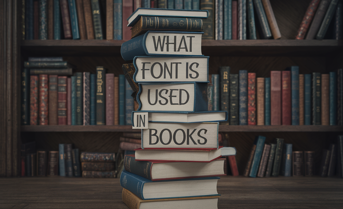
In every designing of a book, the font selection plays a critical role in creating an enjoyable reading experience. Whether you are writing a fiction book, a nonfiction book, or even a children’s book, choosing the right font is essential for readability and overall book design.
There are many different fonts to choose from, and each serves a distinct purpose. In this guide, we’ll take you through the most commonly used fonts in books, explore the importance of font style, size, and selection, and help you make the perfect choice for your book.
Let’s Find Out Which Are In The list of Best Fonts for Books

Choosing the best font for your book comes down to readability, style, and appropriateness for your genre. The right font enhances your book’s layout and ensures your readers can enjoy a seamless reading experience.
The best fonts for books often come from two main categories: serif fonts and sans-serif fonts. Let’s dive into both:
Serif Fonts
Serif fonts are the classic choice for body text in print books. These fonts have small lines or decorations (serifs) at the ends of letters. These little embellishments help guide the reader’s eye across the page, making serif fonts ideal for long-form reading. Serif typefaces are traditional, formal, and highly readable, which is why they are the standard font for most printed books.
Some of the most popular serif fonts used in books include:
- Times New Roman
Times New Roman is one of the most popular fonts for print books. It’s a classic serif font with clear, easy-to-read letterforms. Times New Roman is handy for both fiction and nonfiction books, especially for manuscripts submitted to publishers or for official documents. - Book Antiqua
Book Antiqua is another serif font that is frequently used for books. It is slightly more elegant than Times New Roman and offers a comfortable reading experience, especially for fiction books and printed books. Its readability makes it an excellent choice for body text. - Century Schoolbook
Century Schoolbook is a classic serif font specifically for reading. It is common in books for young readers and really is one of the best fonts for children’s books. This font is clear, highly legible, and works well in smaller font sizes for print books. - Garamond
Garamond is another classic serif font for print books. It has a historical feel and provides a more artistic and elegant aesthetic. Garamond is ideal for both fiction books and nonfiction books, especially those that want to convey sophistication. - Georgia
Georgia is a modern serif font with clarity and legibility, even in smaller font sizes. Many publishers often used this font in ebooks and printed books, as it’s a versatile choice for book layout design.
Sans-Serif Fonts
Sans-serif fonts are typically used for headings, titles, and other display text. These fonts lack the small lines at the ends of the characters, giving them a cleaner, more modern appearance. While sans-serif fonts are less common for body text in print books, they are ideal for book covers and certain sections of your book layout.
Popular sans-serif fonts used for book titles, headings, and display purposes include:
- Roboto
Roboto is a modern sans-serif font that is highly versatile and easy to read. It often shines in headers and titles in printed books or for the body text in ebooks. It has a contemporary look that suits many genres. - Open Sans
Open Sans is another modern sans-serif font that works well in book layout design. It’s clean and easy to read, making it a good choice for web fonts, book titles, and subheadings. - Helvetica
Helvetica is one of the most widely used sans-serif fonts in graphic design, and it also finds its place in book design. It’s particularly useful for modern books that need a minimalist and professional appearance.
Font Size and Book Layout
The font size used in your book is equally important as the font style. The correct font size ensures that your book remains legible, especially in print books.
For most printed books, a font size of 10–12 points is standard for the body text. If you’re designing a nonfiction book or a textbook, you may want to use a larger font size to accommodate the complexity of the material.
When choosing a font for your book, be sure to adjust the size accordingly to make sure it fits within your book layout and provides comfortable reading.
Best Practices for Font Selection
When it comes to selecting fonts for your book, here are some best practices to keep in mind:
- Readability: The font should be legible and easy to read for long periods of time. Stick to fonts with clear, distinct characters.
- Consistency: Choose a font family with multiple styles (regular, bold, italic) to create a cohesive layout. Keep the font style consistent for body text and use display fonts only for headings and titles.
- Appropriate Font Size: Adjust your font size to suit the type of book. For fiction and general text-heavy books, keep your font size between 10-12 points for body text. For children’s books, you may want to use larger font sizes, typically between 14-18 points.
- Spacing: The spacing between lines (leading) should be balanced to ensure readability. Too tight or too wide can strain the reader’s eyes.
- Typography for Book Covers: The font on your book cover plays a significant role in attracting readers. Opt for display fonts for the title, but ensure they are legible even at small sizes. Make sure the book cover font complements the book’s genre.
Google Fonts and Free Fonts
Many fonts require payment, but you can find free options online that work perfectly for book design. For example, Google Fonts provides a wide selection of free fonts licensed for both commercial and personal use. You can download and use fonts like Roboto, Merriweather, and Lora in your book editing software, such as Microsoft Word or Adobe InDesign.
Display Fonts and Decorative Fonts
Decorative fonts can add character to your book design but need to use it sparingly. These fonts are typically used for specific sections of the book, like a book title or unique chapter heading styles. They can be fun and creative, but too many decorative fonts can clutter your book’s layout and make it harder to read.
Conclusion
Choosing the right font for your book is an essential step in the design process. Serif fonts like Times New Roman, Garamond, and Georgia are widely used for body text because of their readability. For titles and headings, sans-serif fonts like Roboto, Helvetica, and Open Sans are great choices. Additionally, using display fonts and decorative fonts can help create an eye-catching book cover design and make headings stand out.
By considering the right font style, font size, and pairing fonts appropriately, you’ll ensure that your book looks professional and enhances the reading experience for your audience.
FAQ
1. What is the best font for book design?
Some of the best fonts for book design include Garamond, Times New Roman, and Georgia for body text, and Helvetica or Roboto for headings.
2. Can I use Google Fonts for my book?
Yes, Google Fonts offers many free fonts that can be used in both print and digital books. Some popular options include Roboto and Merriweather.
3. What is the ideal font size for books?
For print books, the ideal font size for body text is between 10-12 points. For children’s books, you may need larger sizes, typically between 14-18 points.
4. Can I use a calligraphy font in my book?
Calligraphy fonts are best for book titles or headings, but they are not recommended for body text due to readability concerns.
5. Why use a font that looks like Baskerville when you can just use Baskerville?
Using Baskerville ensures authenticity and the refined characteristics it brings to text. Fonts that mimic Baskerville may lack its balanced proportions and elegant stroke contrast, affecting the reading experience.
6. What font and size are good for a 6 x 9 book?
For a 6×9 book, use a serif font like Garamond, Baskerville, or Minion Pro in 11–12 pt size for readability, with line spacing set to 1.15 or 1.5.
7. Does the font license allow you to use the font for a book cover?
Font licenses vary; some allow commercial use, while others restrict usage. Check the licensing terms for commercial use and embedding, especially for book covers.
8. Why are serif fonts seen as more formal and sans serif not?
Serif fonts convey tradition and formality due to their historical use in printed works like books and newspapers. Sans serif fonts are modern and minimalist, often used for digital and casual designs.
9. What is the basic font size used for large print books and magazines?
Large print books typically use font sizes between 16 and 18 pt, ensuring readability for visually impaired readers. Magazines may vary depending on design needs.
10. Which font style and size should I use to write a novel in MS Word?
Use a serif font like Times New Roman or Garamond in 12 pt, with double spacing. This standard format is easy to read and preferred by publishers.
11. What does it mean when the font changes in a novel?
Font changes in a novel often signal shifts in perspective, timelines, or emphasis. They can differentiate characters’ thoughts, letters, or distinct narrative styles.
12. How do you choose the most appropriate font for a professional document?
Select a font that balances readability and professionalism, such as Times New Roman, Calibri, or Arial, and use 10–12 pt size. Match the font style to the document’s purpose and audience.