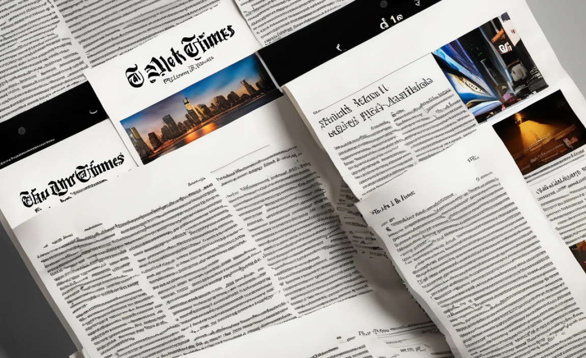
The New York Times is one of the most recognizable newspapers in the world. Its distinct typography, especially its headline font, is crucial in shaping its identity. Every element reflects journalistic integrity and tradition, from the iconic New York Times logo font to the typefaces used in the newspaper and digital platforms like Google Docs.
The Typeface Behind The New York Times Headline
The New York Times headline font is NYT Cheltenham. This serif font has been a staple of the newspaper’s design for decades. Originally, Bertram Goodhue designed it, and later, Matthew Carter refined it; Henrik Kubel adapted Cheltenham for digital use. This custom font combines a classic serif typeface with a modern appeal, making it perfect for headlines.
Overview of NYT Cheltenham Font
NYT Cheltenham is a custom serif typeface that The New York Times uses. It is a modified version of the Cheltenham typeface, originally designed by Bertram Goodhue and Morris Fuller Benton in 1896 and later refined for the newspaper. The font offers a classic yet modern look, balancing readability and elegance, making it ideal for headlines and editorial content.
Font Family & Weight Variations
NYT Cheltenham includes several weights and styles, typically designed for newsprint clarity and impact. The variations include:
- Cheltenham Light
- Cheltenham Regular
- Cheltenham Medium
- Cheltenham Bold
- Cheltenham Black
Each weight may also have italic variations, enhancing its flexibility for different text hierarchies. The typeface maintains the narrow proportions and distinctive serifs of the original Cheltenham but with modern refinements to suit digital and print media.
The Role of Typography in the New York Times
Typography plays a vital role in the New York Times’ brand identity. NYT Cheltenham serves as the newspaper’s headline font. For body text, The New York Times uses Times New Roman. Stanley Morison originally designed this classic serif typeface. For digital content, different fonts like Georgia and Franklin Gothic enhance readability.
The New York Times Logo and Custom Fonts
The New York Times logo features a blackletter typeface that gives it a classic and authoritative look. This logo font differs from the serif typeface in headlines and body text. Over the years, the newspaper has commissioned multiple fonts for various sections, ensuring a cohesive and timeless aesthetic.
Font Usage Across Platforms
The New York Times uses a combination of fonts across print and digital media:
- NYT Cheltenham for headlines
- Times New Roman for body text
- Franklin Gothic for supplementary text
- Georgia for enhanced readability online
- Helvetica Neue for specific design elements
How Font Size and Weight Impact Readability
Font size and weight are critical factors in newspaper typography. The New York Times adjusts these elements to differentiate main headlines from body text. The newspaper also uses italic styles for emphasis and sans serif typefaces for subheadings.
The Influence of the New York Times Font Choices
The New York Times’ typography has inspired other publications and designers. Fonts like Adobe Garamond and Helvetica Neue are frequently used in editorial design due to their timeless appeal. Google Fonts also offers similar options for digital designers looking to achieve a classic newspaper aesthetic.
Why Typography Matters in Journalism
Typography enhances readability, credibility, and brand identity. A well-chosen typeface ensures that headlines capture attention while body text remains easy to read. The New York Times headline font, NYT Cheltenham, is a prime example of this balance.
Popular Fonts in Journals
Many newspapers use a mix of serif and sans serif fonts to achieve a professional look. Serif fonts like Adobe Garamond and Georgia offer classic elegance, while sans serif fonts like Helvetica Neue provide a modern contrast. Using multiple fonts allows for better visual hierarchy and improved user experience.
FAQs
What Font Is Used For The New York Times Headlines?
NYT Cheltenham is the primary headline font used by the New York Times.
What Font Does The New York Times Use For Body Text?
Times New Roman is used for body text, ensuring readability and consistency.
Who Designed The New York Times Headline Font?
NYT Cheltenham was originally designed by Bertram Goodhue and later refined by Matthew Carter and Henrik Kubel.
What Font Is Used In The New York Times Logo?
The logo font is a custom blackletter typeface unique to the New York Times.
Can I Use The New York Times Fonts In Google Docs?
While NYT Cheltenham is unavailable, similar fonts like Georgia and Times New Roman can be used.
Why Does Typography Matter In Newspapers?
Typography impacts readability, brand identity, and overall journalistic integrity, making it a crucial element in newspaper design.