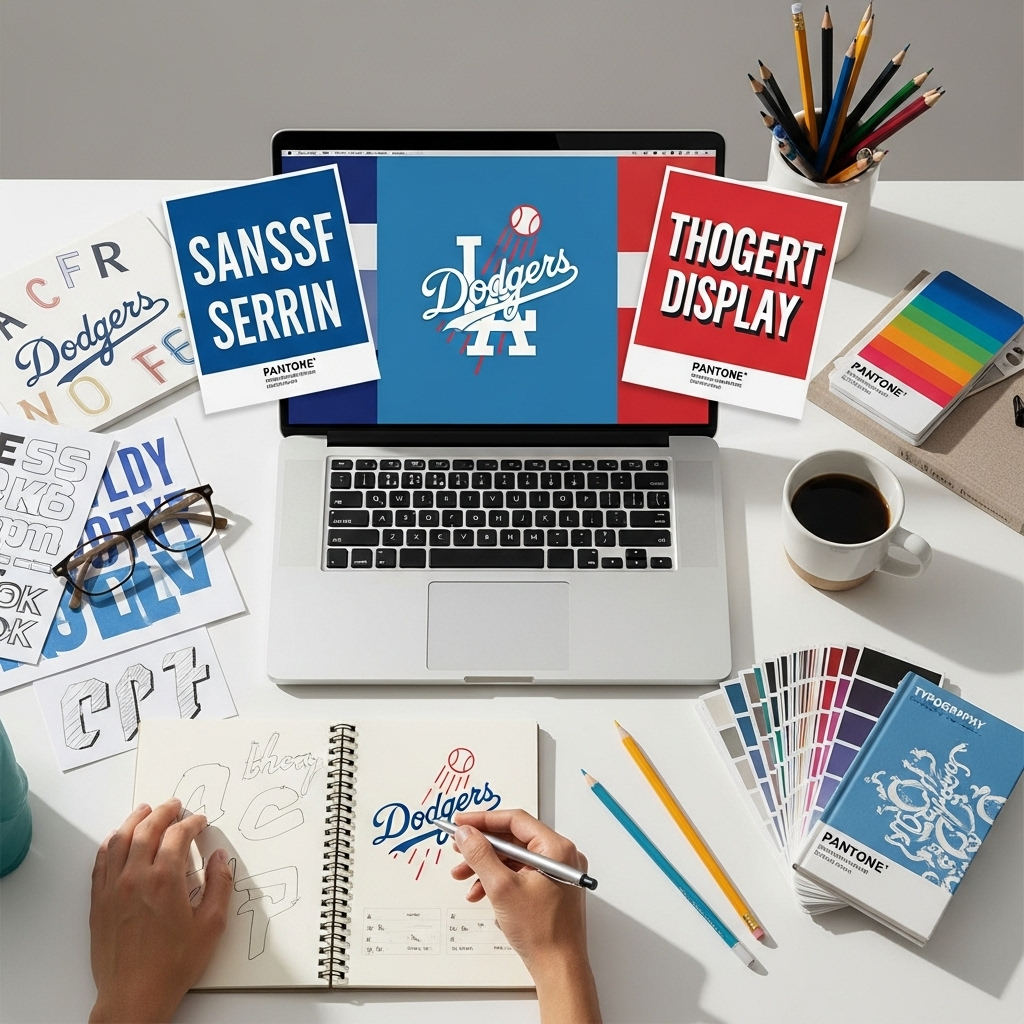
The “LA Dodgers Logo Font” is a classic custom sans-serif typeface, recognizable for its bold, slightly condensed, and distinctive “A” and “Y” characters. It’s a core element of the team’s iconic branding, celebrated for its strong, sporty, and timeless appeal.
Have you ever stared at the famous LA Dodgers logo and wondered about that instantly recognizable font? It’s more than just letters; it’s a piece of sports history that exudes power and pride. Many designers and fans are curious about this unique typeface because it’s so distinctive. But finding the exact font or understanding its design can feel a bit tricky. Don’t worry! We’re going to break down the “LA Dodgers Logo Font” step-by-step, making it super easy to understand and appreciate. Get ready to discover what makes this font so special!
Unpacking the LA Dodgers Logo Font: A Design Deep Dive
The Los Angeles Dodgers, a team steeped in tradition and success, possess one of the most iconic logos in professional sports. A huge part of this enduring appeal is their distinctive typeface. It’s not a commonly found font in typical font libraries; instead, it’s a custom-commissioned design that has evolved subtly over the decades, yet remains undeniably “Dodgers.” This article will explore the characteristics of the “LA Dodgers Logo Font,” how it achieves its unique look, and how you can approach similar design challenges.
The Anatomy of the Dodgers Font
When we talk about the “LA Dodgers Logo Font,” we’re referring primarily to the lettering used within the iconic interlocking “LA” and the full team name. While the official team has commissioned custom lettering for different applications over the years, there’s a core aesthetic that defines it. Let’s break down its key design features:
- Sans-Serif Style: The most prominent feature is that it’s a sans-serif font. This means it lacks the small decorative strokes (serifs) found at the end of letter strokes in fonts like Times New Roman. Sans-serif fonts are generally seen as modern, clean, and straightforward, which fits the sporty and urban vibe of Los Angeles and the Dodgers.
- Slightly Condensed: The letters are not overly wide. This slight condensation allows more text to fit into a given space without feeling cramped, a practical consideration for logos and jerseys.
- Bold Weight: The font is typically used in a bold or even extra-bold weight. This heaviness gives it presence and impact, making it stand out on merchandise, signage, and broadcasts.
- Geometric Foundation: While appearing organic, the letters have a strong geometric foundation. This is evident in the consistent stroke widths and the balanced curves.
- Distinctive Character Shapes: This is where the font truly becomes unique.
- The “A”: The capital “A” is particularly noteworthy. It often features a sharp, pointed apex and a crossbar that is not centered but slightly lower. This “A” is one of the most recognizable elements of the Dodgers’ typographic identity.
- The “Y”: Similarly, the capital “Y” often shares a sharpness in its overall design, mirroring the “A.”
- The “D” and “G”: These letters often have a robust, solid feel, with clear, rounded counters (the enclosed or partially enclosed spaces within a letter).
- The “O”: The “O” is a perfect circle, reinforcing the geometric, balanced feel of the typeface.
- Uniformity and Consistency: Despite the unique character shapes, the overall font family maintains strong uniformity in stroke weight, x-height (the height of lowercase letters), and ascender/descender lengths (the parts of letters that extend above or below the baseline).
The History and Evolution of the “LA Dodgers Logo Font”
The Dodgers franchise has a long and storied history, and its visual identity has evolved alongside it. The iconic interlocking “LA” logo, which prominently features their custom typeface, was introduced in 1913. Over the years, while the core design has been preserved to maintain brand recognition, subtle refinements have been made by designers to adapt it for various media, from old-fashioned scorecards to modern digital displays.
The original font likely drew inspiration from popular typefaces of the era, but its true power lies in its bespoke nature. Commissioning custom fonts is a common practice for major sports franchises and large corporations that require a unique visual signature. This ensures their branding is distinct and protected. While the exact design process and the specific type designers involved in its early iterations aren’t always widely documented in public forums, the lasting impact speaks volumes about the initial design’s strength.
Why is the “LA Dodgers Logo Font” so Effective?
The success of a logo font isn’t just about looking good; it’s about function and emotional resonance. The “LA Dodgers Logo Font” excels due to several factors:
- Memorability: The distinctive “A” and “Y” shapes make the font instantly recognizable, even in limited contexts. You see it, and you immediately think “Dodgers.”
- Durability: The simple, bold, sans-serif design has proven to be timeless. It doesn’t feel dated and can easily span generations.
- Versatility: Despite its custom nature, the font works well across many applications. It looks great on a baseball cap, embroidered onto a jersey, printed on a ticket, or displayed on a stadium billboard. Its readability is also excellent at various sizes.
- Brand Association: Over decades, this font has become intrinsically linked with the Dodgers’ identity, successes, and the passion of its fanbase. It carries a rich history and emotional weight.
- Athletic Feel: The bold strokes and slightly condensed form convey a sense of power, speed, and dynamism – perfect for a sports team.
Finding Fonts “Like” the LA Dodgers Logo Font
Since the official “LA Dodgers Logo Font” is custom and not publicly available for download, designers often look for similar fonts that capture its essence for their own projects. The goal isn’t to clone the Dodgers font, but to find a typeface that evokes a similar feeling of strength, sportiness, and clean design.
Here’s what to look for when searching for “LA Dodgers Logo Font” alternatives:
- Bold Sans-Serifs: Focus on sans-serif fonts with a strong, heavy weight.
- Slightly Condensed: Look for fonts that are either naturally condensed or have condensed variants.
- Geometric Qualities: Typefaces with a solid, geometric structure often provide a similar feel.
- Distinctive Letterforms: Pay attention to how the “A,” “Y,” “V,” and “W” are formed. Fonts with sharp apexes or unique crossbar placements can sometimes mimic the Dodgers’ feel.
Recommended Font Alternatives and Categories
When searching for that perfect font inspired by the Dodgers’ style, consider exploring these categories and specific examples. Remember, these are suggestions to capture the spirit of the Dodgers font, not exact replicas.
1. Bold & Sporty Sans-Serifs
These are generally bold, clean sans-serifs that provide impact and clarity. They often have a strong, geometric foundation, making them excellent for branding and headlines.
Characteristics to look for:
- Solid, uniform stroke weight.
- Clear, legible letterforms.
- A sense of energy and directness.
Examples:
- Bebas Neue: A very popular free font known for its condensed, bold, all-caps style. It’s often used for headlines and titles.
- Oswald: Another excellent free option available on Google Fonts. It’s a reworking of the classic Oswald style, optimized for screens, and offers a condensed, bold aesthetic similar to what you might find in sports branding.
- Impact: A classic system font. Its extreme condensation and boldness make it incredibly punchy for headlines.
2. Geometric Sans-Serifs with Character
These fonts are built on simple geometric shapes (circles, squares) but often include unique stylistic elements that make them stand out, similar to the Dodgers’ signature “A.”
Characteristics to look for:
- Uniform stroke weights.
- Often based on perfect circles and straight lines.
- May have subtly unique letterforms that add personality.
Examples:
- Montserrat: A popular Google Font inspired by old posters and signs in the Montserrat neighborhood of Buenos Aires. It has geometric forms and a friendly yet strong feel, with many weights available.
- Futura: A pioneering geometric sans-serif. While slightly more elegant than a typical sports font, its clean lines and geometric purity are influential.
- Brandon Grotesque: A commercially released font with a geometric structure but a warmer, more approachable feel than some other geometric sans-serifs.
3. Typefaces with Unique “A” and “Y” Designs
If you’re specifically trying to capture the distinctiveness of the Dodgers’ “A” and “Y,” look for fonts where these letters have sharp apexes, angled crossbars, or other distinguishing features. This often requires a careful visual scan of font previews.
Characteristics to look for:
- Sharp, pointed apexes on uppercase letters.
- Non-standard crossbar placement or angles in letters like “A.”
- A cohesive design where unique features are balanced across the alphabet.
Examples:
- Many display or headline fonts might offer these. You’d need to browse font foundries like MyFonts or Adobe Fonts and look closely at character sets. For instance, some variations of fonts like:
- Agency FB: This font has very condensed, sharp letterforms that can evoke a similar strong, impactful feel, especially in its bolder weights. The “A” is quite pointed.
- Univers (certain weights/styles): A highly regarded sans-serif known for its versatility. Some condensed or bold versions might present letter shapes that align with the athletic feel.
Where to Find Fonts
For designers and enthusiasts looking for these types of fonts, here are some excellent resources:
| Platform | Description | Typical Cost | Link |
|---|---|---|---|
| Google Fonts | Vast library of free, open-source fonts. Excellent for web and print. Many sans-serif options. | Free | fonts.google.com |
| Adobe Fonts | Included with Adobe Creative Cloud subscriptions. Huge selection of high-quality fonts, including many premium options. | Included with Adobe CC | fonts.adobe.com |
| MyFonts | One of the largest marketplaces for commercial fonts. Great for finding unique and specialized typefaces. | Varies (purchase per license) | myfonts.com |
| Font Squirrel | Curated collection of free fonts for commercial use. High-quality options. | Free | fontsquirrel.com |
Applying “LA Dodgers Logo Font” Principles in Your Designs
Understanding the design philosophy behind the “LA Dodgers Logo Font” can significantly enhance your own design projects. Whether you’re designing a logo, a website, or marketing materials, these principles can help you create impact and clarity.
Key Takeaways for Your Design Process
- Define Your Brand’s Personality: Is it strong, playful, sophisticated, modern? The Dodgers’ font conveys strength and tradition. What message do you want your font to send?
- Prioritize Readability: Especially for longer text, choose fonts that are easy to read. For headlines and logos, you have more room for stylistic flair, but legibility is still key. The Dodgers font is bold but remains clear.
- Consider the Context: Where will your text be seen? A font that looks great on a giant billboard might be too complex for a small app icon.
- Don’t Be Afraid of Bold: A bold weight can instantly add impact to your designs, drawing attention to key information.
- Look for Unique Character Details: Sometimes, a subtle twist in a letterform – like the Dodgers’ “A” – can make a typeface memorable and distinctive.
- Font Pairing is Crucial: If you use a bold, display font for headings (like the Dodgers-inspired style), pair it with a clean, readable sans-serif or even a simple serif for body text. This creates visual hierarchy and improves readability.
Example Font Pairing Strategy
Imagine you’re designing a website for a local sports league. You want to capture that energetic, team spirit.
- Headline Font (Logo/Title Inspired): Choose a bold, slightly condensed sans-serif font. A font like Oswald or Bebas Neue could work well. This will be your attention-grabber, similar to the Dodgers’ logo.
- Subheading or Key Information Font: Perhaps a slightly lighter or regular weight of your headline font, or a complementary geometric sans-serif like Montserrat. This helps create visual hierarchy.
- Body Text Font: Select a highly readable sans-serif font for the main content. Fonts like Open Sans, Roboto, or Lato are excellent choices. They are clear, clean, and don’t compete with the bolder headline font.
This structured approach ensures your design is not only visually appealing but also functional and easy for your audience to digest. A good starting point for exploring font pairings and learning best practices is resources like Canva’s Design School, which offers beginner-friendly guides on combining typefaces effectively.
Frequently Asked Questions (FAQ) on the LA Dodgers Logo Font

What font is the LA Dodgers logo?
The official “LA Dodgers Logo Font” is a custom-designed, bold sans-serif typeface. It is not a commercially available font and was specifically created for the team’s branding.
Can I download the exact LA Dodgers font?
No, the precise font used in the LA Dodgers logo is proprietary. It’s a custom design and not available for public download or licensing.
What makes the Dodgers font unique?
Its uniqueness comes from specific character designs, most notably the distinctive “A” with its sharp point and slightly lowered crossbar, and a generally bold, slightly condensed, and geometrically balanced sans-serif structure.
What type of font is it (sans-serif, serif, etc.)?
It is a sans-serif font. This means it has no decorative strokes (serifs) at the ends of its letter strokes, giving it a clean, modern, and strong appearance.
Can I use fonts that look similar to the Dodgers font for my brand?
Yes! You can use similar fonts that capture the strong, bold, and slightly condensed sans-serif aesthetic for your own branding. Look for fonts with these characteristics to achieve a comparable feel.
Where can I find fonts similar to the LA Dodgers logo font?
You can find similar fonts on platforms like Google Fonts (e.g., Oswald, Bebas Neue), Adobe Fonts, and commercial font marketplaces like MyFonts or Font Squirrel. Search for “bold condensed sans-serif” or “sporty fonts.”
What makes a font good for a sports brand?
Good sports brand fonts are typically bold, legible, strong, and convey energy or tradition. Sans-serifs are common because they feel modern and direct, while custom details can add a unique identity.
Conclusion: Embracing Timeless Athletic Typography
The “LA Dodgers Logo Font” is a masterclass in enduring brand identity. Its custom-designed sans-serif letterforms project strength, heritage, and a direct connection to the spirit of sport. While you can’t download the exact typeface, understanding its core elements—boldness, slight condensation, geometric structure, and distinctive character shapes—empowers you to select or even design your own fonts with similar impact.
Whether you’re a budding graphic designer, a business owner crafting your brand’s visual voice, or simply a design enthusiast curious about what makes logos tick, the principles behind the Dodgers’ iconic typography offer valuable lessons. By prioritizing readability, considering your brand’s personality, and perhaps incorporating a unique stylistic flourish, you can choose fonts that not only look great but also powerfully communicate your message. The world of typography is vast, but with a keen eye and inspired choices, you can find or