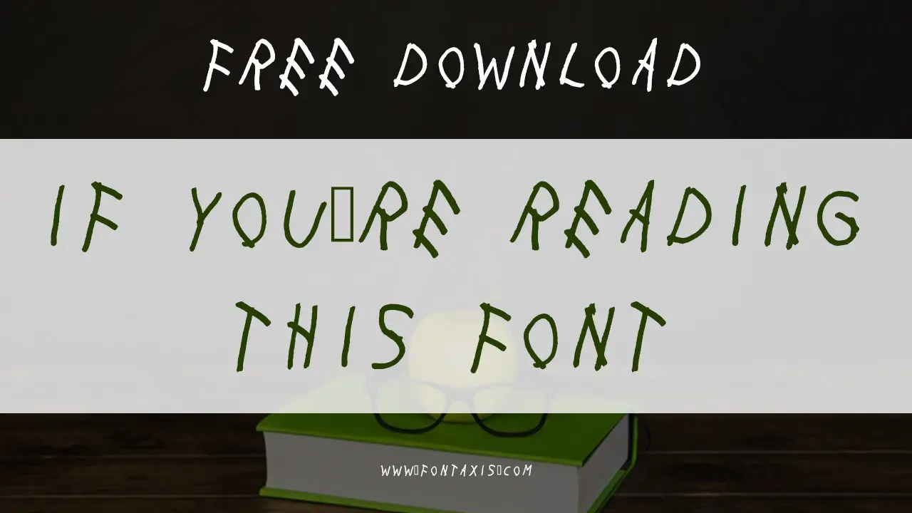
If You’re Reading This is a font inspired by the mixtape If You’re Reading This It’s Too Late by Canadian rapper Drake. Created by OJ Customs, this unique typeface has gained popularity for its bold, graffiti-inspired style. Ideal for urban, music-themed projects, this font offers a distinctive aesthetic that resonates with fans of street art and hip-hop culture.
With My Woes Font Information
| Name | With My Woes |
| Style | Handwritten, Decorative |
| Designer | OJ Customs |
| File Format | TrueType (.ttf) |
| License | Free for personal use |
| Type | Decorative, Script |
Font Family Includes
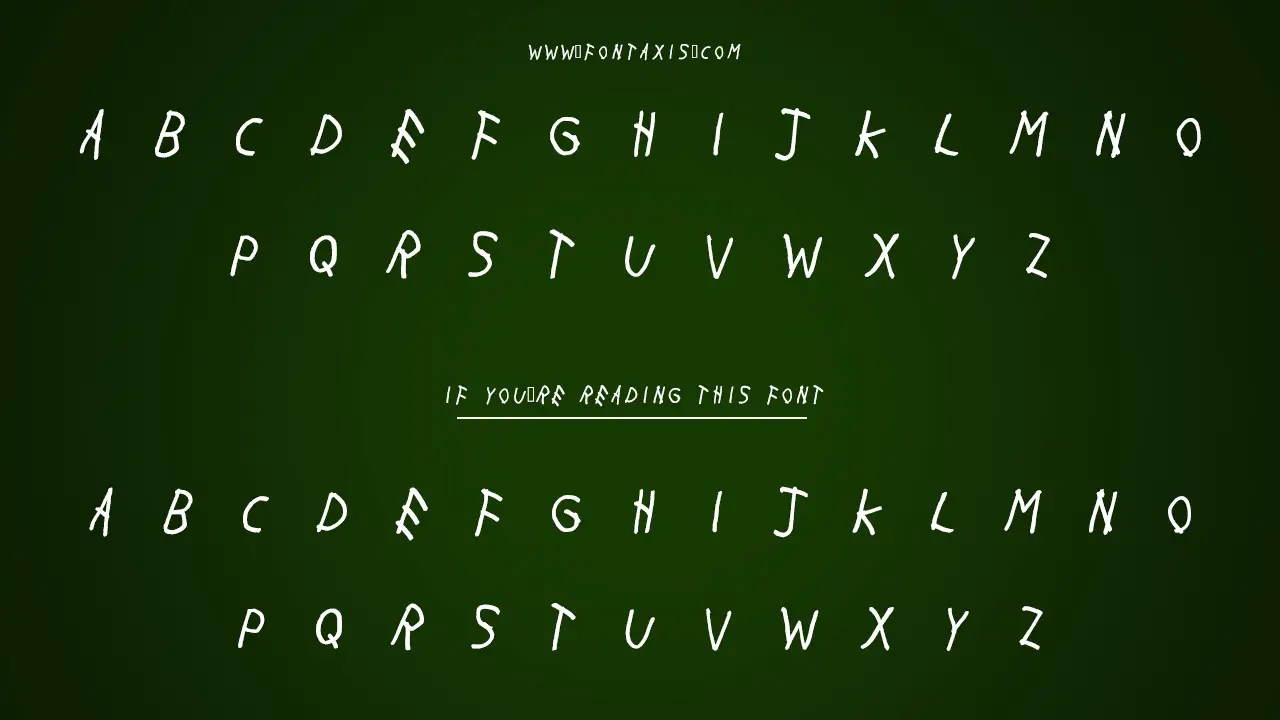
With My Woes (uppercase letters only)
Where With My Woes Is In Use
- Album Covers: Featured prominently on If You’re Reading This It’s Too Late album cover.
- Music Merchandise: T-shirts, hoodies, and other promotional gear.
- Event Posters: Used for music events, concerts, and urban-themed promotions.
- Branding: Suitable for hip-hop or street culture brands.
Similar Font
- EXO Font
- Bionic Font
- The Cookbook Font
- We the Best Font
- Def Jam Recordings Font
- Honey Font
- Crazy in Love Font
- Frank Font
- Channel Orange Font
- Sticks and Stones Font
- Hot Sauce (NCT Dream) Font
- Beerbongs & Bentleys Font
- Beastie Boys Story Font
- In the Heights Font
- Tommy Boy Font
- Trapstar Font
- Lollapalooza Font
- Florida Georgia Line Font
- Hamilton (musical) Font
Best Font Pairing
Open Sans: A clean and modern sans-serif font, ideal for pairing with With My Woes for readability in body text.
Times New Roman: A more traditional serif font to provide contrast when used in body text.
How To Download And Install
- Visit a website like FontBolt or DaFont to download With My Woes for personal use.
- After downloading the .ttf file, double-click it to install the font on your computer.
- You can now use With My Woes in programs such as Adobe Illustrator, Microsoft Word, and more to add a bold, artistic touch to your designs.
Conclusion
The With My Woes font is a bold, decorative typeface that draws influence from street art and urban culture. It’s ideal for music-themed projects, album covers, and promotional materials that require an eye-catching, graffiti-inspired style.
While it may not be the easiest font for body text, it excels in creating impactful headings and designs that resonate with a youthful, artistic audience. Pair it with more readable fonts like Open Sans or Times New Roman to strike a balance between bold design and text legibility.
FAQs
1.Can I Use The With My Woes Font Commercially?
No, the font is free for personal use only. You would need to obtain a license for commercial use.
2.Is With My Woes Available In Lowercase Letters?
No, the font only supports uppercase letters.
3.What Software Can I Use To Work With The With My Woes Font?
You can use software like Adobe Illustrator, Microsoft Word, or any other program that supports TrueType fonts.
4.What Is The Best Font Pairing With With My Woes?
Pair With My Woes with a clean, legible font like Open Sans for better readability in body text.
5.How Does My Woes Compare To Other Decorative Fonts?
It has a unique urban style and is ideal for music-related and street culture designs, offering bold, graffiti-inspired lettering.

