White font on a black background has long been a choice in digital design and typography. Its aesthetic appeal, often associated with sophistication and bold statements, has made it popular in dark mode designs, websites, and applications. However, using this color combination effectively requires understanding its implications on readability, contrast, and overall user experience.
The Psychology of White Font on Black Background
In low-light environments, white text on black background can reduce glare compared to a white background. However, prolonged reading may cause visual fatigue due to reflected light scattering.
To make it more readable try this. Use larger font sizes, adjust font weights, and maintain proper spacing between lines and paragraphs. Avoid low-opacity or darker colors for text.
However, white text on black background is not always accessible for all users. Consider using brighter colors with sufficient contrast and test for readability with users who have color blindness or other visual impairments.
1. Visual Impact
The contrast between white text and a black background creates a striking visual effect, often used to draw attention to important content. This color scheme works well for short, impactful text like titles or icons, making a bold statement.
2. Aesthetic Appeal
Material design and modern typography trends favor dark themes for their sleek, professional look. Combining brighter colors with dark backgrounds is commonly seen in vector graphics and Google fonts, lending a contemporary edge to digital designs.
Challenges of White Font on Black Background
1. Readability Issues
While the contrast is high, white text on dark backgrounds can strain the eyes during extended reading. The reflected light scatters from white characters, making the paragraph text harder to perceive, especially in long blocks.
2. Accessibility Concerns
For individuals with color blindness or certain visual impairments, high-contrast designs may not always be ideal. Adjusting the font size, font weight, and color palette can improve readability for all users.
- Astigmatism affects approximately 50% of people and makes reading white text on a black background harder. The open iris required for dark surroundings exacerbates visual distortion.
- Individuals with color blindness or vision impairments might find the high contrast too harsh.
3. Environmental Factors
In a dark room, a light background is harsh on the eyes, but in bright environments, dark characters on a white background are more readable. Understanding the context in which your design will be used is crucial.
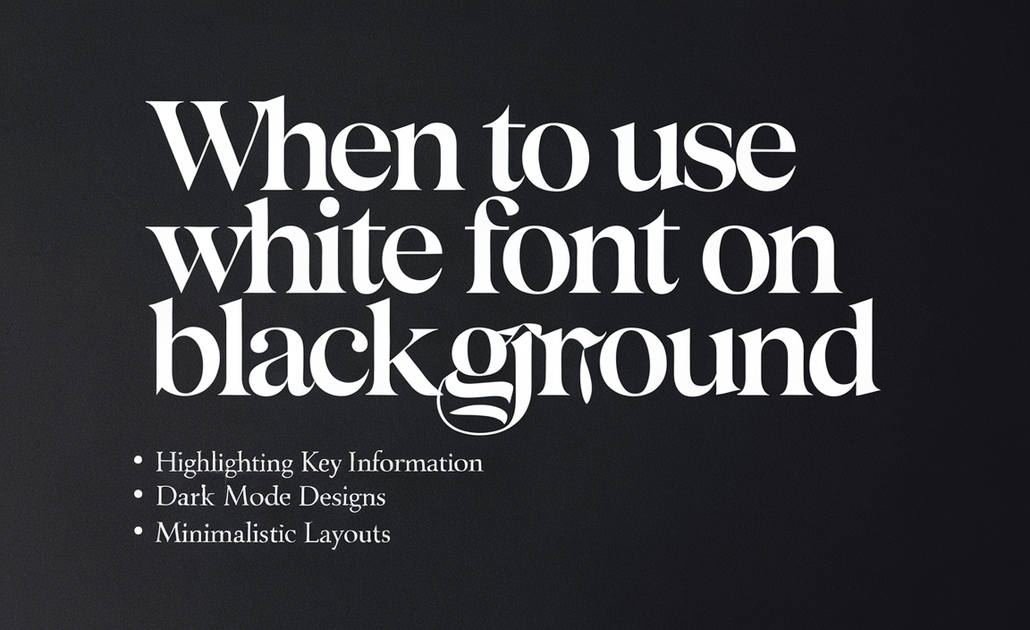
When to Use White Font on Black Background
Studies show that black text on white backgrounds leads to better comprehension and retention compared to the reversed scheme. This is crucial in educational or text-heavy environments.
- Highlighting Key Information: Ideal for headlines, captions, and icons, where brevity ensures clarity.
- Dark Mode Designs: Popular in browsers and applications that offer a dark theme to reduce glare in low-light environments.
- Minimalistic Layouts: Works well with a color palette that prioritizes clean lines and vector graphics.
Tips for Effective Use
The use of white font on a black background can be both a design opportunity and a potential problem, depending on how it’s implemented and the context in which it’s used.
- Adjust Font Properties: Use bold or medium font weights and experiment with typography to maintain readability.
- Enhance Contrast: Avoid using dark gray or low-opacity colors for text. Keep the contrast sharp but not overly harsh.
- Break Up Large Text Blocks: Divide content into shorter paragraphs with ample spacing to reduce visual fatigue.
- Consider Background Elements: Adding subtle background images or patterns can help reduce the harshness of a black background.
- Test in Different Lighting: Ensure your color scheme is readable in both bright and dim environments.
However, improper implementation such as ignoring readability, accessibility, or context can make it problematic. Striking a balance between aesthetics and usability is key to making this design element work effectively.
Real-World Examples
1. Dark Mode Interfaces
Most modern applications, like email clients and social media platforms, offer dark mode to enhance usability in low-light conditions. The white text on black background combination is a staple here.
2. Branding Websites
Brands often use white text on dark backgrounds for their hero sections or splash pages to create a strong first impression.
3. Presentations
In a dark room setting, such as conferences, dark themes with white text can reduce glare and maintain focus on the screen.
Conclusion
White font on a black background is a design choice that balances aesthetics with usability. While it works well in dark mode and minimalistic designs, it’s important to address potential readability and accessibility issues. By carefully managing contrast, font properties, and environmental factors, designers can create compelling yet functional experiences for diverse audiences.
FAQs
1. Why does white text appear less clear on a black background compared to black text on a white background?
White text scatters more reflected light, creating a “halation” effect, making it appear blurry or glowing. This reduces clarity and causes visual discomfort.
2. Why is white text on a black background easier to read under low light conditions?
In low light, the dark background minimizes screen glare and reduces the strain on your eyes, making white text easier to read without overwhelming brightness.
3. What colors go well with a white background and black text?
Accent colors like blue, green, or red work well for headings or highlights, while muted tones like gray or pastel shades can provide a balanced contrast for elements.
4. What are the accessibility considerations for white font on a black background?
High contrast can be harsh for those with astigmatism or vision impairments. Ensuring proper font size, spacing, and avoiding pure white can improve readability.
5. Is white font on a black background better for reading at night?
Yes, it reduces eye strain in low light environments as it emits less light overall, making it more comfortable for prolonged reading sessions.
6. How do you see black text written on a black background?
Black text on a black background is invisible unless highlighted or layered with an outline or glow effect for contrast.
7. What are the best practices for using white font on a black background?
Use larger font sizes, appropriate spacing, a slightly off-white color, and avoid thin or decorative fonts to maintain readability.
8. Who thought that white text on a black background would ever be a good idea?
This design choice dates back to early computer terminals where green or white text on black screens reduced power consumption and screen burn-in.
9. What are the best font choices for white font on a black background?
Sans-serif fonts like Arial, Verdana, or Open Sans work best as they maintain clarity and readability without intricate details.
10. Why is colored paragraph text on a white background difficult to read?
Low contrast between light colors and a white background makes text harder to distinguish, causing eye strain and reduced readability.
11. Are there any disadvantages of using white font on a black background?
It can cause halation, eye strain, and difficulty in bright environments, and it may be less suitable for users with vision impairments or astigmatism.
12. What are the psychological effects of white font on a black background?
White on black can evoke feelings of sophistication or formality but may also feel heavy or hard to focus on for long periods due to visual fatigue.
13. Why is text blurrier when I read white on a black background than when I read black on a white background?
The glowing effect of white text on dark backgrounds scatters light, making characters less distinct and harder to focus on.
14. How would I go about creating white outlined text on black background pages?
Use CSS or design tools with a stroke property or outline effect, like this:
This creates a black outline around white text for visibility.