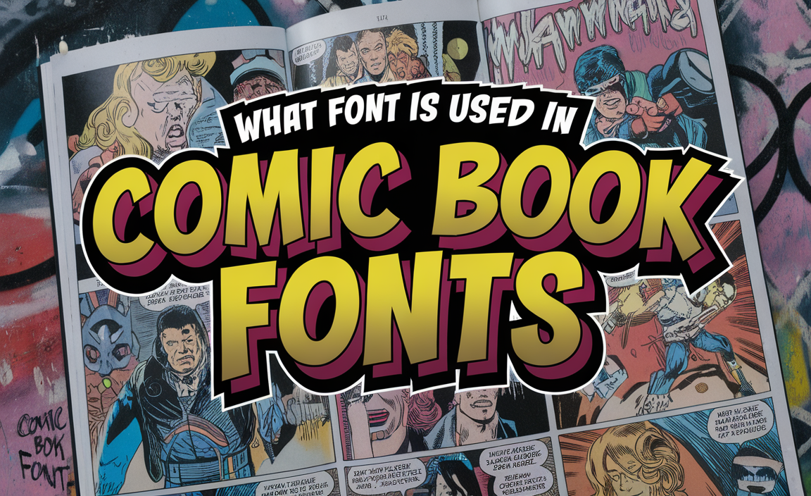
The art of comic book creation goes beyond dynamic illustrations and captivating stories. Typography plays a crucial role in shaping how readers experience the narrative. Fonts in comic books are not just text; they are part of the storytelling medium, reflecting characters, emotions, and themes.
In the early days of comic books, hand lettering was the standard. Artists like Artie Simek crafted every word with care, ensuring the text complemented the artwork. This labor-intensive process gradually evolved with the advent of digital tools like Adobe Illustrator, allowing creators to use digital fonts while maintaining artistic integrity.
Commonly Used Fonts in Comics
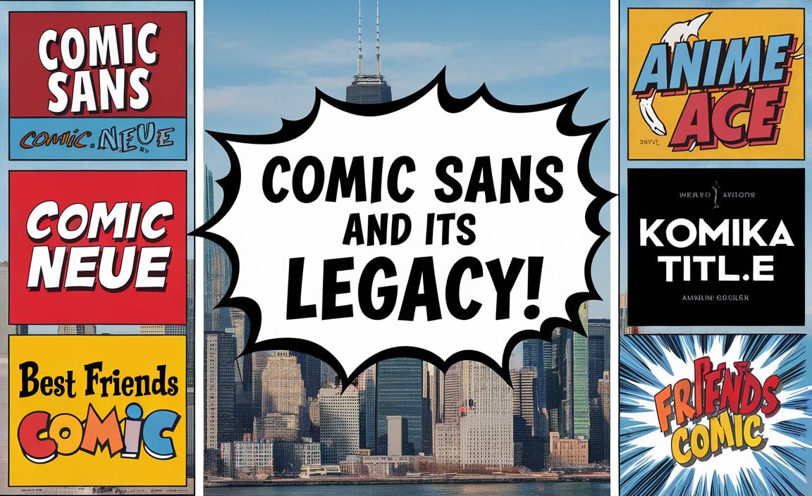
Comic Sans and Its Legacy
One of the most recognized fonts associated with comic books is Comic Sans, designed by Microsoft to mimic the casual look of comic lettering. Despite its widespread criticism in professional design, Comic Sans MS is often associated with informal comic styles and children’s books due to its playful appearance.
Popular Alternatives
- Comic Neue: A modern reinterpretation of Comic Sans, with improved readability and balanced design.
- Anime Ace: Frequently used for manga and graphic novels, offering a clean and professional look.
- Komika Title: A bold and impactful font often used for comic titles and superhero genres.
- Best Friends Comic Font: Perfect for lighthearted comics and children’s stories.
Fonts Used by Major Comic Publishers
DC Comics
DC Comics, known for iconic superheroes like Superman and Batman, often uses custom comic book lettering for titles and dialogue. Fonts like Digital Strip and Komika Title frequently appear in their publications.
Marvel Comics
Marvel Comics, the home of Spider-Man and the Avengers, uses a mix of hand lettering and digital fonts. Historically, artists like Artie Simek created distinctive uppercase letters that emphasized action and drama.
Key Features of Comic Book Fonts
- Uppercase Letters:
Most comic fonts use uppercase letters for dialogue, ensuring uniformity and readability in word balloons and text boxes. - Serif vs. Sans Serif Fonts:
While serif fonts like Times New Roman are rare in comics, sans-serif fonts dominate due to their clean and modern look. - Readability and Style:
Fonts must be legible at smaller sizes, especially in dialogue-heavy comics. Display fonts with exaggerated features are reserved for titles and sound effects.
How Typography Enhances Storytelling
Comic fonts are not just functional—they evoke emotions and enhance the story. A perfect font can convey the tone of a character or scene. For example:
- Bold, angular fonts emphasize strength and action.
- Curved, rounded fonts add a playful or friendly touch, perfect for children’s books.
Choosing the Right Font
When selecting a comic book style font, creators should consider:
- The Genre: For superhero comics, bold fonts like Anime Ace or Komika Title work well. For manga, clean, minimalist styles are preferable.
- Readability: The font should be legible in small sizes without losing its visual appeal.
- Consistency: Using the same typeface for dialogue, narration, and sound effects creates a cohesive look.
Digital Tools for Comic Fonts
Platforms like Font Squirrel and Google Fonts offer a range of free fonts for creators. For custom typography, software like Adobe Illustrator provides the tools to design unique fonts tailored to the comic’s theme.
Conclusion
The fonts behind comic books are as essential as the artwork, transforming stories into immersive experiences. From iconic fonts like Comic Sans to modern options like Comic Neue, typography enhances every aspect of the comic. By choosing the right font, creators can craft stories that resonate with readers while reflecting the essence of their characters and themes. Whether you’re working on a superhero epic or a whimsical children’s tale, the world of comic book fonts offers endless possibilities.
FAQs
What is the standard font size for comic books?
Most comics use fonts ranging from 9.5 to 11 points, ensuring readability while fitting within word balloons and text boxes.
Why are uppercase letters used in comic books?
Uppercase letters create uniformity, making the text easier to read and ensuring visual balance in word balloons.
What is the difference between serif and sans-serif fonts in comics?
Serif fonts like Times New Roman are rarely used in comics, as their decorative elements can hinder readability. Sans-serif fonts, such as Comic Sans, are preferred for their clarity and simplicity.
Are there free comic book fonts available?
Yes, platforms like Font Squirrel and Google Fonts offer free fonts suitable for comics. Examples include Anime Ace, Komika Title, and Digital Strip.
What font would you use for a comic with a serious theme?
For a serious-themed comic, consider using fonts like Anime Ace or Komika Title for dialogue, as they balance readability with professionalism.
For narration, a serif font like Palatino or a clean sans-serif like Lato works well to convey a polished and grounded tone.
What is the best font to use for a comic book logo or title?
Bold and impactful fonts like Komika Title, Impact, or Blambot’s Victory Speech are ideal for comic book logos or titles. They grab attention while reflecting the comic’s genre and tone effectively.