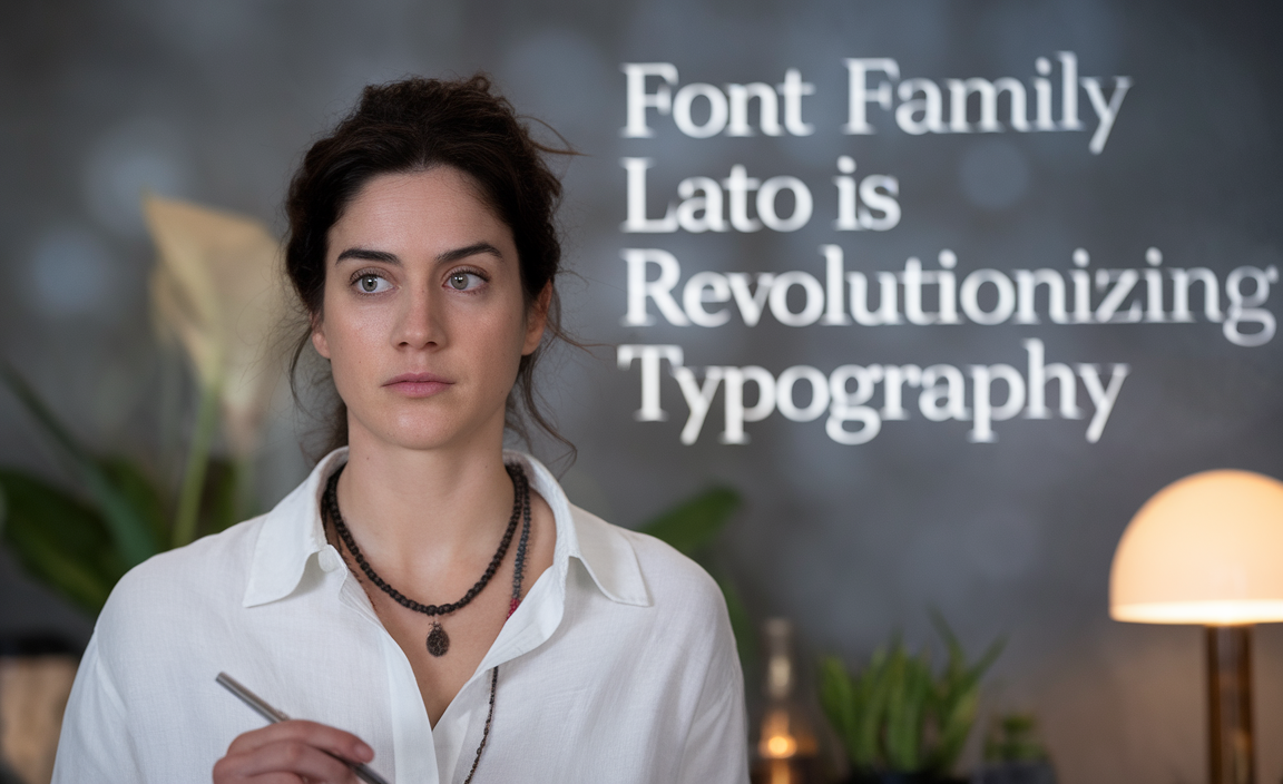
Typography plays a pivotal role in communication, shaping how information is perceived. Among the most impactful typefaces of the modern era, the font family Lato stands out for its versatility, readability, and elegant design.
Created by Łukasz Dziedzic in 2010, Lato has become a cornerstone in digital and print design, revolutionizing how fonts are used and perceived. Lato has been downloaded over 10 million times from Google Fonts and is used on 6.8 million websites, making it one of the top 10 most popular fonts globally.
The Origins and Evolution of Lato
Lato, meaning “summer” in Polish, began as a custom font project for a corporate client. When the project was abandoned, the font family found a second life under the Open Font License, making it freely available for personal and commercial use. This open licensing allowed designers worldwide to adopt and adapt Lato for a variety of purposes.
Initially released with a limited set of weights, including Lato regular and Lato light italic, the font family has expanded over the years to include styles like Lato semibold, Lato italic, and even heavier options like Lato black italic. Today, Lato encompasses multiple weights, italic variations, and over 4,000 glyphs, supporting Latin, Cyrillic, and Greek scripts.
The Lato Font Family
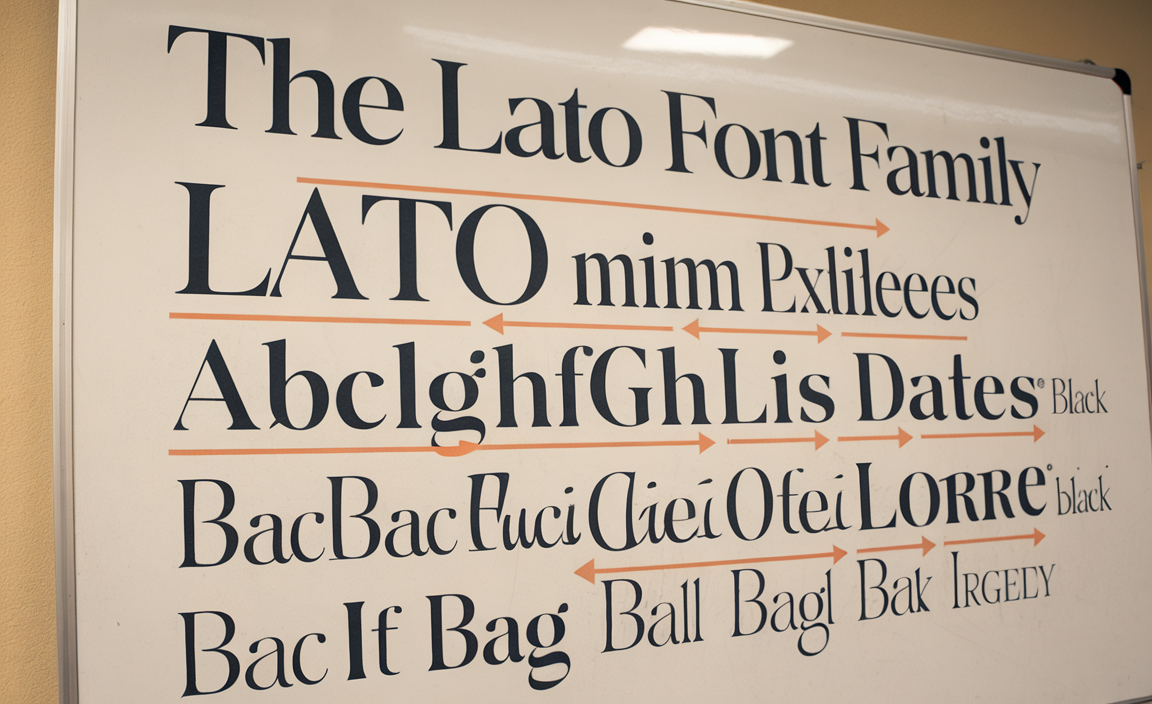
The Lato font family includes 18 styles, ranging from thin to black weights, including italics, providing flexibility for both web and print design. This diverse range ensures Lato’s adaptability for a wide variety of design needs, from clean and minimal layouts to bold and impactful headings.
- Lato Hairline
- Lato Hairline Italic
- Lato Thin
- Lato Thin Italic
- Lato Light
- Lato Light Italic
- Lato Regular
- Lato Italic
- Lato Medium
- Lato Medium Italic
- Lato SemiBold
- Lato SemiBold Italic
- Lato Bold
- Lato Bold Italic
- Lato Heavy
- Lato Heavy Italic
- Lato Black
- Lato Black Italic
Key Features of Lato
- Versatility Across Mediums
Lato functions seamlessly as a web font and in print media. Its sans-serif font style, characterized by clean lines and semi-rounded details, offers a balance of warmth and professionalism. - Classical Proportions
Inspired by timeless typefaces such as Times New Roman, Lato incorporates classical proportions, especially in uppercase letters, giving it an elegant yet modern appearance. - Variable Fonts for Flexibility
With the rise of variable fonts, Lato continues to adapt to evolving typography trends, allowing for more precise control over font weight and size. - Readability and Legibility
Lato’s high x-height and open counters ensure readability, even at smaller sizes. Its design is ideal for body text, headings, and text elements in both formal and casual contexts.
Lato in Web Typography
As a Google font, Lato has been optimized for web usage, making it a popular choice for designers aiming to create responsive and visually appealing websites. Its integration into CSS files is simple, and its compatibility with fallback fonts ensures consistent performance across different browsers and devices.
For instance, you can include Lato in your CSS file with the following code:
This easy implementation has made Lato a go-to option for web developers.
Comparing Lato to Other Fonts
Lato competes with many popular typefaces like Century Gothic, Trebuchet MS, and Adobe fonts. While these fonts have their strengths, Lato’s extensive range of weights and styles, along with its open font license, sets it apart. Its versatility as a sans-serif font positions it as an excellent alternative to default system fonts. Lato offers unique strengths that set it apart.
- Century Gothic: Known for its geometric simplicity, it can feel cold in body text. Lato’s semi-rounded details add warmth, making it more approachable for both headings and body text.
- Trebuchet MS: A system font praised for readability, but limited in design versatility. Lato’s nine weights and italics provide greater flexibility for creating typographic hierarchy.
- Adobe Fonts: Premium fonts offer advanced features but require subscriptions. Lato, under the Open Font License, matches quality while remaining free and accessible for personal and commercial use.
- System Fonts: Default fonts like Arial and Helvetica are reliable but lack distinction. Lato offers a modern, professional alternative with a balance of structure and personality.
Lato’s open licensing, multilingual support, and classical proportions make it ideal for diverse applications, from web design to branding, ensuring it remains a preferred choice over its competitors.
The Role of Open Licensing
The Open Font License under which Lato is distributed is a significant factor in its widespread adoption. Unlike proprietary typefaces, Lato allows for modification, redistribution, and embedding in projects, provided the reserved font name is not used for derivative works. This approach encourages innovation while maintaining the integrity of the original version.
Practical Applications of Lato
- Web Design
Lato serves as a web-safe font, offering a clean and professional look for websites, blogs, and e-commerce platforms. - Print Media
Its ability to maintain clarity at larger sizes makes Lato a favorite for posters, brochures, and banners. - Branding
The variety of font weights, from Lato thin to Lato black, ensures that brands can create a consistent visual identity. - Multilingual Projects
Supporting over 100 languages, Lato is a typeface of choice for global projects requiring multilingual typesetting.
Conclusion
The Lato font family has redefined typography by merging timeless design with modern functionality. Its adaptability, readability, and open licensing make it a top choice for designers, developers, and brands worldwide. Whether used as a default font for body text or as a bold display typeface, Lato continues to revolutionize how fonts are used in both digital and print environments.
FAQs
What makes Lato a revolutionary font family?
Lato combines classical design principles with modern functionality, making it versatile for web and print use. Its open licensing and extensive glyph support further enhance its appeal.
How do I add Lato to my web project?
You can use Google Fonts to embed Lato into your project by linking it in your HTML or importing it in your CSS file.
Is Lato suitable for body text?
Yes, Lato’s high readability and balanced font weight make it an excellent choice for body text.
How does Lato compare to Times New Roman or Trebuchet MS?
While Times New Roman is a serif font, and Trebuchet MS is a sans-serif system font, Lato stands out with its modern design, extensive weight options, and open licensing.
Can Lato be customized for a project?
Yes, under the Open Font License, you can modify and customize Lato for specific project needs while adhering to the licensing terms.
What are some recommended fonts to use with Lato on websites and apps?
Some recommended fonts to pair with Lato for websites and apps include Roboto, Open Sans, and Montserrat for a clean, modern look. For contrast, use Merriweather or Georgia as serif complements for body text.
Playfair Display or Libre Baskerville work well for elegant headings, while Raleway offers a minimalist pairing for sleek designs. These combinations enhance readability and create a balanced visual hierarchy.