Typography plays a significant role in the functionality and aesthetics of modern digital tools, including Google Maps. As a leading navigation platform, Google Maps combines cartography and typography to deliver a seamless user experience.
The choice of fonts influences readability, user interface design, and brand consistency, all of which are critical in helping users navigate their way effortlessly. This article delves into the fonts used by Google Maps, their design, and their impact.
What Font Does Google Maps Use: The Fonts Behind
Google Maps employs a variety of fonts tailored to different purposes within the platform. Here are the primary fonts in use:
1. Roboto
- Role: Default font for map labels, user interface text, and app elements.
- Designer: Christian Robertson
- Font Family: Roboto
- Features: A sans-serif typeface optimized for readability across varying screen sizes. It boasts clean, open curves and exceptional legibility in small sizes, making it perfect for map labels and text overlays in Street View.
- Available Styles and Weights:
-
- Styles: Normal, Italic
- Weights: Thin (100), Light (300), Regular (400), Medium (500), Bold (700), Black (900)
- Use Case: Ensures clarity in dense map views, aiding users in street navigation and point-of-interest searches on both Android and iOS devices.
2. Product Sans
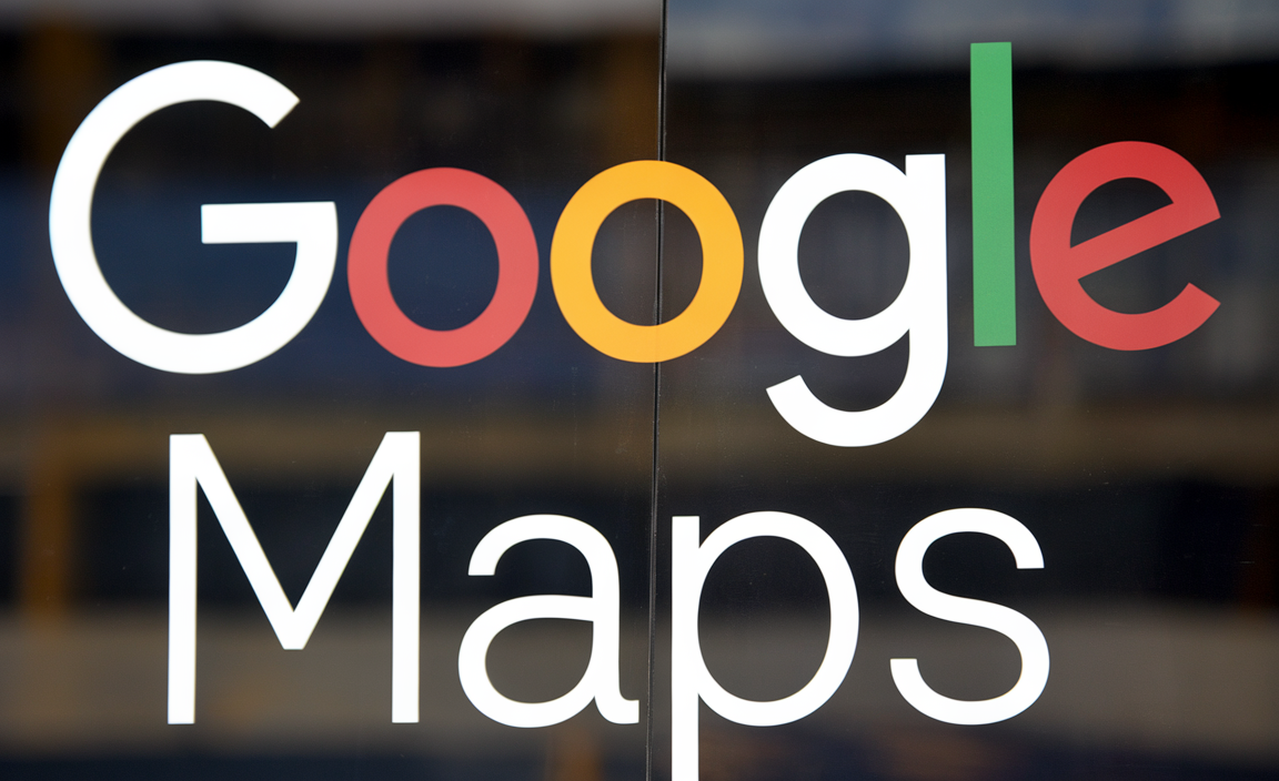
- Role: Exclusively used for Google branding, including the Google Maps logo.
- Designer: Google Design Team
- Font Family: Product Sans
- Features: A geometric sans-serif typeface designed for modernity and simplicity. Its clean shapes and rounded characters align with Google’s branding, delivering a distinct and recognizable identity.
- Available Styles and Weights:
-
- Styles: Regular
- Weights: Regular (400)
- Use Case: Creates a cohesive brand identity across Google products, including Google Maps, Google Earth, and Android Auto.
3. Arial
- Role: Occasionally used as a fallback font or for specific system elements in maps embedded via the Google Maps API.
- Designer: Robin Nicholas and Patricia Saunders (for Monotype in 1982)
- Font Family: Arial
- Features: A universally recognized sans-serif typeface with high adaptability and clarity. Arial is often employed to ensure consistent rendering across platforms when Roboto or Product Sans may not be available.
- Available Styles and Weights:
-
- Styles: Normal, Italic, Bold, Bold Italic
- Weights: Light (300), Regular (400), Bold (700), Extra Bold (800), Black (900)
- Use Case: Ensures compatibility and consistent rendering on systems where Google’s primary fonts might not be supported. Arial is a reliable fallback option in embedded maps via the Google Maps API.
Font Design and Cartography in Google Maps
Google Maps prioritizes functionality and legibility in its font choices. Key considerations include:
1. Readability Across Small Sizes
- Map labels often appear in small sizes, so the fonts must remain legible even at reduced dimensions. Roboto’s open forms and balanced width make it an excellent choice for this purpose.
2. Consistency Across Platforms
- Google Maps operates across a wide range of devices, including smartphones, tablets, and desktops. By using a consistent font family like Roboto, Google ensures that the interface looks uniform across all platforms.
3. Customization and Flexibility
- Developers using the Google Maps Platform or Maps SDK have access to various font customization options through the API. This allows businesses to align map typography with their branding needs.
4. Brand Identity
- Product Sans reinforces Google’s branding, making the platform instantly recognizable. Its modern, approachable style mirrors Google’s emphasis on user-friendly design.
Font Choices and User Experience
Typography is crucial in shaping how users interact with Google Maps. Here’s why font choices matter:
1. Enhanced User Interface
- The sans-serif fonts like Roboto and Product Sans create a clean and uncluttered interface, allowing users to focus on the map’s content and features.
2. Clear Labels and Text
- Labels for streets, landmarks, and points of interest are easy to read, even at smaller font sizes, ensuring a positive navigation experience.
3. Versatile Font Styles
- Different font weights and styles are used strategically to highlight key elements, such as street names, road numbers, and user-defined points.
4. Global Accessibility
- Roboto’s wide character set supports multiple languages, making it ideal for a global audience. This inclusivity ensures that users across different regions can navigate maps in their native languages.
The Role of Fonts in Google Maps Features
Google Maps leverages fonts to enhance various features:
- Labels: Street names, building numbers, and landmarks use Roboto for clarity.
- Street View: The font adapts to provide readable text overlays on images.
- Google Maps API: Developers can integrate custom fonts into their maps while adhering to Google’s style guidelines.
- Android Auto: Fonts are optimized for visibility on car screens, ensuring safe and efficient navigation.
Conclusion
The fonts used in Google Maps, from the versatile Roboto to the iconic Product Sans, are more than aesthetic choices. They play a critical role in enhancing user experience, improving readability, and establishing a cohesive brand identity. Whether you’re a casual user or a developer leveraging the Google Maps Platform, the thoughtful typography ensures every journey is smooth, visually appealing, and efficient.
FAQs
What font does Google Maps use?
Google Maps primarily uses Roboto for labels and interface text, while Product Sans is used for branding and logos.
Can I customize fonts in Google Maps?
Font customization is available through the Google Maps API for developers embedding maps in their websites or apps.
Why does Google use Roboto in Maps?
Roboto offers clean lines, open curves, and exceptional readability, making it ideal for both large screens and small mobile devices.
Is Product Sans available for public use?
No, Product Sans is proprietary and reserved for Google branding. However, Roboto is open-source and free to use.
What’s the difference between Roboto and Product Sans?
Roboto is a versatile sans-serif font designed for interface use, while Product Sans is a geometric sans-serif font used exclusively for Google’s branding.
How does font choice impact user experience in Google Maps?
Typography influences readability, navigation ease, and overall usability, ensuring a seamless experience for users.

