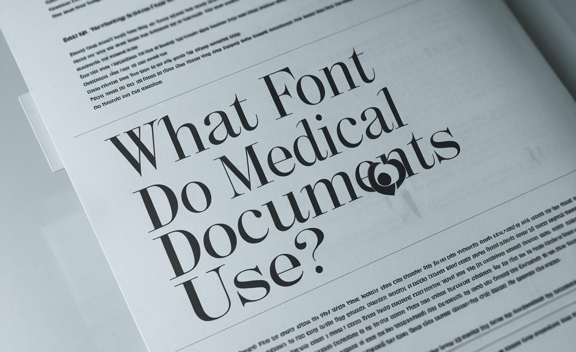
The choice of font in medical documents is essential for ensuring clarity, professionalism, and accessibility. Whether for legal documents, patient forms, or medical certificates, the right font helps maintain readability and convey important information effectively.
64% of medical printed documents rely on serif fonts like Times New Roman and Book Antiqua for their readability in printed material, especially for long-form content like medical reports and books. In this guide, we’ll explore the best fonts used in medical documents, their purpose, and best practices.
Font Selection in Medical Documents

In the medical field, font selection is crucial for readability and accessibility. Medical documents are often dense with technical terms and essential information, such as diagnoses, treatments, and medical history. Therefore, a font that offers excellent readability is paramount. Medical professionals rely on these documents to communicate accurately, and choosing the right font ensures that readers can process the information with ease.
Readability Factors:
- Line Spacing: 80% of medical documents use 1.5 to 1.15 line spacing for optimal readability, particularly in printed materials and research reports.
- Contrast: 85% of medical documents follow the guideline of having a high contrast between text and background, using dark text on a light background, to enhance legibility and reduce eye strain for readers.
Commonly Used Fonts in Medical Documents
Medical documents, including printed materials, legal documents, and medical certificates, often use fonts designed to enhance clarity. These documents might include patient history forms, death certificates, legal documents like medical records, or medical condition reports. Here are some of the most widely popular fonts:
1. Times New Roman
Times New Roman is one of the most common fonts that shines in medical documents. This serif font has been the default font for many formal documents due to its professional appearance and readability. Its classic serif typeface makes it ideal for body text and headings, offering a balance between style and readability. Its versatile font is easy to read on both printed materials and digital documents.
2. Open Sans
Another popular font is Open Sans, a sans serif font known for its modern design and exceptional readability. Often used in Google Docs, Microsoft Word, and various healthcare websites, this font is easy to read at smaller sizes, making it perfect for body copy in digital and printed medical documents.
3. Book Antiqua
Book Antiqua is another excellent choice for medical documents due to its elegant and readable design. Like Times New Roman, it is a serif font that offers a classic and professional look.
It frequently appears in printed materials, especially in documents that clearly separate text and headings. Legal professionals and individuals often use Book Antiqua for legal documents and personal information due to its versatility.
4. Century Schoolbook
Century Schoolbook is a classic serif font that is often used in healthcare documents. It offers clear readability and a traditional look, making it suitable for both printed and digital documents. This serif typeface is commonly used in printed materials like pamphlets, guides, and medical reports.
5. Arial
While Arial is a popular sans serif font, its clear lines and high readability make it a go-to choice for various legal documents in the medical field. Its simplicity makes it a standard font for documents like patient consent forms, headings, and captions.
Best Practices for Font Selection in Medical Documents
When choosing a font for your medical documents, it’s important to consider several factors to ensure that the document is both professional and easily readable. Here are some best practices to follow when selecting fonts for medical documents:
Legibility
Legibility is the number one priority in medical document typography. Choose fonts like Times New Roman, Open Sans, or Book Antiqua that are easy to read at various sizes. Avoid fonts that may appear decorative or hard to read, such as script fonts or fonts with excessive flourishes.
Font Size
For most medical documents, a font size of 11 or 12 points is ideal for the body text. This size ensures clarity and readability, whether the document is being read on paper or a screen. Larger font sizes can be used for headings and captions, but ensure the font remains legible and consistent throughout the document.
Consistency
Font choice should remain consistent throughout the document. Choose a primary font for the body text and a secondary font for headings or captions. Using too many different fonts can make the document feel cluttered and hard to follow. For example, using Open Sans for body text and Arial for headings can create a clean and professional look.
Avoid Using Comic Sans
Although Comic Sans might be suitable for informal settings or children’s books, it should never be used in medical documents. It is widely considered unprofessional and difficult to read in dense text. Stick with more traditional serif and sans serif fonts for medical documents to maintain a professional tone.
White Space
Proper use of white space is essential to improving the readability of any document. Ensure that there is enough space between lines of text, paragraphs, and headings to allow the reader to follow along without feeling overwhelmed.
Typography for Legal Documents
For legal documents, such as medical contracts, death certificates, or patient legal documents, it’s important to use a neutral font that conveys professionalism and clarity. Fonts like Times New Roman or Book Antiqua work well in these situations because they maintain a formal appearance and ensure easy legibility.
Font Choice for Different Types of Medical Documents
1. Legal Documents and Medical Records
For legal documents such as medical consent forms or death certificates, the font choice should be professional and formal. Times New Roman and Century Schoolbook are common choices for these types of documents. Serif fonts provide a traditional and trustworthy appearance for medical records.
2. Printed Materials and Pamphlets
For printed materials like brochures or pamphlets, Open Sans and Poppins are often chosen for their modern, approachable appearance. These sans serif fonts are highly legible and work well in small font sizes, making them ideal for printed guides on health topics.
3. Medical Certificates
For certificates, Book Antiqua and Times New Roman are frequently used. These fonts have a classic serif typeface, which adds formality to certificates such as birth certificates, diplomas, and medical credentials.
4. Subtitles and Captions
In medical videos or online content, Roboto and Open Sans are popular choices for subtitles or captions. These fonts ensure that text remains legible and clear when displayed on digital screens, particularly when used in video content or YouTube videos.
FAQs
Q1: What is the best font for medical documents?
The best font for medical documents depends on the context. Times New Roman is ideal for formal, legal documents, while Open Sans or Roboto are great for digital and printed materials due to their clarity.
Q2: Can I use script fonts in medical documents?
No, script fonts should be avoided in medical documents because they are difficult to read, especially in dense text. Stick to serif or sans serif fonts for optimal readability.
Q3: What font size is appropriate for medical documents?
A font size of 11 or 12 points is commonly used for body text in medical documents. Headings may use larger sizes for emphasis, but consistency is key.
Q4: What is the most professional font for medical certificates?
For medical certificates, Book Antiqua and Times New Roman are ideal due to their formal appearance and easy readability.
Q5: Should I use the same font throughout my medical document?
Yes, maintain consistency by using one primary font for the body text and a secondary font for headings or captions. Too many different fonts can make the document difficult to read.