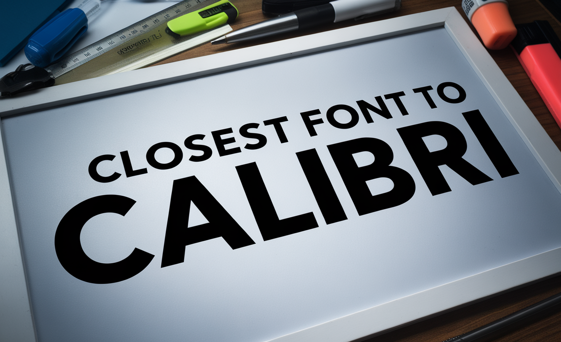
Calibri is a widely recognized sans serif font that has been the default font in Microsoft Word for years. Designed by Lucas de Groot, it has gained popularity for its excellent readability and modern font style. However, if you’re searching for an alternative font with similar characteristics, there are several options to consider that maintain the same level of legibility and versatility for different font applications.
Why Choose an Alternative to Calibri?
Choosing the right font is essential for maintaining consistency and professionalism in documents, logos, and digital content. Whether you’re looking for an alternative font due to licensing reasons, style preferences, or simply exploring new fonts for body text, several options offer a wide range of font sizes and styles while retaining the essence of Calibri.
Top Fonts Similar to Calibri
Here are some of the closest fonts to Calibri that share its readability, humanist design, and excellent functionality in various applications:
1. Open Sans
Designed by Steve Matteson, Open Sans is a popular font known for its neutral yet friendly appearance. It is a humanist sans serif font that provides excellent readability and is widely used in body text, logos, and web content. As a Google font, Open Sans is free to use and available in a wide range of weights and styles.
2. Noto Sans
Another Google font that offers a similar look to Calibri is Noto Sans. It provides a clean, modern typeface with excellent legibility in small sizes. Noto Sans supports multiple languages and scripts, making it a versatile choice for documents requiring a default typeface.
3. Source Sans Pro
Developed by Adobe, Source Sans Pro is an open-source sans serif font that offers a professional and modern font style. It features well-balanced letterforms and excellent readability, making it a great alternative to Calibri for both print and digital content.
4. Segoe UI
Segoe UI is another Microsoft font that closely resembles Calibri. It is commonly handy in user interfaces and is popular for its clarity and readability at various font sizes. This font family is an excellent choice for presentations, reports, and digital documents.
5. Droid Sans
Droid Sans, designed by Steve Matteson, is a sans serif font that shares many characteristics with Calibri. It offers a clean and modern design, making it an ideal choice for body text and document creation.
6. Trebuchet MS
Trebuchet MS is a well-known sans serif font that provides good readability and a slightly different font style compared to Calibri. It is a widely familiar alternative font for websites and printed materials.
7. Gill Sans
Gill Sans is a humanist font with a classic yet modern design. While it has a more traditional look compared to Calibri, its excellent readability and style make it a viable alternative.
8. Franklin Gothic
Franklin Gothic offers a bold and modern look with strong readability. It is widely used for display font purposes but can also work well for body text in documents.
Choosing the Right Font for Your Needs
When selecting the perfect font to replace Calibri, consider the following factors:
- Readability: Ensure the font maintains clarity in different font sizes.
- Font Style: Choose a font that aligns with your brand identity and design aesthetics.
- Legibility: Look for fonts that perform well in both print and digital formats.
- Font Family Options: Select fonts with a wide range of weights and styles.
- Default Typeface Considerations: If used in professional documents, ensure compatibility with various software platforms.
Common Uses for Calibri Alternatives
These fonts can be used for a variety of applications, such as:
- Business documents and reports
- Website body text
- Marketing materials and logos
- Presentations and slideshows
- Official communications and emails
Conclusion
Finding the perfect font alternative to Calibri is essential for maintaining the right balance of style, readability, and functionality. Whether you choose Open Sans, Noto Sans, or Segoe UI, selecting the right font can enhance your documents and create a professional appearance that aligns with your needs.
FAQs
Q: What is the best free font alternative to Calibri?
A: Open Sans and Noto Sans are excellent free alternatives that offer similar readability and modern design.
Q: Can I use Google fonts as an alternative to Calibri?
A: Yes, Google fonts like Open Sans, Noto Sans, and Source Sans Pro are great choices and are free to use for both personal and commercial projects.
Q: Is Segoe UI similar to Calibri?
A: Yes, Segoe UI is a close match to Calibri and is commonly used in Microsoft applications for its clear and professional look.
Q: What font size should I use to match Calibri?
A: Most alternatives, such as Open Sans or Source Sans Pro, can be used at a similar font size (11pt or 12pt) for a comparable appearance.
Q: Are there serif fonts similar to Calibri?
A: While Calibri is a sans serif font, if you’re looking for a serif font with a similar modern feel, consider fonts like Georgia or Garamond.