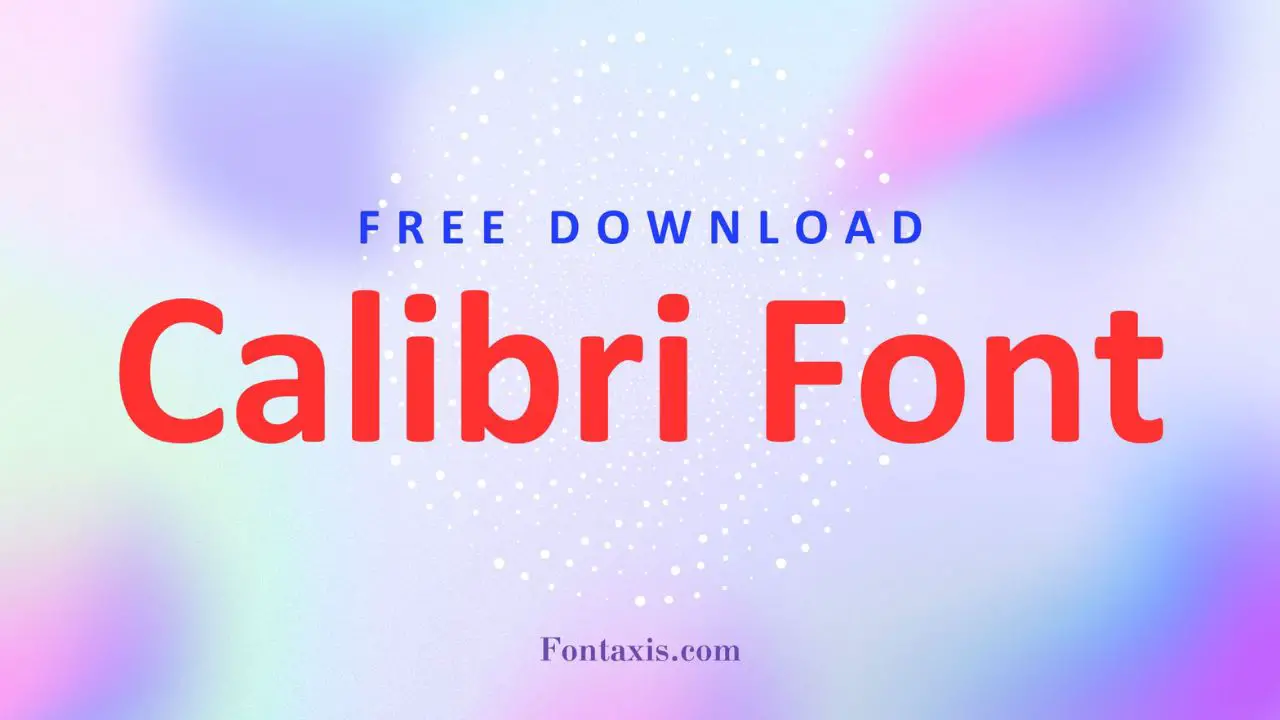
The modern sans-serif typeface Calibri Font features clean lines and readability. Designed by Lucas de Groot in 2002, Calibri has become one of the most widely used fonts in digital documents and interfaces, particularly because it has been the default typeface for Microsoft Office since 2007.
Calibri Font Information
| Name | Calibri |
| Style | Sans-serif |
| Designer | Lucas de Groot |
| File Format | OTF, TTF |
| License | Commercial |
| Type | Humanist Sans-serif |
Calibri Font Family Includes
- Calibri Regular
- Calibri Italic
- Calibri Bold
- Calibri Bold Italic
- Calibri Light
- Calibri Light Italic
- Calibri SemiBold
- Calibri SemiBold Italic
Where Calibri Font Is in Use
Due to its clarity and modern look, designers and users extensively use Calibri in various digital and print applications. People commonly see it in:
- Microsoft Office documents (Word, Excel, PowerPoint)
- Email communications
- Business reports and presentations
- E-books and digital publications
Calibri Font Alternative
If you’re looking for alternatives to the Futura font, here are some excellent options:
- Avenir
- Gotham
- Century Gothic
- Proxima Nova
- ITC Avant Garde Gothic
- Mont
- Nexa
- Renner
- Roboto
- Gill Sans
Calibri Font FAQs
1. Is Calibri a Free Font?
You cannot use Calibri for free. it requires a commercial license, although Microsoft Office products commonly include it.
2. Why is Calibri a popular choice among designers and users?
Calibri is popular for its clean, modern appearance and excellent readability, making it suitable for various applications, from business documents to digital interfaces.
3. Can Calibri Be Customized Or Modified In Microsoft Office?
Yes, Calibri can be customized in Microsoft Office by changing the font size and style and using different fonts like Arial, Comic Sans, or new fonts such as Aptos or Droid Sans. You can also explore free fonts from the Google Font collection or adjust legibility with ClearType settings.
4. What Is The Closest Font To Calibri On A Macbook?
The closest font to Calibri on a MacBook is likely the “Arial font” or “Helvetica Neue”, as they are standard fonts. For a more beautiful font, you can consider “Open Sans” or “Droid Sans.”
5. What Extent Should Overused Fonts Be Avoided?
Opt for beautiful and legible alternatives such as Google Fonts or Calibri fonts to avoid overused fonts like Comic Sans and Arial. Consider using different font styles, such as serif or sans serif fonts, including Aptos, Droid Sans, or Helvetica Neue, to enhance body text and improve legibility.
6. When Should I Use Calibri Over Aptos Display?
Consider the desired font style and legibility when deciding between Calibri and Aptos Display. Calibri, a standard sans serif font, is excellent for body text in Microsoft Word and offers a beautiful, clean look. On the other hand, Aptos may be used for larger headings or display text.
7. Where Is A Safe Site For The Calibri Fonts?
A safe site for Calibri fonts in Microsoft Word, where you can find the standard font. For a free download, consider sources that offer free fonts, like Google Fonts or the ClearType font collection.

