Taking effective notes is an essential skill, whether you’re a student, a professional, or simply managing daily tasks. The right font can significantly impact your note-taking experience, makin0g it easier to organize, comprehend, and retain information. Fonts are more than just aesthetics; they influence readability, focus, and even productivity. Here’s how selecting the right typeface for your notes can make all the difference.

Why Font Choice Matters
Your font choice sets the tone for your notes and affects readability. Fonts with clear letter shapes and adequate spacing enhance focus and comprehension. In contrast, overly decorative fonts can distract you from the content. When selecting a font, consider where your notes will be used—whether in Microsoft Word, Microsoft OneNote, or printed material—and choose one that supports your needs effectively.
Key Characteristics of Productive Note-Taking Fonts
- Readability: Choose a font that’s legible at various sizes. A readable font ensures you can quickly scan and understand your notes without straining your eyes.
- Consistency: Stick to a font family that includes multiple styles, such as bold and italic, for organized and visually appealing notes.
- Versatility: Opt for a typeface that works well across platforms, whether for printed material or digital use in email marketing or web design.
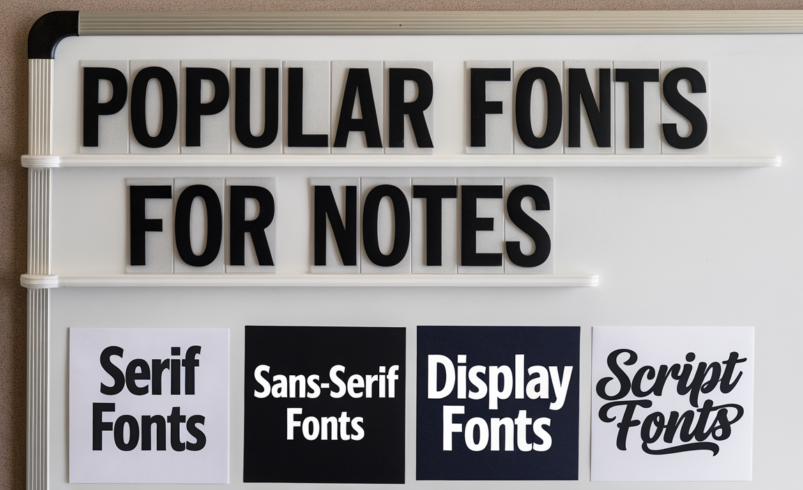
Popular Fonts for Notes
Here’s a closer look at different fonts and their suitability for note-taking:
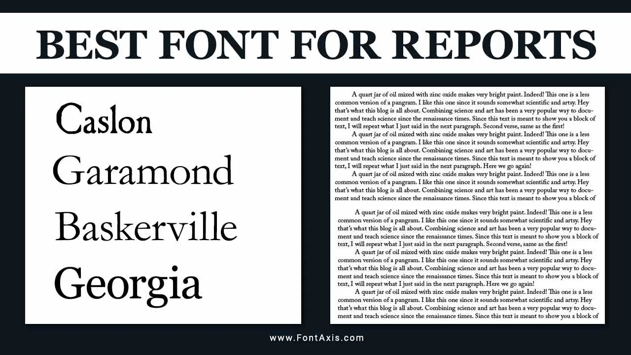
Serif Fonts
Serif typefaces, such as Times New Roman, are classic choices for readability in printed material. Their elegant letter shapes make them a great choice for formal settings, like professional notes or resumes. These fonts are also ideal for Microsoft Office applications, where serif fonts often serve as the default.
Sans-Serif Fonts
Sans-serif fonts are clean, modern, and highly readable on digital screens. Trebuchet MS and Work Sans are excellent examples of sans-serif fonts that balance style and practicality. They’re commonly used as web-safe fonts, ensuring consistent appearance across different platforms.
Display Fonts
Display fonts are decorative and designed for headings or emphasis rather than body text. While not ideal for extensive note-taking, they can be useful for titles or section headers to add a creative touch.
Script Fonts
Script fonts mimic handwriting, making them a suitable option for informal notes or creative projects. Handwriting fonts like Comic Sans MS are fun but may lack the professionalism needed for business settings.
Best Practices for Font Selection
When choosing a font for note-taking, follow these best practices:
- Stick to Readable Fonts: Avoid overly decorative fonts or those with irregular letter shapes, as they can hinder quick reading.
- Optimize Font Size: Choose a font size that is comfortable to read and suits your medium, whether digital or print.
- Use Contrasting Styles: Combine serif fonts for headings with sans-serif fonts for body text to create visual hierarchy.
- Consider the Medium: Use web fonts for digital notes and ensure compatibility with Google Fonts or Adobe Fonts for seamless integration.
- Experiment with Custom Fonts: Custom fonts can make your notes unique but ensure they maintain readability and professionalism.
Fonts and Productivity
The right font enhances productivity by making your notes more structured and engaging. Whether you’re organizing ideas in Microsoft OneNote, drafting an email, or updating your resume, a professional font ensures clarity and impact. Display fonts can highlight key points, while a serif or sans-serif font works well for detailed information. Using a fallback font or popular fonts like Trebuchet MS ensures consistency across platforms.
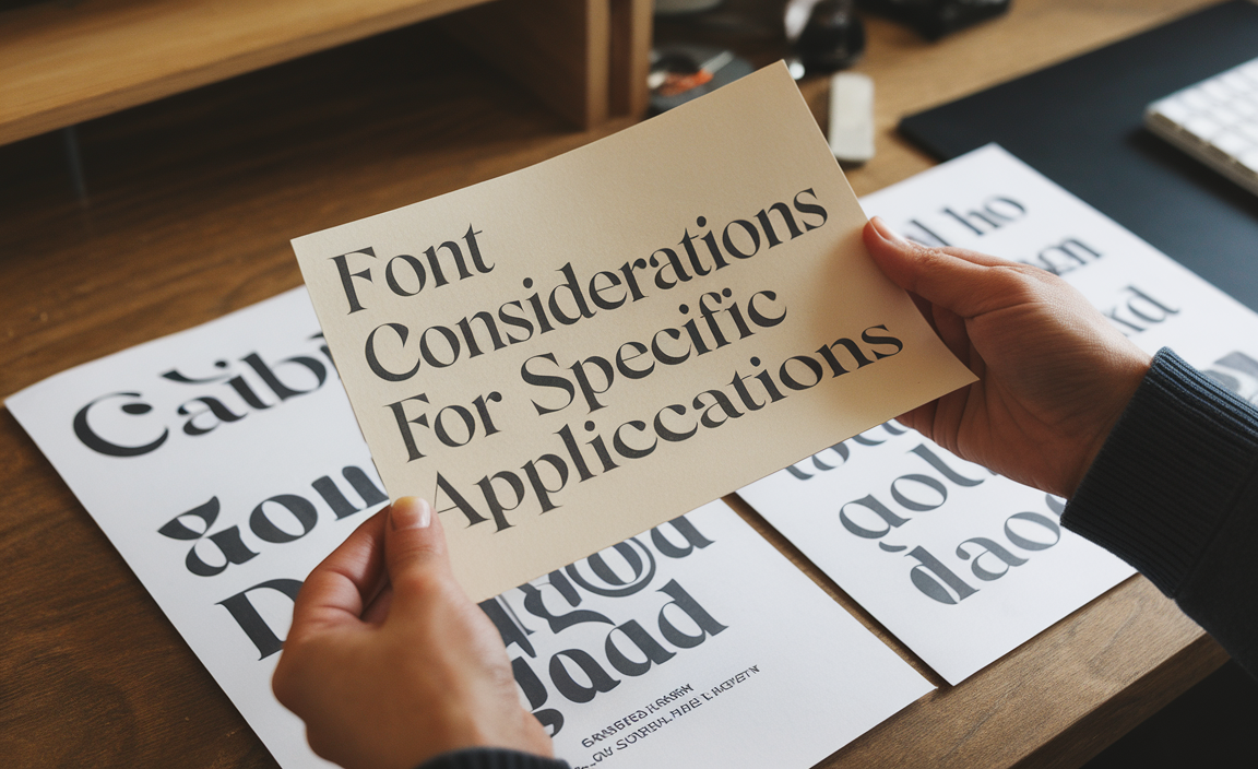
Font Considerations for Specific Applications
Notes for Email Marketing
When drafting notes for email campaigns, choose web-safe fonts to ensure readability across devices. Arial and Verdana are versatile choices that maintain a professional tone.
Web Design Notes
For web design projects, a sans-serif font like Work Sans provides a clean, modern look. Use script fonts sparingly for creative elements and ensure your font family includes fallback fonts for compatibility.
Printed Notes
For printed notes, serif fonts like Times New Roman or Georgia are ideal. These fonts maintain clarity and are well-suited for long passages of text.
Resumes and Professional Documents
The best resume font combines readability and sophistication. Fonts like Calibri, Garamond, or Helvetica are excellent options. These professional fonts balance style and functionality, making them a reliable choice for resumes or other formal documents.
FAQs
1. What is the best font for note-taking?
The best font for notes depends on the purpose. Sans-serif fonts like Trebuchet MS are great for digital notes, while serif fonts like Times New Roman work well for printed materials.
2. Are script fonts good for note-taking?
Script fonts are best for informal or creative notes. While they add a personal touch, they may not be ideal for professional or detailed notes due to readability concerns.
3. What font size is ideal for notes?
Font size 12 is standard for most notes, but size 10–14 can work depending on the font style and purpose.
4. Can I use Google Fonts for notes?
Yes, Google Fonts offers a wide variety of options, including readable fonts like Open Sans and Roboto, which are excellent for note-taking.
5. Which fonts work best for Microsoft Word?
Fonts like Calibri, Arial, and Verdana are commonly used in Microsoft Word due to their readability and default availability.
6. What is a fallback font?
A fallback font is used when the primary font isn’t available on a system. Popular fallback options include Arial, Times New Roman, and Helvetica.
7. Are decorative fonts suitable for notes?
Decorative fonts can be used for headings or creative projects but are not recommended for detailed or professional notes.