Readability is key when choosing the best font for note-taking. Popular options include Times New Roman, a classic serif font known for its clarity. A handwritten font like Monotype Corsiva can make notes feel personal for a more casual feel.
Serif fonts generally enhance reading speed in printed documents. However, many prefer sans-serif fonts for digital notes due to their clean lines. Fonts like Arial and Calibri are often recommended for their simplicity.
Using different fonts can also improve your note-taking experience. Google Fonts offers a wide range of options, making finding the ideal font for your needs easy. Experimenting with font size is crucial; a 12 point font is typically a good starting point for body text.
Decorative fonts may look appealing, but they can hinder readability. Therefore, focus on the easiest fonts that maintain clarity. For professional documents, stick to professional fonts that convey a serious tone.
If you’re working in Microsoft Word, consider using its default font, Calibri. The font preview feature lets you preview how different fonts affect your notes. A monospaced font can also be useful, especially for coding or technical notes.

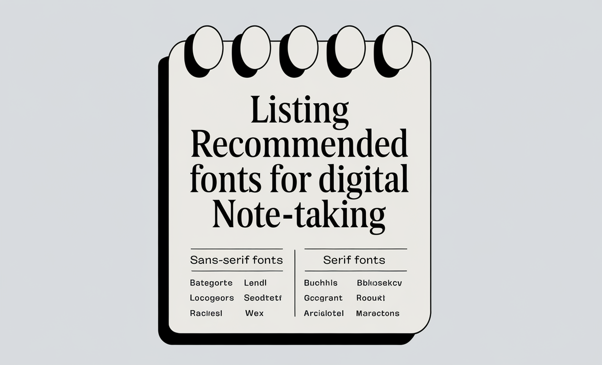
Listing Recommended Fonts For Digital Note-Taking

Sans-Serif Fonts
Sans-serif fonts feature clean lines and lack decorative hooks at the ends of letters. These fonts are designed for optimal readability on digital screens, making them a popular choice for web design.
Examples of Sans-Serif Fonts:
- Arial: A widely used font known for its clarity.
- Helvetica: A classic font favored for its modern look.
- Verdana: Designed specifically for screen readability with wider spacing.
- Tahoma: A clean font often used in user interfaces.
- Trebuchet MS: Offers a friendly appearance, suitable for various contexts.
Serif Fonts
Serif fonts feature small decorative strokes at the ends of letters. While they may be less ideal for digital displays, they excel in printed materials, providing a traditional and formal appearance.
Examples of Serif Fonts:
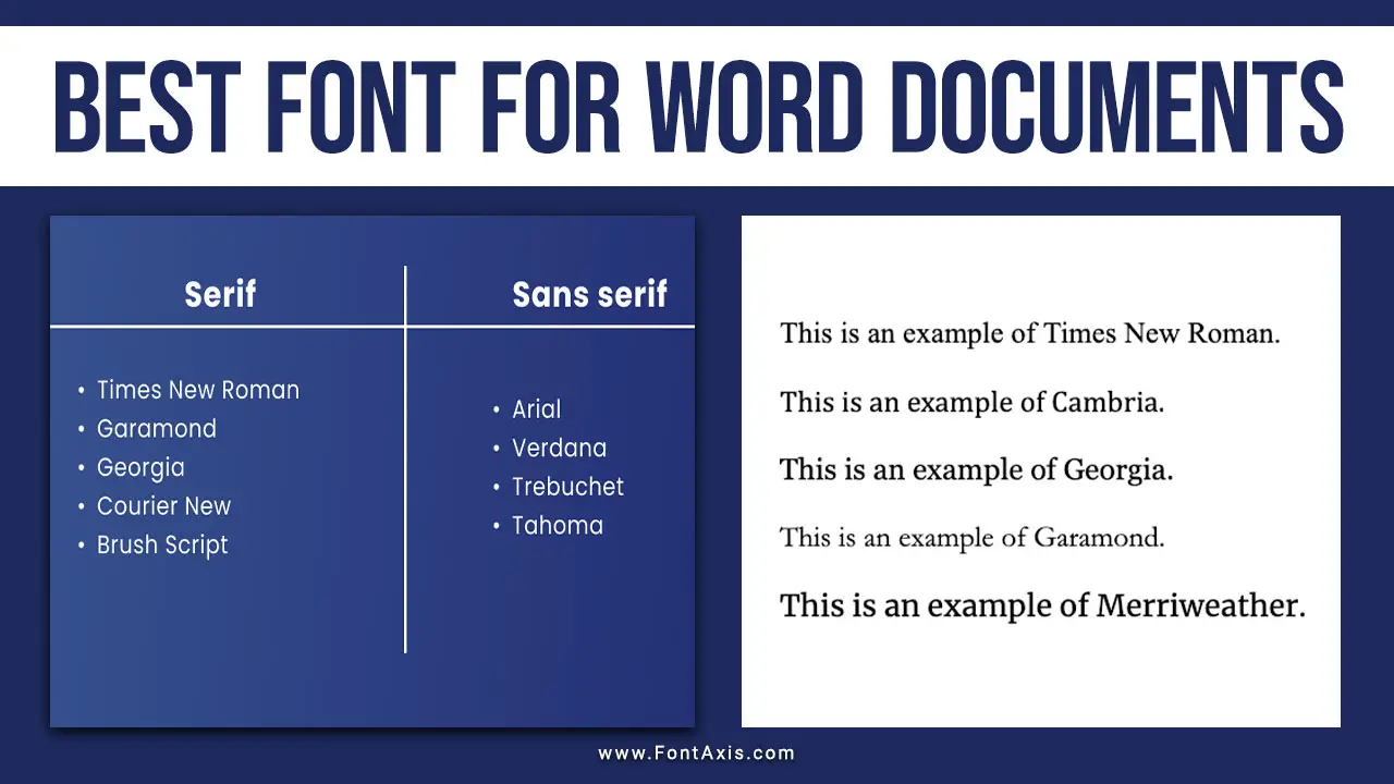
- Times New Roman: A classic choice for formal documents.
- Georgia: Designed for clarity on screens, balancing modernity with tradition.
- Garamond: An elegant font often used in books and print media.
- Palatino Linotype: Offers a sophisticated look, ideal for long texts.
- MS Serif: A straightforward serif font suitable for various applications.
Monospace Fonts
Monospace fonts have uniform character widths, resembling typewritten text. They are particularly useful for coding, instructions, and structured layouts.
Examples of Monospace Fonts:
- Courier New: A classic typewriter-style font.
- Lucida Console: Offers good readability for programming.
- Monaco: Commonly used in coding environments for its clarity.
Fantasy and Cursive Fonts
Fantasy and cursive fonts are more decorative and stylized. While they can add flair, they may sacrifice readability and are best used sparingly.
Examples of Fantasy Fonts:
- Copperplate: Known for its elegant look, it is often used in formal invitations.
- Impact: A bold font that stands out, typically used for headlines.
Examples of Cursive Fonts:
- Comic Sans MS: A casual font often used for informal documents.
- Lucida Handwriting: Mimics a handwritten style, suitable for personal notes.
- Papyrus: Offers an artistic touch but can be overused.
The right font style can significantly impact your note-taking efficiency. A unique font might inspire creativity, while a script font can add a personal touch. Ultimately, choose a perfect font that enhances your written words without distraction.
FAQs
1.What Is The Best Font For Digital Note Taking?
Sans serif fonts like Arial and Calibri are often recommended for digital notes due to their readability.
2.Should I Use Serif Or Sans Serif Fonts?
Serif fonts are better for printed materials, while sans-serif fonts are ideal for screens.
3.What Size Font Is Best For Note Taking?
A 12 point font is generally considered the standard for body text in notes.
4.Can I Use Decorative Fonts For Notes?
While decorative fonts can be appealing, they may reduce readability and are not recommended for lengthy notes.
5.Where Can I Find Free Fonts?
Google Fonts is a great resource for finding a wide variety of free, open font licenses suitable for various projects.


