Have you ever wondered why some fonts look so cool? Have you noticed the text on your phone? You might be looking at the Android Roboto Font. It’s a popular choice for designers. Let’s dive into why this font is so special.
Key Takeaways
- Android Roboto Font is widely used for Android devices.
- It is known for its clean and modern look.
- Roboto is easy to read on both screens and paper.
- It comes in various styles like bold and italic.
- Many apps use the Android Roboto Font for better clarity.
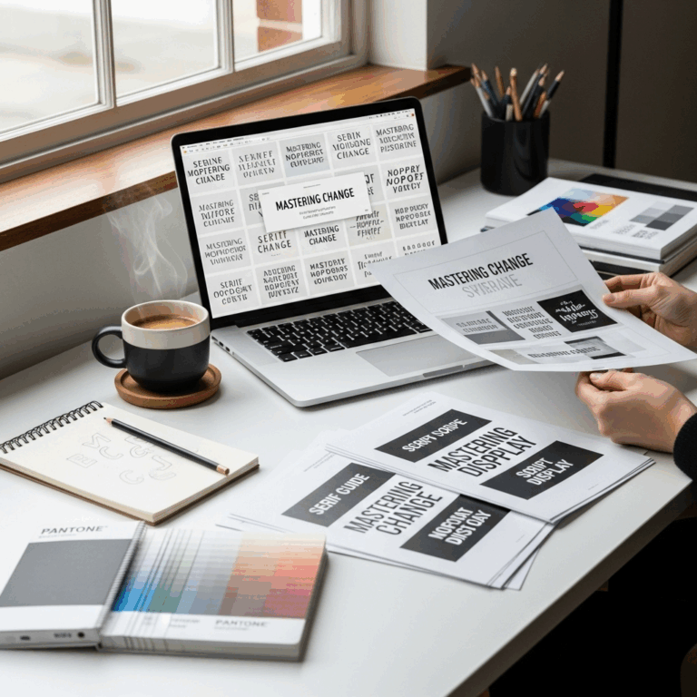
Understanding Android Roboto Font
The Android Roboto Font was created by Google. It’s the default font on Android devices. Why? Because it’s easy to read! The letters are smooth and clear. This makes it great for screens. Whether you’re texting a friend or reading an article, Roboto helps. It’s like the font doesn’t get in the way of the words. Cool, right?
- Created by Google in 2011.
- Default font for Android devices.
- Designed for readability on screens.
- Includes various font styles.
- Known for its clean and modern design.
- Popular in mobile apps and websites.
Roboto is more than just a font. It’s part of the Android experience. The font has different styles like bold, italic, and thin. This means designers can use it in many ways. The design is very flexible. It works for apps, websites, and even print. Plus, it supports many languages. This makes it a global favorite.
Fun Fact: Roboto was first introduced in Android 4.0 Ice Cream Sandwich!
History of Roboto Font
Did you know that the Roboto Font was unveiled in 2011? Google wanted a font that matched the modern look of Android. So, they created Roboto. It was first seen in Android 4.0, which had the name Ice Cream Sandwich. This version was an exciting update for Android users. Roboto was part of this excitement. The font made the text easier to read and the interface more attractive.
Why Is Roboto Popular?
Why do you think Roboto is so popular? It’s because of its simplicity. Many fonts are hard to read on screens, but not Roboto. Designers love it because it doesn’t distract. Instead, it enhances the reading experience. It’s like the font is invisible, letting your eyes glide over the words. The balance between style and readability is what makes it stand out.
Roboto vs. Other Fonts
How does Roboto compare to other fonts? For starters, it’s more readable on screens. Compare it to a font like Times New Roman. Times New Roman is better for print, but Roboto shines online. Its letters are spaced well, making it easy to read. But that’s not all. Roboto offers a range of weights and styles. From thin to bold, it covers all needs. No wonder it’s so loved!
Features of Android Roboto Font

What makes a font special? Look at the Android Roboto Font. It has a unique set of features. For one, it’s highly readable. This makes it great for smartphones and tablets. The font is also scalable. That means it looks good whether it’s big or small. Designers can use it in different ways. Roboto also supports many languages, adding to its versatility.
- Highly readable on screens and paper.
- Scalable to different sizes.
- Supports various languages.
- Offers multiple styles and weights.
- Compatible with many devices.
- Frequent updates for improvement.
Roboto’s design isn’t just about looks. It’s about function too. The font is free to use, so anyone can download it. This openness makes it popular among developers and designers. They appreciate how easy it is to integrate and use. The font is regularly updated to fix bugs and improve features. This keeps it fresh and reliable.
Fun Fact: The Roboto family includes 12 styles, from thin to black!
Roboto’s Open-Source Nature
Did you know that Roboto is open-source? This means it’s free for anyone to use. Google made it open-source to encourage creativity. Designers and developers can modify it to fit their needs. This flexibility is one reason Roboto is everywhere. It’s not just on Android. You’ll find it in web designs, advertisements, and even books. The open-source nature has made it a favorite worldwide.
Various Styles of Roboto
How many styles does Roboto have? A lot! The font family includes styles like regular, italic, bold, and more. This variety allows designers to mix and match. You can use bold for headlines and regular for paragraphs. This flexibility makes Roboto a go-to choice. It’s like having a toolbox with everything you need. Whether it’s for a website or a mobile app, Roboto can do it all.
Roboto in Everyday Tech
Look around you. How many devices can you see? Chances are, they use Roboto. It’s common in smartphones, computers, and more. The font’s readability and style make it perfect for tech. It’s not distracting, allowing users to focus. Whether you’re texting, browsing, or reading, Roboto is there. It’s become part of the tech world. No wonder it’s so popular!
| Font Feature | Roboto | Times New Roman |
|---|---|---|
| Readability | High on screens | Best for print |
| Styles | 12 styles | Few styles |
| Use | Web and apps | Documents |
| Support | Many languages | Limited |
How Android Roboto Font Enhances Design

Fonts can make or break a design. The Android Roboto Font enhances it. How? By being modern and clean. It adds a professional touch to any project. When viewers see it, they focus on the content. The font doesn’t distract them. It guides the eyes smoothly across the screen. This makes it a designer’s favorite.
- Modern look for fresh designs.
- Clean lines for a professional appearance.
- Enhances readability without distraction.
- Supports vibrant and muted color palettes.
- Versatile for different design needs.
- Widely used in app and web design.
Roboto’s clean look is perfect for today’s designs. It works with bright colors and subtle shades. This versatility is key for designers. They can use it for various projects without worrying. The font supports the design without taking over. It’s like a stage manager, making sure everything looks good. This balance is why it’s found in so many designs.
Fun Fact: Roboto is often used in Google’s Material Design!
Professional Look with Roboto
Do you want your design to look professional? Use Roboto! The font’s clean lines and modern style add a polished look. It makes your design look sharp and neat. This is why businesses and designers love it. The font fits well in corporate designs and creative projects. Its professionalism shines through, making any project look top-notch.
Roboto’s Role in Material Design
Have you heard of Material Design? It’s a design language created by Google. Roboto is a key part of it. This design style focuses on clean lines and bright colors. Roboto fits perfectly because of its clarity and readability. It helps create a user-friendly experience. Users can navigate easily, thanks to the font’s easy-to-read style. This harmony is why Roboto is popular in Material Design projects.
Using Roboto for Web Design
Web designers have many fonts to choose from. But why is Roboto often their choice? Because it’s perfect for digital screens. Websites need fonts that are easy to read. Roboto’s smooth and simple design makes it a top pick. It’s like giving your website a pair of glasses. Everything looks clearer. Visitors enjoy a better reading experience, and that makes them stay longer.
Conclusion
The Android Roboto Font is more than just a font. It’s a tool that enhances readability and design. From Android devices to web design, Roboto is everywhere. Its clean look and flexibility make it a favorite. Next time you see text on a screen, remember Roboto is likely helping you read better!
FAQs
Question: What makes Android Roboto Font so popular?
Answer: The Android Roboto Font is popular because it is easy to read. Its clean and modern design makes it ideal for screens. It’s versatile and supports various languages, enhancing its appeal worldwide.
Question: Where is Roboto commonly used?
Answer: The Android Roboto Font is widely used on Android devices. It is also found in web designs, mobile apps, and even print media due to its readability and modern look.
Question: Is Roboto font free to use?
Answer: Yes, the Android Roboto Font is free and open-source. This allows designers and developers to use it in various projects without restrictions, making it a popular choice.
Question: What styles are available in Roboto?
Answer: Roboto offers a wide range of styles, including regular, bold, italic, and more. This flexibility allows designers to use it for different parts of a project, such as headings and body text.
Question: How does Roboto enhance web design?
Answer: Roboto enhances web design by being easy to read on screens. Its clean lines and simplicity help improve the user experience. This makes websites more enjoyable to read and navigate.
Question: Can Roboto be used in print design?
Answer: Yes, the Android Roboto Font can be used in print design. Its clarity and range of styles make it suitable for both digital and print media. This versatility is one of its many strengths.