In web design, typography is more than just selecting fonts—it’s about creating an intuitive and accessible reading experience across various devices. One crucial element of this is choosing the right font size for your text, which impacts both readability and the overall visual hierarchy of your site.
Whether you’re dealing with body text or headings, the right font size ensures that your content is clear, appealing, and accessible to all users, regardless of the screen size they’re viewing it on. Here, we explore the actual font size chart for web design, covering everything from responsive typography to maintaining website accessibility.
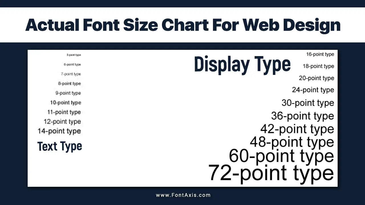
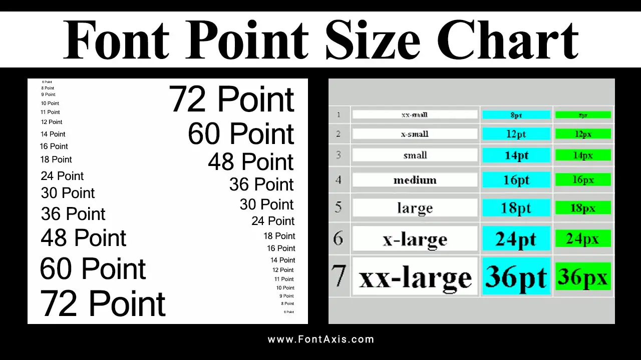
Understanding The Actual Font Size Chart For Web Design
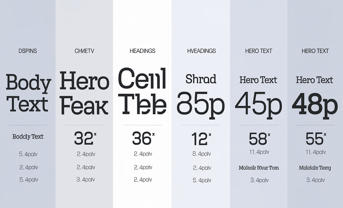
| Font Size (px) | Description | Use Cases |
| 8px | Extremely small | Icon fonts, fine print |
| 10px | Small | Captions, labels, fine print |
| 12px | Base font size | Body text, paragraphs |
| 14px | Slightly larger | Headings, subheadings |
| 16px | Larger | Emphasis, titles |
| 18px | Even larger | Important headings, titles |
| 20px | Large | Section titles, hero text |
| 24px | Very large | Page titles, branding |
| 36px | Extra large | Headlines, hero text |
| 48px | Massive | Logos, hero text |
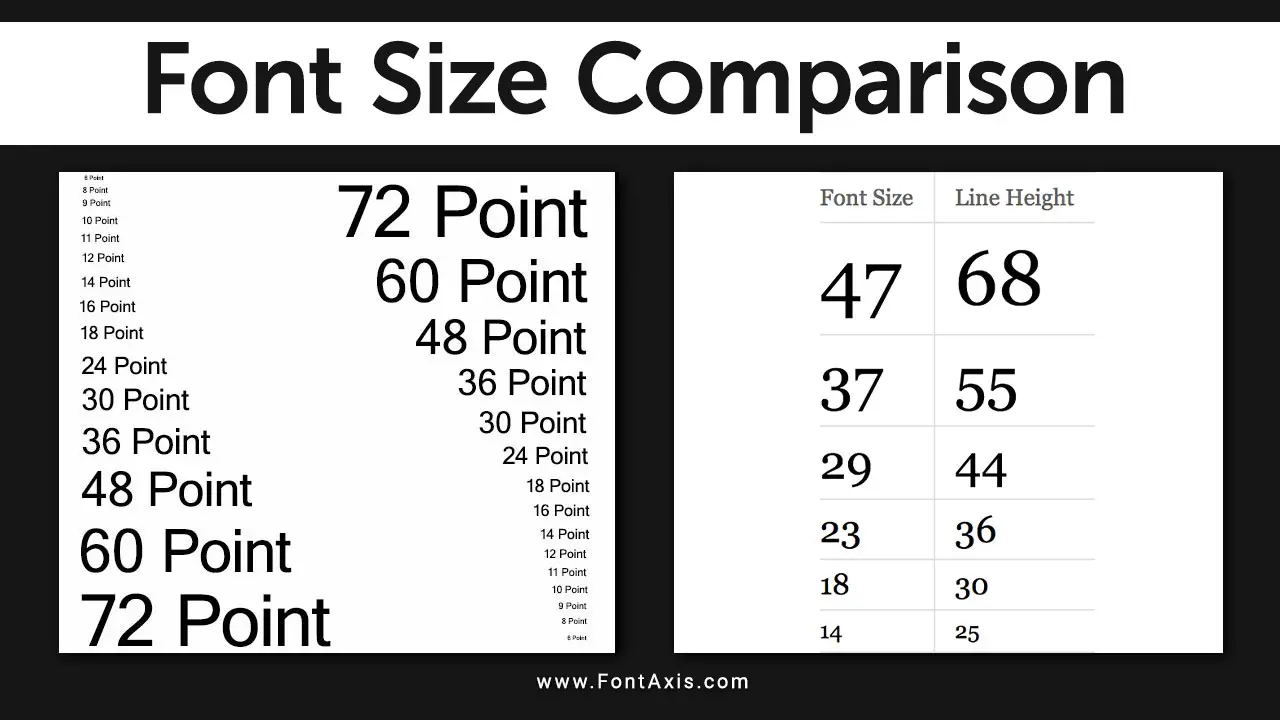
When creating a font size chart, it’s essential to factor in how the text will be displayed on different screen sizes, including larger desktops and smaller mobile devices. An actual font size chart for web design outlines various font sizes, typically starting with a base font size, and scaling them to maintain consistency across devices.
Font Sizing For Different Devices
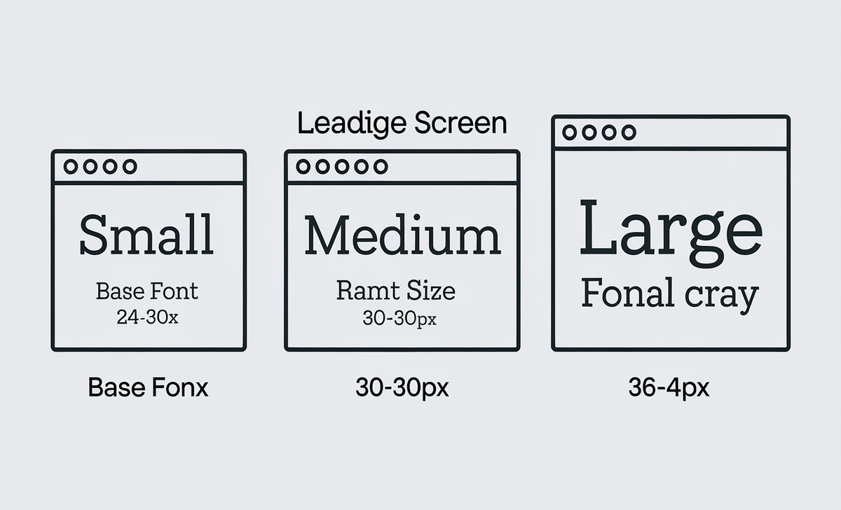
To ensure that your typography looks good on all screen sizes, follow this general guideline for font sizes:
- Small screens (320px to 768px):
- Base font size: 16px
- Headings: Scale down for readability (H1: 24-30px)
- Body font size: 14-16px
- Medium screens (769px to 1024px):
- Base font size: 16px
- Headings: (H1: 30-36px)
- Body font size: 16-18px
- Large screens (1025px+):
- Base font size: 18px
- Headings: (H1: 36-48px)
- Body font size: 18px
For more flexibility, using relative sizes like em and rem ensures the text adjusts based on the user’s preferences and screen size. This method also helps meet Web Content Accessibility Guidelines (WCAG) for readability.
Typographic Hierarchy And Visual Design
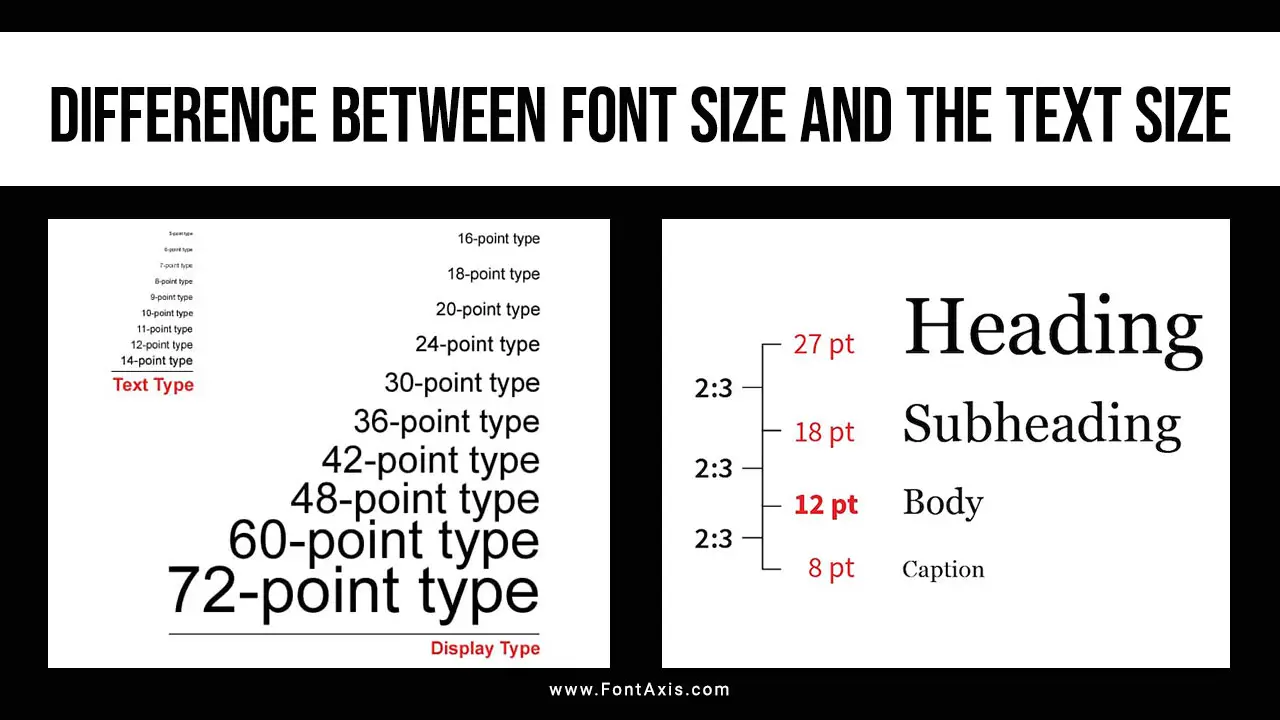
Establishing a clear typographic hierarchy is essential in web typography. The visual distinction between headers, body text, and other elements guides users through content. A larger font size for headings (H1, H2) and a smaller font size for body text creates a smooth flow, enhancing user experience.
Here’s how you can maintain hierarchy:
- H1 (Main Heading): 200-300% of the base font size
- H2 (Subheadings): 150-200% of the base font size
- Body Text: 100% of the base font size
This hierarchy ensures a clean and structured layout, contributing to the overall effectiveness of UI design.
Conclusion
Choosing the right font size, adhering to responsive typography, and maintaining a strong visual hierarchy are all essential aspects of web design.
A well-structured actual font size chart ensures that your text remains readable and accessible across all screen sizes and devices. By focusing on optimal font sizing, website accessibility, and thoughtful UI design, you’ll create a more user-friendly and aesthetically pleasing web experience.
FAQs
1.What Is The Best Base Font Size For Web Design?
The best base font size is typically 16px, as this is the browser default. It scales well on most screen sizes, ensuring text is readable.
2.How Do You Ensure Font Size Is Responsive?
Using relative sizes like em, rem, or percentages ensures your text scales appropriately with the screen size, offering responsive typography.
3.Why Is Typographic Hierarchy Important?
Typographic hierarchy helps users navigate content by establishing clear distinctions between headings and body text, improving the user experience.
4.How Do I Improve Website Accessibility With Fonts?
You can improve accessibility by using a minimum body font size of 16px, clear line spacing, and providing options to resize text for users with disabilities.
5.What Is The Difference Between Serif And Sans-Serif Fonts?
Serif fonts are traditional and have decorative strokes at the ends of letters. Sans-serif fonts lack these strokes and have a more modern, clean appearance.

