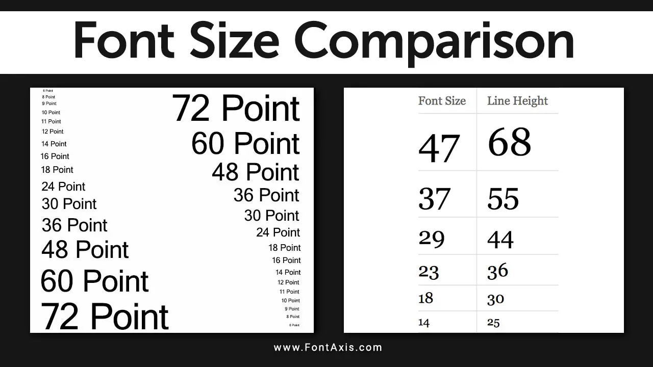
Understanding font size is essential for web pages, printed material, or documents in Microsoft Word. Font size affects readability and can significantly impact how your audience perceives your content. This guide will delve into the importance of font sizing and how to choose the right font size for different applications.

Understanding Key Points In Font Size Comparison
Measurement Units> Font Types> Size Ranges
Font sizes are measured in points (pt) for print and pixels (px) for web design, with 12 pt as a common default in print. Due to decorative elements, serif fonts often look larger than sans-serif fonts at the same size. Different typefaces, like Times New Roman and Arial, can also affect readability. For printed materials, body text typically ranges from 10 pt to 12 pt, while on the web, a recommended size is between 15 px and 25 px for clarity.

| Font Size (pt) | Approx. Pixel Size (px) | Common Uses |
| 8 pt | 10.67 px | Captions, Footnotes |
| 10 pt | 13.33 px | Body text (small) |
| 12 pt | 16 px | Body text (standard) |
| 14 pt | 18.67 px | Subheadings |
| 16 pt | 21.33 px | Headings |
| 18 pt | 24 px | Emphasis text |
Font size is a measurement that describes the height of characters in a specific typeface. It’s usually measured in points (pt), with 1 point equating to 1/72 of an inch. Here are some common terms associated with font size:
- Default Font Size: The size preset in software applications. The default font size in Microsoft Word is often set to 11 or 12 pt.
- Base Font Size: The standard size often references other text elements. For instance, if the body font size is set to 12 pt, headings maybe 16 pt or larger.
- Relative Sizes: Descriptions like larger, smaller, or smaller sizes compared to current font size.
Factors To Consider When Choosing Font Size
When choosing font size, consider factors like screen size or printed material, as smaller screens may need larger fonts for readability. Readability is key—ensure proper line height and spacing to avoid crowding. Your font choice and design affect how different fonts display at the same size, so always test various sizes. For both web design and print, balance line length with font size for the best user experience.
Screen Size Vs. Printed Material
Different media have different requirements. For smaller screens, such as smartphones, a larger font may be necessary for readability. Conversely, in printed projects, a minimum font size of 10 pt is often recommended for body text.
Readability
The primary goal of choosing a font size is to ensure the text is easy to read. Large print (14 pt or larger) is suitable for users who may struggle with smaller text. Line spacing and line height also contribute to readability—ensure sufficient spacing to avoid crowding.
Type Size
The type size must also consider the line length. Text that is too wide can strain the reader’s eyes, while a well-balanced line length paired with appropriate line spacing enhances the overall reading experience.
Font Choice And Design
Different fonts (or typefaces) have varying pixel values for the same point size. For example, a larger font may appear more compact than a smaller one, so it’s crucial to test different font designs to find what works best for your content.
Testing Sizes
Use tools to preview how text appears at different sizes. Websites designed for web design often allow you to experiment with different sizes and styles to determine the most effective combination for your audience.
Conclusion
Choosing the right font size is critical to effective communication. It impacts readability, user experience, and the overall aesthetic of your design. Whether you’re working on web content, printed material, or documents in Microsoft Word, consider the context and audience needs when selecting your font size.
Testing and adjusting based on the intended use will help ensure your text is not only visually appealing but also accessible to all readers.
FAQs
1.What Is The Default Font Size In Microsoft Word?
The default font size is typically 11 or 12 pt, depending on the version and settings.
2.How Do I Determine The Minimum Font Size For Readability?
A minimum font size of 10 pt generally works for body text in printed material.
3.Does Font Size Vary Between Web And Print?
Yes, font sizes may need to be larger for screens, especially on smaller screens, compared to printed materials.
4.What Is The Best Font Size For Large Text?
A large font size (14 pt or larger) is suitable for better visibility and readability for users with visual impairments.
5.How Does Line Height Affect Font Size?
Proper line height enhances readability by providing adequate spacing between lines, making it easier for readers to follow text.
